PHOTOGRAPHY 101 – VIGNETTING - IS IT A FAD?
TO VIGNETTE OR NOT TO VIGNETTE
As with everything else, there tends to be fads in photography. What is popular today will look very out of date in a few years. Selective coloring is one of those outdated styles that came about when it was first possible to use Layers in Adobe® Photoshop. It used to be very popular about 20 years ago when only those skilled in Adobe® Photoshop knew how to do it well.
The heavy vignetting of images in post-processing is one such social media fad, made popular through Instragram etc.. Done well it can be effective as an art form, but done to excess, in my opinion it becomes predictable and boring, and screams “Social Media.” Subtle vignetting, on the other hand still shows the entire image, but darkens the edges slightly in order to draw attention to the center of the photograph.
The manufacturers of lenses work hard to create lenses that create very little lens fall-off (or vignetting,) which is seen as a technical fault caused by too much light hitting the center of the lens, and not enough hitting the edges. It tends to happen more with extremely wide-angle lenses and lenses with very wide apertures. Vignetting can also be caused by stacking too many filters on a lens, thus shading the edges from light, although this is not much of a problem with today's photographers who tend not to use physical filters as often as they did in the past. There is a trend today to try to recreate the photographs taken with the cheaper cameras and lenses of years ago.
Traditionally, most professional photographers would strive hard (and still do) to avoid vignetting in their photographs, preferring the viewer to see what the natural eye can see, while still cleverly drawing attention to the main subject of the photograph through composition, leading lines, and lighting. Even today in the digital age, vignetting of lenses can be corrected in Adobe® Photoshop and other post-processing software.
Of course, I am not telling you how to create your art. Beauty is always in the eye of the beholder. But, for me the most pleasing images have little or no vignetting. I have had all the software tools available for over 20 years to create heavily vignetted images, but I choose as a general rule not to produce that kind of work. It may not be quite as popular, and may not even create as many Upvotes, but I choose to keep my style more traditional in nature for the most part.
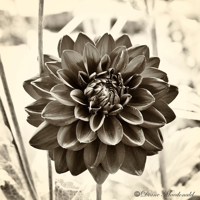
Which of the following images do you prefer?
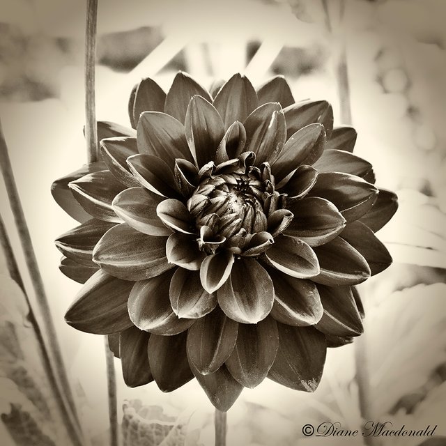
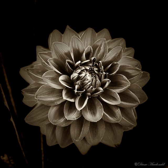
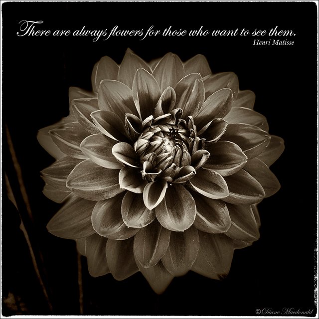
Each draws attention to the subject the matter – the dahlia flower. My own personal favorite is Dahlia 1 with no vignetting. It gives a sense of the environment where the flower is growing, with the focus still on the center of the image and the flower, although the lightest parts of the image surround it. Dahlia 2 is OK, but the vignetting seems unnecessary to me in this particular image. Dahlia 3 has its place as an art form, but eliminates the environment, making the image less interesting to me. True, the focus is on the flower, but I can't help focusing on the gloomy darkness too. That type of image would be great for a text book where text would be added to the image, or for an art print with text added, as in Dahlia 4.
It's up to you how you use this information. Whatever is pleasing to your eye is going to dictate your style, but decide for yourself based on each photograph whether to vignette or not! Don't just do it because it's the "in" thing to do. Do it because it adds interest to your photograph!
Dahlia 1

Image © Diane Macdonald. All Rights Reserved.
Dahlia 2

Image © Diane Macdonald. All Rights Reserved.
Dahlia 3

Image © Diane Macdonald. All Rights Reserved.
Dahlia 4

Image © Diane Macdonald. All Rights Reserved.
My color image of the dahlia is available as a stock photograph on Getty Images here
Camera:Canon EOS 5D Mark II
Lens: EF28-135mm f/3.5-5.6 IS USM
Exposure: 1/100 sec; f/11; ISO 1250
Post Processing: Adobe® Photoshop CC 2017, Adobe® Camera Raw, Nik Collection Color Efex Pro 4 and Silver Efex Pro 2
xxxxxxxxxxxxxxxxxxxxxxxxxxx
If you wish to have your before and after vignetted images critiqued by myself or your peers, just add the photography101 tag!


Most of that is outside my understanding. Bit I know what I like. The forms and shapes of the natural world are wonderful and convey a truth that can not be duplicated by automated and artifical technologies. The fir st and the third stood out to me. The first reminded me of the connection between a subject and its context. The focus may a particular point of interest. But it is an illusion to think of "things" as seperate. The third reminded me that there is value and wonder in meditating on the part. For the whole is also there. String work. Peace and Love and Liberty.
You don't need to understand anything to know what you like.:-) I appreciate your feedback. I too am drawn to the natural world and all the interconnections. With the background eliminated, the image "says" nothing much to me. It's a flower head. Yet, I don't really dislike it. I just like the natural better. There's a moodiness to the dark ones, which many people like these days.
Some folks think memes are real too and fight about them. Peace brother
That's true. LOL! Do they really fight over them? Not much point in that.
Yes. Meme/label/construct wars on FB and in the media. It like someone yelling at a video game like its more than contrived stimulation. Peace
Dear Diane, I understand your reasons and agree with them. Vignetting is something that I dislike as a principle, but it's contradictory as I end up finding my photos more interesting with vignetting. Especially the kind of photos you show up in this post: nature, flowers, macro. I edit most of my flower photos with heavy vignetting and I confess I like the result better with it. It has kind of a baroque touch, I guess, like a still life painting, and I like that. Words said I like your last photo better! Happy New Year, sweetie!
Thanks for commenting, Isabel. Your opinion is likely in the majority. The eye always goes to the lightest area of the photograph, so it is a natural! But, rules are meant for breaking, and as a photographer, I like to break them. Sometimes I like to make the eyes work. Lol! Strangely, though, I have sold very little in the way of heavily vignetted prints on my art sites. And stock sites are not keen on them at all. I believe people like them on screen, but they often don't print well. And when all is said and done, the people who buy photography appear to prefer the cleaner look. That's only my experience, of course. Others may have a different experience completely. That's what makes it all so interesting. Photography is very subjective. 🙂
Happy New Year to you and yours!
Indeed, and that's the beauty of it! I hardly see my photos printed, so, thinking about what yo say, I can understand and totally agree with it. It's a perspective I had never thought about. And, my dear, you are a photographer I absolutely admire, you have made a career and I don't doubt for a second about following your advice. They are precious to me. Cheers, my dear Diane!
Vignette is one thing I use now and again I find it all depends on my mood whether or how much I use it
Same here. It serves to hide a lot of photography mistakes too, which can be a good or a bad thing. :-)
Yes I do so agree
Your photography has been good. And flower enhances the beauty of the picture.
I prefer no.1 too. I agree the vignette effect is nice for portraits as in this example from a recent contest.
https://steemit-production-imageproxy-upload.s3.amazonaws.com/DQmdBocu6vVSPbbAqH5dWkMzT3nHfSuFtifKfHApqoTfujf
The vignette of the other three flowers is as you say. Distracting and progressively more so as they go on.
Vignetting has its place, and I do sometimes use it too, but mostly I like to see a subtle background giving a sense of the environment.
Agreed. Everything in moderation.
Thanks! :-)
Nice new picture of you on your blog :)
Gee, I had to really look at these photos to see the differences....the first two are very close but I could see the differences around the edges being more blurred in the second than the first. But honestly, I can't tell with the dark backgrounds. What am I missing? The only difference is the edge being ragged vs sharp.
Nevertheless....beautiful photos and thank you again for the photog lesson. Always appreciated.
I'm not sure what you are looking for in the last 2. LOL! They are identical except for the text. I added Dahlia 4 as an example of adding text to Dahlia 3.
Perhaps your screen is not showing the vignette in the second shot. It's not actually more blurred - just slightly darker - subtle vignetting.
lol....I thought the text might have been it but I was looking for filtering, tones, etc....lol. Way to overlook, and overthink. Gee.
The difference in the first two is very subtle and I thought vignetting had to do with blurring the edges...see? I don't read well...or see well. Getting so old. It's good for a laugh at any rate.
There is so much to see and read on here, that we are all guilty of skim reading! LOL!
You can create a blur type vignette too, so you were not wrong at all! And you did get my point that I preferred subtle vignetting. LOL! With subtle vignetting you don't so much see the vignetting as you see the center more clearly because there is a little more contrast. If you go back and look at Number 2, you may notice that the area around the flower appears lighter - although it is not. It's the outside edges that are darker. :-)
Oh yes...I see it. Mind tricks. Optical illusions and whatnot. It's interesting how the brain processes what the eyes see.
It is interesting, I agree!
A gift for who?
My Friday Haiku
Inspired by none other than you!
I don't really see this as a gift for me. You took my image which says "All Rights Reserved" and used it to promote your own poetry. I did not give you permission to use my work.
I like the last photo a lot. Very cool. The border and the quote seem to add a very nice touch, at least when viewing it on here.
Yes, it seems to be a popular look these days, and works well for adding text. However, it is not how the image was photographed, so I use the technique sparingly.