Split Tone Photos: Includes Quick Lightroom Tutorial and Example Portrait for Comparison
Split Toning - What is it?
Toning is a processing technique where a small amount of colour is added to photos to tint them. In standard toning a single colour such as sepia is used to tone the whole image.
In split toning (duotone which is the commonest type) two different colours are used, one for the shadows and one for the highlights. There are more advanced types of toning but that is beyond the scope of this post.
In theory using two different tones in this way lends greater depth and interest compared to the standard B&W or single tone tint.
Personally I think like most things this is subjective and down to personal taste.
How To Do It in Lightroom
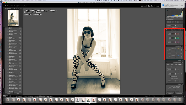
The B&W and split toning panel in Adobe Lightroom 5. (You may need to click on the triangle in the top left hand corner of each panel to make is visible if it is hidden.)
With modern photo processing software e.g. Adobe Lightroom this is really easy to do.
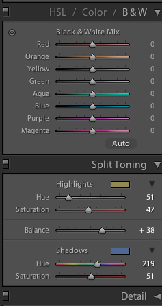
In Lightroom you simply select B&W in the colour settings panel (see red box in the image) and then use the sliders in the Split Toning panel to adjust the hues for highlights and shadows separately.
The balance slider allows some fine tuning of which hue is more dominant.
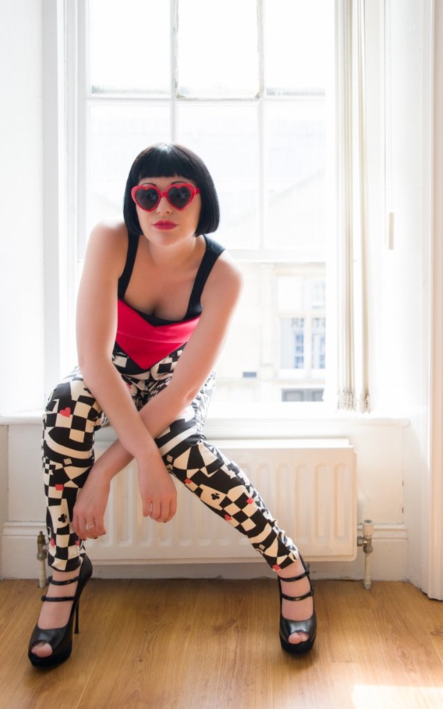
Example: Portrait of Kelly Ann Horn
The colour version.
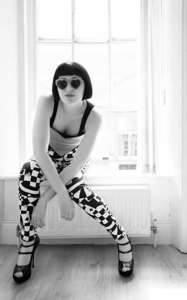
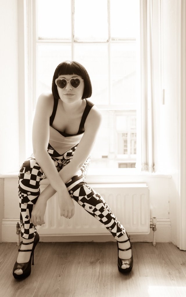
The standard black and white.
This is a normal sepia image (i.e. single tone, shadows & highlights = same colour)
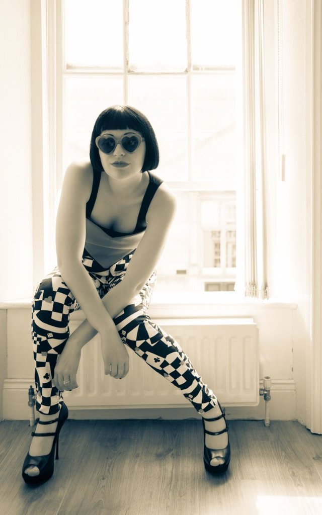
Split tone 1 - with bluer shadows and yellower highlights.
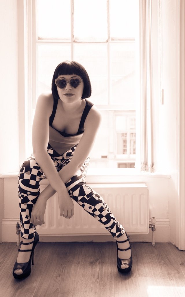
Split tone 2 - this one has a slightly red tint to the shadows.
This is a natural light photo with backlighting to the rear and a reflector held in front of the model. B&W conversion and split toning was done in Lightroom as shown above.
It was taken in an old Victorian shop. I like portraits with natural backlighting and this window was perfectly placed.
I'm not sure if I personally have a preference for any of these shots but I do think this series helps illustrate how split toning can give a different character to the photo from simple Black and White and even just regular single tone sepia.
Anyway what do you think?
Which one do you prefer and why?
Do you use split-toning?
Please have your say in the comments below.
Equipment used:
- Nikon D800 Camera
- Sigma 24-70mm/2.8 lens.
- Hand held white reflector (foldable) - I always have this!
- The Sun from the window.
You can see more of my work @thecryptofiend - hope you enjoy.
(Verification for me here: http://www.aapicture.com/about-me)
Solid tutorial. I use Lightroom CC. Good job.
I do too - I think the latest version of Lightroom is 5 though but I'd have to check.
If you are a part of the Adobe Creative Cloud it's just referred to as Lightroom CC. I like the Creative Cloud because it just automatically updates me to latest version. But again, solid tutorial. I've been meaning to do one as well.
The weird things is My Photoshop says CC but Lighroom still say 5 so I'm not sure if it has just not updated properly or something. Have they added anything new lately?
I don't know much about photography but I have been enjoying your photos, thanks for posting! I like the split tone 2. I can't quite put my finger on what makes it stand out over the others, maybe it's just that the red tint feels like a good match for those heart shaped glasses.
Thanks. Good choice. I keep wavering between that one and the plain B&W - I think it is just whatever personally looks best to your eye there isn't always an obvious reason.
Very helpful tip. Will try it out.
Please do and post the results.
Sure, will do.
Great.
I actually tried it out and posted the results here. Thanks for the inspiration!
Nice tutorial, very useful. Thank you!
You're welcome:)
Very much it was pleasant to a photo
Thank you:)