You are viewing a single comment's thread from:
RE: Street Photography on one of the TOP 10 beaches in the world, Jericoacoara, Brazil.
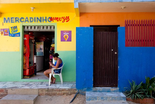
Wow. You took a lot of shots. Very beautiful. They are all really stunning but one really stood out to me and I think would make a great photo competition entry for one of those big ones like the Sony. It's this one:
It is one of the best compositions I have seen in ages. The woman in the chair. The different coloured walls, the step, the sign - everything works perfectly here.
I would love to see a separate post with just this photo where you discuss the photo, how you took it, why, what settings you used etc.
Also there is lots of other strong work here I would suggest next time separating them out into separate posts so people don't overlook them as there is lots of great work here.

Hey Thanks a lot. I don't remember the settings but I can take a look. I shot RAW and P mode most of the time. ISO was probably 200. This little camera is amazing for street stuff. I can definitely make a post talking about the photo later. This one I took while walking back to the hotel. I was just passing by and noticed the different colors and shapes. She's using the phone and there's a phone provider add on both sides of the yellow wall, saying that they sell SiMM cards. :) I thought it would be interesting...you know? This paradise place, beautiful beaches, but she is a native, got used to it and only care about texting and Facebook. :)
Regarding split the post in more than one...I don't know, maybe I could edited better and take it down to only 12 pictures, but they should be together to tell the story. I have literally 1000s of pictures like these that I collected in the last 15 years or so.
Thanks again.
Yes it definitely works well - it is interesting.
I understand about posting to together to tell the story but I definitely think you should do a post with that photo on its own. It just works so well with all the different colours and divisions in it.
I will do it and maybe try to explain on the post why the image works...
So, EXIF says: 1/60 f 6.3 ISO 400. focal length equivalent to 28mm. Shot in RAW and developed in LR. Adjusments are very basic, just exposure, WB and a curve for contrast. Sometimes I add bit of dehaze on LR, It looks better than clarity in my opinion.
Great thanks OK. I think I need to manually upgrade my LR because it doesn't seem to have changed in over a year (even though PS keeps getting done automatically though CC). I will need to try out dehaze and see how it works. That said since I mostly shoot portraits I find that modern cameras are a bit too sharp if anything!
I use a lot of prime lenses with large apertures for portraits. Like a 85mm 1.4 . This helps a lot to soften the skin and reduce the overall detail, but eyes are still sharp if you get the focus right. In this case, clarity will only work on the areas that are in focus.
clarity and dehaze are different effects. That's why I like dehaze... it acts more on the contrats instead of sharpness.