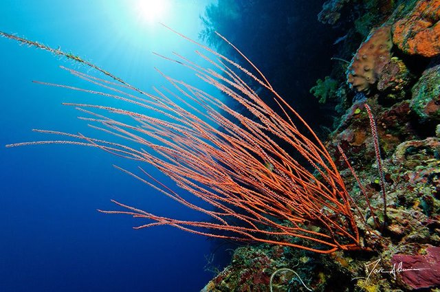
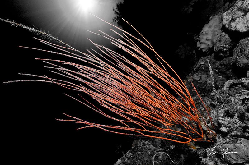
BORNEO - Stop #6 - Maratua - Laquelle préférez-vous...?
| Les fonds sous-marins sont riches de couleurs mais quelques retouches photos changent radicalement l'ambiance. Quelle version préférez-vous? | The underwater world is rich in color, but some photo retouching radically changes the mood. Which version do you prefer? |
|---|


D300 - 10-24mm
Dernier reportage sur Bornéo en français ici:
https://steemit.com/fr/@marc-allaria/borneo-stop-6-plongee-a-maratua
More about Borneo in english here:
https://steemit.com/travel/@vcelier/borneo-diving-in-maratua-by-marc-allaria-translated-from-french
Follow Me Here

I like the first one. The blue colour and the contrast with the orange colour is more interesting than orange on black.
Thank you for the reply and yes, it's more natural.
You got a 1.41% upvote from @postpromoter courtesy of @marc-allaria!
Want to promote your posts too? Check out the Steem Bot Tracker website for more info. If you would like to support the development of @postpromoter and the bot tracker please vote for @yabapmatt for witness!
Both are nice, but I like the color version a little more.
You are awesome....
Hello! I have just featured one of your images that you recently submitted to my 7 World´s Continents Photo Challenge in today´s color challenge. Feel free to attend the post to interact with other users through answering some of the comments. Thank you. Have a great day. Tomas
ColorChallenge - Yellow Wednesday - @marc-allaria in 7 World's Continents Photo Challenge!