Basics of color combination. How to understand the essence of color perception of a photo.
Hi, friends. Today I want to talk to you about color in photography. This is one of the main components of its success. It is competent color harmony that makes the picture pleasant to the eye. Or Vice versa, the color creates a repulsive impression.
When we look at any image we perceive it too superficially and too relatively. In fact, the BRAIN of most people for the most part does NOT see THE COLOR itself in the photo. Our subconscious mind analyzes two things in the background of consciousness. First of all - black and white contrasts and color contrasts. And it already compares with their previously seen patterns of experience.
Why do we need contrasts on any image:
1.Color and black and white contrasts help our subconscious to conduct a quick analysis of what he saw. Since the subconscious mind works on the type of previously saved patterns (from past visual experience), the presence of contrasts simplifies and accelerates the recognition of objects in the frame and comparison with previously saved patterns in our subconscious. The faster the brain recognizes the information seen (here the account is for milliseconds, not for minutes and hours, at long distances already other factors can be included) the better it will be perceived ( in a more positive way). The brain will spend less effort and less stress, and less stress - positive perception.
- Separation of plans from each other. The main task of any photo/video - is the distinction between people and the background(plans), just to our brain immediately saw a clear, understandable picture without the need to strain the gyrus in the background and quickly absorb the picture we see.
And how to separate them, these plans? just with contrast transitions in light and color. PEOPLE ( or the main object in the frame) MUST ALWAYS BE identified by LIGHT! It's basically either drawing, or contouring, or both together. And there are a couple of things where photographers are wrong. The worst and most frequent option - the lack or absence of drawing light on the faces, when the main light pounding in the back of the head model, eventually dark face, impaired contrast and volume of facial features, plus not the best skinton in the end, TK in the shadows more reflexes (even those that we do not catch the eye, but still have an impact on the final shade of the face)
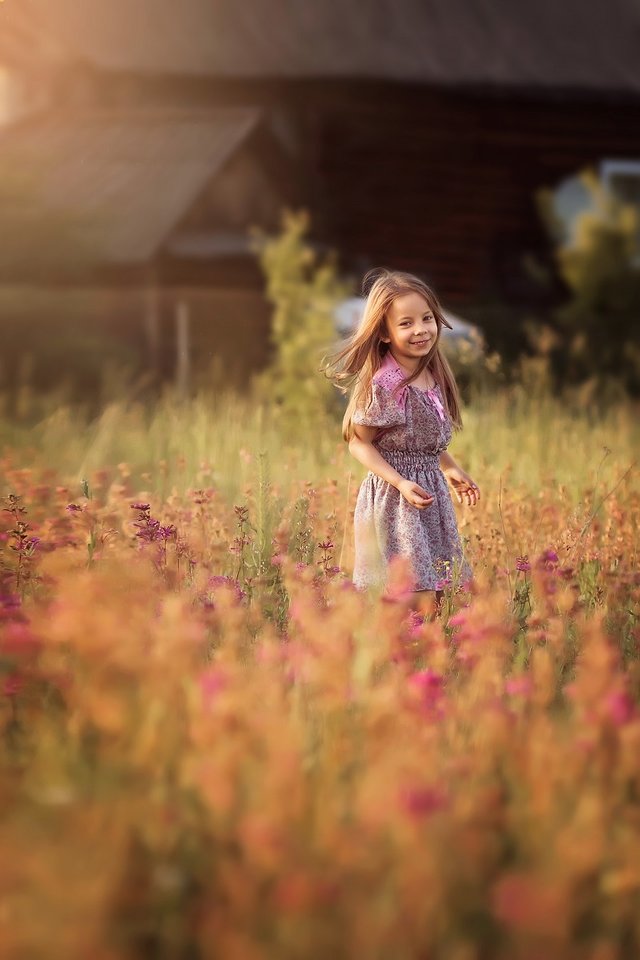
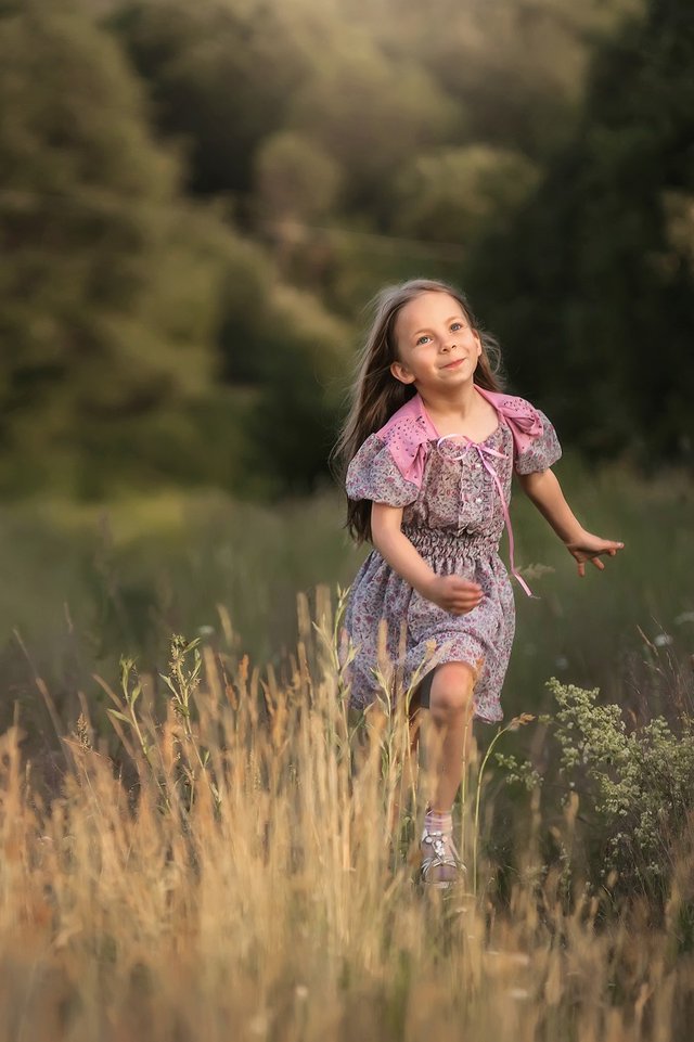
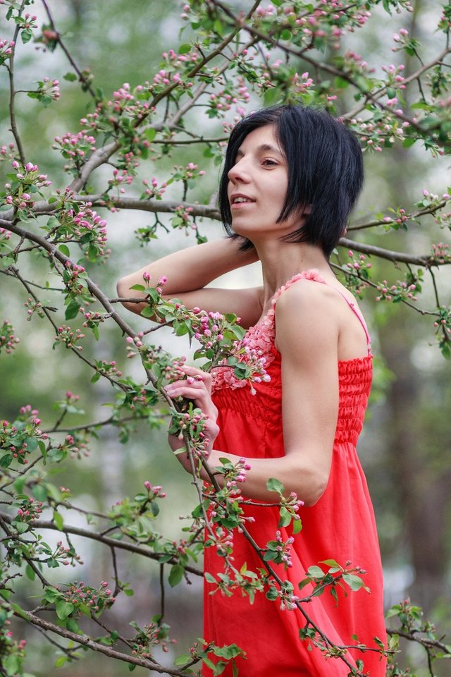
The model on the background of the green in fact is already using contrast color, warm skin (and perhaps a warm tone dresses) + green color, which in itself is cooler than the skin, at least on the color circle. And if the greens are taken away in an even colder shade when toning the frame, we will further push our colors into more complementary, also increasing the color contrast. But here it is necessary to adhere to the principle of organicity, all toning should look quite natural. You do not have to use purely opposite (complementary) colors for color contrast, or saturated, rather small separation - one shade is a little warmer, the other a little colder.
The more complementary and bright colors in the photo - more emotional and energetic mood of the photo.
More close/less saturated/pastel colors - frame mood is more calm, gentle, soft. Accordingly, it is possible to choose for the task.
- The third factor, which requires contrasts - Volume. Of course you've heard it, thanks to two human eyes we see a 3d picture, due to the fact that the eyes look at the object a little at different angles, giving the brain two pictures a little bit in different planes, which add up to a sense of volume in our brain. A photo is just a flat picture, the eyes see the same image, and for the volume of the brain need tips - the distribution of black and white and color contrasts. This is the volume when read - our brain is very happy, and immediately says - wow, this picture is beautiful!
Especially for people in the frame it is important, maybe you need the correct delineation of facial features to emphasize them beautifully, without creating unnecessary negative shadows.
Some tips on light:
. A good color is enough light. Especially the light necessary for our persons making them cleaner and interrupting microrelease from all surfaces around the location.
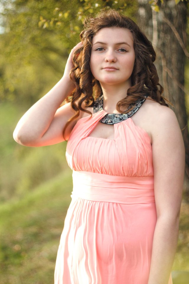
. Especially important is the angle of incidence of drawing light. The optimum is ± 30-45 degrees relative to the plane of the face, not the head as a whole. Raising and lowering your head, you are already changing this angle.
. The hardness and softness of the light is not as important as the angle of incidence. You can in the afternoon to shoot with light painting, if you stand 45 degrees. Shadows are just a little deeper and the processing of contrast need less to add,but the photo itself is great
. On the street, do not remove under a canopy of leaves that covers all sides of people. This increases the chances of hard reflexes from the greens, plus places completely in the shadow zone, depriving the slightest drawing light on the faces/people. Otherwise, it's either dirty frame, or boring in the light. If you go into the shade of the sun, it is better that it was a spacious shadow location, not a small closed. Here will be better distributed scattered light, respectively, and color.
. Sunset contour light should not at times dominate the amount of light over the drawing, otherwise the face will be too dark. Ideally, the face is better to highlight any source.
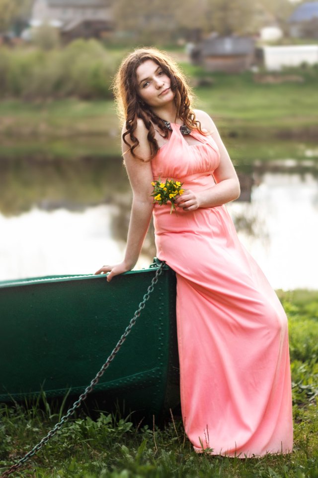
. Look for the boundaries of light and shadow, they allow you to simultaneously illuminate the models and darken the background, this gives a qualitative result separating the model from the background.
. In cloudy weather, the light may not be the same on all sides, in fact, still on some side of it more, look at the ground (there are minor shadows), and shoot where more.
. The rule of organic color, whatever you do with it, it should match any popular patterns in the real world. This will give maximum viability to your staff, and you will not want to delete them in a year.
Thanks for reading. Hope this helps you understand something new in photography. See you soon. And Hello to my friends:
@mnallica
@raj808
@gtg
@dmcamera
@projectgiving
@tristanoliff
@fabien
@fyrstikken
@hanshotfirst
@creativecrypto
@karja
@elteamgordo
@choogirl
@axeman
@artizm
@guyfawkes4-20
@meanmommy33
@rea
@donkeypong
@lugina
@thekittygirl
@themagus
@kotturinn
@staceyjean
@natureofbeing
This post was shared in the Curation Collective Discord community for curators, and upvoted and resteemed by the @c-squared community account after manual review.
@c-squared runs a community witness. Please consider using one of your witness votes on us here
Thank you !!!