Off Grid Paradise Logo Competition.
I have been working on an Off Grid Paradise for everyone plan and as it's about to come to fruition I need your opiniion.
I really need your input on this as it will be a forever decision that each of you could help decide. I will put up 5 Steemit Tokens for the comment that resonates with me most.
So with more fan fare than one could possibly handle here are the two options. I like both and both will be used, I had a few others I don't care for but these two are my first choices. One is my vision and the other is a vision I also love. I didn't create either. At best I gave my opinion and these are what my designers came up with.
If you aspire or are living off grid which of these two best resemble what you'd expect to see when looking online for an Off Grid Paradise north of Lake Superior (the world's largest fresh water lake in Canada, it has a minuscule tide.)
Steemits feedback has always been incredibly influential to me. Please share with your friends and get them to vote, I will notice (share love) and it will take part in my decision; which one to make my main. I love Steemits opinion and in many ways has it has done great things for all. It's the best way after all.
I will reveal the artist after voting has expired and payouts made, if they want me to.
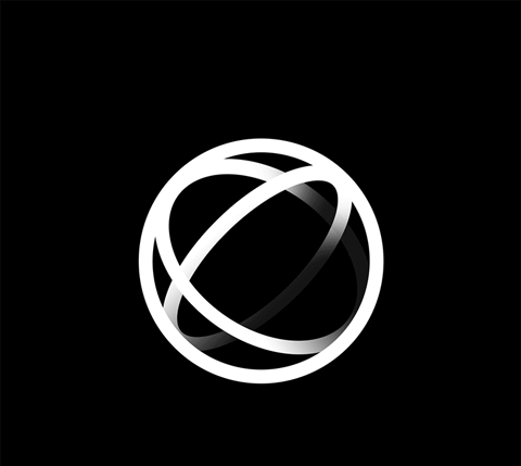
First to get back to me was this
![]()
It's incredibly unique, attracts the eye, can be recognized from a distance. Truly good quality artwork that won't be topped easily. I love this image and I feel it can't easily be replicated.
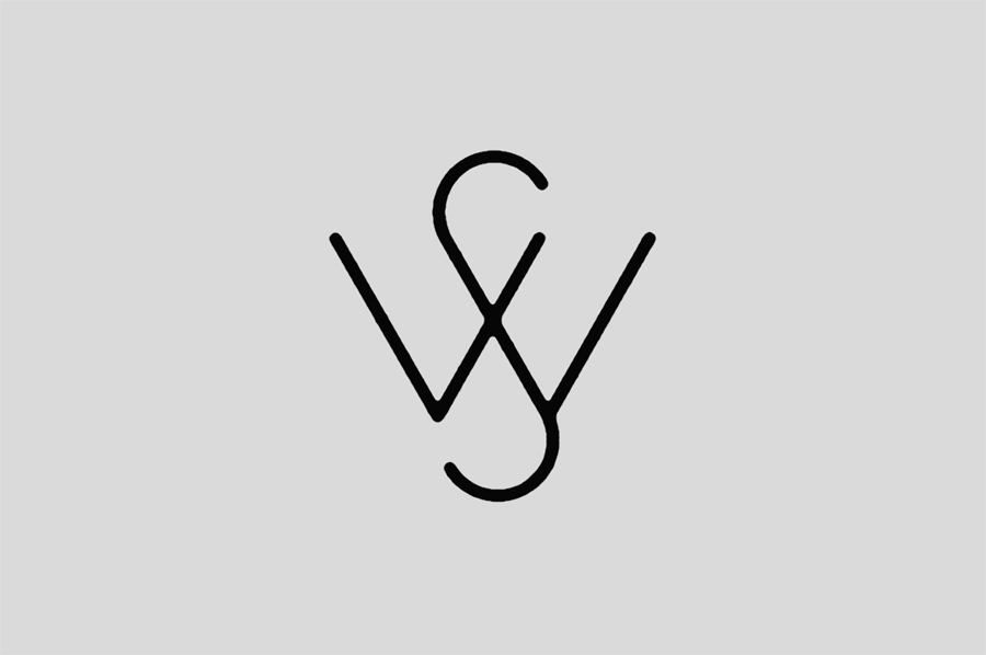
Next is a different vision.
My other favourite. It embodies the feel I'm looking for. Not incredibly unique though it is. It met all my expectations aside from creativity. Not exactly what I wanted but fair enough.
![]()
which is best in your eyes?
Aside from your vote, your comment will be the key decider. Genuinely, I need it.

Your comment needs to say Moose for the the first image, the moose head or Loon for the second image, which is of a loon. *(if you don't know the difference between a moose and Loon the you'd better pay close attention my past and future posts.)
LoL the bot like people are hilarious like uh can't move my ass to replying something even little meaningful.
Maybe for them we should redirect them to a straight to follow guide on making at least $5 a day by following simple steemit rules, I think they are lost and coming up with their own ways of making money here, well that's what they are here for the buck hehe.
Regarding your logo
I love the 2nd one the duck for sure but you know me with interest in graphics design, I'll say that there can be a lot of modifications done to make it look more attractive like just by using some color accent like complimentary colors you can make it look amazingly perfect and of course the background also matters like where you gonna put it on.
I'll say that you should tweak the duck one little with the colors to give it a pop effect, best way to get inspiration is to go through some reference pngs or vectors or Shutterstock vectors, you will get amazing color accent ideas from there.
I took less time but you can dwel down searching for some breathtaking visuals.
I like everything you said. Find me in Steemit.chat. we got a chatting to do!
Alright mate 😂 I'll catch you on steemit.chat in 7-8 hrs. I already feel excited. 💪
I like the moose. I have a canadian friend here in Shenzhen and just last night we were talking about mooses crushing cars :-)
I like the moose too. I will use both probably. They have each have a place. And yea, I moose can really mess up a car if they want to, some good utube vids of that. If you're driving 100kmh and hit a moose your car is totaled and you;re gonna a need a doctor.
My option is second one. It is catchy to eyes and giving beautiful and lovely feeling.
catchy indeed
It's great competition of Paradise Logo.
Thanks. I like that animated lolo you have. Snazzy.
Loon it is. I prefer the 2nd. I like the water presence and the presence of the loon.
It gives a feeling of peaceful water but free enough to fly away whenever
good choice. I like it too. Both are good. But the loon with the northern lights in the back ground... priceless .
sorry posting error
all of your post is always so informative,so i regularly follow your blog. love to read it.......This is so great! You got the great point here..love to read it ...
so what do you choose robot?
sorry posting error
sorry posting error
Wow! that's a wonderful logo Paradise Logo Competition.
Thanks for share.
I like the loon--the second image.
In my mind the off-grid paradise should be a big pond with clear and green water, where a duck/loon is swimming comfortably and freely.