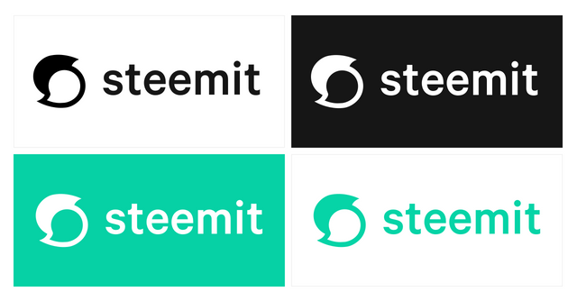
The New Steemit Logo is Here!
As you’ve probably noticed, things are looking quite different on steemit.com. We’ve been working on these changes for some time, and we worked hard to have them polished and deployed in honor of SteemFest.
The new logo and design changes serve multiple functions. The primary motivation is to improve the user interface and user experience of steemit.com. The other important function is to clarify the distinction between Steem and Steemit.
The Steem blockchain supports a whole ecosystem of applications, most of which have been created by independent developers in our community. The Steemit company and Steemit website are a part of this ecosystem, but they are not the entire ecosystem.
The new Steemit logo
Everybody has a story to tell. Maybe it’s a tragic love story. Maybe it’s a world changing idea. Probably, it’s a meme post. No matter what, your voice is worth something.
Steemit gives people a powerful voice. We help them tell and spread their stories by providing an economic system with incentives that reward valuable contributions. Our new logo is a nod to the community, the conversations, and the powerful voices we aim to amplify.
The Steemit brand and logo are protected by intellectual property laws, including copyright and other proprietary rights of the United States and foreign countries. This is to allow Steemit to protect the brand and logo in ways that extend user safety. One may not make unauthorized commercial use of, reproduce, prepare derivative works, distribute copies, perform, or publicly display the Steemit logo or brand, except as permitted by the doctrine of fair use or as authorized in writing by us.
The Steem logo
The Steem logo remains unchanged, and will continue to be the logo for the Steem blockchain and STEEM currency.
The Steem logo is licensed under Creative Commons CC0, meaning you’re free to copy, modify, or distribute (even for commercial purposes) without needing to ask permission or give attribution.
![]()
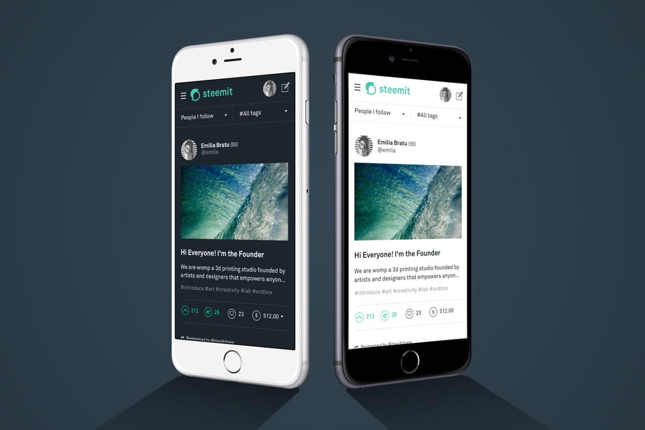
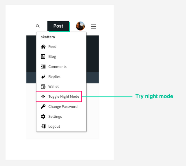
The new night mode
Today, we're also excited to introduce a new dark theme. It's been one of the most requested features and you can access it within the profile menu while logged in.
For now, the darker theme has been applied to a few of the major pages. We'll be applying this theme throughout the site in the coming weeks.
Stay tuned for more updates.
Steem on,
All the TEAM at Steemit
Love it!
Looks like quotation marks 69ing each other
But seriously it's pretty cool :)
Looks to me like a stingray turning around. 😕
The logo itself is ok, but the green color is too ugly. The green shadow behind the button and the window makes the page more ugly.
I can bear the green logo, green upvote, green shadow. What make me crazy is the color of the links is also bright green. When an article has many links, a whole area is bright green and very uncomfortable for the eyes.
Because of this, I am considering to use other UI, for example Busy.org, or steemkr.com
The advantage of Steem blockchain is that you can use any interface you want. You could even build your own interface.
Yes, we can use any interface. The issue is that I don't know whether I can trust the 3rd party products or not. For me, it's ok to use posting key, but I don't want to use the owner key for security concern. I tried to use posting key to login busy.org, but failed.
Once I reveal the fact that a reputation 69 spammer, a former steemcleaners member, adm of steemit.chat, spammed Steemit with a comment bot. The spammer, whose id is firepower, threatened me publicly on the block chain. He also banned my account at steemit.chat. We never know who is behind the 3rd party websites. That's another reason I cannot trust the 3rd party.
Yes, I am considering to build my own interface.
For all you Minnows that cant find the logo for your creating new posts and t-shirts, here it is. I created vector versions for you all. :)
Download the new Steemit Logo here and put it on T-Shirts, and share it with your friends. Thanks for supporting Steemit and for supporting your fellow Minnows!
https://steemit.com/steemit/@lifeinspired/download-steemit-s-latest-2018-logo-minnow-support-network-1
It looks like a ghost, Nintendo Boo style, with a trojan helmet on, traveling from left to right, lol.
Yes!! I couldn't put my finger on it.. but that's it! (kinda looks like Kirby, a little bit too now that I think of it...) Oh, and maybe he's in the Water Level too lol
Nailed it
Ha ha, thats pretty funny! lol
Best comparison for the logo I've seen!
yeaa. waiting for much memes about new logo.
I was thinking more like pleasingly plump Ying Yang figures...
please, get your mind out of the gutter!
=)
It is an awesome new symbol for our Steemit family. :)
Now that's the spirit! ;)
Love you millions more Steemit, especially with dark background!
schönes Logo
It's so important that we teach people the difference between Steemit Inc and Steem blockchain... steemit.com is just a front end gateway for the steem blockchain like busy.org and steem token and blockchain are the cryptocurrency under the hood
having different logos is a very important step in the right direction! also any changes can be reversed or updated so anyone who doesnt like the logo can petition via steemit posts to change it and offer a new one,but we cannot go back to the old one like many are asking for because we mut m,ake a separation between steemit and steem!
You crack me up @trafalgar 😂
My first thought was a Cuisinart blade turning fiat money into a puree, but now that you mention the 69, I can see it too. Night mode is really nice!
hahahaha
nice comment.
thats great!!!!
That is it exactly @donkeypong
teehee
:D
Epic way of using Cuisinart blade...Nice Work..
I like it! ha ha, the Boo with a Trojan hat is funny too!
Lol did you just make the logo dirty
:P
no, they did =)
Lol ..
why?
Lolz I was thinking the same; however now I think it's a dude with a rad 80s quiff :-). I think I like it as well; though it has nullified the usefulness of a million T-shirts in one fell swoop. :-)
Cg
Those t-shirts will be collectibles.
Aha @bbrewer, I see you're a make lemonade type person; good spot! :-)
Cg
haha ya I was thinking that too!
it's really fucked the ppl with all those posters and T shirts
ah well
Its unfair.... Lol the other versions was a bit faster.... And besides it kils the spirit of alot guys out there trying to help the platform... Because it now difficult to print T-shirt and banners.
Yeah I'm wondering about that; do people have to ask permission for every single promo? I'm sure not, but it will leave lots of people guessing.
Cg
Yes
you are right.
Lolz; I suppose they could cover up the 'i and t' of Steemit, seeing as it is still the Steem logo :-)
Cg
Lol
Looks like a hurricane. Not sure if that's good or bad.
Logo is cool. But that green is simply unreadable to say the very least. It's good for a night theme. I wish they get back to blue usernames and links... as this color yuck....
you are right, but i think this logo is also better in day. this is cool logo.
Totally agree. I can't stand the new coloring and the logo is just blah.
ROFLMAO! Loving night mode! :-D
I'm digging the night mode as well. I actually like the teal color as well. The logo is just ok though.
It certainly is quotation marks, steemit is about writing and commenting, I don't see any yin yang here
Take participate on donation for education for the poor student who can't afford the tuition fee.
Your small help will make other's future.
so make donation please at below link
https://www.youcaring.com/student-995545
And please share this link to your friend and family please!!!
LOL'd
Ha ha ha .... that is very true.
Yes I like it alot @rafalgar, as indeed it does in oine simple visual form translate the very idea and purpose of social media, the meeting of two minds,ideas and thought ! Very nice feminine form with clear relationship to Ying and Yang and balance in consensus! Bravo Steemit.Inc ! I plan to make a post on this myself as I think our branding is important and this is a good thing to differentiate the coin Steem and the Social Media Website that helps to distribute it !!
yep. love it too. It's beauty for me.
LOL
nice
for me it looks like Yin and Yang symbol, well I like it too even the color, lol
LOL
Definitely some 69 subliminal messaging going on... also looks like a chat bubble which makes sense. And I really like the color/font!
congratulations Steemit, a wonderful logo
Really liking this updated look.
Where are these mobile apps?
U show them without announcing launch date?
7.5$ good pay for comment. I wanna it too.
Create something unique that others want to see. That could work.
new logo is cool! What about color? I like blue.
I agree. eSteem sucks. We need something better.
the classic will always be dear to my heart, but I love the new look as well. nice colors and the drop highluights are a nice touch too. :)
thank you for your efforts
hi dengised. nice work taking you to create post. well done.
I like the new changes. What is required to get permission to make artistic variations of the steemit logo?
I hope we're at least allowed to copy it for posts!
In case it is currently a hang-up in creating those artworks, we are going to get more specific with the carve outs around "non-commericial" and posts earning STEEM here for the sake of the community soon. In the meantime, if the use is non-commercial and "fair use" (https://en.wikipedia.org/wiki/Fair_use), then it is totally OK!
-n
What are the requirements to use the new logo for merchandising products like logo-print on T-Shirts etc.
If anyone has questions like this they can feel free to contact me on steemit.chat or email me at [email protected].
Community Liaison, Steemit
I am emailing you now. Thanks.
I absolutely love the night mode. I was very surprised that it was added but it shows Team Steemit is listening to our requests. (I commented asking for a dark mode on a recent update, looks like a bunch of others did as well!) However, when navigating to a specific comment link on a post, where it is supposed to be highlighted, it currently looks like this: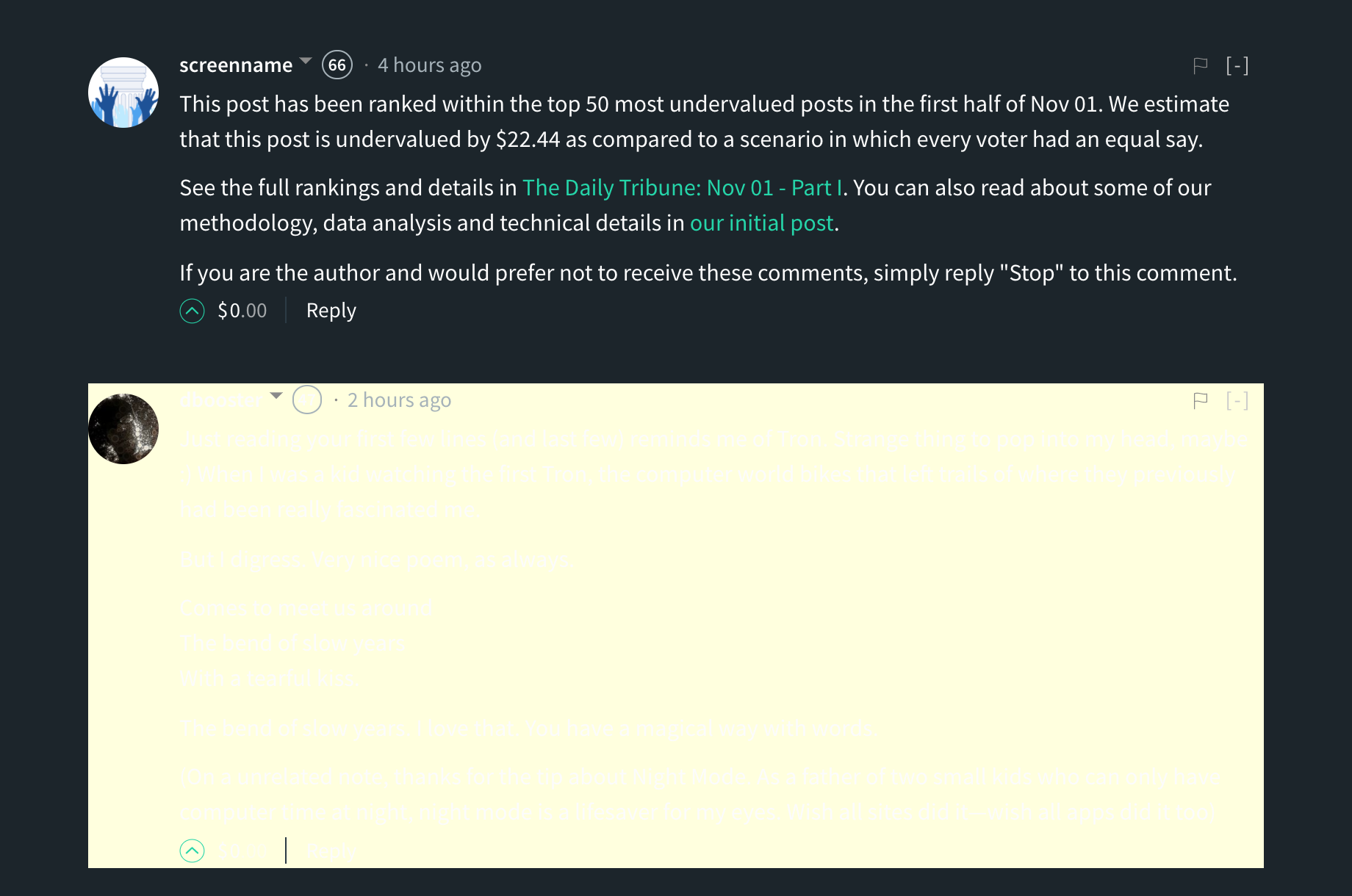
As you can see, the comment is totally invisible due to the highlighting colors chosen, so maybe change the text of a highlighted comment to black, or else change the color of the background highlight? Just wanted to bring that to attention. Thanks so much for all your hard work!
Myself and @steemitqa run http://steem.shop
We feature merchandise designed by artists on steemit.
How can we go about seeking permission to use the new logo in artwork?
We wouldn't be looking to create anything with just the logo by itself, but incorporated into fully unique artwork.
Any assistance is greatly appreciated.
My first reaction for new logo was: "ok, logo is not bad, but color is...well, I will need to get used to it..."
and then, I found "Toogle Night Mode" button, and I fell in love in it! (♥‿♥)
Great job!
PS.
So, having new logo of Steemit, could you finally set an avatar to @steemitblog? :D :)
Yeah. I always get queasy with green-on-white. Two colors that don't mix so well.
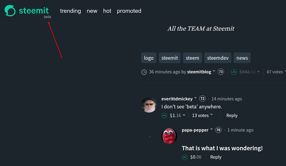
Not having beta is the bigger news if true.
How do you like the new logo?
@stellebelle made this via Giphy.
i like it so much. nice gif
Thanks to the
welcome
Nope, the beta is still there on the website ;)
I was wondering why beta would be removed without a big annou
what exactly is it !? Does anybody know !?
I think it is collection of two thoughtboxes, one empty and one filled. Is is an S in shape which stands for Steemit and the thought symbols stand for
Hum mm !? Sounds good !! I like it indeed , and the best explanation I have heard yet ! Thanks a bunch !!👍👍👍💚💚💚
My reaction was the opposite. I like the color, but not so engaged by the logo.
Hell yeah, night mode is hot
Same here. The night mode got me.
Awesome and lovely logo
I was thinking the same, maybe they are too busy to change it. 😅
yes please!!!!!
It's Halloween, it's a ghost!
your profile pic is great , cute new style ! haha
well explained about new logo.
why devote my this comment.
Great job votup me please friends
and the night mode is well designed too! nice work !
I don't see 'beta' anywhere.
That is what I was wondering!
I still see it:
Okay, I wasn't on my end. Thanks @noisy.
how can you see it.
what is beta
Beta software refers to computer software that is undergoing testing and has not yet been officially released. The beta phase follows the alpha phase, but precedes the final version. Some beta software is only made available to a select number of users, while other beta programs are released to the general public.
It appears on my screen right beneath the "it" of steemit.
O Really ?
Cool logo!