Design a logo: process for a Barber shop | Disegnare un logo: processo
![]()
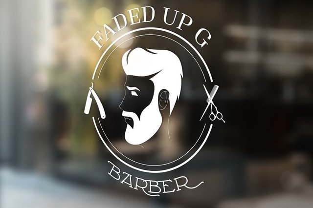
Logo for a barber shop | Logo per un barbiere
ENG - Recently I was commissioned this logo for a barber/hairdresser. I list below the main steps that I personally use starting from the concept to the final realization.
ITA - Recentemente mi è stato commissionato questo logo per un barbiere/parrucchiere. Vi elenco di seguito i passaggi principali che personalmente uso partendo dalla progettazione alla realizzazione finale.
1. Briefing
ENG - Briefing seems a big word, but in reality it is "simply" the collection of information. Well, not always that simple. Sometimes the client already has a precise idea and is perfectly able to express what he wants to achieve. Other times it is not so easy and you have to dig deep in the mind of your customer. Never stop at a "do you, invent something" that almost ever will result in "I imagined something more like... ". Above all, we must try to achieve the goals of our logo and the client must understand this. So it is fundamental to ask questions: which audience does it refer to; what is the main activity; what do you want to express. Other important details may be the personal preferences of the client, which in some cases can be safely respected, in others they must be discussed, such as
for colors and symbols to use.
ITA - Briefing sembra un parolone, ma in realtà si tratta "semplicemente" della raccolta di informazioni. Semplicemente tra virgolette perché a volte il cliente ha già una idea precisa ed è perfettamente in grado di esprimere cosa vuole ottenere. Altre volte non è così semplice e bisogna inventarsi un po' p(is)sicologi e scavare a fondo nella mente del nostro interlocutore.Mai* fermarsi a un "fai tu, inventa qualcosa" che quasi irrimediabilmente si tradurrà in "mi immaginavo qualcosa più così....". Soprattutto bisogna cercare di centrare gli obbiettivi del nostro logo e il cliente questo deve capirlo. Fondamentale quindi è fare domande: a quale pubblico si riferisce; quale è l'attività principale; cosa si desidera esprimere. Altri dettagli importanti possono essere le preferenze personali del cliente, che in alcuni casi possono essere tranquillamente rispettate, in altri vanno discussi, come
per colori e simboli da usare.*
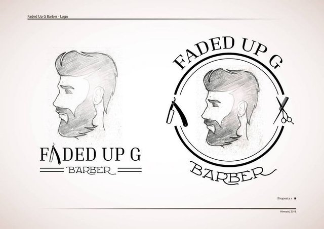
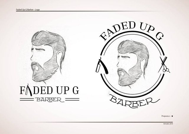
2. Sketching
ENG - At this stage I throw down some ideas on paper. Personally I often use paper as a first step, it helps me to sort and see quickly if ideas can work. I often combine with digital when you need the use of fonts or other details such as complex and repetitive decorations that would take too long to be drawn by hand. Once I get two or three ideas that I consider valid I propose the sketches to the client. This allows us to see if the concept is ok and we are on the right way.
ITA - In questa fase butto giù qualche idea sulla carta. Personalmente uso spesso la carta come primo passo, mi aiuta a ordinare e vedere velocemente se le idee possono funzionare. Combino spesso con il digitale nel caso sia necessario l'utilizzo di font o altri dettagli come decorazioni complesse e ripetitive che prenderebbero troppo tempo per essere disegnate a mano. Una volta arrivato a due o tre idee che ritengo valide propongo gli schizzi al cliente. Questo permette di vedere se il concetto piace e siamo almeno sulla strada giusta.
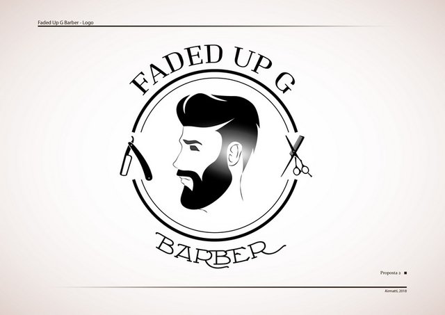
3. Creation
ENG - Once you find the desired setting (sometimes we are asked to do some small changes to the sketch or it can even be completely distorted) I proceed with the creation in digital. A logo almost always requires vector processing to be used on several fronts and to maintain scalability (for an overview about the difference between vector and raster see [this post](https://steemit.com/ita/@airmatti/vector-illustration -part-1-what-it-is-and-what-it-is-for-or-vector-illustration-of-one-thing-eea-what-used-eng-eng)). Once this phase is completed, further review by the customer is required. We then move on to the final part.
ITA - Una volta trovata l'impostazione desiderata (a volte gli schizzi subiscono qualche modifica o vengono stravolti completamente) procedo con la creazione in digitale. Un logo necessita praticamente sempre una elaborazione in vettoriale per poter essere utilizzato su più fronti e mantenere la scalabilità (per una differenza tra vettoriale e raster vedi questo post). Completata questa fase è necessaria un'ulteriore revisione da parte del cliente. Si passa poi alla parte conclusiva.
4. Finish
ENG - Usually some minor changes are still made at this stage. The important thing is to clarify that at this point everything must be well defined in order not to find yourself having to completely change the idea or make changes to changes. Once this is done, a good presentation is prepared which can include some mockups and the files are delivered in the required formats (usually raster and vector). It is important to indicate the colors used, according to the CMYK method or the PANTONE system. Another important step can be creating a guideline, ie how the logo should be used (spacing and combinations, colors, other details). However here we are definitely on highly professional levels that often small businesses can not afford.
ITA - Di solito qualche modifica minore viene ancora apportata in questa fase. L'importante è chiarire che a questo punto il tutto deve essere ben definito per non ritrovarsi a dover stravolgere completamente l'idea o fare modiche su modifiche. Fatto ciò si prepara una buona presentazione che può includere dei fotomontaggi e si consegnano i files nei formati richiesti (di solito raster e vettoriale). Importante indicare i colori utilizzati, secondo il metodo CMYK o con il sistema PANTONE. Altro passo importante può essere quello della creazione di una guideline, ovvero come dovrebbe essere utilizzato il logo (spaziature e accostamenti, colori, altri dettagli) anche se qui siamo decisamente su livelli altamente professionali che spesso le piccole imprese non possono permettersi.
This is the path that I usually follow for the creation of symbols and logos. There are no rules but only suggestions. I hope these steps can be useful, if you have more to add or if you have some of your work to share in the comments, gladly!
Questo è il percorso che solitamente seguo per la creazione di simboli e loghi. Non ci sono regole ma solo suggerimenti. Spero che questi passi possano esservi utili, avete altro da aggiungere o se avete qualche vostro lavoro da condividere nei commenti, ben volentieri!

You can also see my work at the following sites:
 ..…
..…  ..…
..…  ..…
..…  ..…
..…
llustrator, graphic designer
Outdoor adventurer
Folk and Blues enthusiast
Team sports lover!
It turned out great 👍Nice Job !
Thank mate!
Lavoro veramente bello, credo che il cliente non abbia di che lamentarsi.
Ottima anche la spiegazione del workflow che ha portato al prodotto finito :)
Grazie mille! ;D
Without a doubt, the silhouette of the logo looks a lot like me.
Ahah absolutely true!! Where you at this barber shop?
Turned out well...clean work mate!
Thanks @bronkong!
Hello @airmatti, thank you for sharing this creative work! We just stopped by to say that you've been upvoted by the @creativecrypto magazine. The Creative Crypto is all about art on the blockchain and learning from creatives like you. Looking forward to crossing paths again soon. Steem on!
Hello @creativecrypto, thanks a lot for stopping by! Love your website and I'll shurely have a deep look in to it!
I apologize, but you need to increase the thickness of the line. When this logo is small or when we look at it from a distance, the silhouette of the face is poorly visible.
What you say make sense and thanks for pointing it out! I have to say that I(we) wanted something light. In first stance the customer didn't asked for a face, just beard and hairs, I then proposed to add a face and other small details but in a poorly visible way. So it's not really important, the hair and the beard are the thing that should be seen.
Ti ringrazio! Tra i free inkskape penso sia tra i più usati, io ho provato Affinity e non sembra male (costa tipo 40euro ma credo li valga). Ti segnalo anche Vectr. Indipendentemente dal programma bisogna prenderci la mano ma con i tutorial e le guide su internet assolutamente niente di impossibile!
Secondo mè è giusto che il cliente indichi la strada, ma poi una volta indicata, lasciare tutto in un'artista della materia come tè, a me è personalmente, piaceva molto il primo schizzetto, che poi tra l'altro hai revisionato...
Comunque resta un bel logo, complimenti !
Giusto, a volte dipende un po' dal cliente. Ci sono quelli più "aperti" e altri che invece hanno un'idea precisa e il grafico diventa più un interprete. Non è sempre così divertente ma bisogna saper fare anche quello per conto mio. Spesso cerco una via di mezzo. Grazie mille!!
Definire eccellente quello che hai fatto è il termine giusto, perché è veramente un gran bel lavoro, caro @airmatti, complimenti per la tua indiscutibile professionalità, ulteriormente confermato da questo validissimo post
Grazie mille mad! Dai sempre una bella carica!
Gran bel lavoro,molto professionale e pulito......Grande Il "tutorial" magari mi potrebbe servire in futuro ....
Grazie! Quando disegni usi un processo simile o vai diretto di colori?
Dipende dal tipo di disegno o materiale su cui lavoro...ad esempio per i graffiti su zaino-cappellino o muro ....il mio metodo è fare prima il bozzetto poi la traccia,colorazione ,sfondo,outline,dettagli e infine il passepartout(la linea che divide sfondo e outline)..... su carta prima un bella outline e poi la colorazion... etcetc