Steemer @orcheva's submission for our logo - Community Thoughts?
@orcheva , of www.orchevadesign.com, submitted the following possibilities for the logo in response to this post The Informationwar Logo - Let's come up with an idea.
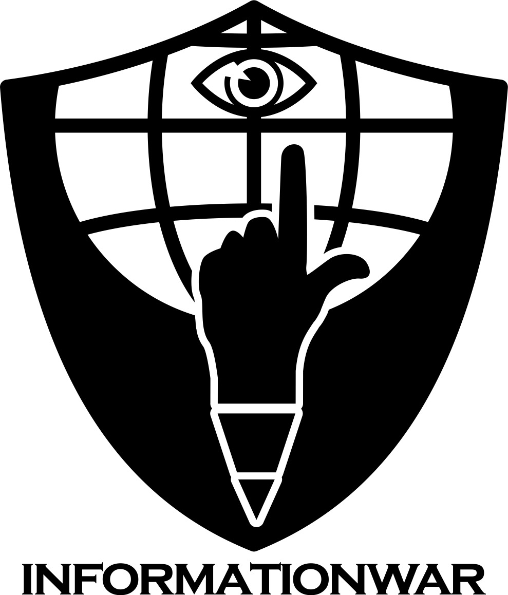
I (@stevescoins) like all of these.
The hand gesture represents a gun, which works for me; there are also globe and "pen" elements, with an optional "eye" element.
What do you as a reader like?


Here's mine!
LOL; I had the wiseass suggestion of exactly this gesture, although it would have been under crossed pens ;>
I was working on limited time! Check out this meme I just found...
Roaring and Rolling On The Floor laughing!
I'm holding off on upvotes for the rest of the day; went hogwild this morning ;>
The Night Gods wouldn't mind a RS (ahem) Just sayin...
posted to FB with this caption:
The question:
why do people so pitifully mockable have the most influence in our country?
The answer:
because Americans have been too nice to boot the boot in their lying treasonous asses. We have been too lazy and complacent to do the duty to OURSELVES of maintaining our liberty.
NOW is the time to recognize that mistake, and to fix it.
We can get to that point before we have to water the Tree of Liberty
That's what I've saying all along! Open up on ANTIFA once with a M-134 and those left will climb back into the woodwork like the cockroaches they are!
it requires enough of the country demanding that; we have too many public officials tolerating treason
until those officials are taught a sharp lesson, they will continue to support treason and sedition
Well, I'm up to the challenge (I ain't shot nobody in damn near 2 week)
I should run a steemit contest...;>
How many antifa can you skin and mount on the wall in a week
LOL
Awesome, but not really the brand image we're looking for... but, damn that made my morning. Good thing there was zero coffee involved at the time.
It was a joke for Steve
This post recieved an upvote from minnowpond. If you would like to recieve upvotes from minnowpond on all your posts, simply FOLLOW @minnowpond
Congratulations @informationwar! You have completed some achievement on Steemit and have been rewarded with new badge(s) :
Click on any badge to view your own Board of Honor on SteemitBoard.
For more information about SteemitBoard, click here
If you no longer want to receive notifications, reply to this comment with the word
STOPthe falling characters motif from the Matrix movie should be part of this, because the info war is between people wanting to hide their evil acts, and those seeking relevant truth.
this?
It's a good suggestion, because it has the connotation that facts (numbers, letters) may not be what they seem AND that there is a cultural reference to it.
OTOH, it's not simple.
yep that's what I was thinking about, and yep it isn't simple or good for a 32x32 or 64x64 icon.
Congratulations @informationwar! You have completed some achievement on Steemit and have been rewarded with new badge(s) :
Click on any badge to view your own Board of Honor on SteemitBoard.
For more information about SteemitBoard, click here
If you no longer want to receive notifications, reply to this comment with the word
STOPWithout the eye, the finger gun gesture seems to be saying it is futile, there is nothing to be aimed at. Like a bunch of yahoo's on fourth of july firing their guns at an empty sky.
I don't think adding an eye adds much to it. It seems to me we want to bring Truth into the equation. The sword and scale one I liked better, but perhaps a tipped scale (to the right) with Truth on the right, and Fake news on the left. I don't know, but the above logos to me do not really show Information or the fact there is a war on about it.
Agreed. These are okay.. A good start but yes, the finger gun needs to point at something and and eye is really not enough.
+he sword and scale one is the logo I use for the society vs individual balance, at the end of force via rule of law; I wanted an example of simplicity ;>
I've seen that gesture used before to indicate "loser"; is this perhaps the connotation of futility that you get?
I don't know. A finger pointing up, I just don't get it. even if it is the form of a gun. I what is it showing, that we are going to shoot god and/or the illuminati eye and solve all our problems. It just did not have a ring of sincerity to it. I really don't know, it's why I am such a terrible art critic. Some subtleties I get, some are like you could explain for a 1000 years and I still would not get it.
lol! I'm just going to chalk you up for a "did nae like it" vote!
if you don't like it, you aint gotta explain ;>
we've got time for other folk to give a stab at it too
That would be best. ;-}
yup, I'd still like to see more input about what elements should be includedby the community ;)
Flip phone vs smartphone vs blackberry, battling it out like old MS vs Apple.
I used to want to punch those smug Apple users in the head LOL
I really didnt care either way; it was just the smugness that needed a balck eye
Congratulations @informationwar! You have completed some achievement on Steemit and have been rewarded with new badge(s) :
Click on any badge to view your own Board of Honor on SteemitBoard.
For more information about SteemitBoard, click here
If you no longer want to receive notifications, reply to this comment with the word
STOP