Character Design - The Commander for Tugboat Comic
Hi everyone!
Today I'd like to talk a little bit about my process for designing the robot commander for my webcomic, Tugboat. She's one of our main villains, in charge of tracking down our crazy pirate crew.
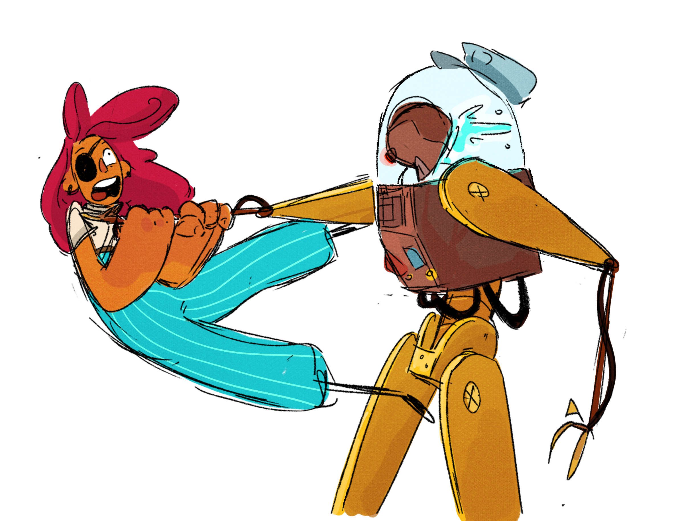
So I'm not really great at designing robots. I haven't done a whole lot of it, and it was a fun new challenge for me. The Commander is supposed to be pretty scary - she needed to look daunting, sinister, and of course, official.
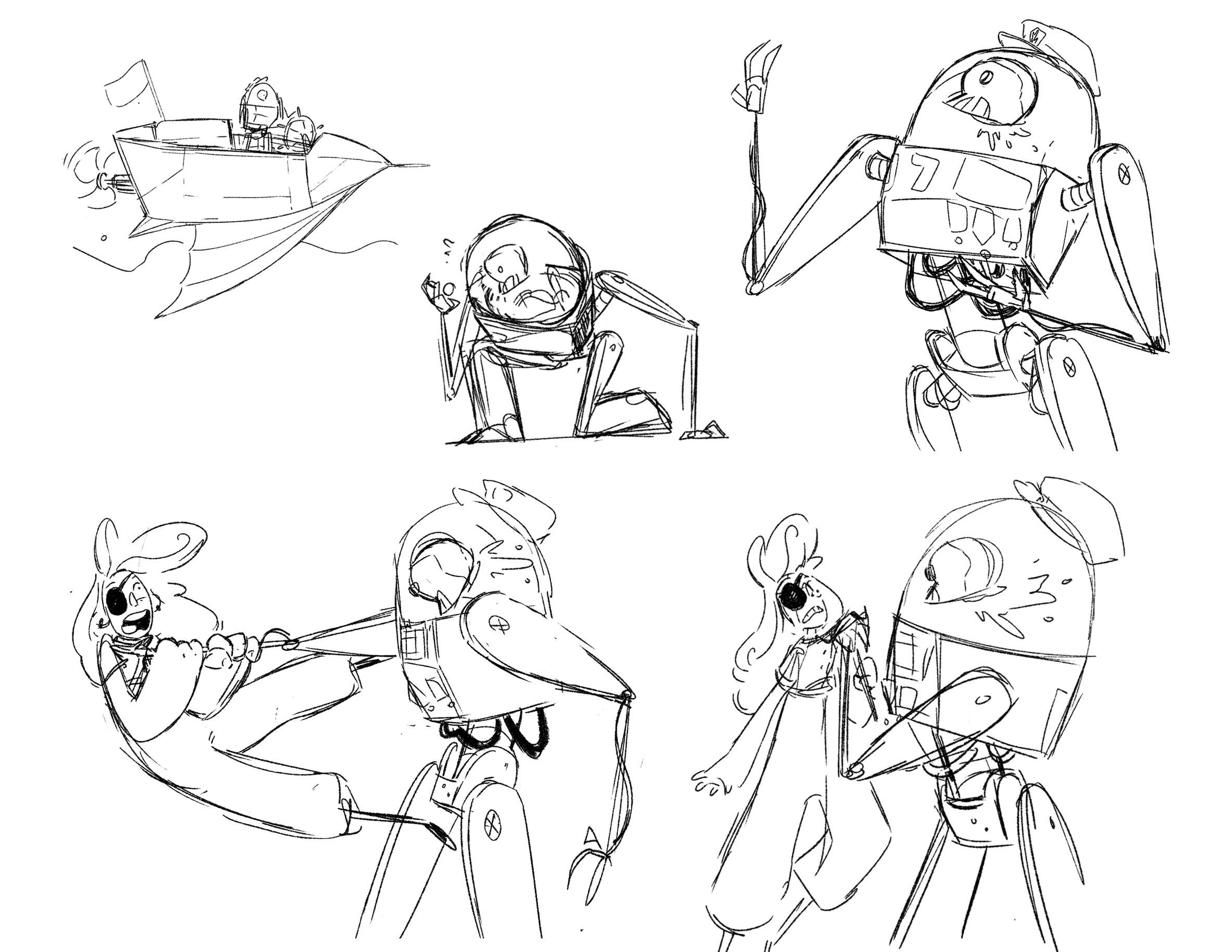
A lot of the early sketches I did (which were without reference - my first mistake of many) were too round. She looked like a little toy.
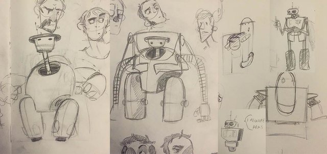
I decided to look at what people had done before me. I tried to get inspired by the shapes that other artists had used for their robot characters, turning to the work of Ashley Wood and Star Wars designers.
So then I started sketching, every once in awhile looking to some of my references for tips. Every design got stronger, and eventually I was able to take bits and pieces from each previous design until I had the strongest parts.
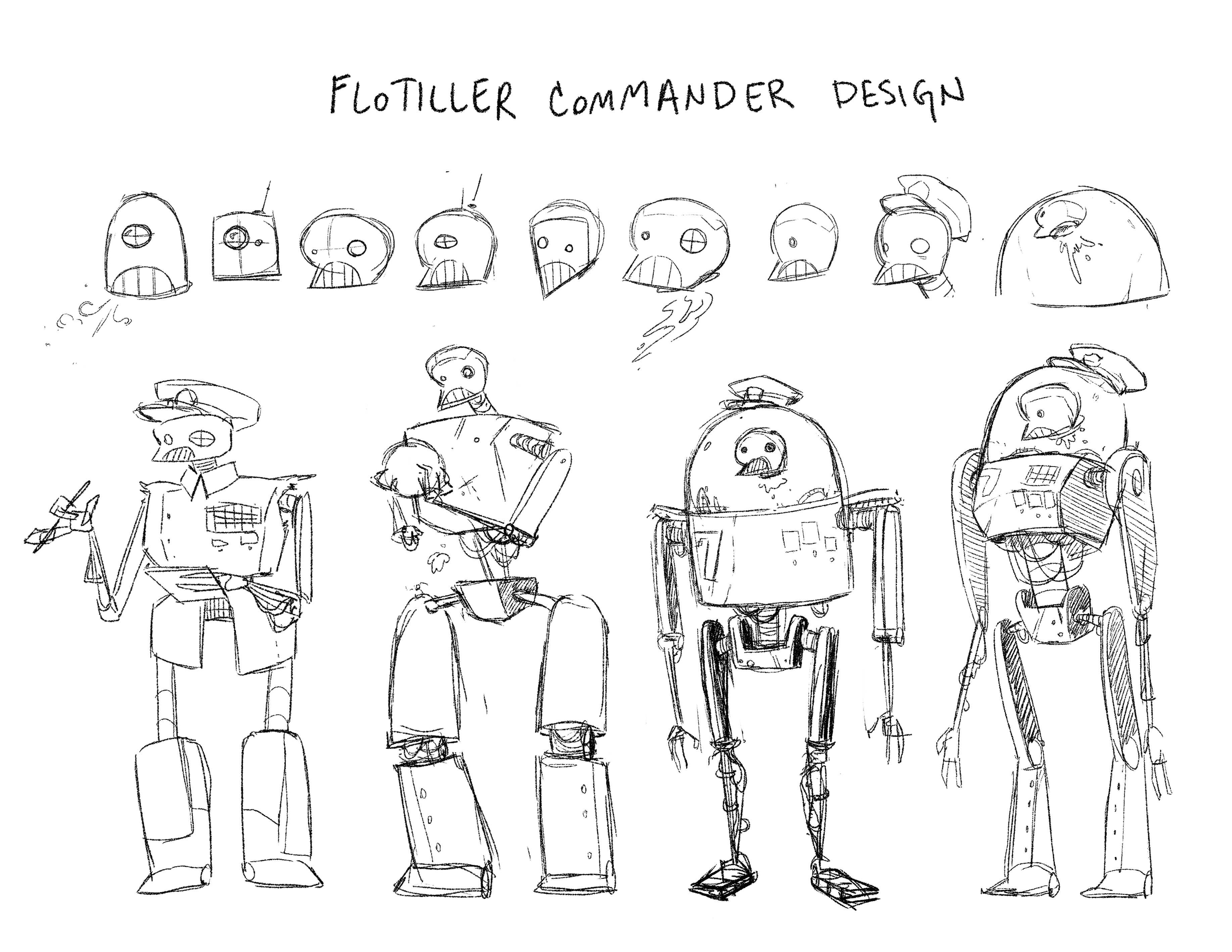
I was happy with the design the furthest to the right. It felt regal and commanding. She wasn't unnecessarily bulky, which fit her character as an analytic strategy robot, but she still had an intimidating look about her.
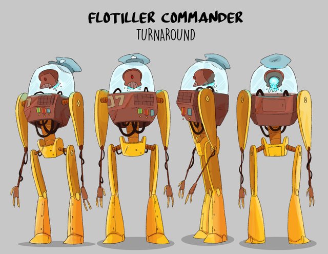
The next step was trying to find a color profile that worked.
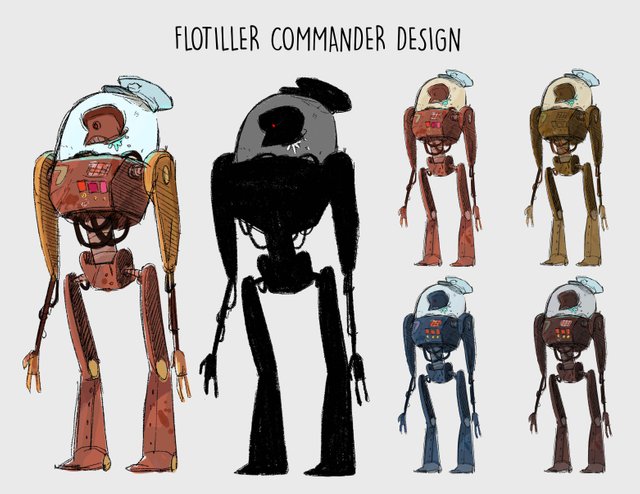
I liked the idea of her being a bit rusty. However, as a commander in the military I also felt like it may not make sense for her aesthetic to be fully grunge. Finally, I decided to have the best of both worlds. In the Tugboat universe, a lot of the more advanced tech has been scavenged by the military and re-designed for their use. Having her body be rusty and beat up, but some refurbished limbs was a nice compromise.
So then it was time for sketches and the turnaround!
And that just about does it!
Adeline (The Captain) | Mag (The Pilot) | Piper (The Big Guns) | Ooma (The Illusionist)
And you can read Tugboat here!
Thanks for reading!
I have just had a spark of interest into this kind of stuff since I will be working on game design, and this really kind of stuff is really good inspiration for concept art. Nice artwork
Thanks! So glad this has inspired you, I hope you post some of the cool stuff you end up creating :)
A very neat design. Am amazed with your work
thank you so much!
Ahaaaa ...
Very nice
Thanks!
That's very cool :) moving from bulky round part to slimmer and longer extremities was a good choice for the character, I feel like characters like that always show a sinister aura on them
Yeah! When she was rounder she wasn't as "wicked" looking, but adding the thinner elements made her feel more imposing i think. Glad you liked it, thanks Cob!
Agree, all great decisions you made :)