Ouch!!! 6
Hello to all art lovers !!! and of those who have felt a painful empathy when seeing how someone gets hit hard, or something very expensive breaks. XD
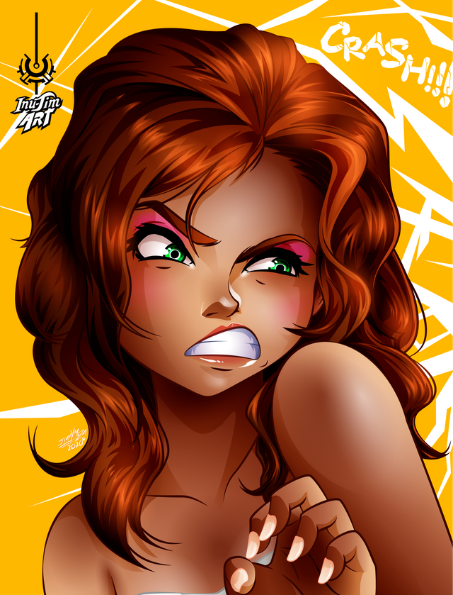
Until finally I was able to make an illustration ^ _ ^ this portrait took me several days to finish this work, for the little time I had this week ¬_¬ the frustrating thing is that I realized it myself when analyzing the time distributed in this portrait I should have finished in less than two days, the good thing is that I am already more than fixed in MCY studio and I am acquiring more speed when working, and I think that the best option for me is to take Sundays to do the layout of what I'm going to post during the week so that every time I get home from work I just start drawing, I think that's how I can balance my drawings and resume all my projects ^ _ ^.
In the last drawings I did, they were portraits focused on facial expression, which was a study that I am needing to give more life to my drawings, that is why I decided to take up that trend again because I still have a lot to learn in that subject, and in this work and for reasons of personal challenge I wanted to apply in this portrait a deformation due to facial expression, on an attractive face, the objective had to be a girl with an attractive face, who made a grimace of someone else's pain, and even would continue to look attractive, that is why I decided to do it with makeup, I also wanted to try another skin tone that conveyed an air of a Latina, originally I wanted to apply wrinkles on her face, but it would make her look older as an old woman and that It was not the result I was looking for, in the end I only made an expression of pain but without exaggerating it, like the one we all put when we see that a friend hit a painful place or when we see that someone drops their s martphone with the screen against the ground, I liked how cute and funny it looked and that's why I decided to leave it like that.
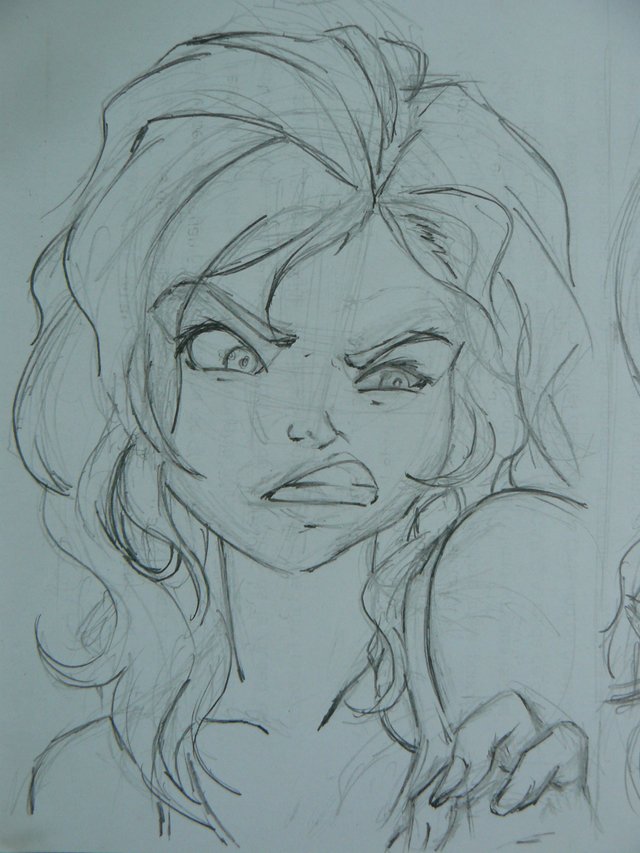
Sketch done in pencil

Detecting errors
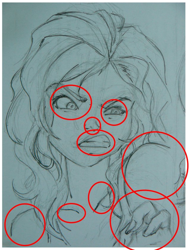
It seemed curious to me but in this drawing I thought that when I digitized it I would make many mistakes but in the end it was not like that, what I made was that the eyes were somewhat small, especially the left one, the nose is small and somewhat elevated, the mouth is also very elevated and not sufficiently stretched, the most noticeable error is the shoulders, which are widely separated according to body expression, there is a lot of separation between the clavicles and the left hand had to be more visible.
Correcting mistakes
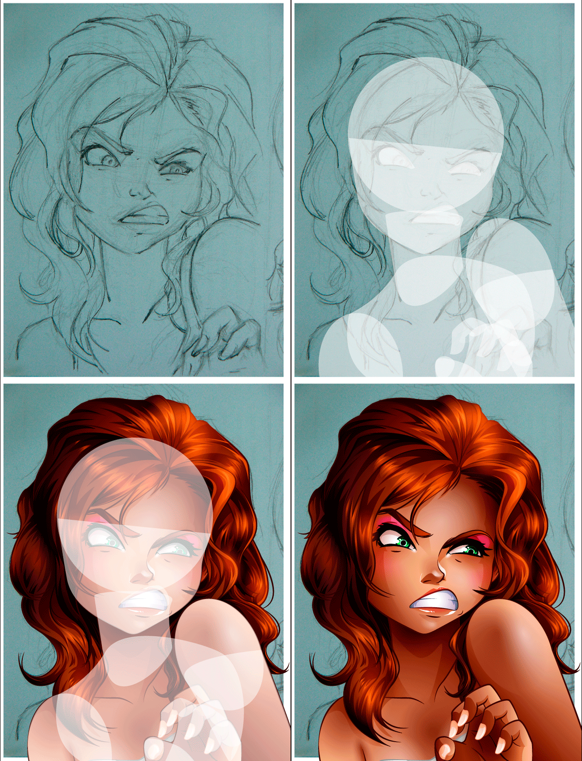

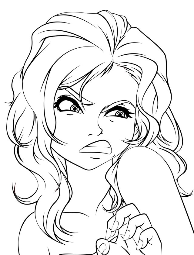
Lineart
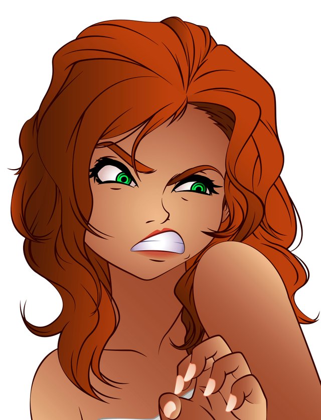
Flat colors
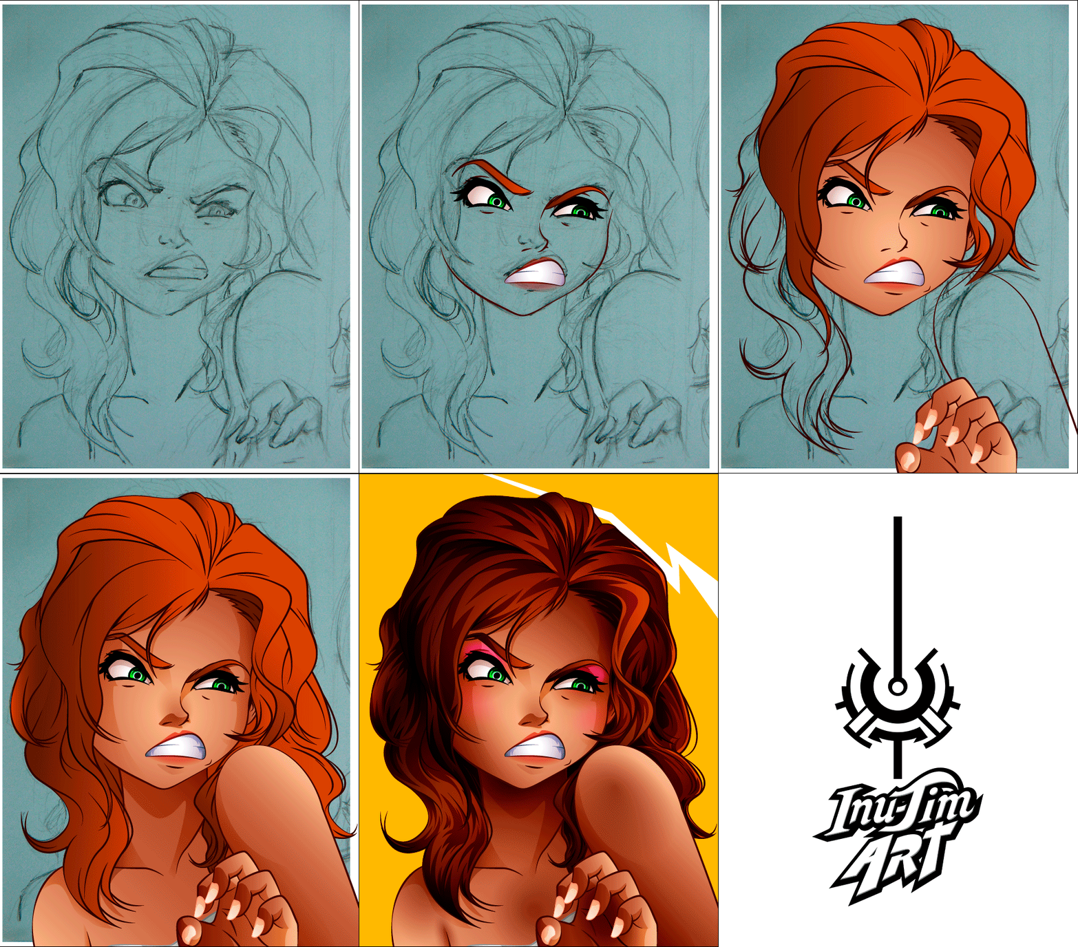
With this GIF I show you the entire illustration process
The Contours of Each Vector
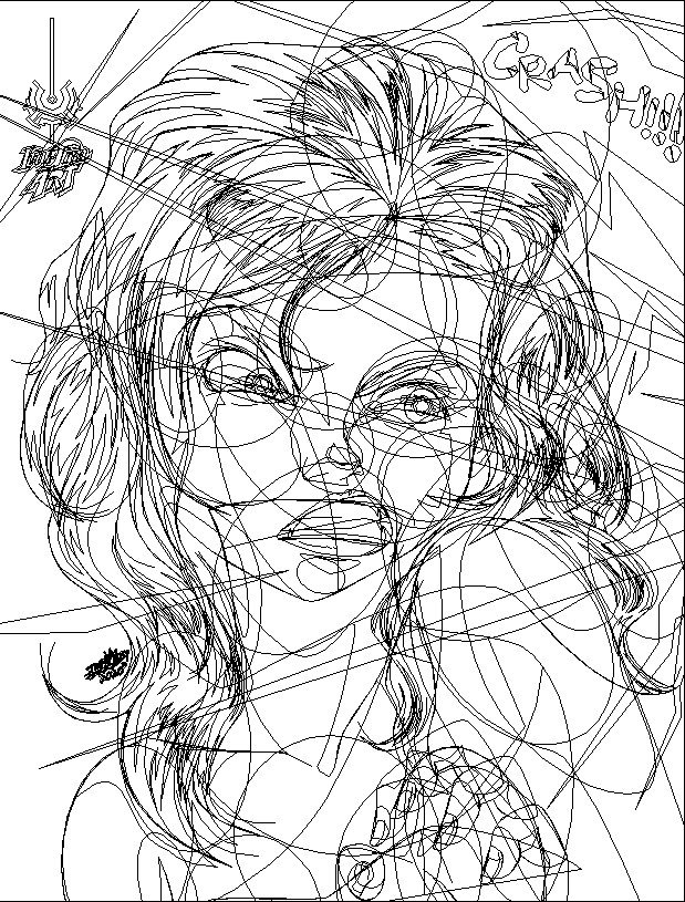
Each trace and node that make up the image
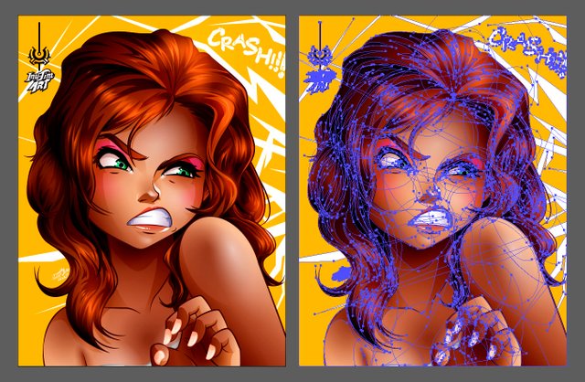
All drawing progress

Technical information:
Digital vector drawing
Program used Adobe Illustrator CC 2015
Full resolution 3602 x 4724px at 300dpi
Thank you very much for reading my post
What are your criticisms and comments about this drawing, what would you improve?
Please let me know in the comments below.
I hope you liked my work
See you in a future post
Inu-Jim
Copyright @inu-jim –Allrightsreserved
What are your criticisms and comments about this drawing, what would you improve?
Please let me know in the comments below.
I hope you liked my work
See you in a future post
Inu-Jim

Copyright @inu-jim –Allrightsreserved
Very nice style! Love the result
World of Xpilar Community Moderator
Thank you very much @axeman, it was a long journey to define my style, and I think this is one of my favorite works, both for the result of the color of her skin, her hair and especially her expression, in fact I am using it Meme at my work every time my colleagues drop their smartphone on the floor XD
Your post is manually rewarded by the
World of Xpilar Community Curation Trail
join the World of Xpilar Curation Trail, info can be found here
Thank you very much ^ _ ^