You are viewing a single comment's thread from:
RE: Steem T-shirt design and production sponsored by @stephenkendal for steem promo campaign in Ghana.
Looking awesome.
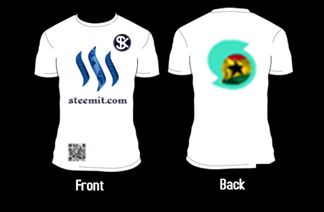
Personally, I would go for Design 2 and lift the Steem logo and steemit.com higher up and increasing them slightly.
On the back, I would make your logo a lot bigger.
At the bottom, I would also increase the size of the QR code.
As for the colour, I always think white is the better colour to go for as a Promotional T-Shirt as it stands out more.
Other than this, awesome job.
Stephen

Wow. That's awesome. I will certainly get into that for your preference. You deserve more than making you an icon of #promo on the steem blockchain. Once again thanks for this. It means a lot to me sir.