SEC-S20W4: "Graphic Design Hands-on Practical 1"
Greetings everyone! Hope you’re all doing well. I’m back with my fourth entry for this graphic design contest series, and I must say, I’ve been learning loads, thanks to the dedication of our instructor, @lhorgic. This time, we were given a practical task to replicate a design provided by our instructor, so I’ll walk you through how I did it, step by step. Without further ado, let’s dive in!
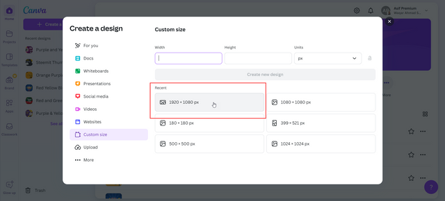
- Step 1: First things first, I opened the Canva website and went to the “More” section, where I created a new custom design size (1920x1080).
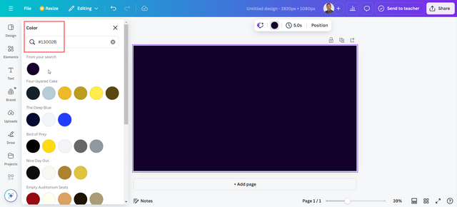
- Step 2: Next, I set the background colour to a dark shade by entering the hex code
#13002B.
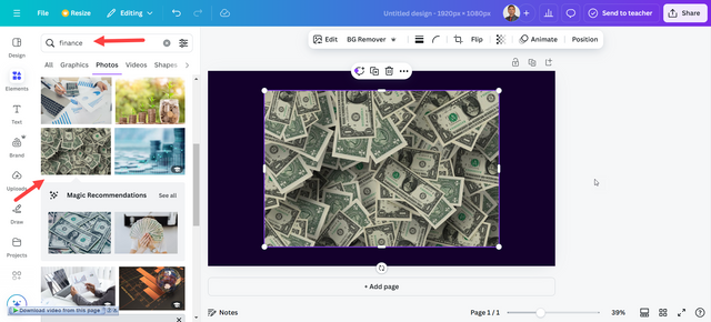
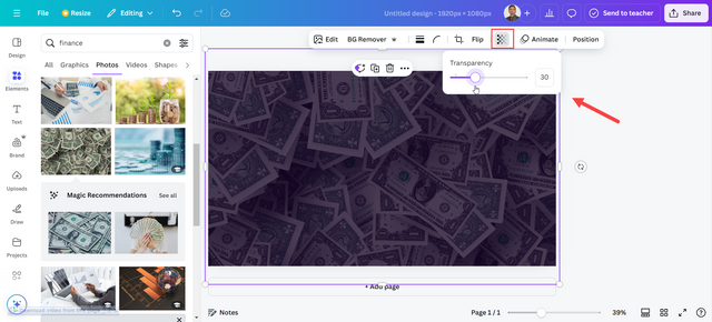
- Step 3: After that, I headed to the "Elements" section, searched for a finance-related image, and selected one. I added it to my design so that I can adjust its transparency to blend in.
- Step 4: I resized the image to fit the design, then clicked on the transparency icon. This opened up a slider that allowed me to adjust the transparency. I set it to 30.
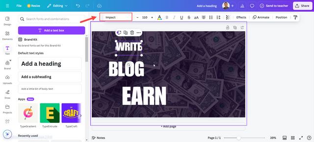
- Step 5: Next, I added three words to the design—EARN, BLOG, WRITE—following the hierarchy principle. This basically means I started with the smallest size and worked my way up to the largest. For this step, I chose the "Impact" font and set the text colour to white.
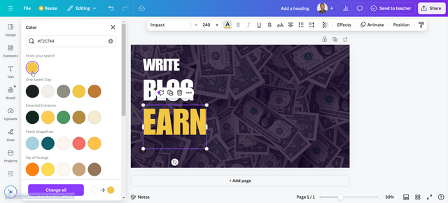
- Step 6: I applied the spacing and alignment principle by left-aligning all three words. To emphasize the word EARN, I changed its colour to yellow to make it stand out.
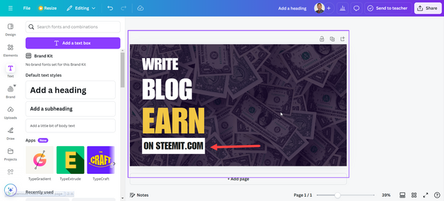
- Step 7: After that, I selected a square shape from the Elements section, made the background colour white, stretched it, and placed it below the word EARN—again keeping the spacing and alignment principles in mind.

- Step 8: Next, I typed "STEEMIT.COM" using the Impact font, changed the font colour to black, and positioned it inside the white square beneath the word EARN, creating a contrast between the black text and the white background.
- Step 9: For the “&” symbol, I selected a sphere, made the background white, resized it, and placed it between BLOG and EARN. I then typed the "&" symbol using impact font and placed it inside the sphere.

- Step 10: Next, I chose one of the images provided by the instructor and added it to my design.
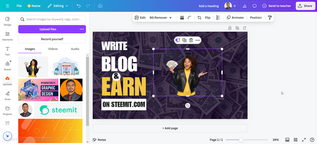
- Step 11: I enlarged the image and repositioned it to make it more visible. Then, I created another white sphere.
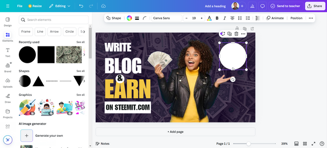
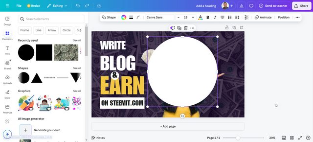
- Step 12: In this step, I resized the white sphere and placed it over the image I had just added.
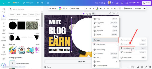
- Step 13: Finally, I selected the white sphere, clicked on the three dots to open the menu, and chose the "Send backward" option to position it behind the image.
Final Design |
|---|
And there you have it—my final design, which you can check out below!

Note:
All screenshots featured in this post are my own and have been captured directly by me.

Hello @waqarahmadshah thank you for participating in this week's lesson. We have assessed your entry and we present the result of our assessment below.
Feedback:
Let me start by commending you for the effort put into this practical work. Weldone. Your result is cool, It's obvious you attempted following me right from top to bottom and I appreciate. I would just point out few things you need to adjust on subsequently.
Your text element seems disjointed, you have to close up the space between the text element to unite the elements. Moreso the free space on the right side is too much compared to the one on the left, that's to say your element is not well centered.
In all, you did beautifully well and I must commend your effort. I hope you keep up with the energy level dear student.
Regards
@lhorgic❤️
Upvoted. Thank You for sending some of your rewards to @null. It will make Steem stronger.