Steemit CryptoAcademy Season 3 Week 2 HomeWork Task for @reminiscence01-Beginner’s Course:Introduction to charts
Hello everyone, I'm really excited to finally have the chance to engage in the educative programme. @reminiscence01 thank you for the educative lesson. These are my answers to the homework.
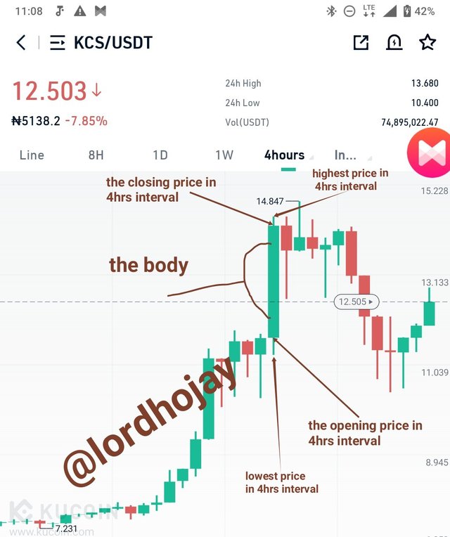
1. Explain the Japanese Candlestick Chart? (Chart screenshot required)
The Japanese candlestick chart is chart that graphically displays the high, low, open and closing prices which is also known as (HLOC) it is the price of a commodity and each candlestick represents a period of time . The body of each candlestick represents the opening and closing prices while the candle shadows display the high and low prices for each period.
The colour of candlesticks will depend on the settings that was used, but most Japanese candlestick chart are always green and red as the default colours. A green candlestick shows that the price closed higher than where it opened which is often called a bullish candle while the red candle means that the price closed lower than where it opened which is often called a bearish candlestick.
A candlestick has mainly 6 parts namely;
- The body which displays the open and closing price of the asset.
- The shadow which displays the highest price and lowest price
- The opening which indicates the price the assets Started with at the specific period.
- The closing which indicates the last price of the asset at the specific period.
- The high which shows the highest price of the asset at the specific period.
- The low which shows the lowest price of the asset of the specific period
Here is a screenshot of kucoin trading view that I labelled.
2. Describe any other two types of charts? (Screenshot required)
Line Chart
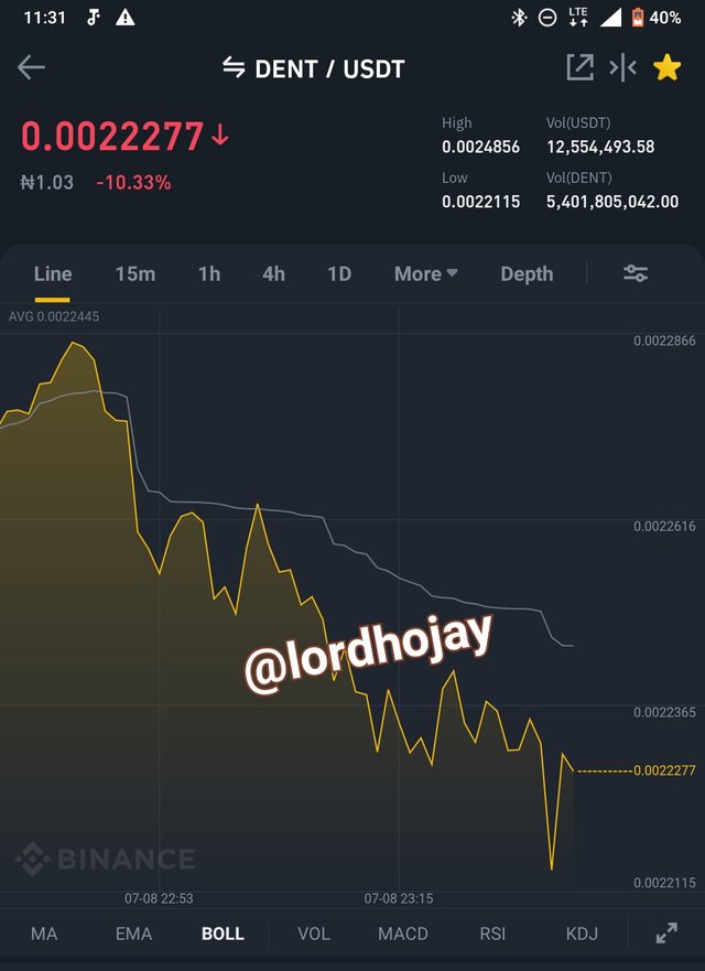
A line chart as the name implies, is a line that typically displays the closing prices of an asset and nothing else and each closing price is linked to the last closing price which forms a continuous line that is easy to follow and understand. A line chart are usually curvy and bend due to the unstable price of the asset.
This type of chart is commonly used for public article e.g newspaper, television etc because of it simplicity and it very easy to understand. It provides little information compared to the candlestick or bar charts but it is better for viewing at a glance for a simplistic market view.
Bar chart
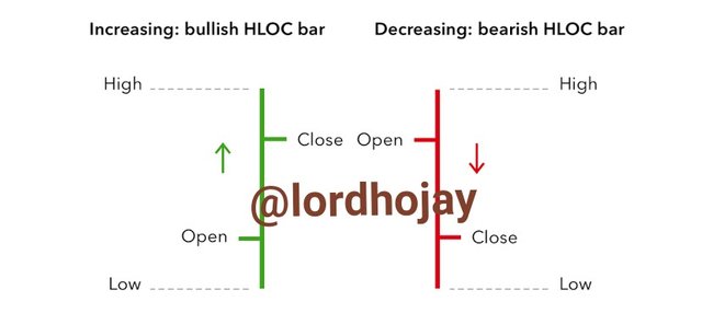
image source
The bar charts is a very common chart it consist of several price bars, with each bar interpret the movement of an asset over a specified period of time. Each bar generally shows the open, high, low, and closing prices also known as (OHLC).
In a bar chart each vertical line that shows the highest and lowest price that was reached during the specified periodnof time. A horizontal line is marked at the left side of the vertical line which represents the opening price and the closing price is a small horizontal line marked on the right of the vertical line.
3. In your own words, explain why the Japanese Candlestick chart is mostly used by traders
The Japanese candlestick chart graphically interprets the way the buyers and sellers control an assest's price as a data for the traders
It is one of the most used chart because it displays a detailed movement of the price of an asset at a specificied period.
The Japanese candle stick chart provides accurate results to the traders since the price movement of assets being traded are well presented on the charts for all the traders to view, study and understand.
The candle stick chart indicate the most vital price points of an asset.
It is easy to understand and analyse
The Japanese candle stick chart shows the price movement of an asset being traded in a given period of time
4. Describe a bullish candle and a bearish candle identifying its anatomy (screen shots required)
Bullish Candlestick
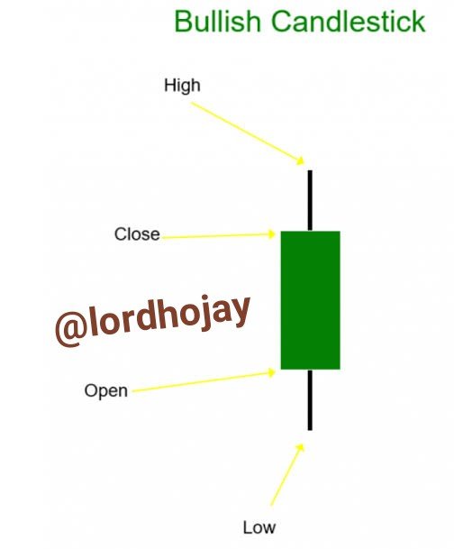
image source
A bullish candlestick signify a continuous increase in the movement of the price of an asset in the candlestick chart. It is usually green in colour.
In a bullish candle the opening price is lower than the closing price
The closing price is the last recorded price in the given period. It is higher than the opening price.
Highest price is the peak of the assest at the given time. It is at the top the candlestick.
Lowest price is at the bottom of the candlestick. It is the least traded price of the asset at the specified period.
Bearish Candlestick
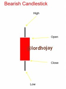
Bearish candlestick is a red in candle which signify a continual decrease in the movement of price of a recorded traded asset in the candle chart in a given period of time.
In a bearish candlestick the opening price is the first recorded price of an asset. It is higher than the closing price. It is at the top of the body of the candlestick.
The closing price is the last price that was traded in a candlestick. It is at the bottom of the body of the candlestick.
The low price indicate the lowest price in the candlestick of the traded asset in a given period of time.
The price shows the highest price the traded asset reached at a given time. It is at the top of the candlestick.
5. ANATOMY OF BULLISH AND BEARISH CANDLES
Differences between bullish and bearish
.jpeg)
Bullish candle has a green colour while the bearish candle has a red colour.
Bullish candle indicate a constant increase in the price of an asset in a specific period of time while bearish is a continuous decrease in the price of an asset in a given period of time.
The increase in price movement is presented as bullish while the decrease in price movement is bearish.
Similarities between bullish and bearish candle sticks
The bullish and bearish both have a low point price of a recorded traded asset in the candlestick at a specific period of time
The bullish and the bearish both have a high point price of a recorded traded asset in a candlestick at a specific period of time
CONCLUSION
In conclusion, Japanese candle stick chart is a very useful chart for traders to help know the order of the price movement in a specificied duration. It helps the trader to easily understand and assest inorder to know the right time when to buy and sell. The difference in colour of bearish and bullish assist the trader to easily identify a bearish or bullish asset. Lastly it enables trader to identify of an asset is decreasing in value or increase.
Thank you professor for this informative study
C.c @reminiscence01
@tipu curate
Upvoted 👌 (Mana: 0/5) Get profit votes with @tipU :)
Thank you
Hello @lordhojay, I’m glad you participated in the 2nd week of the Beginner’s class at the Steemit Crypto Academy. Your grades in this task are as follows:
Recommendation / Feedback:
I expected you to be more technical in explaining Japanese candlestick chart. Thank you for participating in this homework task.
I'll improve next time. Thank you.