Crypto Academy / Season 3 / Week 2 - Homework Post for professor @reminiscence01 || Introduction to Charts || By @eloksjoseph
Hi guys welcome to steemit Crypto Academy Season 3 week 2. Today I'll be making a post based on the lecture given by professor @reminiscence01 on Charts.

Explain the Japanese Candlestick Chart? (Chart screenshot required)
CHARTS
Before we delve into the Japanese candle stick chart, we need proper understanding on what charts are or what a chart is. A chart is often a diagram or a pictorial representation of statistical data and information using symbols like lines ,bars ,sticks ,etc.
A chart is often used to show information on a given subject matter in relation to time . An example of chart is the crypto currency chart that shows the prices of a coin in relation to time . The time could be 1hour, 4hours , 1 days ,etc. What should be taken note of is that a chart is used to represent data graphically.
JAPANESE CANDLESTICK CHART
Now that we have understood the basic meaning of charts , let's talk about the Japanese candle stick chart. The Japanese candle stick is a financial chart that shows the price movement of an asset or in this case a coin using the 4 most important features - opening price ,closing price, high, low.
The Japanese candle stick chart is also called the candlestick chart. It is similar to a bar chart but in this type of chart, the bars have lines coming out of them called wicks. These wicks give the high and low. Now the candlestick chart may be plotted according to different intervals eg hours,days ,weeks,etc. A candle gives information about one interval. For example,if it is a day graph, one candle would give the high of the day, the low of the day,the closing price of the day and also the opening price.
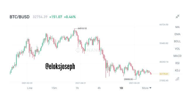
ONE DAY BTC/BUSD CHART
From the chart above, you'll notice 2 types of candles. The red and the green. The green candles are called bullish candles- this means the price is increasing - and red candles are called bearish candles - which means the price is decreasing.
Regardless of what type of candle it is, each candle have common components which include;
.jpeg)
HIGH:
This is the highest price the asset reached in one time interval.
LOW :
This is the lowest price the asset reached in one time interval.
OPEN:
This is the opening price of the asset at one time interval.
CLOSE:
This is the closing price of the asset in one time interval.
Other components include;
SHADOW:
This is the range from the opening price to the closing price.
BODY:
This is the range of the entire candlestick. It runs from high to low.
It should be noted that the candles can also come in black and white. In fact, the colour can be configured to the choice of the trader. What really determines if it's going bullish or bearish is the closing price of the asset. But it should be noted that the red and green candles is the default in most trading platforms.
Describe any other two types of charts? (Screenshot required)
Other type of charts include:
- Line chart
- Bar chart
LINE CHART:
A line chart is a very basic chart and is really easy to read . It doesn't have as much information as the candlestick chart and it is plotted based on only one data which is the closing price of the day.
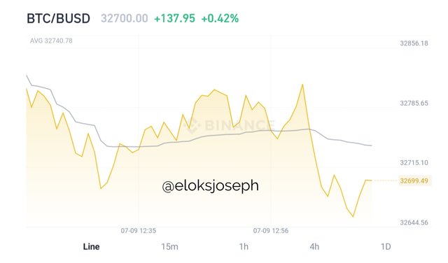
BTC/BUSD LINE CHART
As you can see ,as the name implies the chart is made up of just one line being constructed from the closing price of each day.
BAR CHART:
Unlike the line chart, the bar chart shows more information about the price of an asset. It shows the opening and closing price,it also shows the high and low of the time interval.
.png)
Source
The vertical line shows the high and low while the left horizontal line shows the opening price and the right horizontal line shows the closing price.
In your own words, explain why the Japanese Candlestick chart is mostly used by traders.
I personally believe the candle stick is mostly used by traders because it helps in analysing the market by showing the price action of the asset. It is also used mostly because it is the best chart for technical analysis.
It also helps in understanding the price pattern. Combining price pattern with technical analysis allows traders get insight on good entry and exit points therefore reducing losses and increasing profits.
Describe a bullish candle and a bearish candle identifying its anatomy? (Screenshot is required)
BULLISH CANDLE:
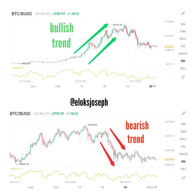
A bullish candle is a candle that is formed when the closing price of an asset is more than the opening price of an asset. This simply means that the price of the coin has increased in that time interval. A long stretch of bullish candles often lead to a bullish trend .
BEARISH CANDLE:
This candle is formed when the closing price is less than the opening price. This happens when the price of an asset decreases in that time interval. When a lot of bearish candles are being formed continuously cloe to each other , a bearish trend is formed.
ANATOMY OF BEARISH AND BULLISH CANDLE:
Since we've already established what a bearish and a bullish candle is,let's try and understand what they're made of. Now each candle has four ( 4) components.
1. HIGH:
The high price of a candle is the highest price the asset got to in that time interval.
2. LOW:
The low price on the other hand is the lowest price the asset dropped to in that period.
3. OPENING PRICE:
When a new period or time interval starts, a new candle is plotted. The first price that starts a new candle is called the opening price.
4. CLOSING PRICE:
When a period is about to end, the price of the asset at the end of that interval is the closing price. When the closing price is lesser than the opening price ,a bearish candle forms but when the closing price is more than the opening price, a bullish candle is formed.
%20(1).png)
CONCLUSION:
Thank you for the lecture Professor @reminiscence01 . It was great to be a part of it and the assignment task was very challenging.
Overall ,I learnt a lot of new things about charts and especially the candlestick chart.
CC: @reminiscence01
All unsourced images are screenshots from my binance mobile app
@tipu curate
Upvoted 👌 (Mana: 3/5) Get profit votes with @tipU :)
Hello @eloksjoseph, I’m glad you participated in the 2nd week of the Beginner’s class at the Steemit Crypto Academy. Your grades in this task are as follows:
Observations:
Please remove this image with company name "Investopedia"". Use copyright free images.
Recommendation / Feedback:
I assume you wrote from other users who have submitted their post. Please spend time to perform your homework task and submit a quality content.
Thank you for participating in this homework task.
Thank you for your review professor.
Ive removed the image