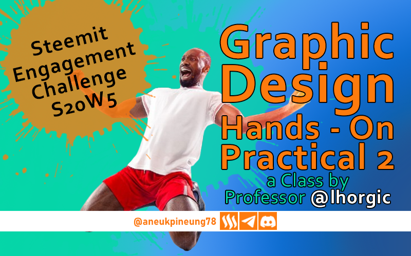
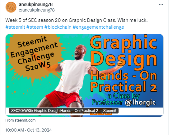
SEC20/WK5: Graphic Design Hands - On Practical 2
This is my homework post for Steemit Engagement Challenge Season 20 Week 5 assignment of Professor @lhorgic’s class, SEC20/WK5: Graphic Design Hands - On practical 2.
00 Preface
Since last week, (week 4 of season 20), the graphic design class run by Professor Lhorgic has entered the practicum phase. As a graphic design enthusiast, I really like how this class has been run. Once again I would like to thank him for doing this on Steem.
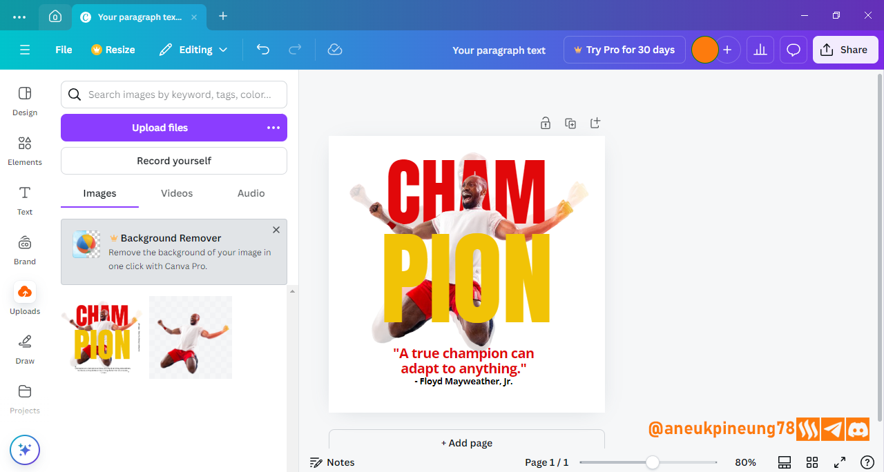
So, this week as week 2 of the practicum phase, students are expected to replicate the design he has created, which is shown below.
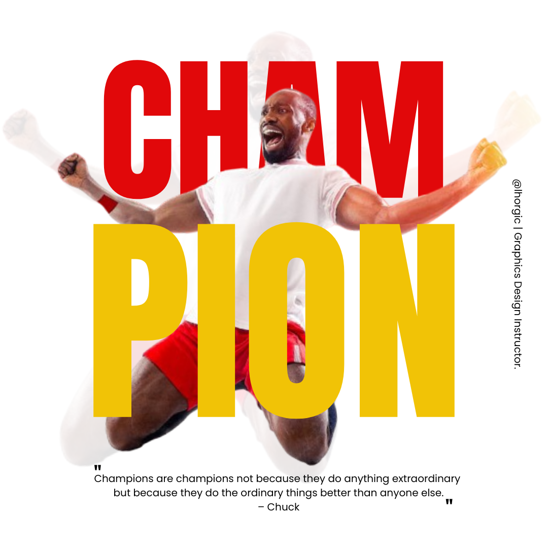
It is a design that conveys positive messages such as passion and spirits of never giving up, and having fun. Not only the model, but the bold and “clean” font used further strengthens the solid impression of the message. And the color, an interesting mix of red and yellow, enhances the contrast massively. I love the way it's done.
I will try to come as close as possible to that design, and as instructed in the assignment brief, will use the same colors in the design. So basically, mine won't be too different from what Professor Lhorgic has done. The challenge is that I have to use Canva, which is new for me. I hade taken some hours to get to know it better, and I think I can now proceed with enough confidence. We will see how good I am with Canva.
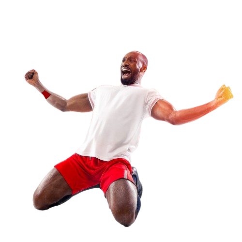
The image provided is a transparent png image below.
So, in my humble imagination, the steps required are:
- opening the image in Canva;
- duplicating the image and lowering the transparency of the backmost one;
- creating three layers of text.
So, at least 5 layers were needed for the design, not including the layer containing the ownership claim watermark.
01 Importing Image into Canva
For this assignment, I used the Windows version of Canva, which is free to download at https://www.canva.com/download/windows/.
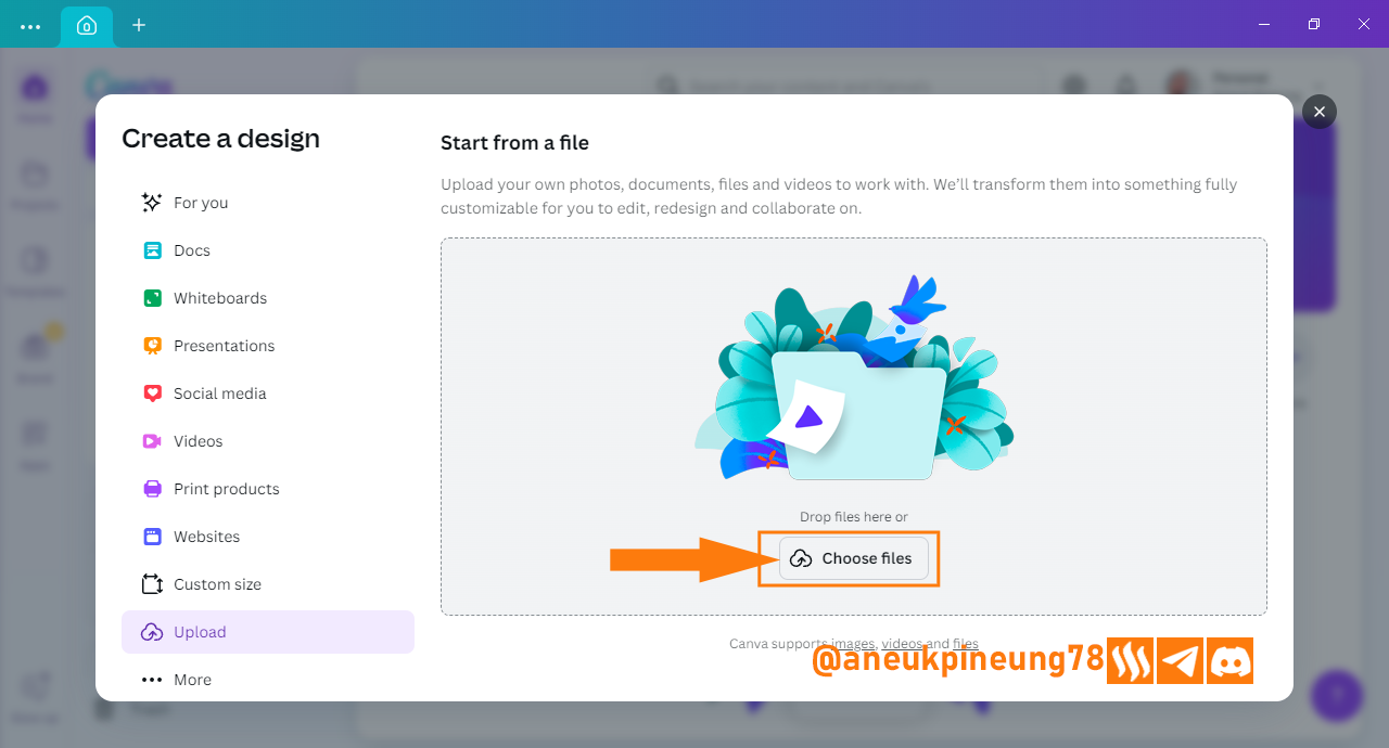
- First, open Canva and click [Create design].
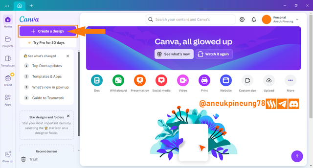
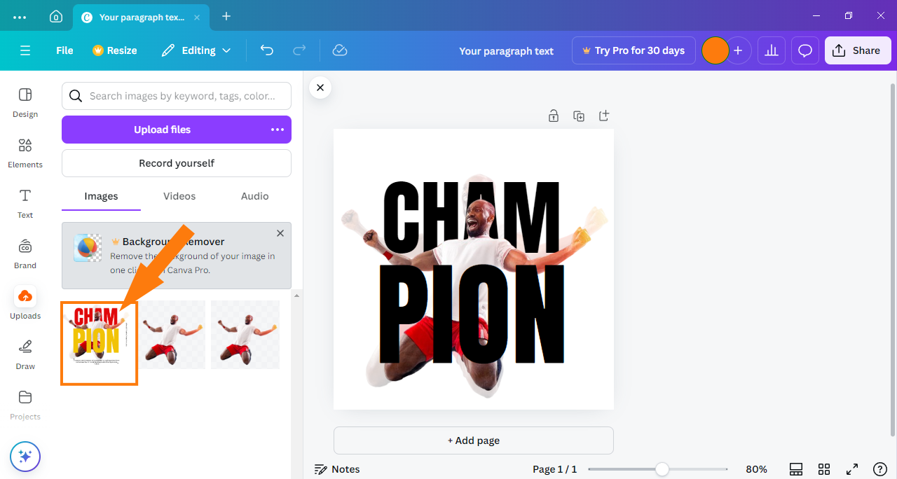
Image is clickable and might show larger resolution. - On the window that appears, click [Upload].
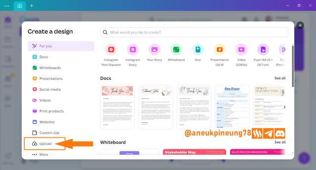
Image is clickable and might show larger resolution. - Click [Choose files].

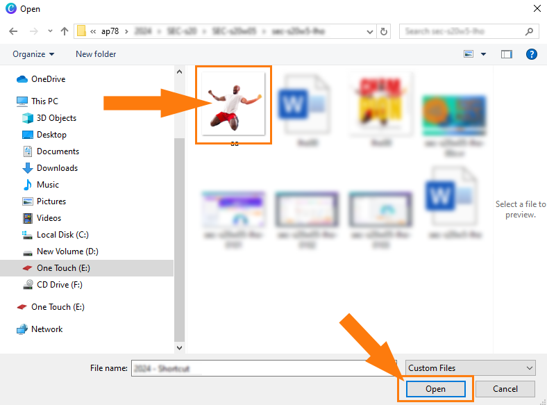
Image is clickable and might show larger resolution. - Locate the image in question, and press [Open].

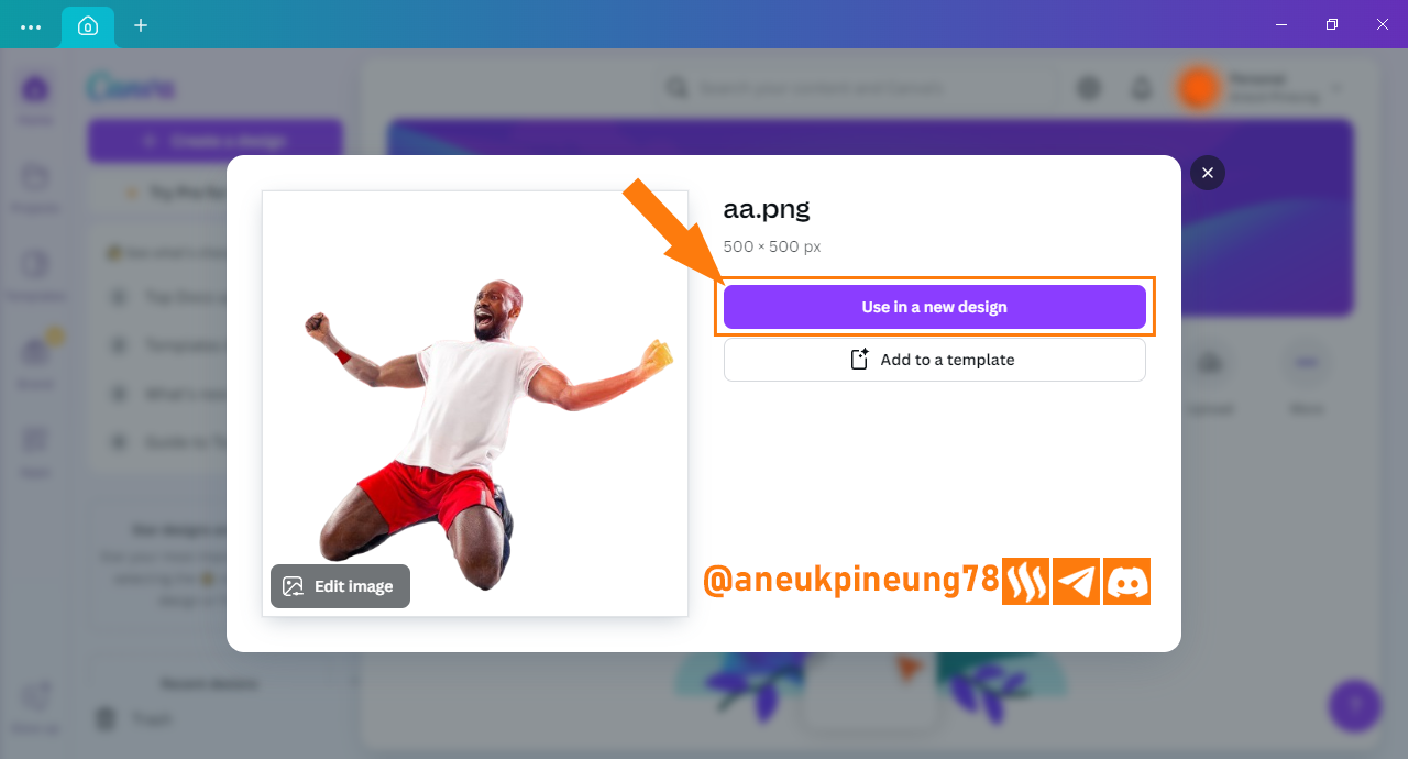
Image is clickable and might show larger resolution. - Since this image will be created in a new design, click [Use in a new design].

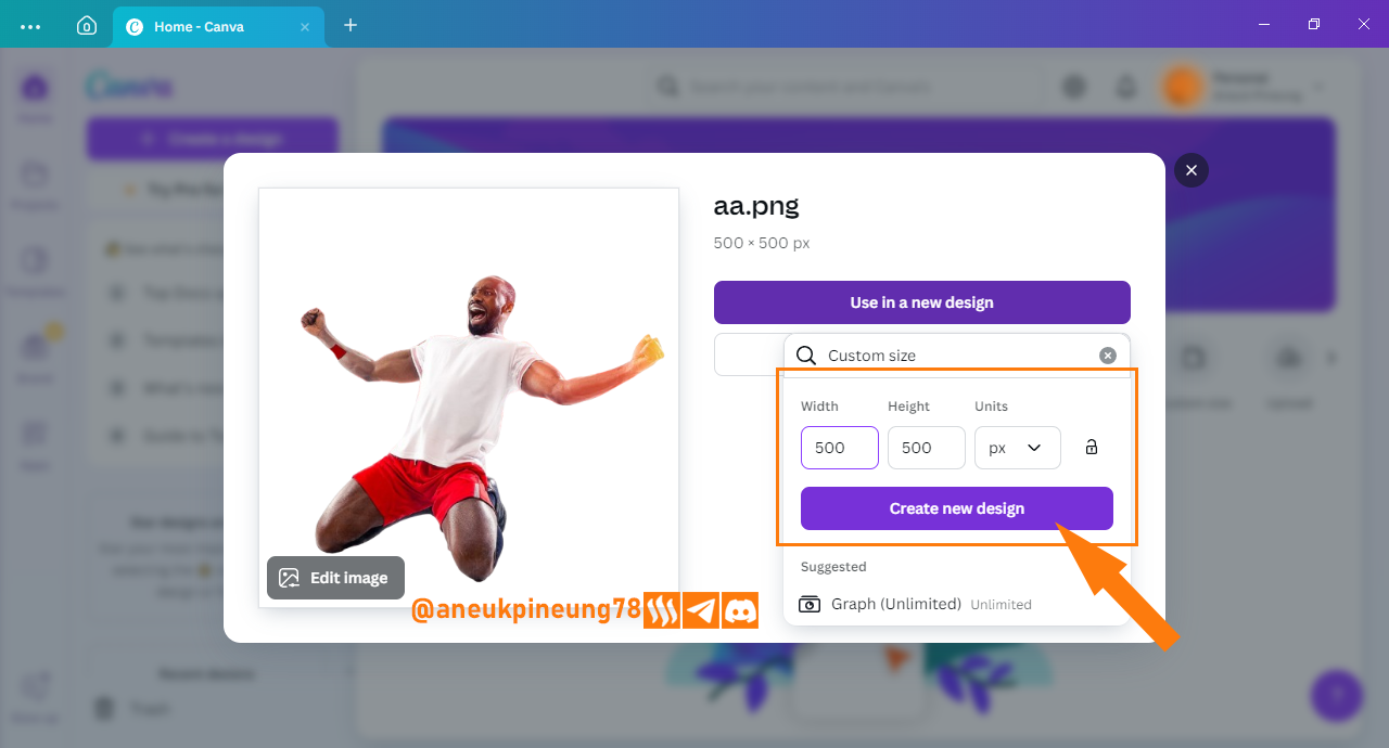
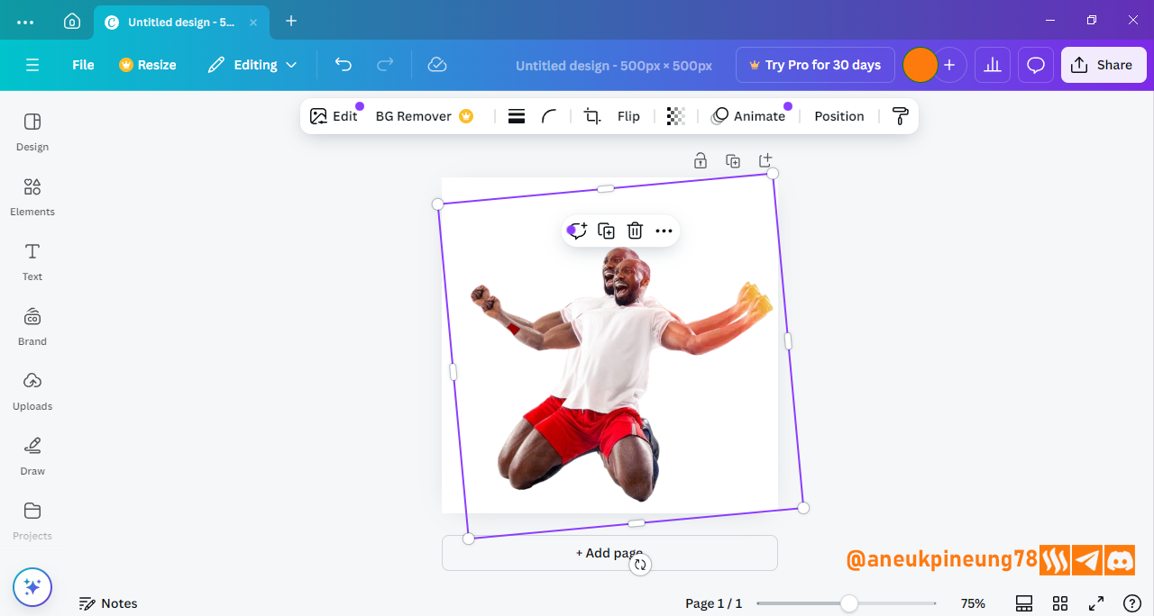
Image is clickable and might show larger resolution. - In the dropdown menu, I chose [Custom size], since I want to stick with the image oroginal size which is 500 x 500 pixels.
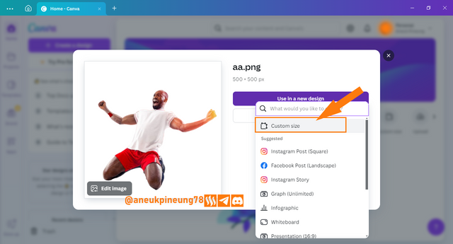
Image is clickable and might show larger resolution. - I set the canvas size I want and press [Create new design].
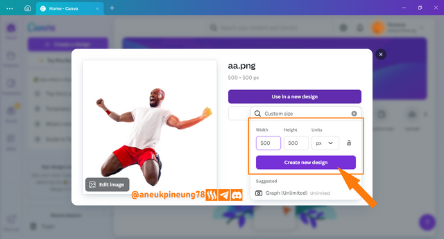
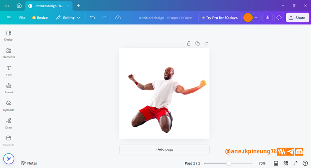
Image is clickable and might show larger resolution. - The image is now available in Canva and ready to be worked on.
> Image is clickable and might show larger resolution.


02 Duplicating the Image and Adjusting the Transparency.
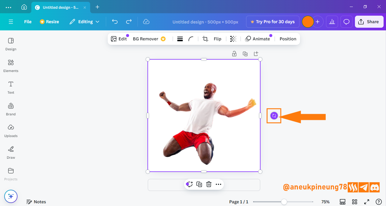
- Before duplicating the image, I will perform a slight rotation on the image so that the image will look more “balanced”. I click on the image so that a purple handle appears around the image. To rotate, I press and hold the rotation button and move the mouse in the direction I want.
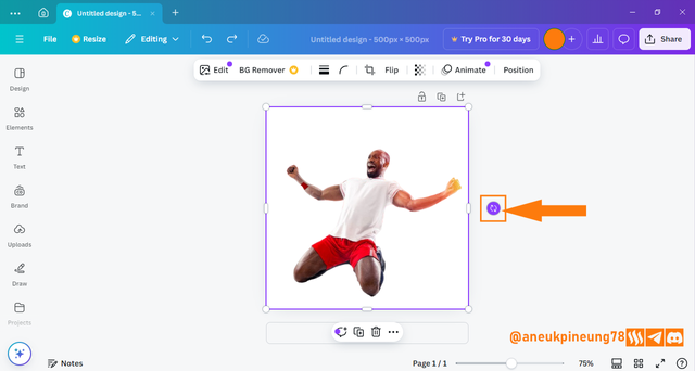
Image is clickable and might show larger resolution.
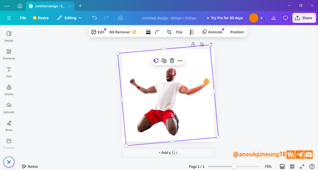
Image is clickable and might show larger resolution.
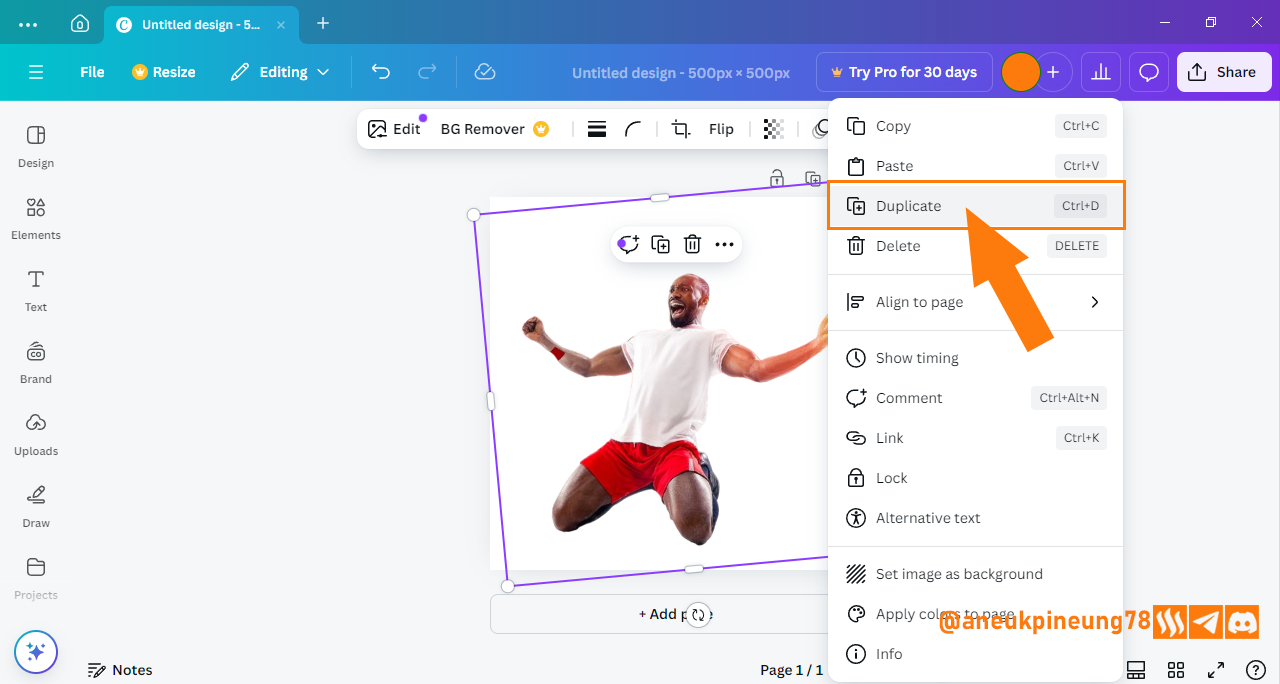
I think that's good enough, later if necessary, more adjustments can be made. - Right-click on the image and select [Duplicate] or you can also press [Ctrl+D] (on Windows computers) after making sure the image you want to duplicate is active (selected).

Image is clickable and might show larger resolution.

Image is clickable and might show larger resolution. - Next is to set the size of the image behind to be larger. To do that, the layers need to be shown. Right-click on the canvas, select [Layer], then [Show layers] and the shortcut for Windows computers is [Alt+1].
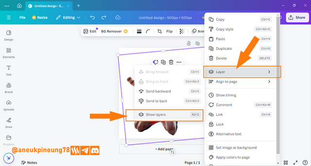
Image is clickable and might show larger resolution. - Now the layers are visible next to the canvas. Layers are arranged in the manner that the frontmost design element is on the topmost layer, and so on sequentially until the bottom (back) layer. I selected the layer containing the image at the back and resized it using the handles that appear around the image that I wanted to manipulate. There are eight handles that can be used.
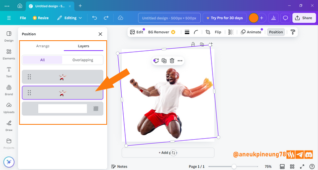
Image is clickable and might show larger resolution. - In the process, I also had to make slight adjustments to the image on the front. The result that I got is as follows.
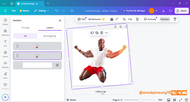
Image is clickable and might show larger resolution.
That's good enough. Now we will work on the transparency of the image at the back. - Utilizing the layers window, select the image at the back, and then click the [Transparency] button. Use the slider to get the desired level of transparency.
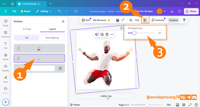
Image is clickable and might show larger resolution.
That's good enough for now, if we need further customization, we can do it later. Now let's move on to adding and decorating text.


03 Adding and Decorating First Texts
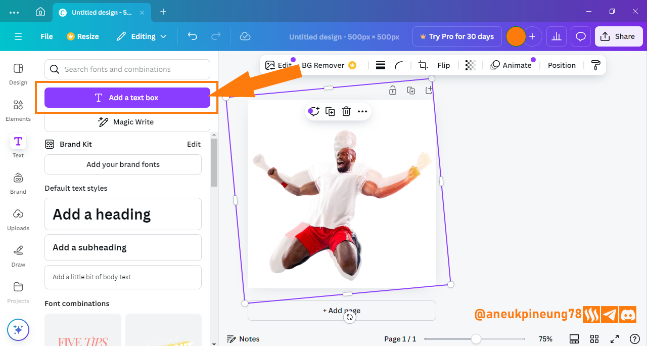
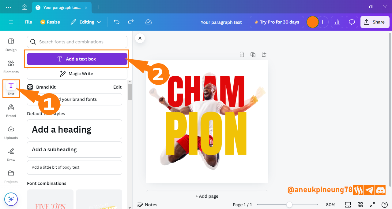
- Press the [Text] button.

Image is clickable and might show larger resolution. - Click [Add a text box] button.

Image is clickable and might show larger resolution. - A text box appears, it's time to fill in the text we want.
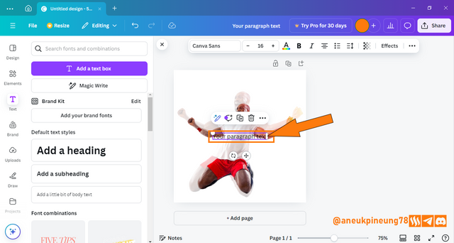
Image is clickable and might show larger resolution. - I added text and used the text box handle to increase the size of the text. At the top of the Canva window, there is a menu for text settings, including: the font to use, size, weight, color, alignment, transparency, and so on. By default, the font selected when typing text in Canva is Canva Sans. It's an elegant, “strong” and modern font. If you want to change the font, you can do so by pressing the [Font] button. I will try to find another font. I press the [Font] button.
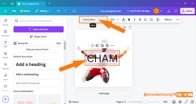
Image is clickable and might show larger resolution. - The font window opened on the left of the screen, I scrolled down and found a font similar to the one used by Professor Lhorgic called Anton. This font is designed to be sturdy with a built-in bold impression and does not have a bold feature, so the font menu shows the [Bold] button to be inactive. This font is slim and bold, perfect for giving a strong and dynamic impression. In addition, Anton is also designed clean and has a spacious space between characters so that it looks modern.
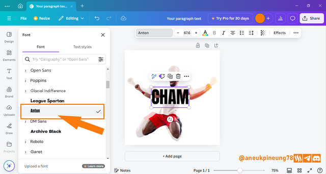
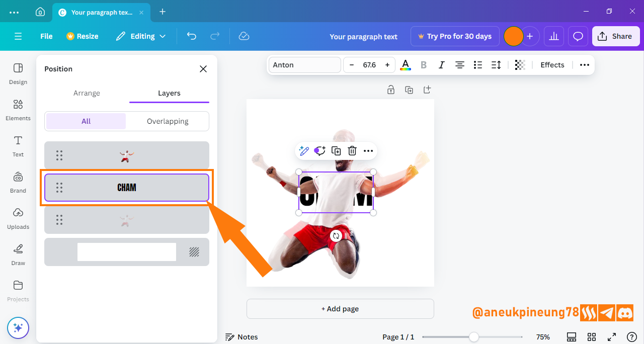
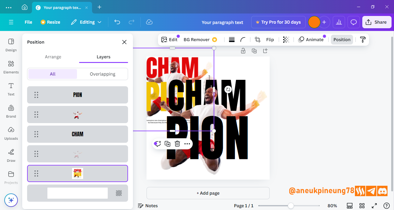
Image is clickable and might show larger resolution. - Next, move it behind the frontmost image. Adjustments to the font (such as size and color) can be made after that. To do this, I made use of the layers window. So I pressed [Alt+1] to open the layers window. As you can see in the image below, the layer with the CHAM text is at the top, so I need to shift it below the layer with the frontmost image. So, the CHAM text layer will be between the layers of the two images.
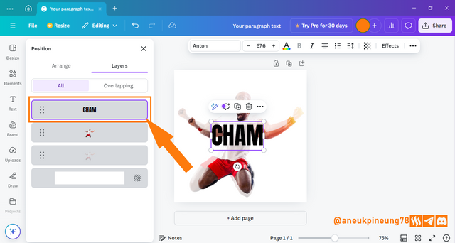
Image is clickable and might show larger resolution.

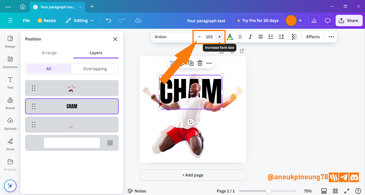
Image is clickable and might show larger resolution. - Next is to fix the position of the text and resize it. To change its position, we can do this by dragging the text box. The font size can be changed by utilizing the text box handlers, or setting the size through the [Font size] menu, I did it by hitting the [Increase font size] button until I find the right size and the [Decrease font size] is used when I want to make it smaller.
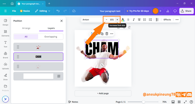
Image is clickable and might show larger resolution.
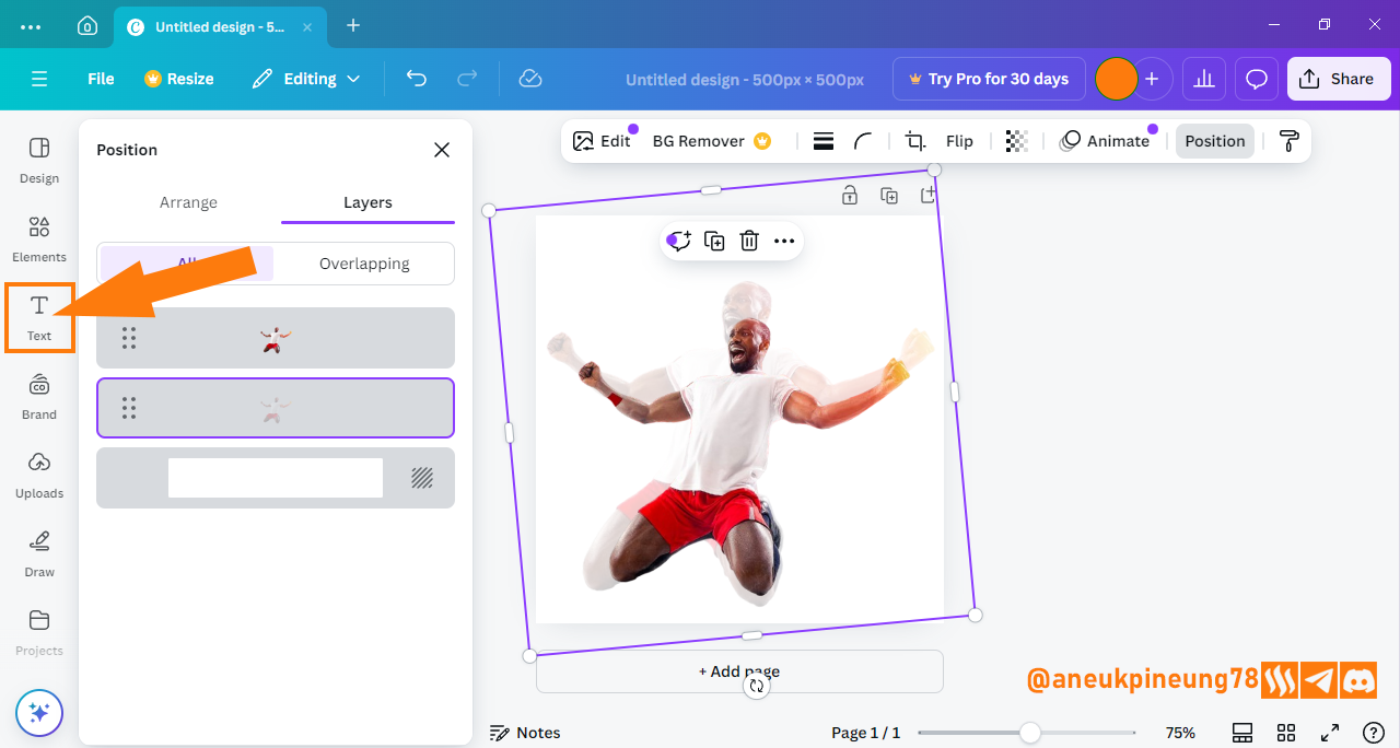


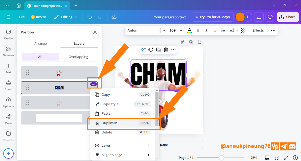
04 Adding Second Text By Duplicating The First One
To add the second text (PION), I will use the duplication method. So I don't need to generate a new text box. After duplicating the text, I will move it to the front, where it should be.
- To do this, I need to display the Layers window. So I press somewhere in the canvas, then I press [Alt+1]. After that I select the CHAM text layer, press the three dots in the top right corner of the layer and select [Duplicate] in the dropdown list that appears or I can just press [Ctrl+D] after the layer I want to duplicate is selected.
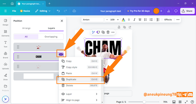
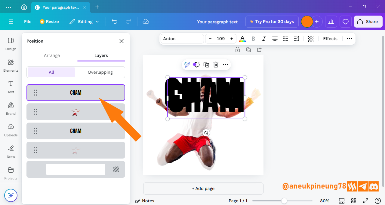
Image is clickable and might show larger resolution. - It turns out that the duplicate result will automatically be placed at the topmost of the layers, meaning at the frontmost of the design, so in this case then I do not need to do anything to move it to the frontmost (topmost).

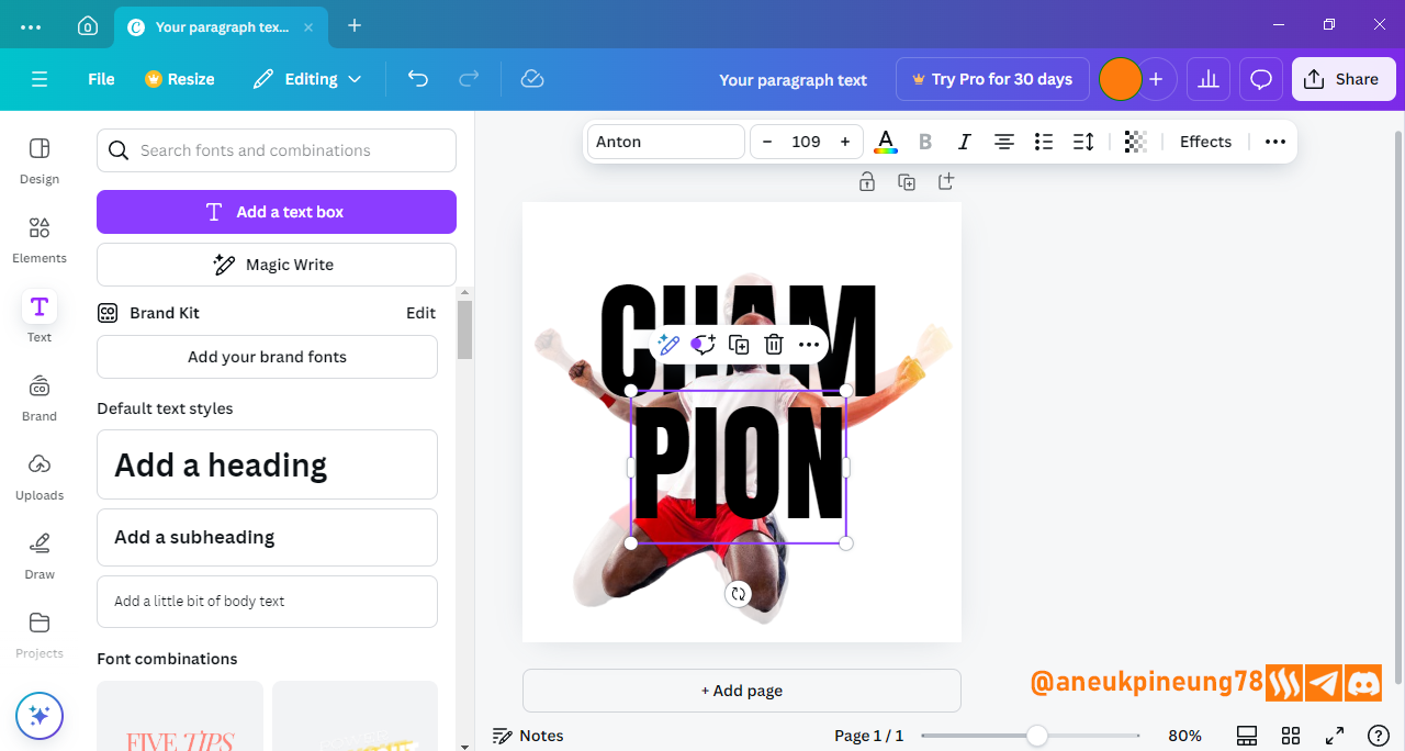
Image is clickable and might show larger resolution. - Next, I adjust the position of the text, and change the CHAM text to PION. I change the position of the text by dragging it as previously done on the CHAM text. Then I double-click inside the text box to choose all the characters inside it.
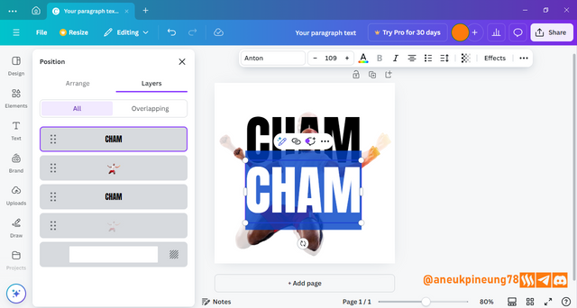
Image is clickable and might show larger resolution. - I type PION.

Image is clickable and might show larger resolution. - Looks like I need to make it larger. I utilize the text box handler to do so, and a little dragging to position it the best. I come out with this:
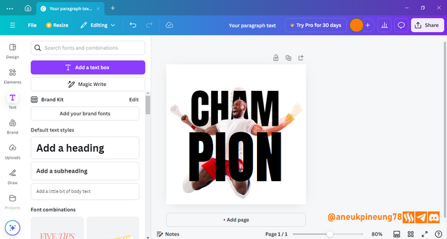
Image is clickable and might show larger resolution.
I think all is good so far, now I will change the color of both texts.


05 Changing Texts Color.
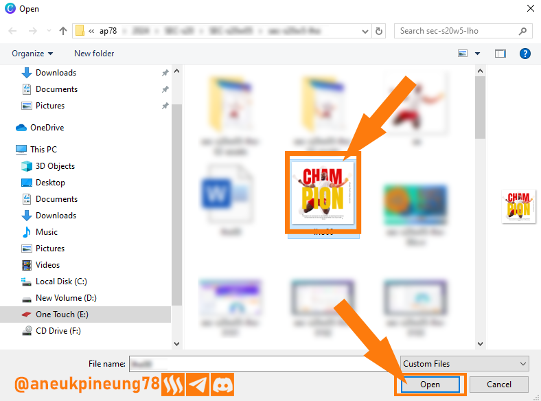
- To change to the color that Professor Lhorgic used in his class post, I need to import his design to the canvas I am working on and then I will use color picker to imitate the color. I import the image by hitting the [Uploads] button.
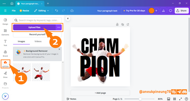
Image is clickable and might show larger resolution. - I then search for the image in question and pressed the [Open] button.

Image is clickable and might show larger resolution. - The image is now available in my Canva library.

Image is clickable and might show larger resolution. - I click on the image in the library and it was immediately inserted into the canvas.
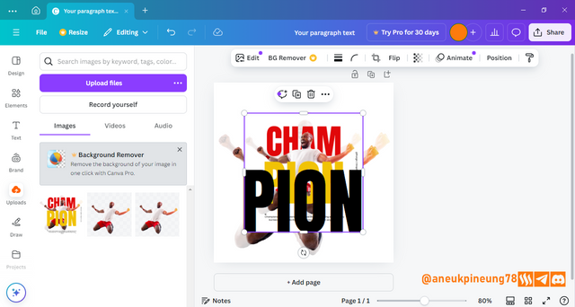
Image is clickable and might show larger resolution. - To make it easier for me to work, I move the image layer down and reduce the size slightly to a size that I think is good enough.

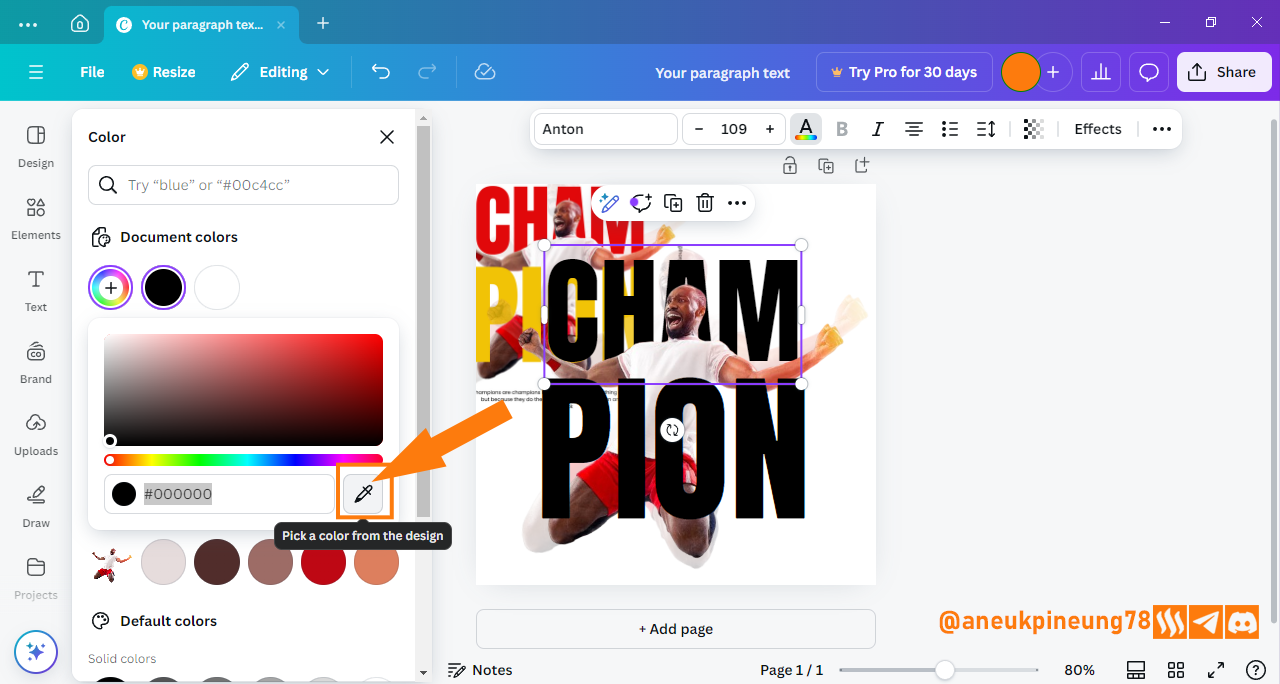
Image is clickable and might show larger resolution. - I select the layer containing the CHAM text to change its color, and then press the [Text color] button in the text menu at the top of the screen.
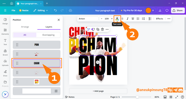
Image is clickable and might show larger resolution. - I clikc the [Add a new color] button.
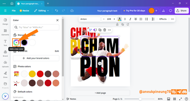
Image is clickable and might show larger resolution. - I click the color picker icon.

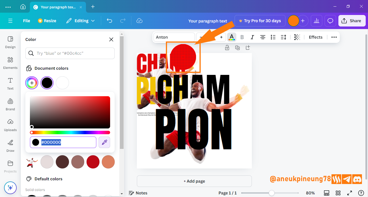
Image is clickable and might show larger resolution. - I hover the color picker circle over the color that I want to duplicate.

Image is clickable and might show larger resolution. - I click on the color I want. And the result is:
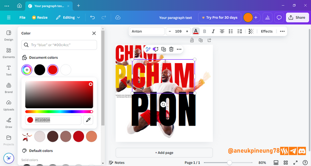
Image is clickable and might show larger resolution. - Using the same way, I get the color for the PION text. I then remove the reference image. Here is the result.
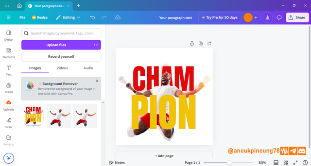
Image is clickable and might show larger resolution. - I think the overall positioning of all the elements is too downward. I select all the layers and drag them up a little, considering the space for the text I will insert at the bottom of the design.
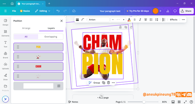
Image is clickable and might show larger resolution.


06 Adding The Third Text (Quotation)
- To add the next text I press the [Text] button and select [Add a new text].
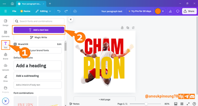
Image is clickable and might show larger resolution. - I add a quote from professional boxer Floyd Mayweather, Jr, “A true champion can adapt to anything.” I emphasize the quote by making the text size in the name part a little smaller but still maintaining readability. I use Open Sans font for the quote text.
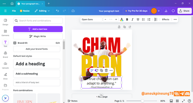
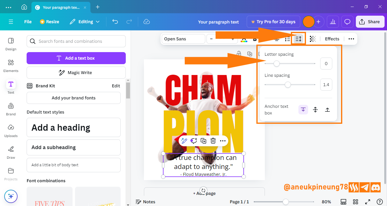
Image is clickable and might show larger resolution. - It's time to adjust the spacing so that it looks more elegant.

Image is clickable and might show larger resolution. - I want to use two colors in the text that I used before, but yellow turns out to have a contrast that is not good enough when used on small-sized letters when attached to a bright background such as white, so I replace it with black. Here is the result.

Image is clickable and might show larger resolution.

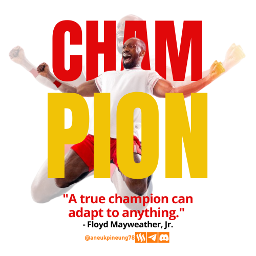
07 The Final Result
The final touch I make is to adjust the position of all the elements both individually and as a whole, including reducing the size so that the design has enough whitespace for each element. I do not forget to add an ownership watermark to the image. And the result is like this.
08 Principles
- Color Theory
- Colors used. The color selection in this design as a whole supports each other.
- The white (
#ffffff) background makes it easy to set contrast for the elements. The color also makes the design looks clean and relief. - The selection of the red color variant (
#e1080a), in harmony with the color of the pants worn by the model, shows unity in the design. - The yellow color (in this case we are using a slightly darker variant of
#f1c306), has a balancing effect on the red color so that overall it makes the design look more energetic. Because after all, these two colors are in the same color warmth system, so it supports each other in a way. - The black color (
#000000) is used at the bottom of the text to provide a strong contrast to the background in particular and to the overall design in general.
- The white (
- Color psychology. Amongst the positive psychological value of the chosen colors are:
- White: Clean, simple, fresh;
- Red: energy, strength, excitement;
- Yellow: creativity, optimism, cheerfulness;
- Black: strength, assertiveness, luxury;
- Orange: creativity, energy, passion, familiarity.
- Colors used. The color selection in this design as a whole supports each other.
- Typography
- Fonts used and their typefaces. In this design, two types of fonts are used, namely Anton and Open Sans. Both fonts are Google fonts, free to use, and belong to the San-serif typeface. Anton has a firm structure, while Open Sans has a more relaxed structure. But both are formal and modern typefaces. Anton, is also categorized as Display font, so it is a typeface that is only suitable for use in large sizes and for short texts, so it is only suitable for titles or short headings. While Open Sans’s design allows it to be used in paragraphs text. They have characteristics that support each other to be used together in a design.
- Hierarchy. The design shows a clear hierarchical arrangement between texts. It is clear which text acts as headings and which as paragraphs. The hierarchy in the design also successfully shows focus without taking away from the function of other text.
- Leading. There is enough clean space between lines (especially in paragraph text) so that the text can be read easily and does not disturb the overall design aesthetics.
- Contrast. The selection colors, the weight, and the size of the letters used successfully brings enough contrast for the design.
- Tracking. The spacing between letters is adequate (not too close and not too far), making the text easy to read.
- White Space. There is enough white space where the text elements can breathe freely.
- Alignment. The text as a whole uses center alignment, both in particular and in general.
- Emphasis. The design clearly shows that the emphasis is on the word CHAMPION which is split into two parts, and used to explain the main image (model). Not only with the size determination but also with the use of striking colors and positioning that seems to “dominate” the design, but still in a sufficient nature and does not “kill” the rest of the design.
- Contrast. This design achieves its contrast by the use of colors that support each other and the adjustment of the size of each element.
- Alignment. It's a very simple design, and that's where its strength lies. Unlike more complex designs that can have more than one element with their own alignment regardless of the total alignment system of the design, this design only has one alignment, the center alignment.
09 Design Details


Thanks
Thanks Professor @lhorgic for the lesson. I want to invite @rayfa, my bros @amjadsharif and @rashid001.


Hello @aneukpineung78 thank you for participating in this week's lesson. We have assessed your entry and we present the result of our assessment below.
Feedback:
Let me start by commending you for the effort put into this practical.Your work came out cool, However I have few things to point out to give you a better output.
I understand you wanted to try something new with your motivational quote which is quite cool, maybe a little drop down on it size and that of the element close to it would have given us something more. Moreso you skipped adding to your design.
Thanks for talking about the principles you engaged in making this design and how you engaged them.In all, you did beautifully well and I must commend your effort. I hope you keep up with the energy level dear student.
Regards
@lhorgic❤️
Thanks, Professor. I think Canva is not that hard. It is easy to use, no wonder it has been one of the famous image editors there are. And I hope this class will continue in the coming seasons.
https://x.com/aneukpineung78/status/1845298487145136326
Your design process is incredibly thorough! I love how you explain each step and the reasoning behind your choices. The color combinations really make the text stand out, especially the hex codes you used.
@max-pro. thanks for your kind word, Actually, the main colors used in the design was chosen by Professor @lhorgic, so I guess the credit in this matter should go for him. 😀 You yourself have created an amazing design for this week's Graphic Design class.
Anyway, Canva is new to me. How long have you used it?
I have been using it for about 1.5 years
Do you do graphic design regularly? Except for the steemit posts, I mean.
No, I only learned graphic design for steemit and applied it here. 😚
I guess Professor @lhorgic has done great job in educating us in Graphic Design basics?
Thanks, really appreciate it.
Your presentation is good in this Graphic Design Course.
Thanks, my bro Amjad... how are you doing? I hope everything's fine.