SLC21/WK5: Hands-On Practical
Hi friends,
I am Jyoti from India. Here I am going to participate in the SLC S21 W5 contest: https://steemit.com/hive-147599/@lhorgic/slc-or-s21w-5-or-hands-on-practical-using-any-design-app-software-of-your-choice organized by @lhorgic
.jpg)
Design A logo for your brand, if you already have one, this would be optional for you.
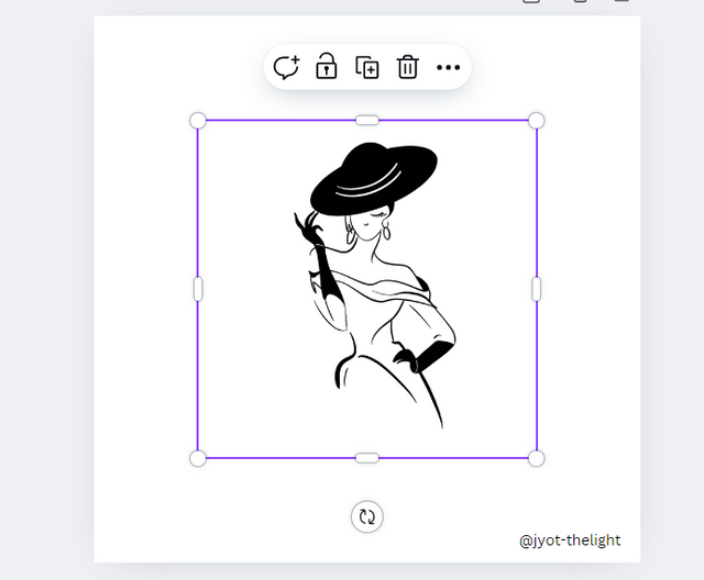
We can create very beautiful logos in Canva. But, since we are using the elements in it, it will not be unique. However, for this task, I am going to use canva to make a logo design and I am going to explain here how to make it. First, I took a screen of 1080x1080 px. I clicked on the elements tool to insert some images in it.
Since I was going to make a fashion-related logo, when I typed fashion woman, there were many silhouettes and outlines, and symbols of fashion-related women, among which I selected this and inserted it.
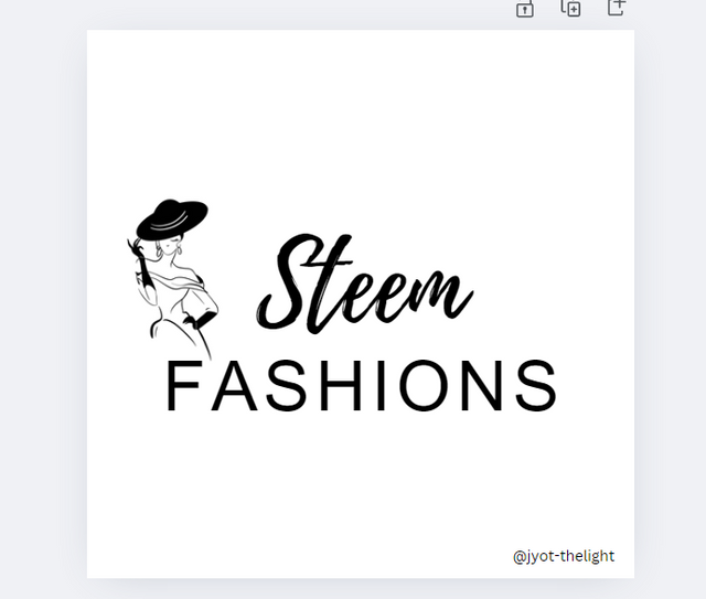
Then I was going to make a company logo called Skin Patients, so I typed "Steem fashions" and then selected only the word STEEM and changed its font style. Then I changed the word "fashions" font and increased its space between letters and decreased the leter size.
After that, to align the symbol, name, and tagline, I moved all three. First, I placed the symbol on the left, then the company name on the right, and then the tagline below it. Now that we have a beautiful logo that matches our company name, we are going to design a player using this logo. Now to download it, you need to save it first and then download it as a JPEG or PNG image.

Design a promotional flyer/banner/poster for your brand using any design app/software of your choice. Kindly be sure to be very detailed, showing every relevant detail as this could be your leverage.
Step 1 :
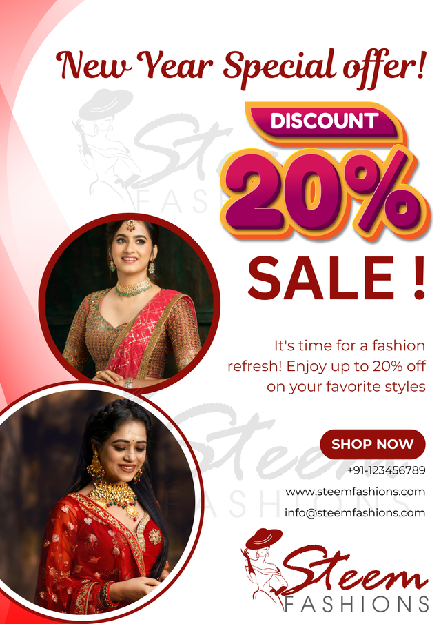
I am going to design a flyer of an advertisement for a company which is a textile store that sells traditional Indian women's clothing and giving a special offer for the New Year , so I am going to design it accordingly.
At first, I opened the Canva web site and clicked the "create new design" button and chose the A4 size screen to make a flyer for a textile store's new year offer advertisement. I let the screen color since our color scheme is combination of Meroon , Pink , Yellow and white.
I'll going to incorporate some woman images who wearing indian traditional cloths, since the advertisement related to the same cloths, and some abtract desings, offer graphics and also i'll incorporate the logo we designed for the textile store earlier.
Step 2 :
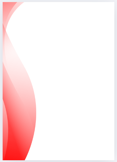
Now we need a graphic element to match our flyer design. I clicked the elements tool and searched "abstract design graphic" and found this design, incorporated it, and placed it on the left side of the page.
By placing an abstract design and images on one page, the right side is empty, so by filling it with the text we need, the design fills in properly on both sides.
Step 3 :
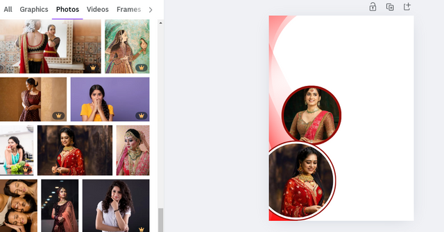
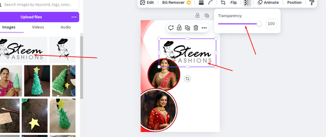
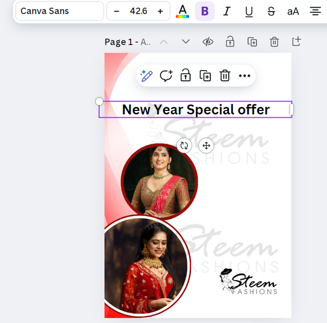
Then I clicked the elements tool and searched Indian fashion women and found some free images. Then I inserted the two images and gave them a border with a meroon color. After that, I uploaded designed logo and inserted it, placed it on the background, and make it transperrant to 10% using transperant tool ,
Step 4 :
It is good if our logo presented as watermerk in the design. I wanted to make two transparent logos as watermark in the flyer. So I place them as watermarks now that they are visible slightly on the background, and then put the original logo in the player, copied the logo, and placed it once again in the background, and also placed it at the bottom right corner of the flyer as the original logo.
I wanted to hilight the logo in the flyer so I left it's color as black, at the end I'll change it it is not suitable for the design and also its size and location.
Then type the words "New year special offer" using the text tool , changed it's font to a cursive style, gave meroon color and make size little bigger and placed it at to top right corner of the flyer .
Step 5 :
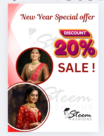
After that, I searched offers graphics in the elements and found this beautiful a redy-made "20% offer" symbol graphic from the elements tool and inserted and then typed "SALE!'' using text tool. changed font and increased it's size as per "Hierarchy" rules to highlight in the design because it should be dominant in the flyer, and also I gave it a maroon color to match with our theme and color scheme.
Then I inserted a "round corner rectangle shape" below the "SALE!" text . I also gave it a maroon coloras per our theme and color scheme. Then I typed "Shop Now" words on it and gave it a white color. I made this shape look a little a button and also different from the other designs because we can use it for shoping site link for digital files which will be used to send through social media .
Then I typed other information, such as "Its time for fashion refresh. Enjoy 20% off on your favorite fachion styles." offer terms, offer duration, and contact information such as website phone number and email address.
Step 6:
Now that the flyer design has been inserted, the necessary elements need to be aligned, but to keep the design balanced, I placed all the text on the right and the images and abstract design on the left.
I also changed their sizes to small and large according to their importance. For example, I made our "20% offer" larger in design so that it would reach people, and the terms and conditions and the contact information were smaller. I made our logo medium in size, and similarly, I made it large so that the image would be more dominant.
When finishing the flyer design i foudn the logo is not hilighted in black color so I changed its color to maroon to match with the entired design.
.png)
Now our "New Year offer advertisement flyer" is ready. We can print it and distribute it or save it as a digital file and publish it on social media such as WhatsApp, Telegram, Facebook, and Twitter.

Dedicate a section to talk about the graphics design principles engaged in making your design. You might want to revisit the lecture on graphic design principles to refresh your memory.
There are many design principles that we need to follow when designing a graphic, the most important of which are the following:
- Alignment
- Balance
- Contrast
- Colour
- Hierarchy
Alignment
Alignment is a very important design principle, so I have given a lot of importance to alignment in my flyer design. Accordingly, I have placed the upset design image on the left and the test contact information logo on the right.
Balance
The balance of elements in a design is very important, so in this player design I have balanced all the elements according to their importance.
Contrast
Contrast is a very important principle in design. When we use colors according to our color team, they should also be in contact with the background. That's why I'm using maroon color for text and borders.
Colour
The color theme we selected here is "Maroon, White, Pink" and I have added these colors to all the text, borders, and designs accordingly.
Hierarchy
An important principle to keep in mind when designing is Hierarchy. That is, in the design, we should make the most important things we need to say big, the rest medium, and the less important things very small. That is why in our flyer design, I have made the image large, the logo and offer details medium, the contact information smaller, and the terms and conditions even smaller.

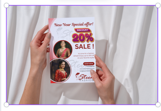
Once again use a suitable mockup to promote your design.
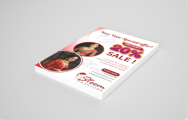
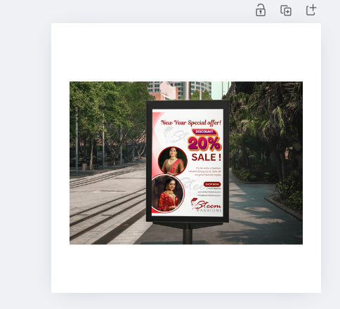
Here are some mockups that i have created through canva
I would like to invite
to take part in this contest.
Discord : @jyoti-thelight#6650 Telegram :- https://telegram.org/dl


Upvoted! Thank you for supporting witness @jswit.
Este diseño quedó increíble, muy bonito y elegante.
Se ha elegido una gama de colores que hacen un buen efecto visual, la letra, los fondos, las imágenes adicionales han formado un equilibrio y se ve muy atractivo a la vista, así que es un buen diseño, seguro tendrá mucho éxito.
Saludos
Perfect! Loved it ❤️
Thank you, dear!
My pleasure dear ❤️
Postingan nya sangat menarik sekali ya kak,.. Semoga sukses di kontes nya
Thank you for the compliments and for the greetings.. have a nice day!