SEC20/WK5: Graphic Design Hands - On practical 2
I’m excited to share my design for the SEC20/WK5: Graphic Design Hands-On Practical 2 contest organized by @lhorgic. I had so much fun replicating a design that celebrates success and motivation.
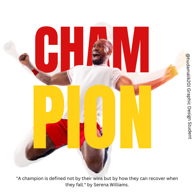

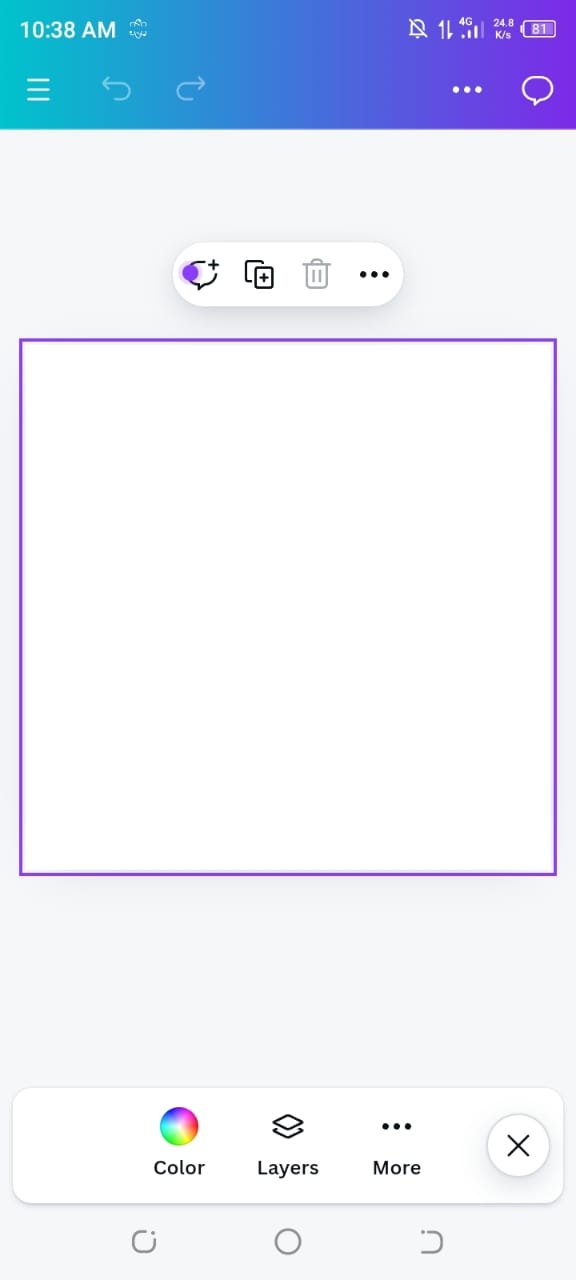
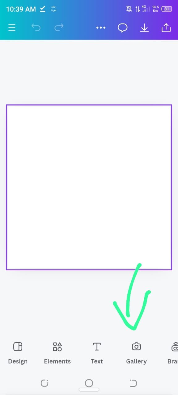
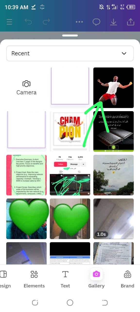
I started by opening Canva and selecting a 1080 x 1080 pixel template, the same size used for Instagram posts, which was also the size used in the contest post. I then uploaded the image provided in the contest post by going to the gallery and selecting it.
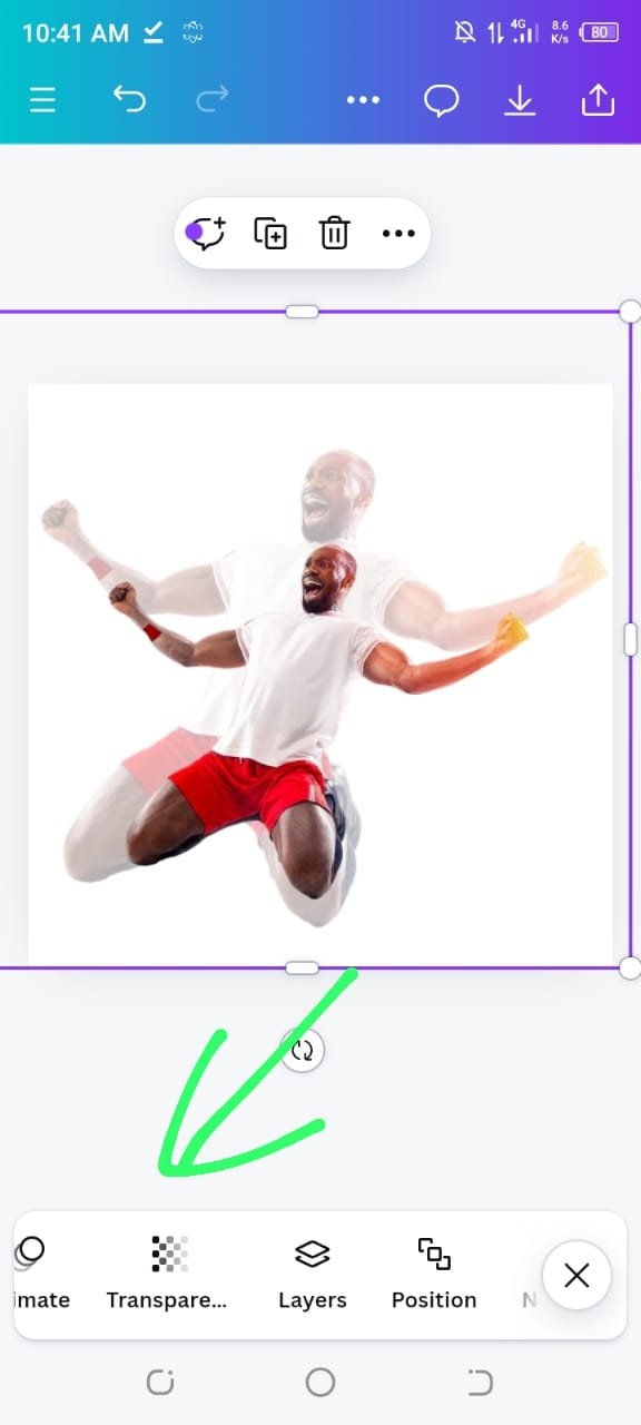
Afterward, I created a duplicate of the image. This step was essential to maintain the design's integrity while experimenting with its transparency.
 |  |
|---|
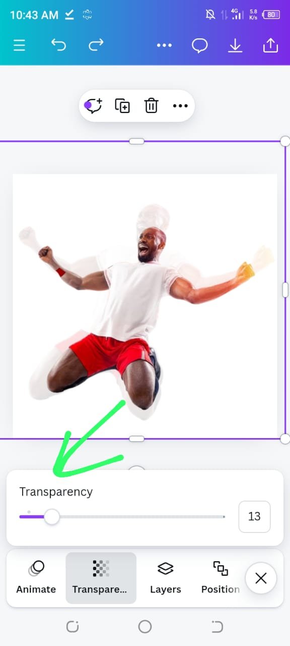
Once the copy was made, I adjusted its transparency. Using the contest post as a reference, I decreased the transparency gradually until I settled on 13%, which matched the look of the original post.
After getting the transparency right, I enlarged the image to fit the design accurately, ensured it mirrored the dimensions of the contest post.
 |  |
|---|
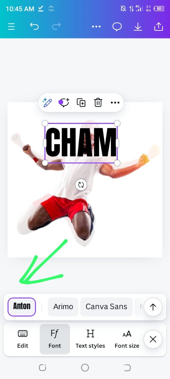
Next, I needed to add the text. To do this, I clicked on the text tool and selected the heading option. For the main text, I typed "CHAMP" and on finding the right font. The font used in the contest post was bold, so I searched for a similar style and found that the "Anton" font closely matched it.
 |  |
|---|
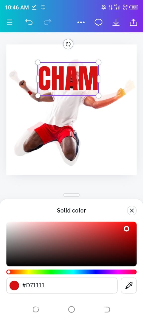
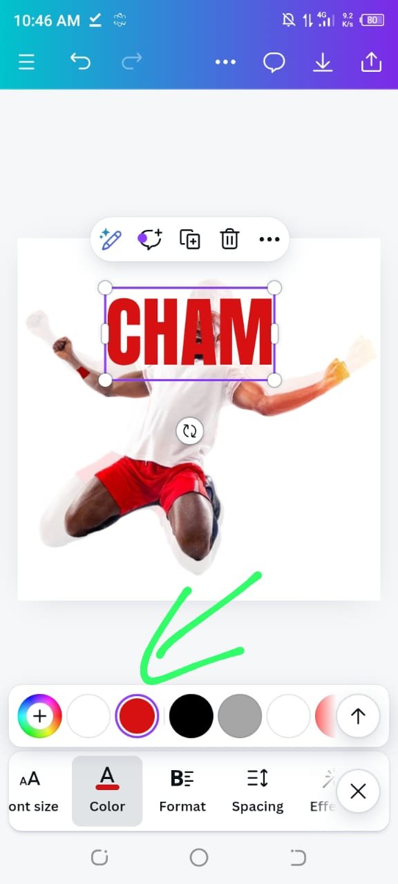
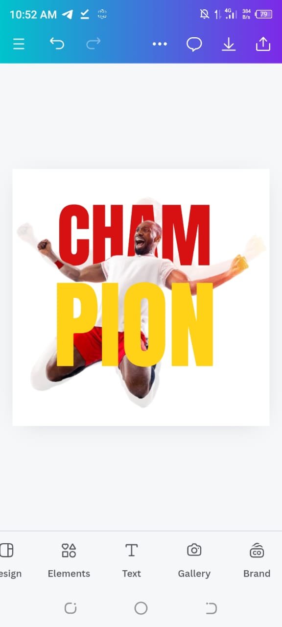
With "CHAMP" in place, I duplicated the text to create the second part of the heading, "PION" I then focused on matching the colors. The "CHAMP" text in the contest post was red, but it was a slightly darker shade, so I adjusted the red to make it darker. For "PION" the contest post had used a yellow color, so I changed it to yellow.
 |  |
|---|
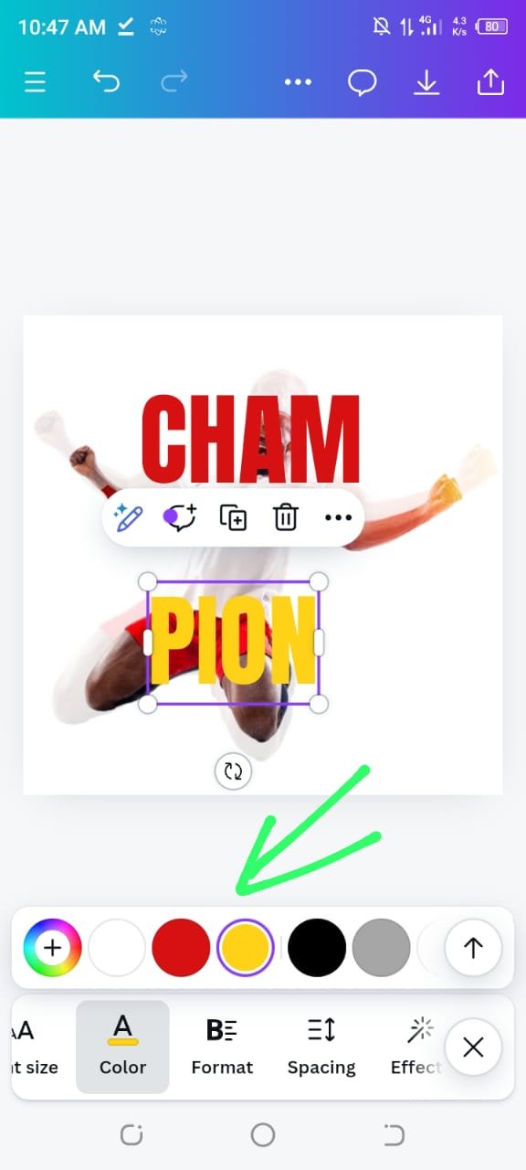
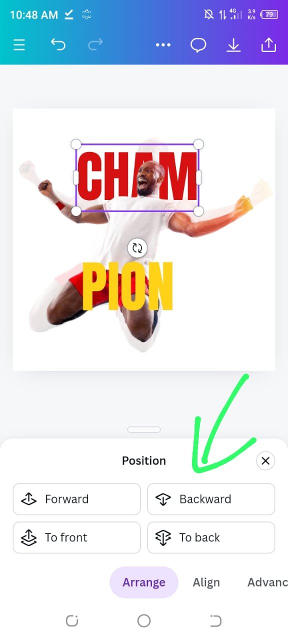
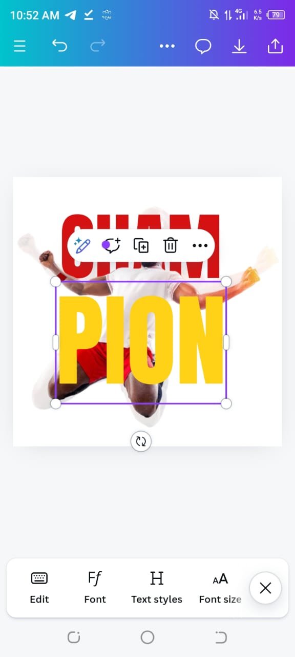
After getting the text and colors right, I needed to position the text correctly on the image, which we have learnt in previous week lecture "Position," which allowed me to send the text behind the image.
 |  |
|---|
By selecting the "backward" option, the "CHAMP" moved behind the main image. I then fine tuned their placement by dragging them slightly until they aligned perfectly with the original contest post's design.
 |  |
|---|
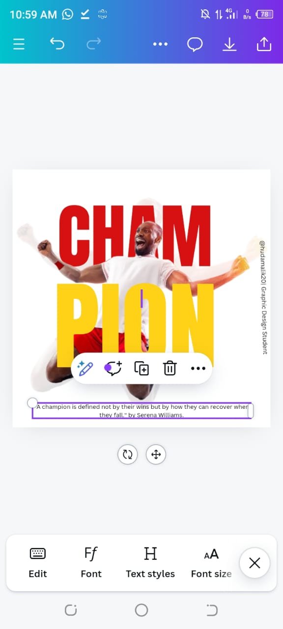
Finally, I added a quote that I had read in a book and felt would fit well with the design. I positioned it in the lower section of the image and added the name of the person who said it.
To finish off the design, I added my username and title as a graphic design student on the side of the image to give it a personal touch.
 |  |
|---|
In this way, I was able to replicate the contest post's design as closely as possible. Carefully I tried to aligned it matched the original. I hope the final result looks as good to others as it does to me.
I’m happy with the final result and believe it closely resembles the contest post. The combination of red, yellow, and neutral tones gave the design a vibrant but cohesive look.
Briefly talk about the principle you engaged in your design.
Emphasis:
In this design, my focus was on making the text "CHAM PION" the most prominent element. To create emphasis, I used two bold colors: red for "CHAM" and yellow for "PION" because these contrasting colors immediately draw the eye to the text.I made the text large and placed it in the center of the design to make sure it catches our attention first.
Design Size & Dimension:
For the design size, I chose a square dimension of 1080x1080 pixels, which is commonly used for social media posts like Instagram. This size helped keep all elements well proportioned, ensurres the text and image were visible and clear without being too small or too large. By sticking to a square layout, I ensured
Element Spacing:
I carefully spaced the text and image elements. I made sure there was enough space between the words "CHAM" and "PION" and between the text and the person’s image. I done this spacing in such a way that each element had room to breathe, ensuring they didn’t feel crowded or touch the edges of the canvas.
Color Combination:
For the color scheme, I stuck to the colors provided in the sample design: red for "CHAM" and yellow for "PION." These two bright colors work well together, creates a vibrant contrast.I chose a white background so that the text and the image popped out clearly.
I hope you enjoyed my replication of this design. Wishing everyone success in this contest and beyond. Thank you for visiting my post, and I appreciate any feedback you have🤗💞🌸🌼.
That's it from today's blog I hope you will like it. With best wishes ❤️. Now I like to invite @ahsansharif, @abdul-rakib and @norat to participate in this amazing contest.
Thanks alot for reading ❤️🤗 .
My introduction post

Upvoted. Thank You for sending some of your rewards to @null. It will make Steem stronger.
Congratulations, your post has been upvoted by @scilwa, which is a curating account for @R2cornell's Discord Community. We can also be found on our hive community & peakd as well as on my Discord Server
Felicitaciones, su publication ha sido votado por @scilwa. También puedo ser encontrado en nuestra comunidad de colmena y Peakd así como en mi servidor de discordia