SEC20/WK4: Graphic Design Hands - On practical 1

This week class is one of the best class I have enjoyed so far. I like it when I do things with my hands and it comes out with a very beautiful result. It may not be beautiful us you may think or the one you do but to me as long as I can achieve this I am so happy that I have made a graphic design with my hands Thanks to @lhorgic I appreciate this your lecture.
So far I have learnt how graphic design works the different principles to apply while designing, colour combination and ofcourse the different typeface and font. This week is going to be practical of what I learnt and having gone through the lecture for the week following through the graphic design step by step of which was shown how to do, I arrived at a design.
To do my homework task for this week, I proceed by opening my canva app to a workspace and progress with my work follow along as I make my designs.
Homework task
Step 1; creating of workspace and adding background colour
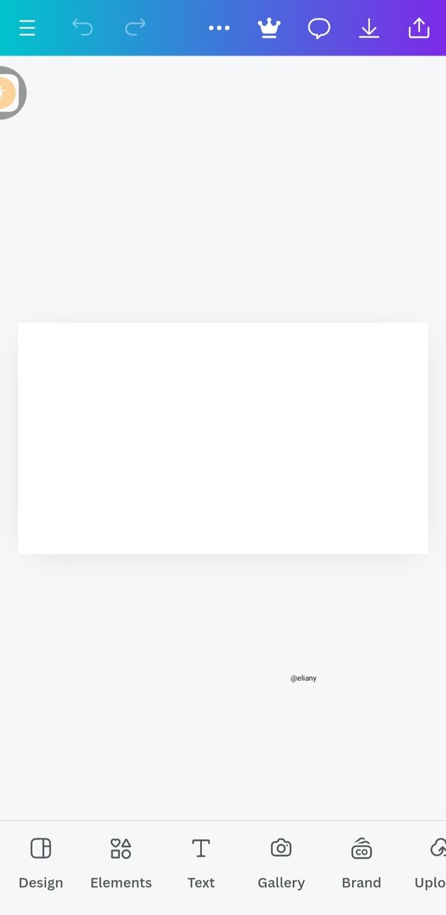
I opened my canva app and create a dimension that is not to big but suitable for a cover image. I'll be creating an advert promoting steemit, using effect and adding an image to it.
 1 1 | 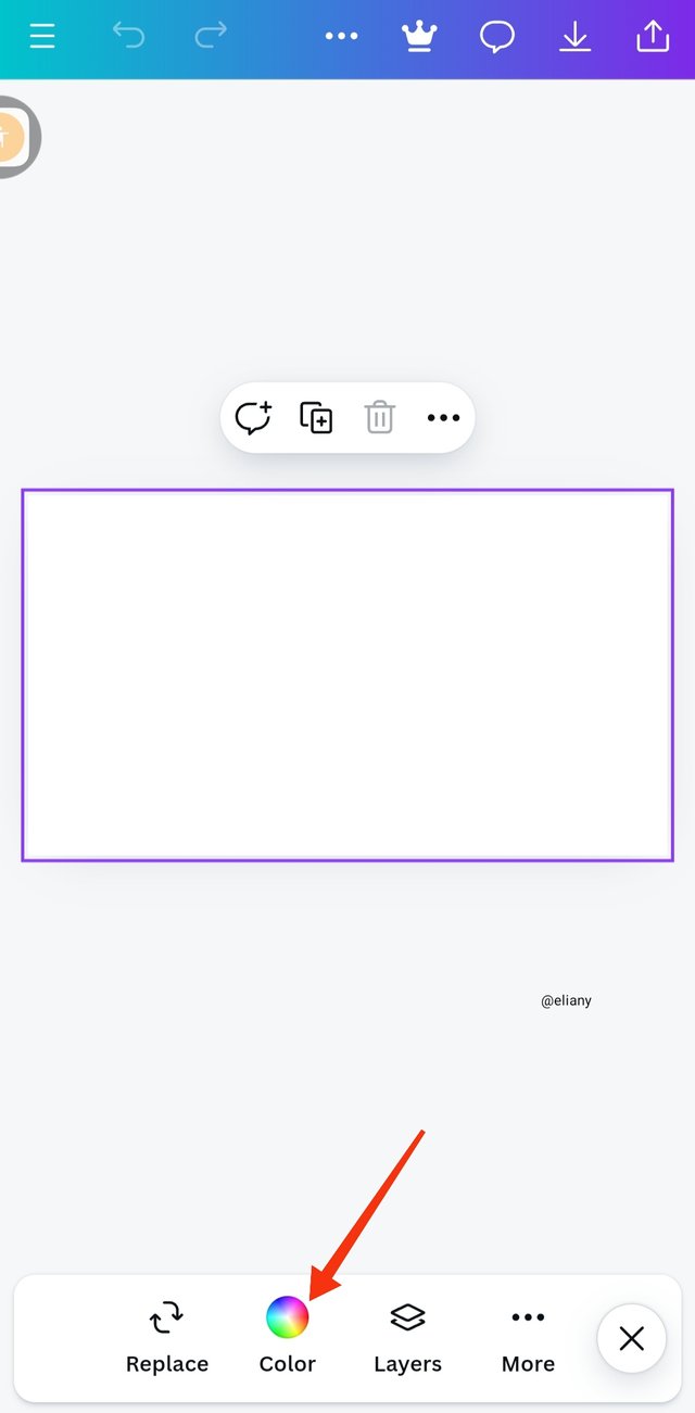 2 2 | 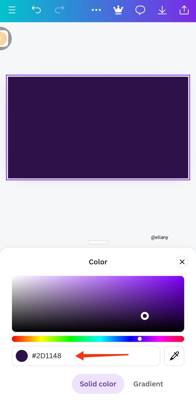 3 3 |
|---|
The first image shows dimension of a workspace of 1280 by 720
I selected my background colour by clicking on the colour icon as I indicated in the image.
The third picture shows the hex code I choosed, meanwhile I already choosen a traidic colour for my work which are purple, orange and green.
Step 2; adding of effects to the background
Next, you can see the variant of how this purple look like
 1 1 | 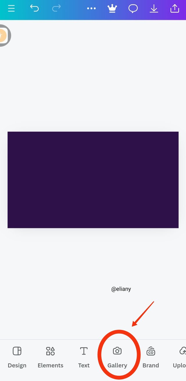 2 2 | 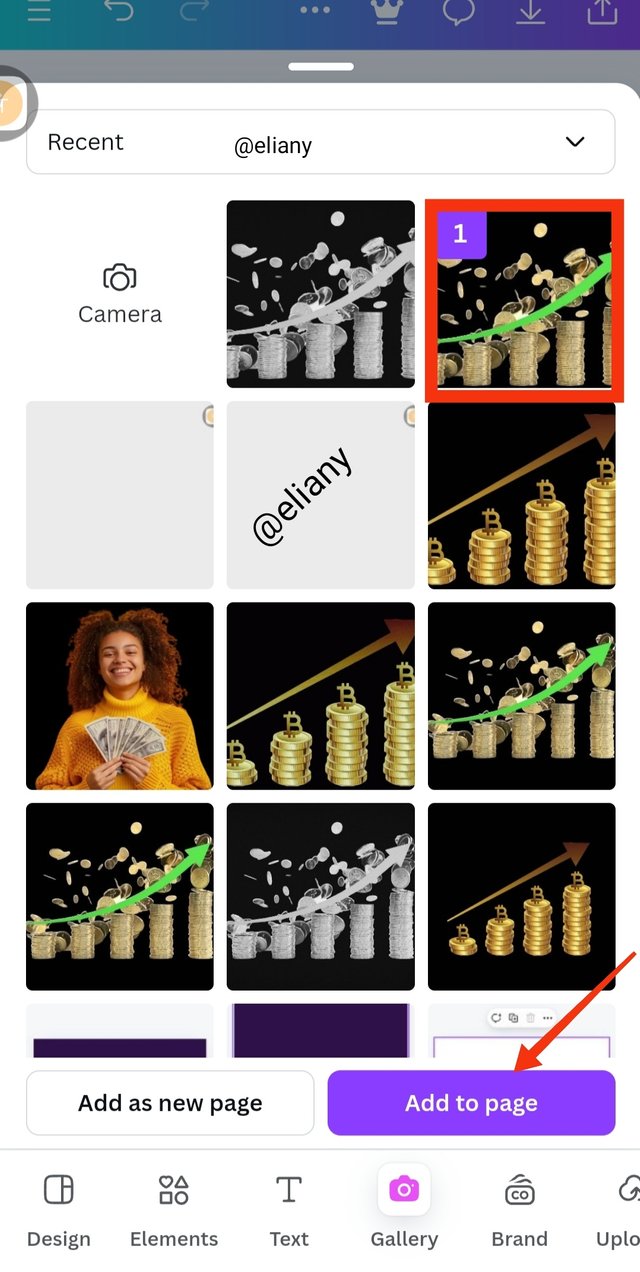 3 3 |
|---|
Shows the background colour
I went ahead to choose an image that will give my background some effect. I clicked on gallery and the next image took me to gallery.
I choose image that has to do with money because the fly out I'm creating is a financial advert. I selected the image and clicked on Add to page
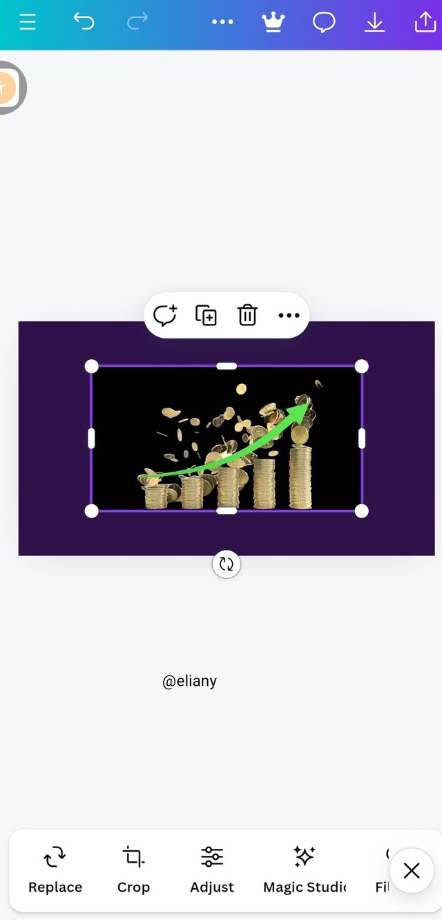
Step 3; Adding of effects
 1 1 | 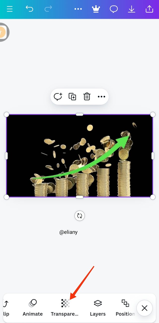 2 2 | 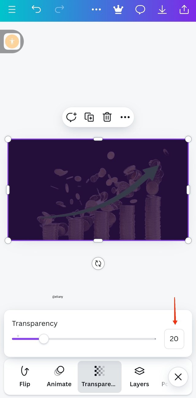 3 3 |
|---|
Shows my background effect on the workspace
I enlarged the image to cover the background then click transparency to add this effect to the background
- I adjusted the the slide to set the transparency at 20
Step 4; addition of text
 1 1 | 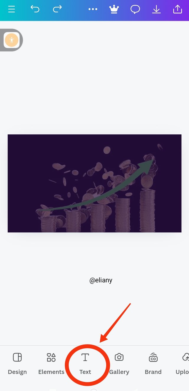 2 2 | 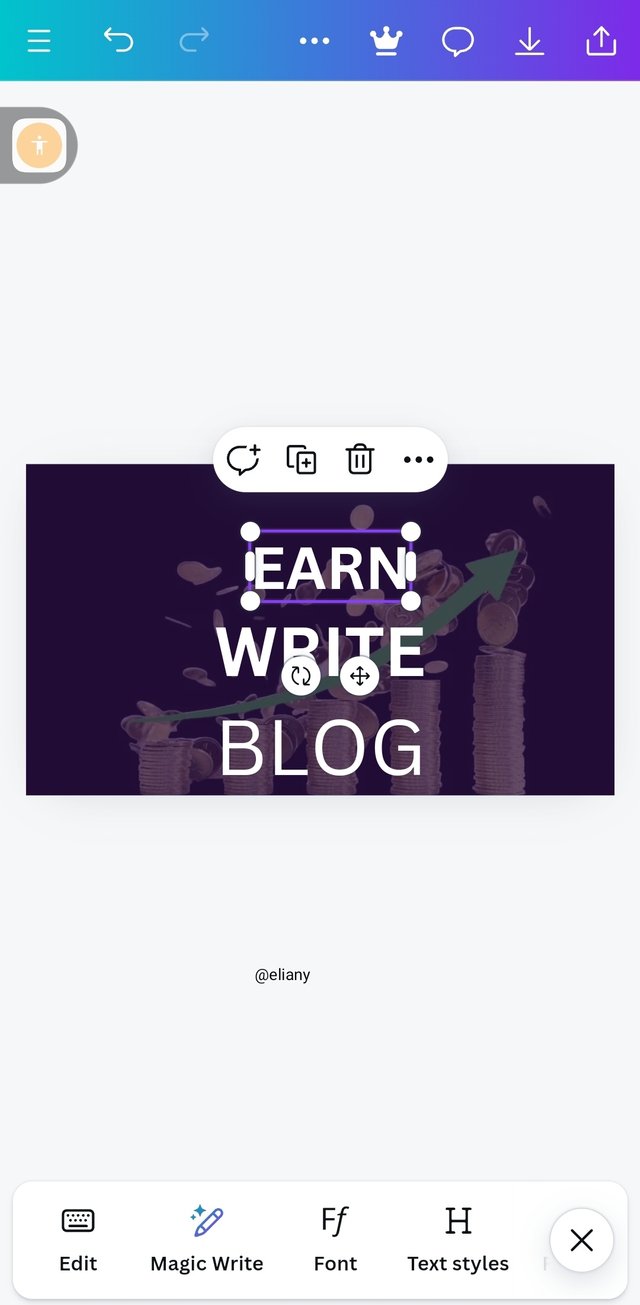 3 3 |
|---|
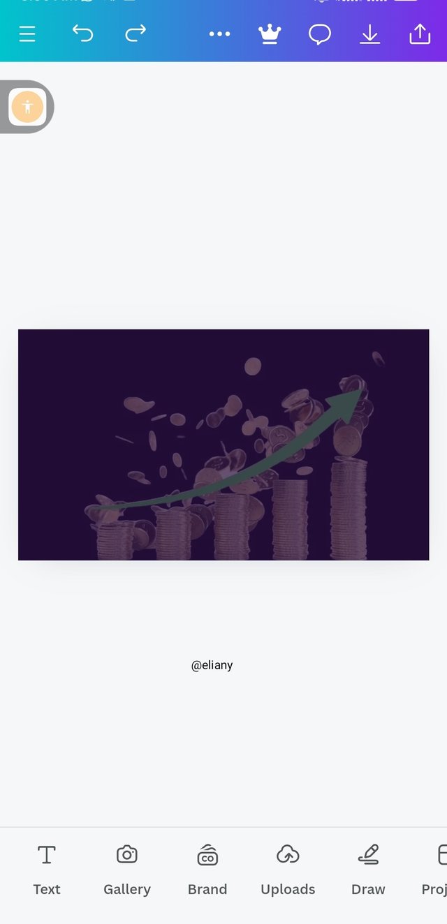
Shows the effect of the background
To add the text, I clicked on the text icon
I typed the words I'm using for the design, write blog earn.
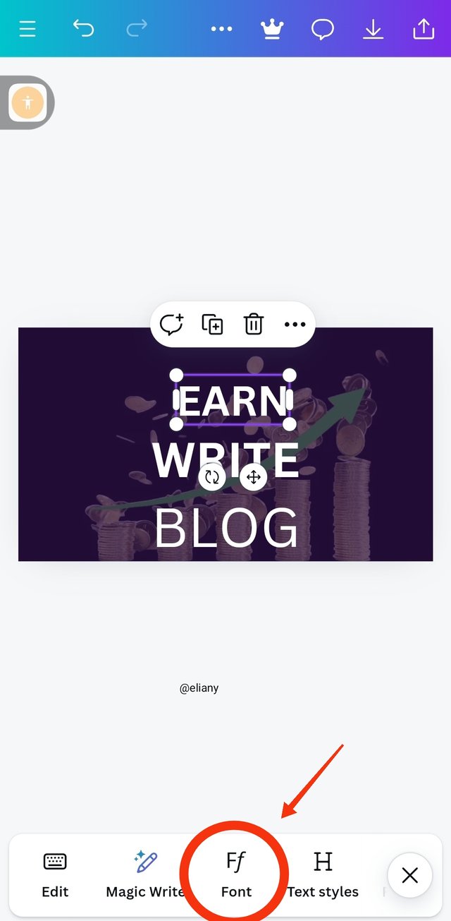
Step 5; choosing typeface
 1 1 | 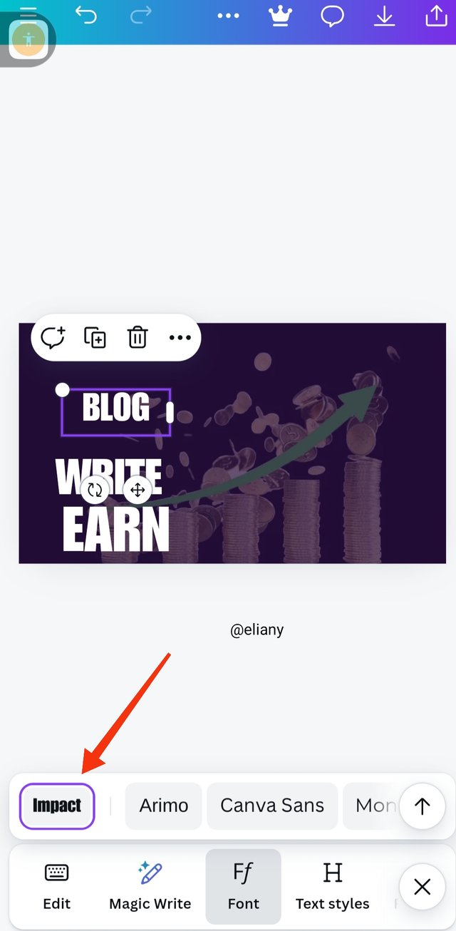 2 2 | 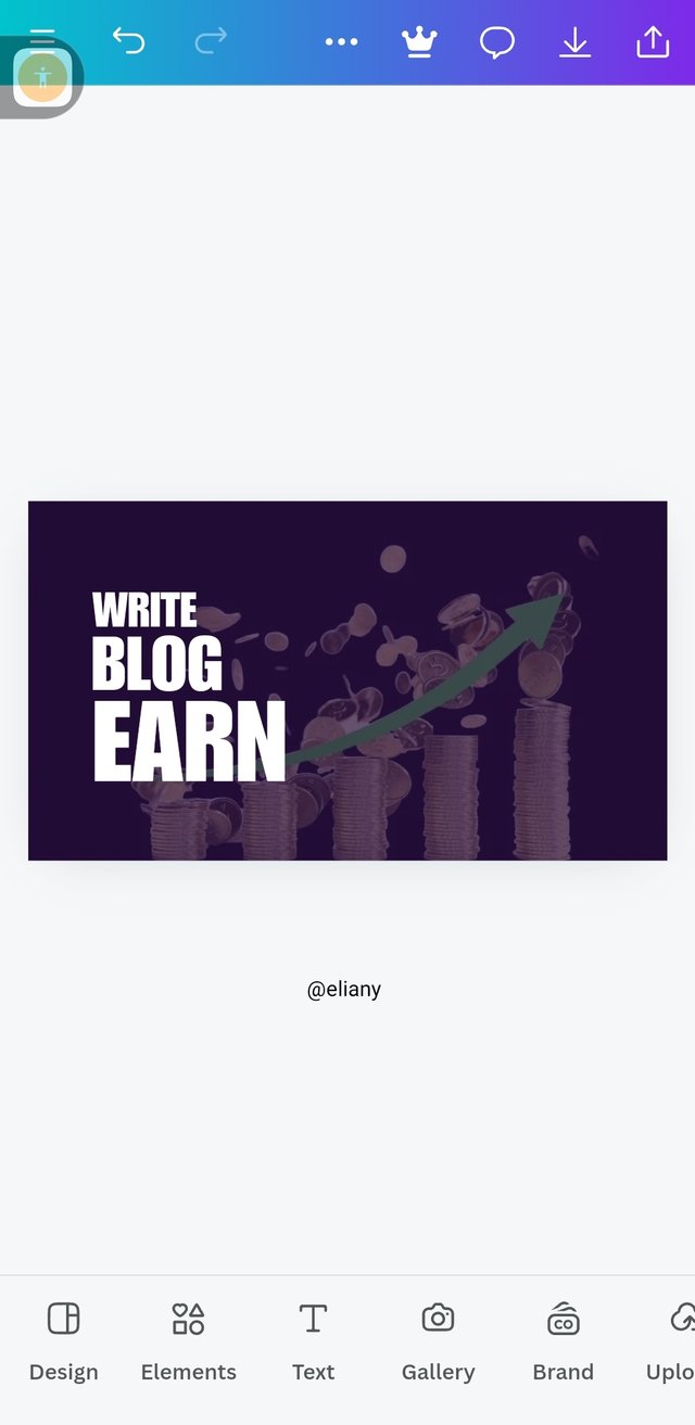 3 3 |
|---|
I clicked on font
Choose impact as my type face
The principle of hierarchy is shown here.
Step 6; addition of element
 1 1 | 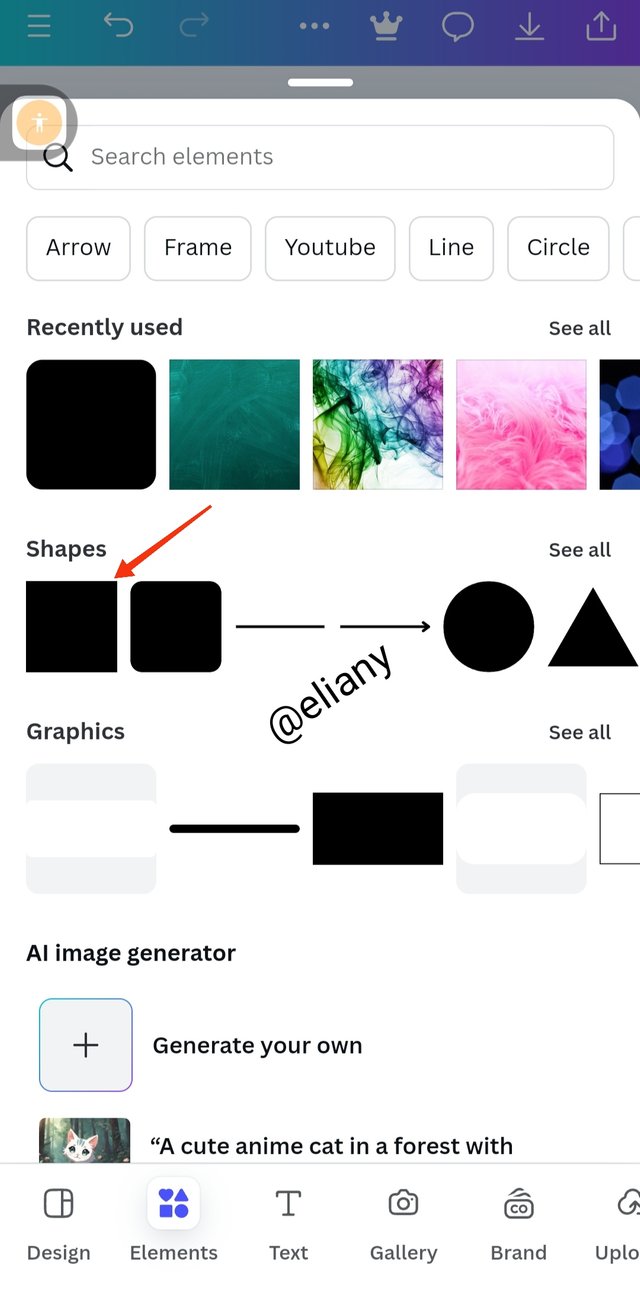 2 2 | 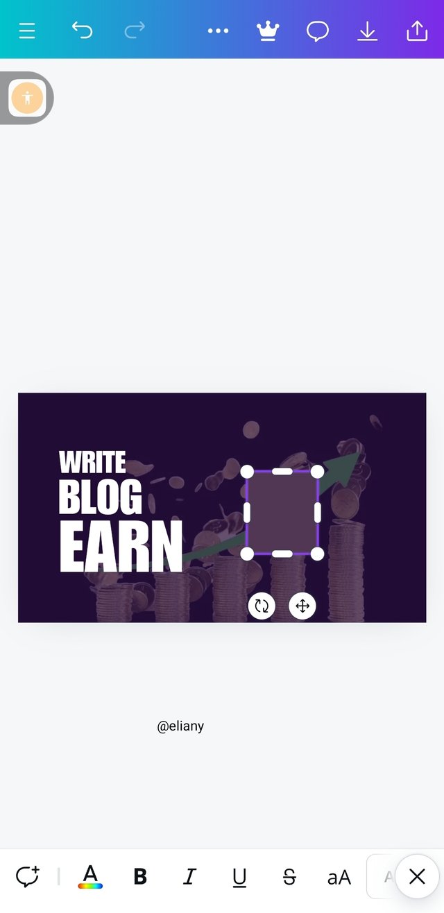 3 3 |
|---|
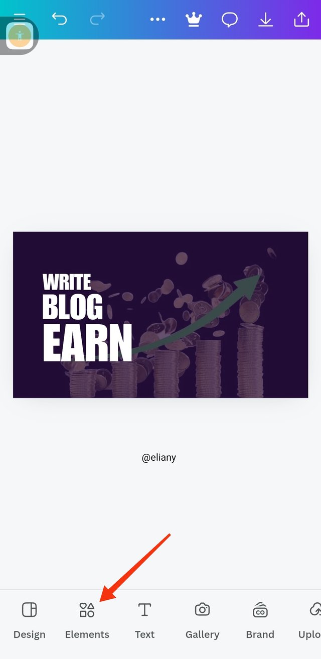
That's the final look of my arrangement, then I selected the element icon to pick elements needed for my design
I selected a square.
Highlighted the elements and drag it to give my desired and fitting shape for the design.
Step 7; adjusting of element and applyimg colour to test
 1 1 | 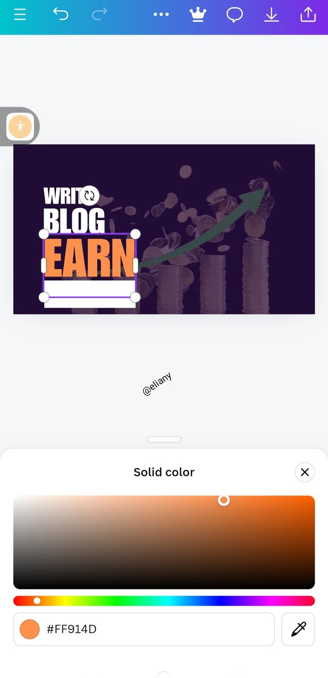 2 2 | 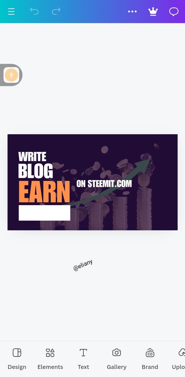 3 3 |
|---|
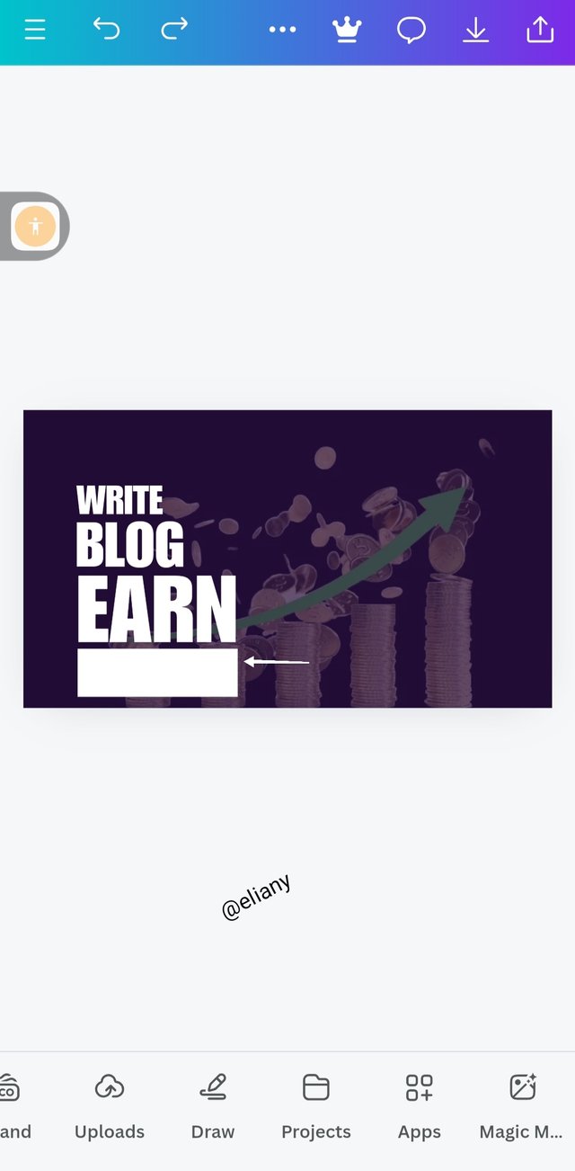
After getting the shape, I placed it below my text then make sure it maintain the principle of heirachy and Alignment.
Then I applied the principle of emphasis, by changing the colour given on "EARN" to orange colour thus, my viewers would pay attention to this word. I used hex code as seen to select preferred colour.
An Introduction to another sentence which is "ON STEEMIT.COM" this will help my viewers to understand the advert and go on to experiment what they saw. At this point the sentence is not yet complete but let's go further.
Step 8; Applying colour to text and adding of image
 1 1 | 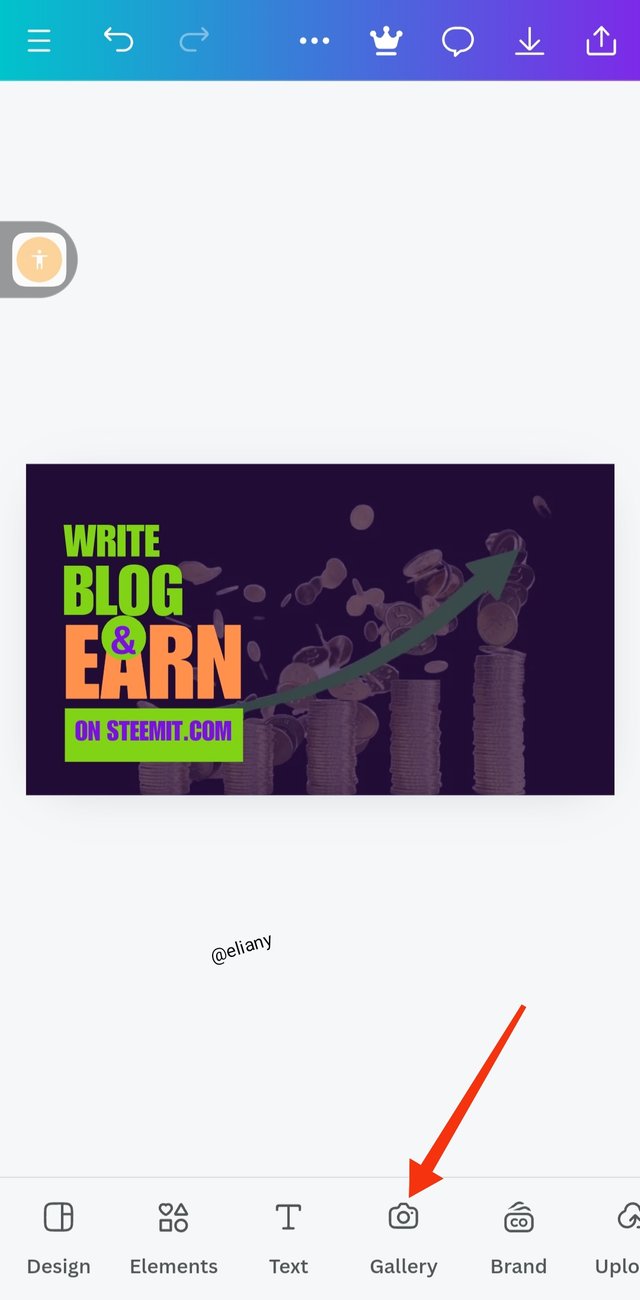 2 2 | 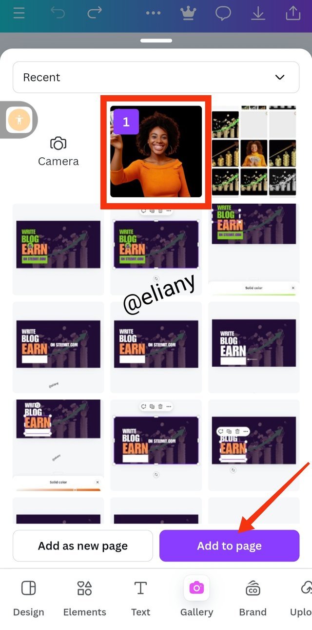 3 3 |
|---|
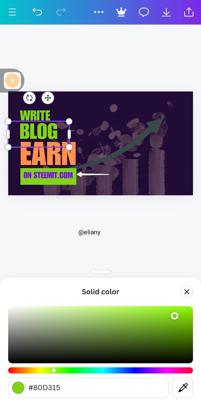
I placed the text on the rectangular elements as seen in image 1 above, I used impact as typeface. I also changed my text colour to green see the hex code above. Changed some text to purple colour and that's makes my work have a triadic colors which I choose from the colour scheme.
To complete my sentence so it can make sense and give out meaning to the viewers I added "&" At this point, I repeated the process of adding a shape, this time I choose a circle then added the symbol &.
I clicked on Gallery to get photo from my gallery for this design. The image has already been fix for this design. But I've learned to always use remove.bg, to remove background from image for my design
Step 9; adjusting of the image
 1 1 | 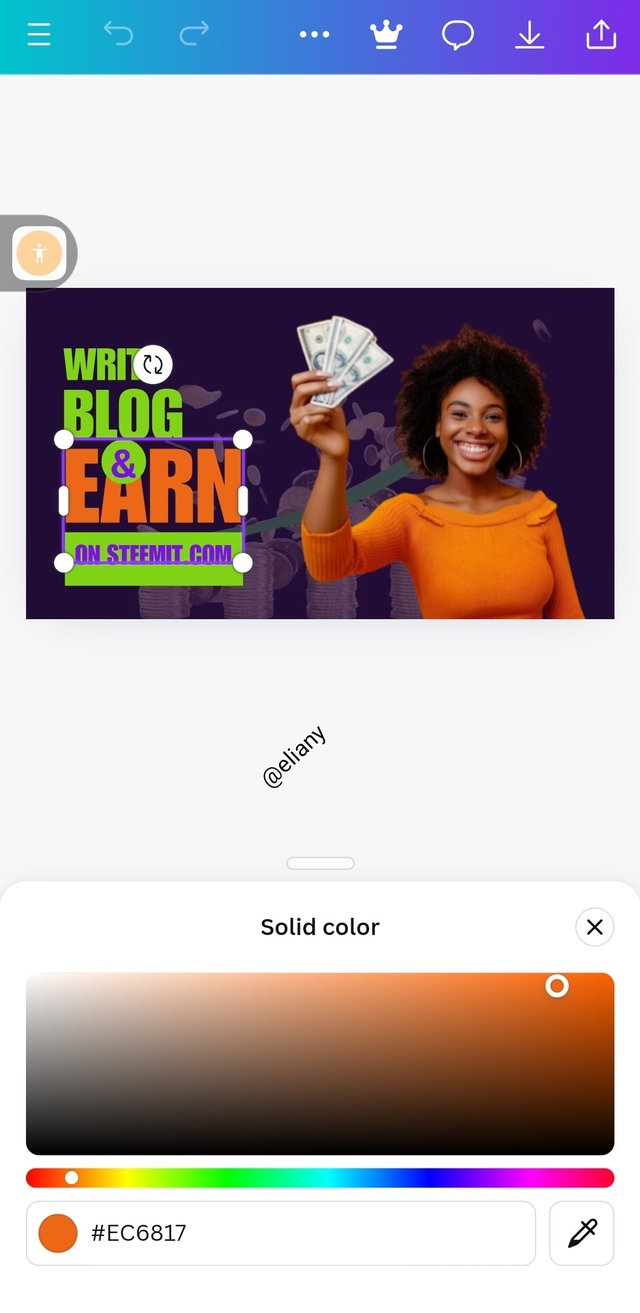 2 2 | 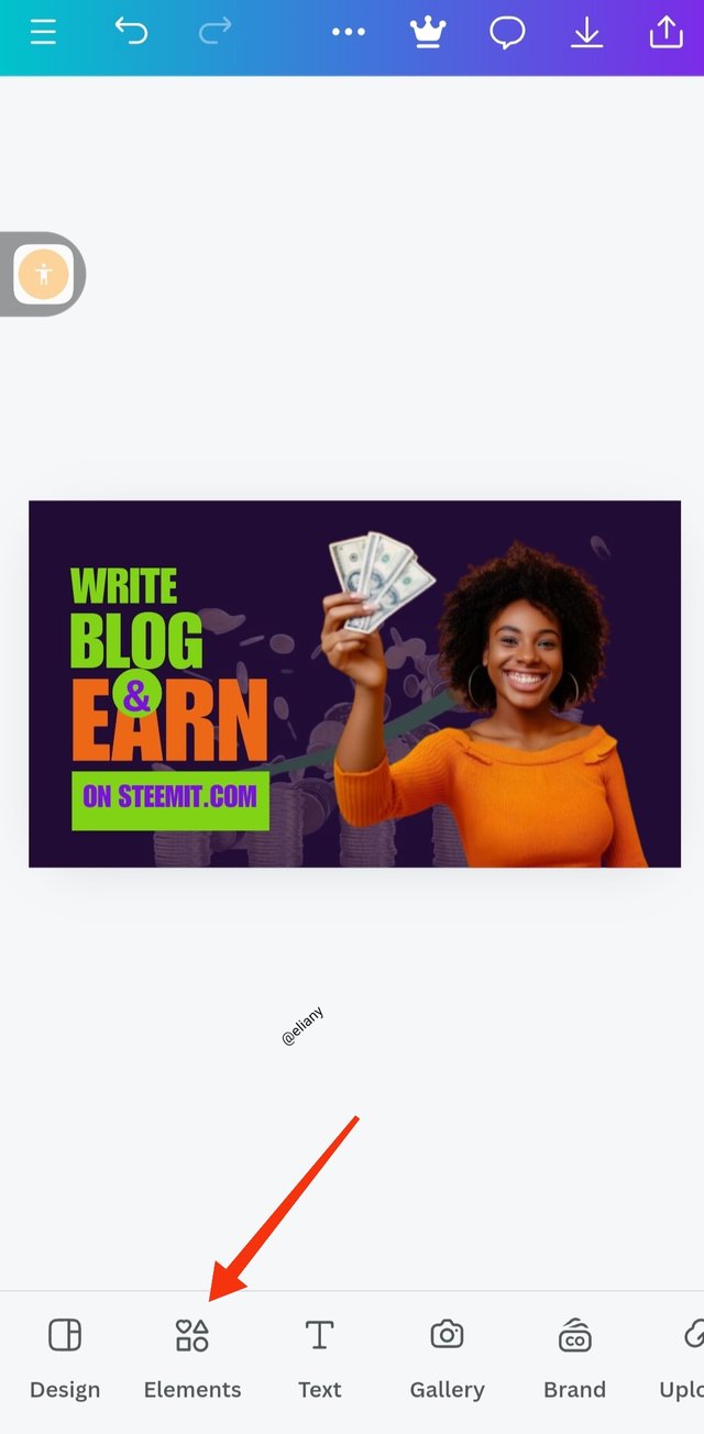 3 3 |
|---|
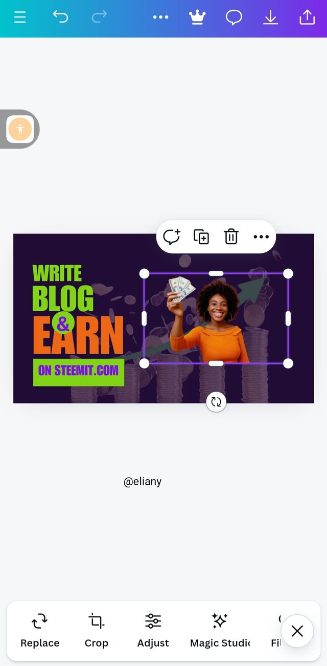
I selected the image and placed it well on the design.
I discover that the image has a different colour from my text so I adjusted the text colour to align with the image own so as not to flaunt my work with unnecessary colours. See the hex codes
I finally achieved a nice position for the image and a suitable matching colours. I proceeded to add an element to make the image stand out.
Step 10; Applying element
 1 1 | 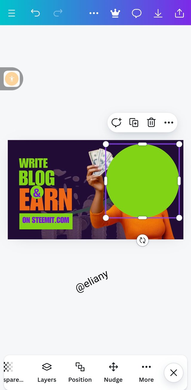 2 2 | 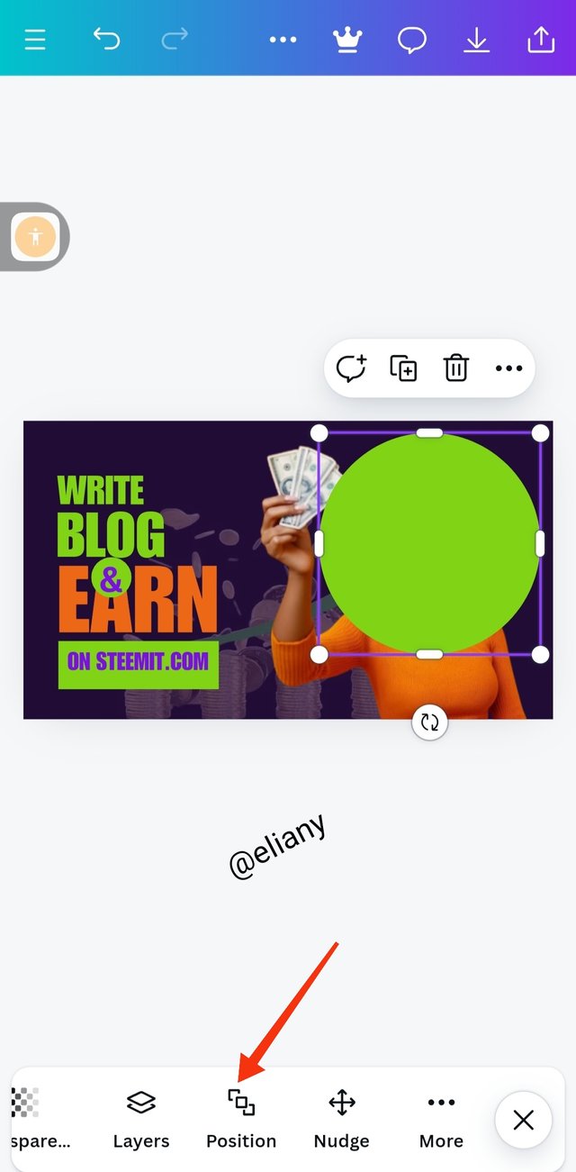 3 3 |
|---|
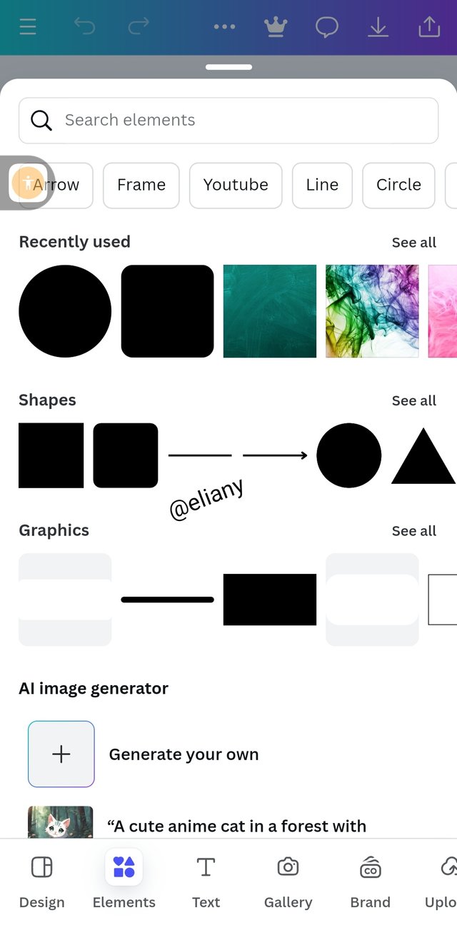
I selected a circle
Adjust d it to fit well on the image to a point I needed it to.
Then I proceeded to position the circle at the back of the image by clicking on the position icon as shown in the second image above.
Step 11; Finally process
 1 1 | 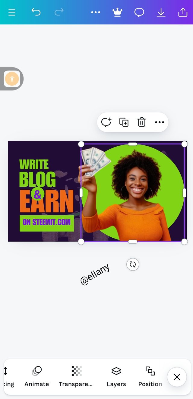 2 2 | 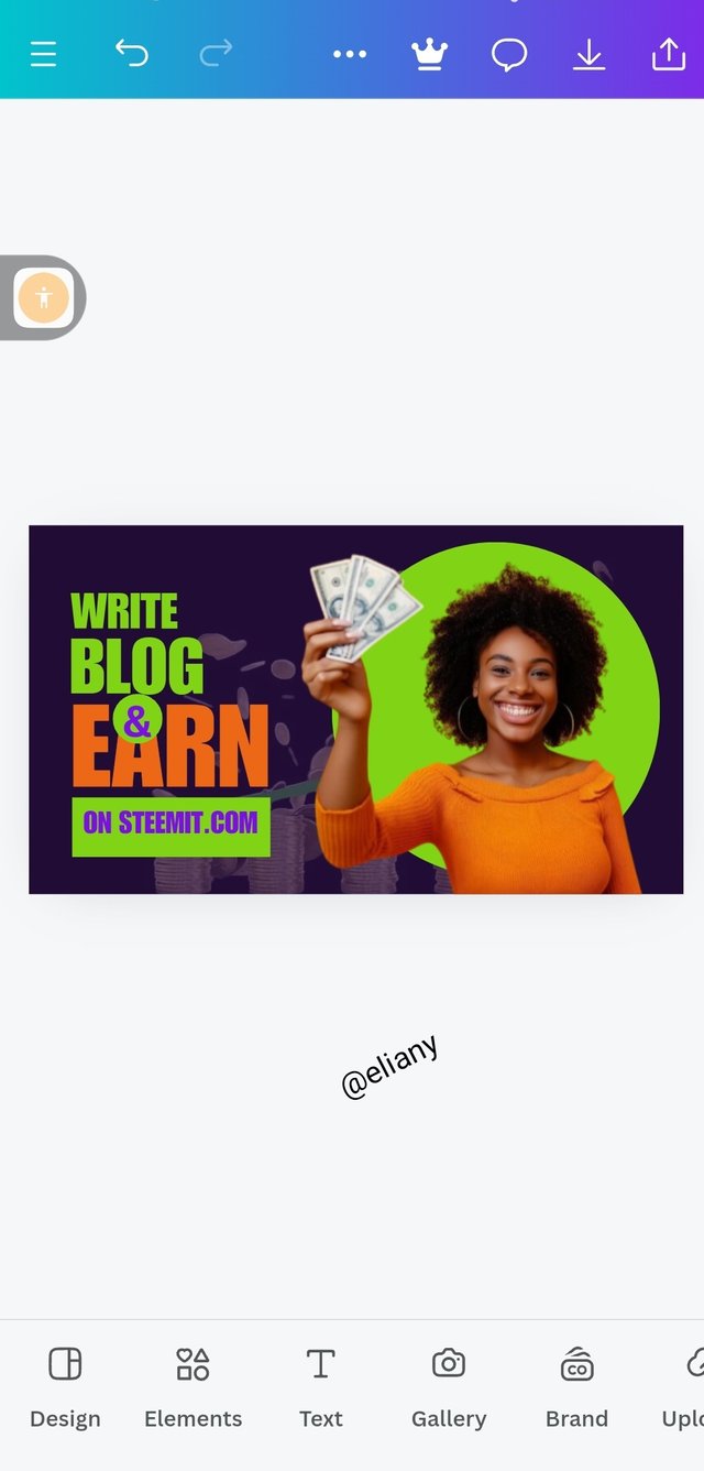 3 3 |
|---|
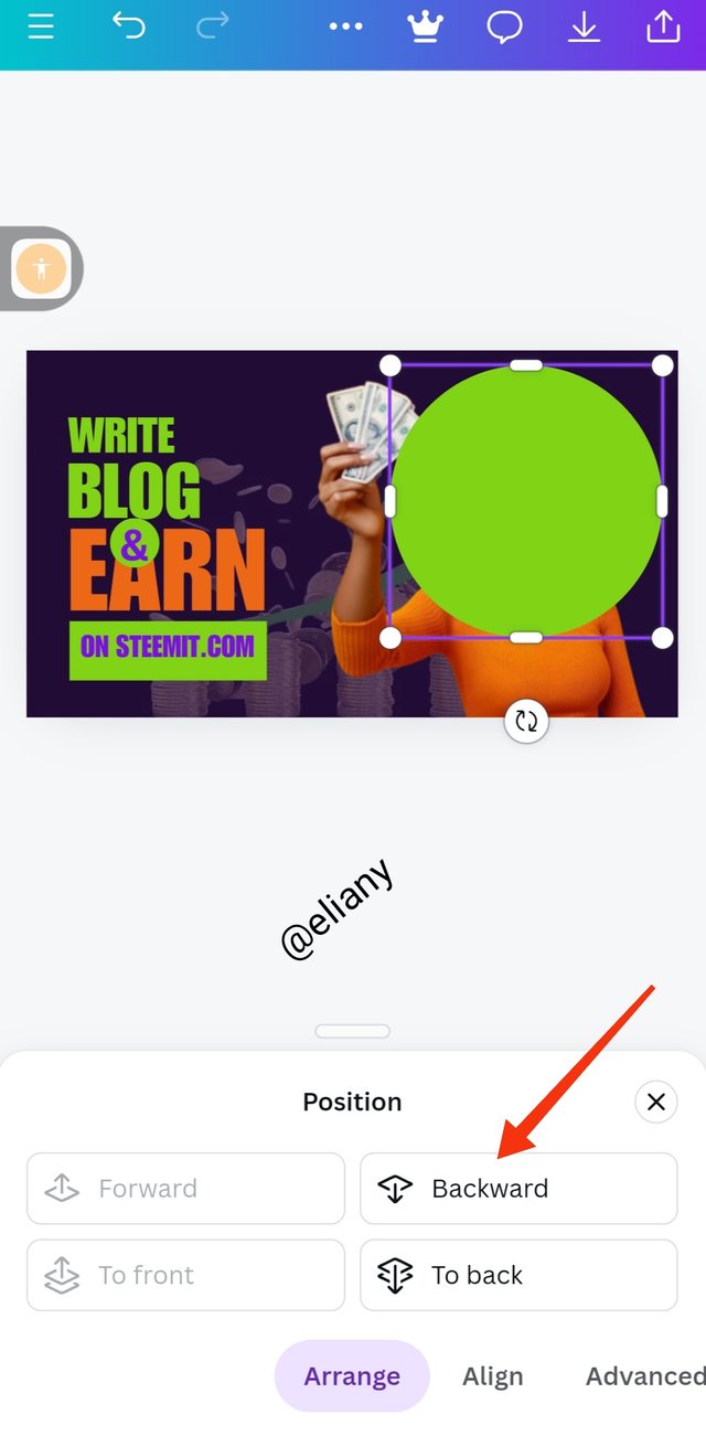
1.It took me to another page that I selected which side I want to position the element, I selected backward because I want the image to show up.
2.I adjusted the element well, and look up for other adjustments to give my final look.
3.My design is finally ready after many hours of learning and practice.
 |
|---|
The experience on it was awesome 👍
I want to invite @wirgo @goodybest and @chant to take part in this contest.

Hello @eliany thank you for participating in this week's lesson. We have assessed your entry and we present the result of our assessment below.
Feedback:
Let me start by commending you for the effort put into this practical work. Weldone. Your result is cool, It's obvious you attempted following me right from top to bottom and I appreciate. I would just point out few things you need to adjust on subsequently.
What could have inspired your colour choice? I thought within myself, it's not bad a choice...smiles. Another thing I want to comment on is that your text element should have increased a bit to level up with the height of your circle effect although they would both be too close to the top, alternatively you can reduce or move down the circle...I always advice one leave a significant space at every edges so that one's design can remain intact even if it goes through a printer.
In all, you did beautifully well and I must commend your effort. I hope you keep up with the energy level dear student.
Regards
@lhorgic❤️
Oh I'm grateful, I appreciate the corrections, I've taken note of it.
Hahaha I followed every step to learn I just think that doing that will help me get exactly the steps of how you do it and I did it.
This comments make my day I'm so happy It shows that my teacher really appreciates the effort I put to learn and it motivates me to learn even more.
You know I miss those days in skillshare where you usually teach graphics design and I'm happy it's up again.
Thank you for your suggestion on my design I just corrected it and I like you to take a look at it to see if this is what you actually mean.
That's for the colours I don't know what actually inspired me but I think I like the colour combination.
Thank you so much for replying.
Oh really, you remember those days, it been over two years o.. wao! How time flies, am glad I could do again on the platform what I know to do and thanks for being part of the journey so far.
I'm grateful 🤗
Congratulations for bringing a quality post, you have earned a positive vote from team 2 and it is delivered by @pandora2010.
Many Blessings...🙏🏻
Your detailed step by step process in achieving this design is well explained and understood. I like your color combination. Well done and success in the contest!
Oh I'm grateful 🤗🤗🤗