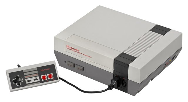
Two Buttons And A Lot Of Fun: The Simple Design Of Nintendo That Kept Us Entertained
Don't get me wrong I like my buttons. And new controllers come with a lot of them. There is the X,O, triangle and square on the playstation controller, plus the R1, R2, L1, L2, and you can click in the thumb sticks to use those as buttons. Then you had the directional pad, which if it wasn't used for movement, guess what, four more buttons. You would not think you would not need all these buttons but modern games utilize them all. Take an FPS for example, you have a button to jump, one to aim, one to run, one to shoot, one to crouch, one to switch your weapon, one to use equipment, one to melee, and one to use your killstreaks. It sounds crazy but when you get use to it, it really feels natural. But Nintendo only had two. This might have limited it in ways that hindered it from making more complex games, but they still managed to hold our attention.
Let's talk about how these buttons were used. Take a big part of the Nintendo line-up, the side-scroller. This was a starting point for a lot of games. Super Mario was the first. You used one button to jump and one to run. If you got fire power then the run button also was used for that. That was it. And you know what, it was awesome. It made the game simple and accessible. The goal of the game was to go straight (literally) to the end of the level. And with only two buttons you were in the game in seconds. It was simple but fun. And challenging. The original Mario, even if you use warp pipes, is still a pain to beat. You had to master the run and jump and be able to react quickly as bad guys tried to take you down with their hammers. It required two things from the player, timing and reflexes, and those two, or even one, if engaged correctly is enough for a fun game.
But that was from the player side. Think of all the great design elements that came from developers because they had to work with only two buttons. When you only have so much to work with you start to get creative. Mario 1 had a mushroom that made you go big, a star that made you invincible and a flower that gave you the power to shoot fireballs. Cool. But by Mario 3, you were flying, jumping around in a frog suit, throwing hammers and boomerangs. And they added a world map with level select on it. This was still with just two buttons. Other games too brought more and more to the table. Mega man 1-6 all had different stages and robot master design. They created different weapons for each robot and you use them all be selecting them to one button. And where these games really shined was the level design. You are running, jumping and shooting. These developers had to design worlds that felt from game to game. Yet no one confuses Contra with Mega Man with Mario with Kirby with Metroid. They all are great games that pushed the imagination and they all worked with simple controls .
Buttons are great. And they may be needed for games that have the depth to be competitive enough for esports. But look at Rocket League, that is getting pro league buzz and it is a pretty simple mechanic.
How do you feel about so many buttons for a game?
*my upvotes/rep disclaimer: https://steemit.com/steemit/@whatageek/my-steemit-account-where-i-stand-on-bots-self-votes-and-multiple-account

whatageek, I must say I've started to read a lot of your stuff, and Im loving the Nintendo post. I grew up on the NES, but X-box 1 and its button lay out seems to work for me. Awesome post.
Thanks @carterx. Yeah the xbox controller is pretty sweet. They do a great job adding a lot of buttons and still keeping it manageable for players.
Memories! Great nostalgic feeling!
I spent many hours on my NES
Nintendo is and will forever be a classic console. It what started it all. After the gaming crash in the 80's, Nintendo revived the market by making this gem!
They really did bring gaming home in a big way, it would not be the same without them.
This post has been ranked within the top 80 most undervalued posts in the first half of May 14. We estimate that this post is undervalued by $7.95 as compared to a scenario in which every voter had an equal say.
See the full rankings and details in The Daily Tribune: May 14 - Part I. You can also read about some of our methodology, data analysis and technical details in our initial post.
If you are the author and would prefer not to receive these comments, simply reply "Stop" to this comment.
I remember coming from the single button controllers of the Atari 2600 to the NES and it was definitely confusing at first. Especially considering the graphics upgrade the NES represented.
Thanks for bringing back some awesome memories man.
Love my nintendo NES!
You and me both.