Eye4art Logo Contest entry
-1.png)
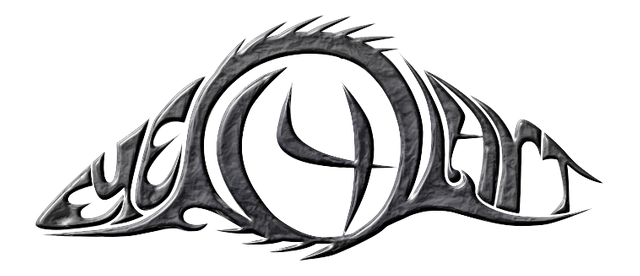
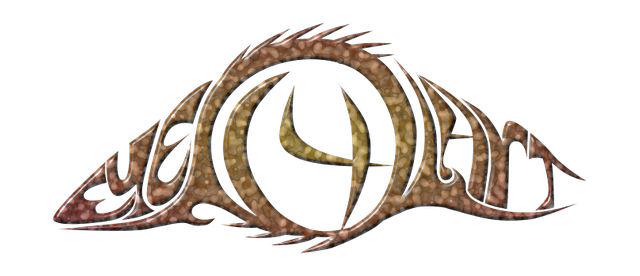
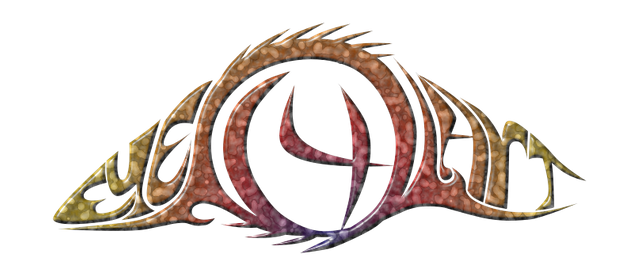
Eye 4 art logo design is based on the shape of the eye formed by a custom made unique typography made for it. The center is a spherical shape followed by the number 4 as an iris.
I visualize it this way because I want it to have a smooth flow, trapping the number four in the sphere, while giving it the wave eye shape.
The idea behind it is to utilize everything as a whole, where the whole is the eye shape.
This logo can be so versatile that all types of art can be adopted under it and none has to be left aside. A simple organic logo with a an eye that will capture it all.
This my entry to the logo contest by @eye4art. Thank you for stopping by.
Some logo variations
Aqua blue smooth with bevel

Texturized gray with bevel

Marbled orange smooth variant with bevel

Multi-color smooth variant with bevel

Plain black

Animated gif


Wow, really great job on this, captures the word and eye shape beautifully. I don't even know how or what Eye4art is but now I want a sticker from them with this logo. Gray is my favorite but I love all the options. What program was used in the making of this piece?
Thank you very much! @cryplectibles I use a vector program called inkscape and you can download it for free. Works on both mac's and pc's.
Sweet! I just recently got that program too (month or so ago) as an add on to an open source video editing tool, I am just now grasping it is just it's own full on program. Love the open source communities.
Yeah! Open source programs are awesome.
This post was spotted by @theluvbug and has received a 100% upvote and a resteem.
If you would like to possibly receive future support from @theluvbug
then please make use of the #theluvbug tag.
Spreading the STEEMIT LOVE with upvotes and resteems of AWESOME Steemit content. Use #theluvbug to get my attention :)
In Proud Collaboration with @steemitbloggers
and their founder @jaynie
interested in joining the Steemit Bloggers Community?
Thank you!