You are viewing a single comment's thread from:
RE: What vote weights do you use when up-voting content?
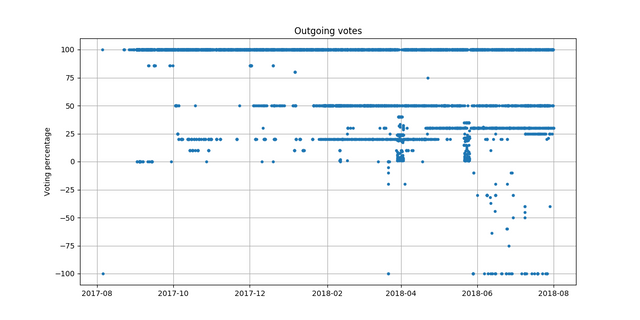
I prepared a different kind of vote % visualization for my steemiversary post but didn't use it at the end:
This should already suggest how the pie chart will look. Hit me with your graph! :)
Pressure is on now to represent your chart with a pie!
Looks good to me. The ranges (required for a pie) give clues, your chart shows the exact weight and gives a reasonable representation of the number/% at each weight.
Should have left it to the master ;)
Thanks, seems to fit pretty well! The pie chart shows the distribution of vote % better than the scatter plot. The scatter plot gives a bit of time information.
Seems like I should find a use case for 70-80% votes :)
I don't have a single 80-90% vote cast this year - might as well for for the full monty!
@abh12345 @crokkon
.
.
.
.
Nerds.
Hmm, that didn't happen for the first time - should I be worried?
I take it as a compliment, thanks! ;)
My pie looks like a 5 year olds work compared to the plot graph. Thanks though!