Making an dynamic heat map
Dynamic heatmaps are great examples of beautiful data visualization. Normally a heatmap shows the density of an observation in a precise moment of time.
A dynamic heatmap instead, will show you the density of the observation in time and how it will evolve. That means that a dynamic heatmap can show you how the density moves inside your observation space. This way you can understand much better the phenomena studied.
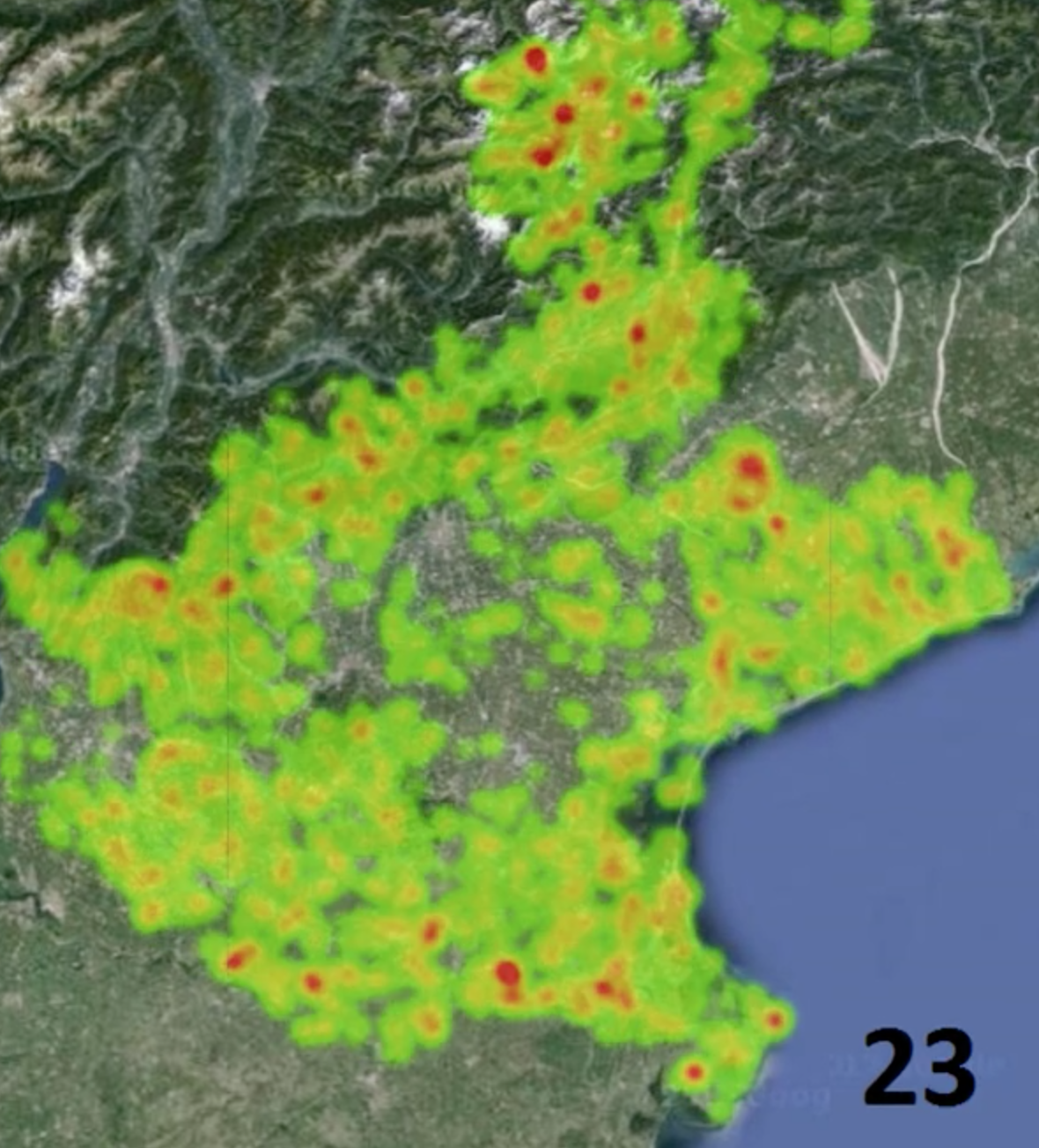
For example the dynamic map below shows the number of traces from Flickr users making pictures in different locations of Veneto county, Italy. By aggregating these data by hour it is possible to make one heatmap for each hour of the day from 00 to 23.

Then inserting those heatmaps in a video and adjusting the speed of presentation you have a dynamic heatmap. In this case it shows how during the different hours of the day -the black number at the bottom right- the Flickr users move from the city center to the suburbs.
Have a look at it in Imgur.
Hellooo how's your day..
Hey, good :-) How about yourself ?
@datatreemap You have received a random upvote from @looktothefuture because this post did not use any bidbots.
If you use the the #nobidbot tag as one of your five tags on future posts, you may be selected for a random upvote from @transparencybot.
I see! Well thanks then :-)