You are viewing a single comment's thread from:
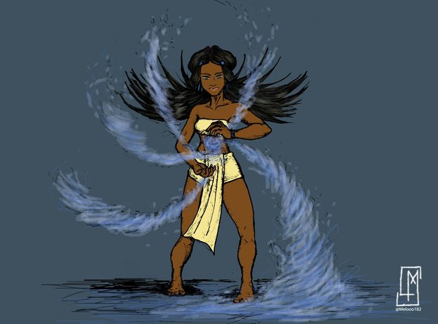
RE: 🎨 Art Posting / Character Design Challenge KATARA redesign ✏️💧🌀
This is really good!
Kinda hard to find amongst all those resteems (not that I'm complaining).
I think the blue background is a little too heavy.
Thanks @zeroooc! 🙂

better?
I may keep working on it 😛
Way better! You can also try it with a mild green.
Next you can give her some more space and make the element bend out more wildly!
(for example)
Nice Work!