[ESP/ENG] Rebranding @DLIVE (Propuestas/Proposals)
![]()

This design project has us a little nervous, it's the biggest contest we've been in and WOW... It kept us pretty busy the last couple of days.
It is about nothing less than the logo redesign of the @DLive web platform. That's right! Its founder and CEO Charles Wayn (@wa7) expressed in this post that he wants the STEEM platform community to participate in the new @DLive branding.
In the same post he said that the Dlive team would like the theme to be Ninjas.
Why do we choose ninjas?
When you look for the word ninja on dictionary.com you will be presented with the definition of “a person who excels in a particular skill or activity.” I could not think of a better definition to describe what the DLive content creators and viewers represent.
In addition to some graphic reference to the Ninja theme, he mentions that the color yellow must be present in any proposal.
Without further ado we will present you the Logo design proposals for @DLive platform:

Este proyecto de diseño nos tiene un poco nerviosos, es el concurso más grande en el que hemos participado y WOW... Nos ha tenido bastante ocupados este último par de días.
Se trata nada más y nada menos que el rediseño de la plataforma web de @DLive. Así mismo! Su fundador y CEO Charles Wayn (@wa7) expresó en este post que desea que la comunidad de la plataforma de STEEM participe en el nuevo branding de @DLive.
En el mismo post expresó que al equipo Dlive le gustaría que la temática fuese de Ninjas.
¿Por qué elegimos ninjas?
Cuando busques la palabra ninja en www.dictionary.com se te presentará la definición de "una persona que sobresale en una habilidad o actividad en particular". No podría pensar en una definición mejor para describir lo que los creadores de contenido y los espectadores de DLive representan.
Además de alguna referencia gráfica alusiva al tema Ninja, menciona que el color amarillo debe estar presente en cualquier propuesta.
Sin más preámbulos les presentamos las Propuestas de diseño de el logotipo para la plataforma @DLive:
SKETCHES
This design process began like many others, with a sheet and a pencil. The letter D always stands out and is also the centre of attention and the word "Live" being a complement to it. For the development of all the proposals we used the golden proportions of the circle/circumference.
We couldn't decide on a single proposal, so we developed ALL of them.
BOCETOS
Este proceso de diseño empezó como muchos, con una hoja y un lápiz. La letra D consideramos que siempre sobresale y que además es el centro de atención, la palabra "Live" Vendría siendo complemento de la misma. Para el desarrollo de todas las propuestas utilizamos las proporciones áureas del círculo/circunferencia.
No logramos decidirnos por una sola propuesta, así que las desarrollamos TODAS.

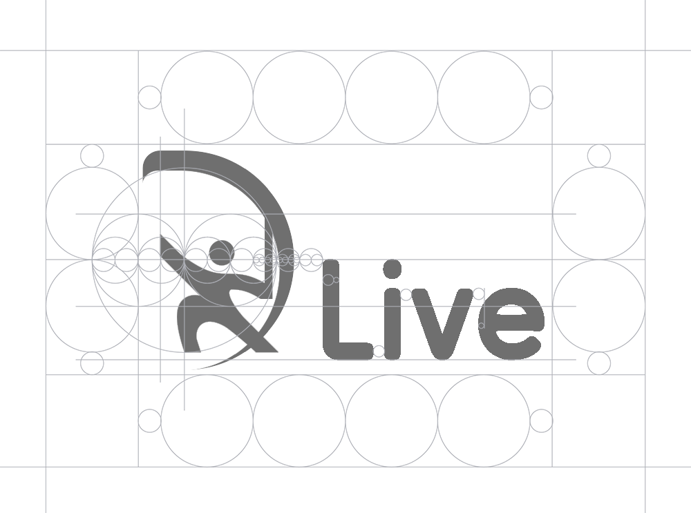
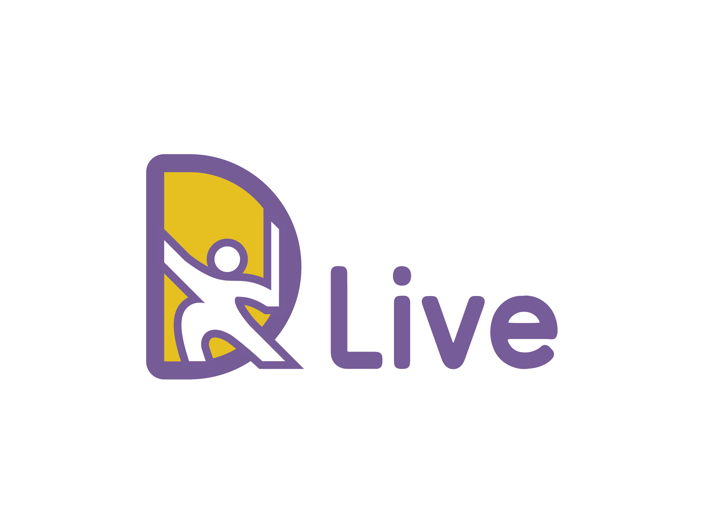
PROPOSAL 1/6
It is a graphic representation of a ninja face, we convert it into a D letter and add the characteristic ninja ribbons behind it.
PROPUESTA 1/6
Es una representación gráfica de una cara ninja, la convertímos en una letra D y agregamos las características cintas de ninja detrás.


PROPOSAL 2/6
This is also a graphic representation of a ninja face that we converted into a letter D, but this time it is stealthily peeking out horizontally to form the letter D.
In the sketch it has happy eyes but we thought it was too cute to be a ninja so we left it with a neutral look more appropriate to the subject.
PROPUESTA 2/6
Esta también es una representación gráfica de una cara ninja que esta vez esta sigilosamente asomándose de manera horizontal formando así la letra D.
En el boceto tiene unos ojos como de felicidad pero nos pareció demasiado lindo para ser un ninja así que lo dejamos con una mirada neutra mas adecuada al tema.


PROPOSAL 3/6
This proposal was not very clear either in the sketch or in the computer, yet we gave it several opportunities until we got something within the functionality and aesthetics we were looking for. A ninja ready for streaming.
PROPUESTA 3/6
Esta propuesta no estuvo muy clara ni en el boceto ni en la computadora, aún así le dimos varias oportunidades hasta que obtuvimos algo dentro de la funcionalidad y estética que buscamos. Un ninja listo para un streaming.

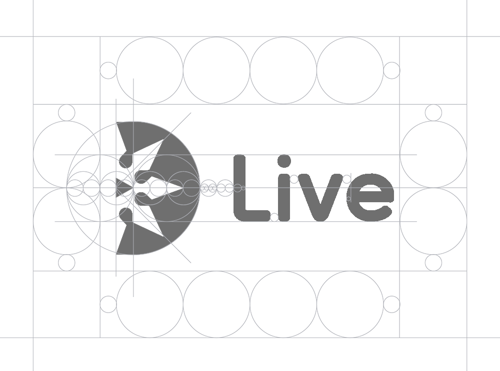
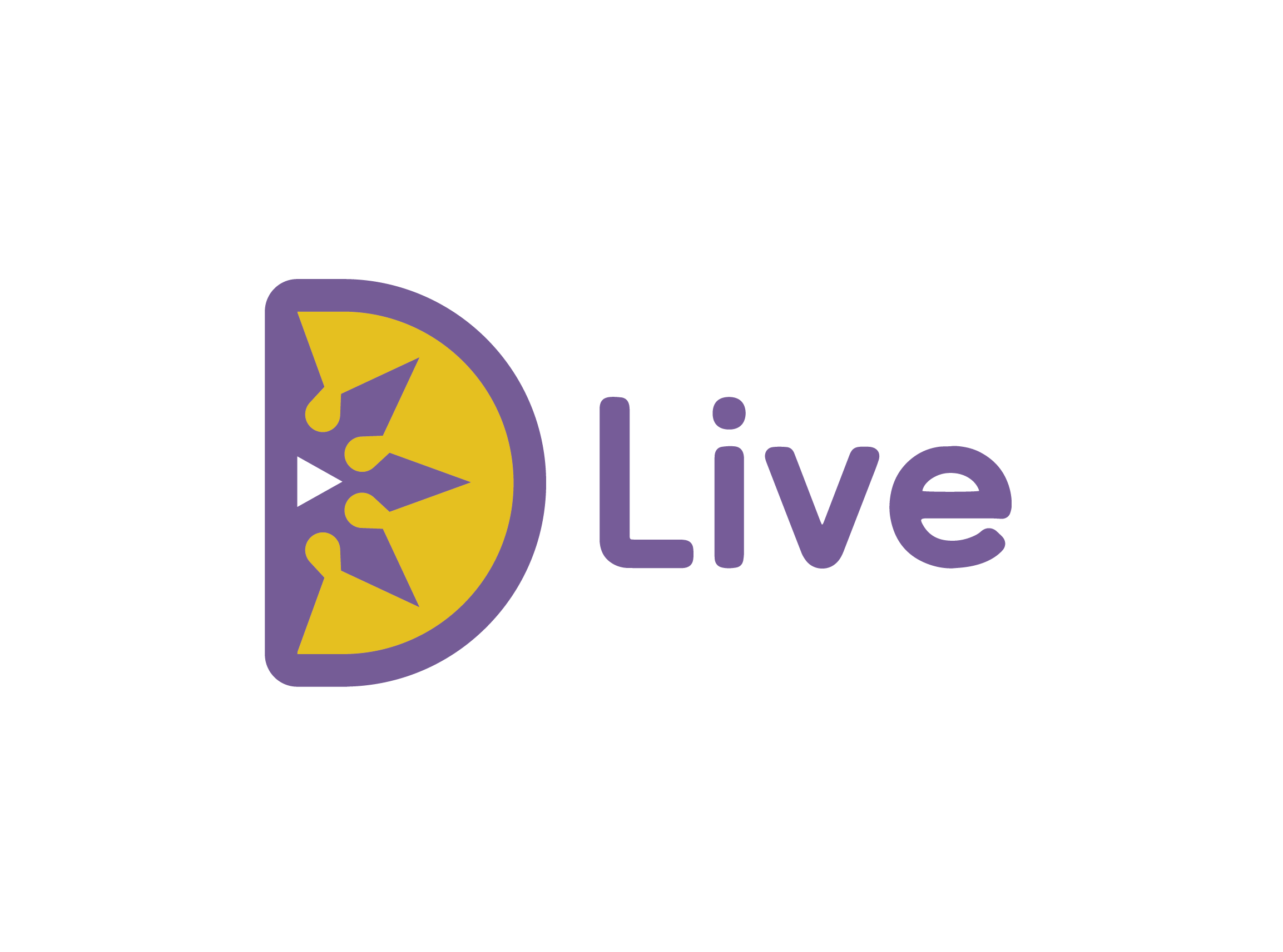
PROPOSAL 4/6
The following is the only proposal that does not graphically represent a ninja but if one of its most recognizable elements.Nope... It is not a Japanese sword (Katana), it is a ninja star (Shuriken).
Due to its circular and radial proportions, it was perfectly contained within the letter D. In turn, we added a triangle in the center making it similar to the symbol of Play.
PROPUESTA 4/6
La siguiente es la única propuesta que no representa gráficamente un ninja pero si uno de sus elementos más reconocibles. Nope... No es una espada Japonesa (Katana), es una estrella ninja (Shuriken).
Por sus proporciones circulares y radiales quedó perfecta contenida dentro de la letra D a su vez agregamos en el centro un triangulo haciendo semejanza al símbolo de Reproducir.

PROPOSAL 5/6
We left our two favorites for the end, as well as the first proposal consists of a graphic representation of a ninja face that we converted into a letter D but this time implicitly (as we like to do it) the opening of the eyes of the ninja is a triangle making similar to the symbol of Play.
In the end we discarded the ninja ribbons behind the head, the logo is so explicit and yet so simple that we didn't think it looked right.
PROPUESTA 5/6
Dejamos para el final nuestros dos favoritos, así como la primera propuesta consta de representación gráfica de una cara ninja que convertímos en una letra D pero esta vez de manera implícita (como más nos gusta hacerlo) la apertura de los ojos del ninja es un triangulo haciendo semejanza al simbolo de Reproducir.
Al final descartamos las cintas de ninja detrás de la cabeza, el logo es tan explícito y a la vez tan sencillo que no nos pareció que quedaba bien.


PROPOSAL 6/6
Last and second favorite, a logo just like the others contained in a letter D. This is our favorite proposal because it is as minimalist and simple as the others but has that spark of illustration that characterizes us for developing with only some simple lines and shapes very recognizable and functional concepts.
PROPUESTA 6/6
Último y segundo favorito, un logotipo justo como los demás contenido en una letra D. Esta es nuestra propuesta favorita debido a que es igual de minimalista y sencilla como las demás pero tiene esa chispa de ilustración que nos caracteriza por desarrollar con solo algunas lineas y formas sencillas conceptos muy reconocibles y funcionales.


Here you can see and compare all the logos together, we also took the opportunity to talk about our selection of colors and why we made concepts so similar to the current one.
Acá pueden ver y comparar todos los logotipos juntos, igualmente aprovechamos para hablar de nuestra selección de colores y sobre por que hicimos conceptos tan similares al actual.

About the colors, yellow was part of the rules of the contest and by the way we love the color, it is extremely versatile on light and dark backgrounds if you use the correct tones, and it stands out a lot on any type of screen, even if it is small.
With regard to concepts, a "redesign" or "rebranding" does not always mean "a clean slate", when a brand is already established and recognizable by its users it is not always a good idea to do everything from scratch with a totally different graphic concept.
@DLive is already a platform clearly recognized by its users, that's why we decided to keep the layout of the logo elements, the letter "D" and the word "LIVE", we also use the purple/purple color of the current @DLive branding which by the way is the complementary color of yellow in the color circle so they match perfect.
Sobre los colores, el amarillo era parte de las reglas del concurso y por cierto nos encanta el color, es extremadamente versátil sobre fondos claros y oscuros si se usan los tonos correctos, además resalta muchísimo en cualquier tipo de pantalla así sea pequeña.
Con respecto a los conceptos, un "rediseño" o "rebranding" no siempre significa "borrón y cuenta nueva", cuando una marca ya está establecida y es reconocible por sus usuarios no siempre es una buena idea hacer todo desde cero con un concepto gráfico totalmente diferente.
@DLive ya es una plataforma claramente reconocida por sus usuarios, es por eso que decidimos mantener la disposición de los elementos del logo, la letra "D" y la palabra "LIVE", también usamos el color violeta/morado del branding actual de @DLive que por cierto es el color complementario del amarillo en el círculo cromático de colores así que combinan perfecto.
BOOM!
Thank you for reading us, thank you @johnstone and @derangedvisions for letting us know about this contest, thank you @dlive team for giving the community the opportunity to be part of this great project. Needless to say, ifwe win e are totally willing and available to develop more elements of digital branding for web and networks as well as for physical use.
Greetings!
-V&W
¡BOOM!
Gracias por leernos, gracias @johnstone y @derangedvisions por avisarnos de este concurso, gracias equipo @dlive por darle la oportunidad a la comunidad de formar parte de este gran proyecto. Está de más decir que de ser ganadores estamos totalmente dispuestos y disponibles para desarrollar más elementos del branding tanto digital para web y redes como para uso físico.
¡Saludos!
-V&W
If you want to use any of our products you can do it with the only condition that every time you do it you mention us (@themonkeyzuelans), it would be great if you can mention that they can contact us by Discord @themonkeyzuelans#9087.
@themonkeyzuelans#9087.If we've already designed something for you, we'd love for you to do it, if you don't already do it, thank you for trusting us.
Anyone who wants some great designs just contact us through Discord @themonkeyzuelans#9087 where we are always online and ready to work.
@themonkeyzuelans#9087 where we are always online and ready to work.Si deseas usar alguno de nuestros puedes hacerlo con la única condicion de que cada vez que lo hagas nos menciones (@themonkeyzuelans), sería genial si puedes mencionar que pueden contactarnos por Discord @themonkeyzuelans#9087.
@themonkeyzuelans#9087.Si ya hemos diseñado algo para ti, nos encantaría que lo hagas, si es que ya no lo haces, gracias por confiar en nosotros.
Cualquiera que desee algunos diseños geniales sólo contactese con nosotros a través de Discord @themonkeyzuelans#9087 donde siempre estamos en línea y listos para trabajar.
@themonkeyzuelans#9087 donde siempre estamos en línea y listos para trabajar.
Toda la información, los textos, el relato, las imagenes y fotos, donde no se especifique lo contrario, son de nuestra autoría y propiedad
iPod Touch 5, iPhone 5, BLU R1 HD, Nikon Coolpix P520, GoPro Hero 3+, Sony Alpha300
Diseño de Logo y Firma por @themonkeyzuelans como Multitakers
iPod Touch 5, iPhone 5, BLU R1 HD, Nikon Coolpix P520, GoPro Hero 3+, Sony Alpha300
Diseño de Logo y Firma por @themonkeyzuelans como Multitakers
Wow...impressive work! Nicely done!
Hello William and Victoria, @themonkeyzuelans Cool! 6 different logo proposals. I wish you'll be among those 3 who will go to the next tour. And big thanks for mentioning my steemit name in this post!
These are fantastic, I think I like number 1 the best because it looks like a Ninja mask. Good luck with the contest.
#thealliance #witness