Contest Entry - Minimalist Logo for Tau
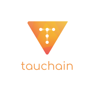
A logo to represent Tauchain
As some of you might know, @kevingwong passed on the contest from Reddit where all designers are called to participate to redesign the logo of both Tauchain and Agoras.
It took me some time to come up with something which I was satisfied with after I tried focussing more on underlying meanings when I chose shapes and colours.
Tau is a blockchain platform that will allow for on-the-fly logical consensus detection which enables it to scale some of the largest bottlenecks to human advancement including social governance and knowledge creation.
By using a self defining and decidable logical framework, Tau is the first in this space to be able to gather data voluntarily submitted by its users and logically deduce valuable knowledge over a network secured with blockchain technology.
What this means is that in effect, we can scale collaborative endeavors between thousands of mathematicians, doctors, computer scientists, engineers and other experts to greatly accelerate the production of knowledge.
Tau aims to become an indispensable technology. Once Tau has launched, any company, nation or organization not using the collaborative power of the network will be rendered obsolete.
Eventhough I haven't done much on design lately, I wanted to give this one a shot! For now, I only focussed on Tauchain and will start playing around with a design for Agoras soon.
Below the designs, I will elaborate upon my design choices.
The shape
As you obviously can see the main shape of the logo is a triangle. This shape represents the same shape as the T.
Two rounded corners, one sharp
When you look at the Greek Tau-Symbol, both the left side and the bottom are either crooked or rounded. To minimaltistically bring this feature back, I rounded the same corners of the triangle to make it even more representable as the T. Because of this, this created an arrow icon, pointing to the top right, at the same time, representing an upwards trend.
The 'T'
In the middle of the logo, you can find a T. Or some chains in the shape of the T. The chains represent both Tau and the blockchain in a rough but minimal way.
The colors
As I personally like minimal and flat design, I couldn't go without adding some colors to spark it up. I chose for a gradient going from Orange to Gold.
Orange
Represents energy, stimulation, activity and rejuvenation - focussing on the use of Tauchain.
Gold
Represents respect, rules, loyal, thorough, faithful and caring - focussing on the chain part of Tau.


Track your followers with SPECTACLES

Looks really good. Simple and clean design. Hope ya win 👍🏻👍🏻
this is a good logo, but I think the most recent logo is interesting
love the design dear.
i am missing you all🙁🙁🙁.
the single meet in our life has made us so close....
Really bro missing them so much.
😥
yeah really missing those moments which i had spend with them.