Designing a Public Signage!
Signaling Betterment
For the last few weeks, I’ve been focusing on signage at Herbert von King Park (HvK). Other than a few official labels that it is indeed a New York City park, there isn’t much of anything in the area that explains the history of the cultural asset, shows visitors where to find what, and offer any kind of guidance of how to properly use the park. Of all the potential routes of development in the park, the conservancy leader and I realized that without an easy and cohesive way to tie the park’s story together, any progress forward would be aimless and jumbled.
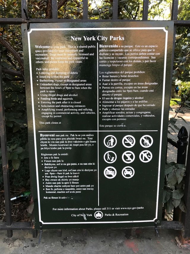
Currently this is the only signage at the Park.
So our first mission became clear - a map and signs for HvK.
Sounds easy right? An map here, a sign there, and a few arrows so people know where they’re headed. But the process turned out to be a great deal more difficult and today I’ll be sharing a bit of the strategy of developing signs in and around STEEM Park.
Major (Dirty) Obstacles
When I met the team maintaining Bryant Park, I asked them what they thought was the key factor to their success compared to other parks of the world.
Their answer was immediate - cleanliness.
As long as their public bathrooms smelled respectable and litter wasn’t dragged around, visitors would enjoy the park. No matter what awesome performances were going on or how many kegs were used at the outdoor beer tent, uncleanliness would ruin all the hard work.
What does this have to do with signage? Well it turns out, signs are the most reliable way to upkeep the desirable use of the park. No littering, no smoking, no loitering, etc. are all achieved with explicit but compelling and non-obnoxious markings.
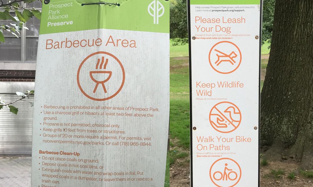
Signages are installed every 5 meters at the Prospect Park, Brooklyn. You constantly have to remind people!
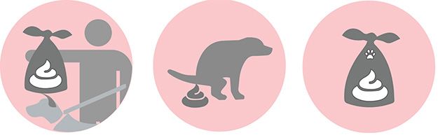
Herbert von King Park, with it’s severe lack of upkeep budget and hired attendees, suffers from lots of litter, lots of dog poop, and lots of improper use of parts of the park. People relieve their pets in areas other than the dog run, kids trample over fenced gardens, and you can tell when a bbq happened on a patch for many days after.
These little communal habits are hard to shake, especially in such a tight-knit and dense community such as Bedford-Stuyvesant. The area is mostly brownstones - beautiful but cramped townhouses split into several apartments. As such, the park becomes like everyone’s collective backyard and less of the city’s property.
Ushering Change with Symbols
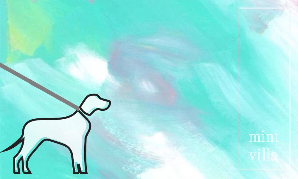
Here’s my first go at our park’s symbols.
It is not very different from the ones we have already
.
.
.
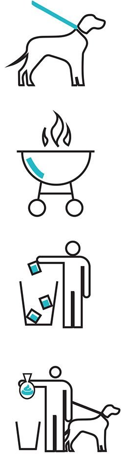
Second go,

Hrmm... This seems a bit better!
.
.
.
Not sure what is the best way to say "BBQ at designated areas only"

.
.
And still deciding which one to use for "Pick up after your dog"
.
.
There are obviously better and worse ways of doing clear signage and here’s what I’ve learned. In this go around, the symbols are narrative but not very instructional. They have the related components but no clear instructions. The icons and writing are so small… who got time to read all that? =D
@Mintvilla, an ever-learning landscape architect

Hey. Pleased to meet you. I found my way here from @sndbox's recent post about incubator membership.
It's an interesting thing sign design. It's something people see and use everyday but no one every really thinks much beyond seeing them as an information service or a utility. But a lot of thought goes into them.
First and foremost they have to be university understood in an instant by everyone of any age. This is a massive challenge and not only takes in design aesthetics but also psychology and sociology. Even just the placement of signs needs to be thought about.
I think you've done really well. I really like the idea of the blue accents in your first set of designs. But I prefer the second set of designs. I think the floating bin in the second set is a bit odd, maybe you could try with having just the top of the bin showing so to give it a bit more of a real world size to it.
I imagine its hard doing the dog poop ones as it's not a nice subject. Do you think injecting a bit of humor into those signs would work? I only say this because whilst i was looking at the second one of the dog pooping I could see him looking out the corner of his eye as if to say "I know i'm not supposed to do this. I'm sorry". Maybe you could add an eye somehow. Also the dog on the leas in the second design could have a little smile as if to say "I'm being good. I'm happy".
These are just little ideas I had whilst checking them out. Hope you don't mind the feedback. I'm not really a designer. I just animate other peoples designs like the little steemit gif above that I made. But I do appreciate a good design.
Thanks for sharing. Look forward to seeing more of your work.
@animate
Hi @animate, thanks for your comment! I am not a connoisseur in graphic design work so I certainly welcome your feedback. Giving some personality to the icons would be actually great. It will not only encourage them for a guided behavior but also will make people smile.
I recently saw your SNDBOX design challenge as well. What a great work and congratulations! Looking forward to see more of your work as well =]
Hi ya. Ah thanks. It was fun to make. I'm not really a graphic designer either. I mainly prefer to animate other peoples designs. But I do like and follow design ideas and trends. And love coming up with different ideas myself.
Yes I think people would tend to engage and remember stuff if its has a friendly and fun personality to it. Keep up the good work.
Cool. speak again soon.
@animate
nice! @mintvilla i like the first version of the guy dropping the bag in the garbage - shows what to do pretty clearly I think. You could use a speaker off / mute symbol for the no music possibly?
thanks Weston!
I was debating b/w the "NO AUDIO" text only vs. this one:
I like that!
상징(아이콘)+안내(레터링) 의 조합이 좋아보이네요.
아이콘을 그릴 때는 욕심을 버릴 수록 잘나오는것 같아요.
그런가요? =]
레터링이 더 클리어한것 같아서 시도해 보았어요.
아이콘이 은근히 까다로운것 같습니다
욕심 나지만
깔끔해야하구 ㅠㅠ
ㅎㅎ
great work. and anticipate something related to steempark.. 방문해주셔서 감사합니다. Followed and save to home screen..
방문 고맙습니다 =]
뉴욕 스팀파크 조성된 공원에 들어갈 사인들 입니다.
일본 스토리가 기대되요
팔로 하고 뵙겠습니다.
디자인을 정말 효율적으로 잘하시는것 같아요. 전문적으로 디자인하시죠? 역시 느낌이 다릅니다 ! 잘보고가요 ^^
옥자님 =]
설계가 주업인데
종종 그래픽 디자인도 업무상 하고 있습니다.
고맙습니다!
Hey, i think there is an error on one of the signs: "NO LOUD MUISC". I guess you meant: "NO LOUD MUSIC" Great article btw!:)
Hello @mintvilla. Nice to meet you.
As you have contact with people managing public places, you may be interested in the Matrioshka project.
http://www.sensorica.co/home/what-we-do/projects/matrioshka-project
Matrioshka is an open source solar urban design where people can load there mobiles from solar energy. The project is run by a collective company named Sensorica. I am interested in solar energy and I would like to be a member of the sndbox incubator. Here is my last article :
https://steemit.com/ico/@chrisaiki/three-things-to-do-to-earn-topsol
Would you nominate me ?
멋진 디자인입니다^*^ 진행되는 모습보다 대단하네요. 디자인관련프로젝트는 항상 새롭고 신선합니다.