Design - Dreams of the Ocean logo contest
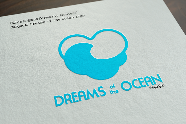
@surferMarly issued another contest. This time for her charity project called Dreams of the Ocean where she wants to help kids in need through watersports activities. A noble cause if I ever saw one. Naturally I couldn't sit this one out.
So here's my take on the logo. I tried to keep it simple. Simple is always most effective in a logo.
I wanted to join 3 elements in this one, Clouds (for dreams) Waves (for ocean) and a heart (for charity). The way I see it, that's where charity stems from, the heart. The desire to do good and help others.
So, combining those 3 elements got me to the following: an overal heartshape, build of clouds, enveloping a wave.
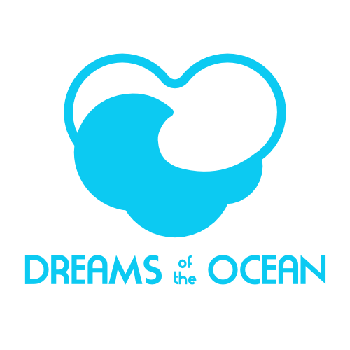
golden ratio
For this particular logo, I used the golden ratio principal for all the curves, as you can see the logo is build out of circles that are all in a 1:1.618 ratio to each other. The golden ratio is often thought of as a well balanced ration in math & nature resulting in (in my opinion) better logos, when adhered to it.
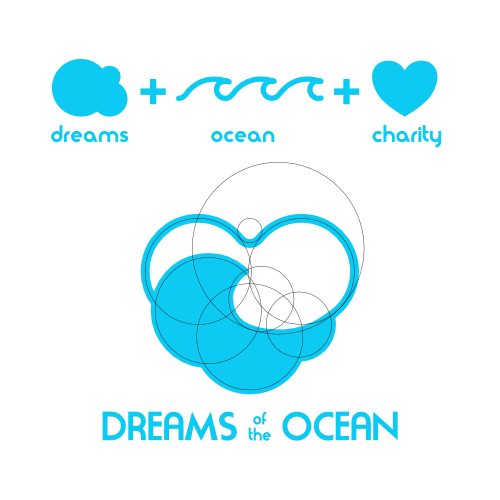
variations
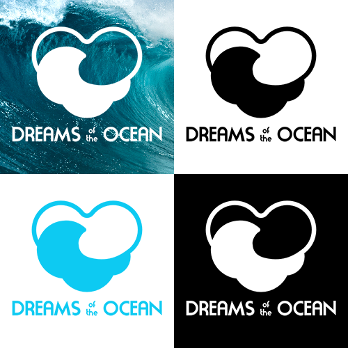
Apparal
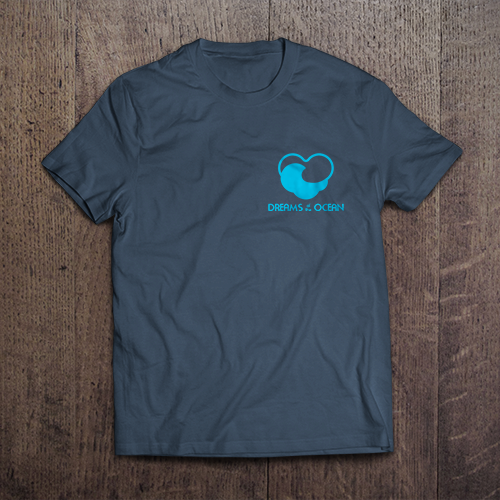
Keeping in mind that it's for charity and apparel might be in order for the charityworkers, here's how it could look on a shirt (I specifically placed the logo over the heart)
Full STEEM ahead my fellow Steemians - @eqko

You’ve outdone yourself once again bro! Proud of this one!
Thx for giving me a headsup on this contest bro.
Looking good. Well done!
thx man.
@eqko this is really fantastic!! My sincere compliments for your achievement!
THIS is incredibly good! Wow!
I'd love to give you some standing ovations right now :-)
Full upvote and resteem. Reeeeeally nice!!!
Thanks a lot for your dedicated time, efforts and creativity. Appreciated!
Great job👍💡