Some Thoughts about the Penrose Triangle | The Inspiration for my #decentmemeslogo
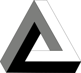
You have probably seen this triangle before:
It's a Penrose triangle, named after Lionel Penrose (a psychiatrist) and his son Roger Penrose (a mathematician). They popularized it in the 1950s. However, they did not come up with it. It was Oscar Reutersvärd, a Swedish graphic artist, who created it first. In his version the sides of the triangle are broken up into cubes. It is also featured in the work of M. C. Escher.
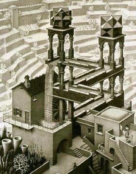
Waterfall, 1961. M. C. Escher. (Source)
A Penrose triangle is an impossible object. If you look at a square, you will see that it has four sides...
...and every side meets two other sides at a 90 degree angle. A triangle, however, has three sides (Captain Obvious strikes again) and the sum of all interior angles is always exactly 180 degrees.
Let's take a closer look at the Penrose triangle. It has three sides. Each side is perpendicular to the two other sides. 3 times 90 equals 270. But we know that the angles in a triangle always sum up to 180 degrees. That's why it's an impossible object.
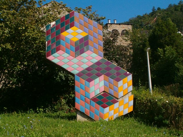
However, there are objects which look like a Penrose triangle from a certain perspective. But if you move your head, you'll see that it's only an illusion.

Impossible triangle sculpture in East Perth, Western Australia (source)
I've always been fascinated by impossible objects. They combine mathematics and art in a beautiful way. I love Eschers work as well as newer incorporations of impossible objects, like in the Penrose stairs in Inception or the game Monument Valley.
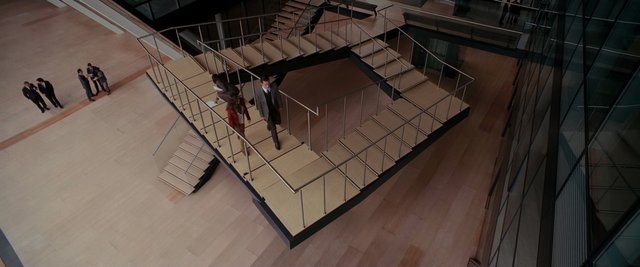
Penrose Stairs in Inception (source)
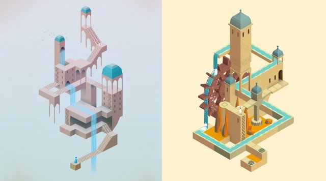
Monument Valley by ustwo (source)
A week ago I read @acidyo's post about the contest for a new #decentmemeslogo. decentmemes.com is a decentralized meme site. Take a look at it. If you like it, give @netuoso and @acidyo some love. They're doing a tremendous job. I immediately started to scribble some drafts. The first ones weren't great to be honest. It was very difficult to represent decentralization. @marty-arts did it very well. But of course I wanted to go another way. Then I thought about things without a center: A donut? Maybe. A Penrose Triangle? Yes! That's it. Impossible objects don't have a center. And they look really cool. It was the perfect starting point.
I wrote down D for decent and M for memes and tried to make them look "impossible". The result was okay, but not great:
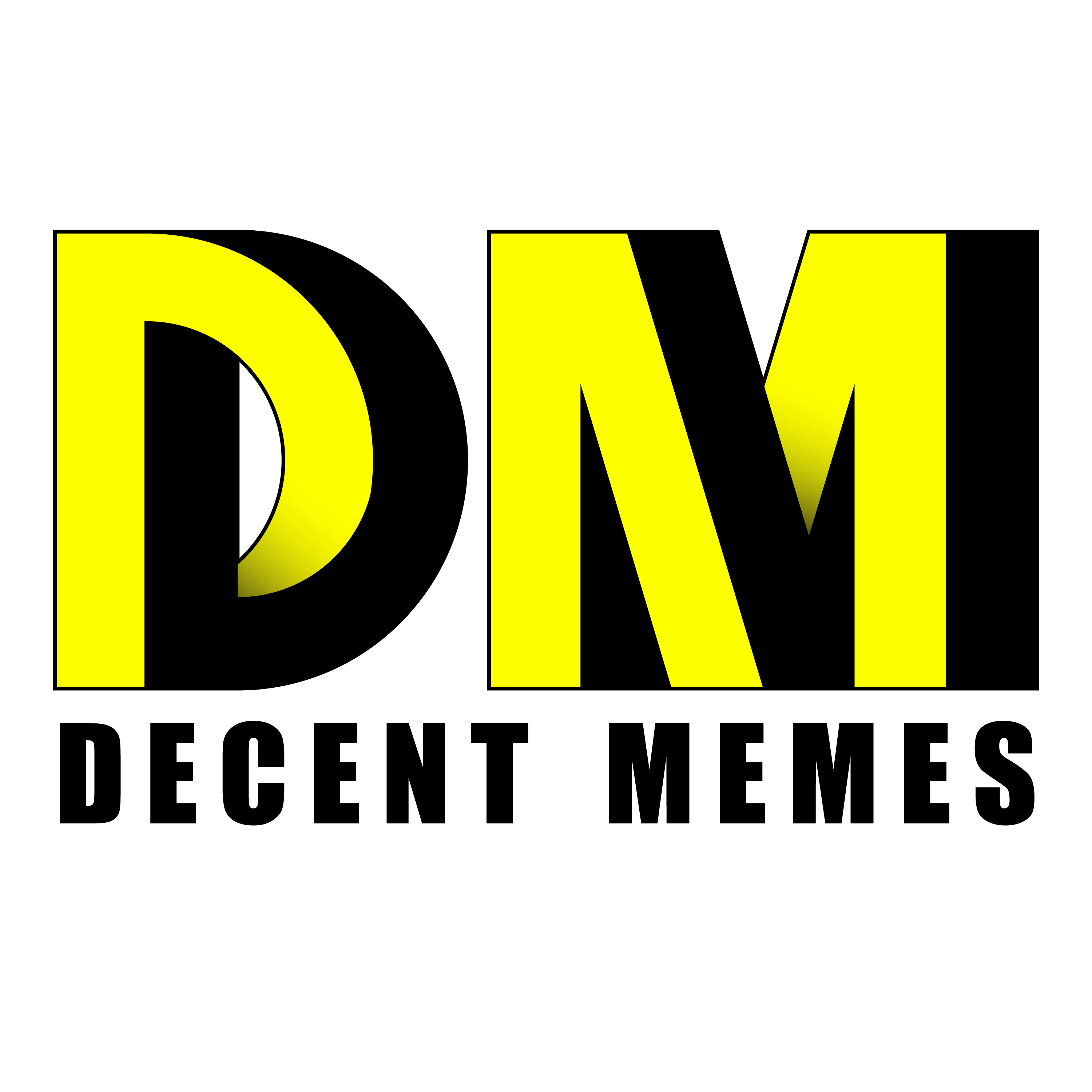
I photoshopped the logo on a screenshot of the site, but it didn't really convince me. So I tried something else. I dropped the D and created a "Penrose M":

It is a simple black logo on a transparent background. It can easily be inverted, filled with different colours, combined with various gradients, backgrounds and even with gifs:
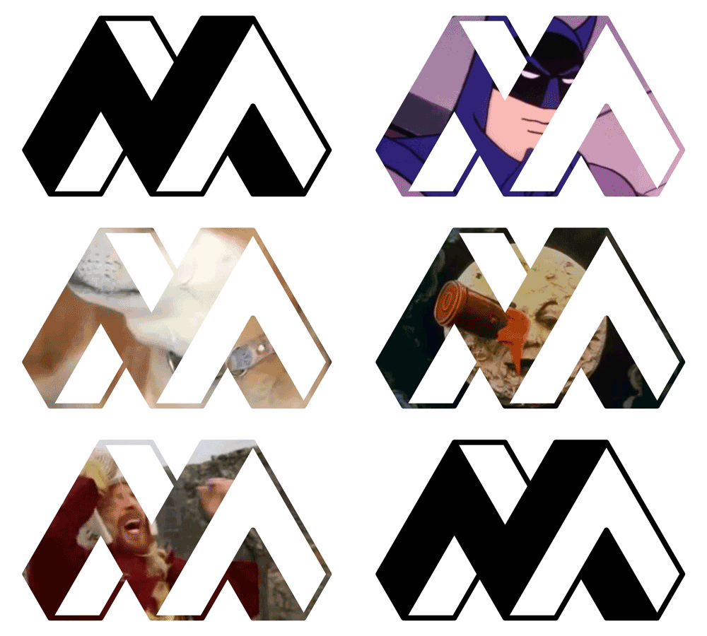
In total, I created eight logos for the contest, but this is the one I personally like the most, because I had so much fun creating it and I think it looks good on the site:

What do you think about it? Are you also a Penrose fan? Let me know in the comments.
Maths and Art is a great combination :D Do you know Vasarely?
Never heard of him. But it looks interesting.
This video explains how the stairs in Inception were done.
+1 for the moving meme one. I love it!
2.42% @pushup from @crypticalias
Behind the scenes of Monument Valley: