Data Visualization
Data visualization is a general term that describes any effort to help people understand the significance of data by placing it in a visual context. Patterns, trends and correlations that might go undetected in text-based data can be exposed and recognized easier with data visualization software.
Today's data visualization tools go beyond the standard charts and graphs used in Microsoft Excel spreadsheets, displaying data in more sophisticated ways such as infographics, dials and gauges, geographic maps, sparklines, heat maps, and detailed bar, pie and fever charts. The images may include interactive capabilities, enabling users to manipulate them or drill into the data for querying and analysis. Indicators designed to alert users when data has been updated or predefined conditions occur can also be included.
Importance of data visualization
Data visualization has become the de facto standard for modern business intelligence (BI). The success of the two leading vendors in the BI space, Tableau and Qlik -- both of which heavily emphasize visualization -- has moved other vendors toward a more visual approach in their software. Virtually all BI software has strong data visualization functionality.
Data visualization tools have been important in democratizing data and analytics and making data-driven insights available to workers throughout an organization. They are typically easier to operate than traditional statistical analysis software or earlier versions of BI software. This has led to a rise in lines of business implementing data visualization tools on their own, without support from IT.
Data visualization software also plays an important role in big data and advanced analytics projects. As businesses accumulated massive troves of data during the early years of the big data trend, they needed a way to quickly and easily get an overview of their data. Visualization tools were a natural fit.
Visualization is central to advanced analytics for similar reasons. When a data scientist is writing advanced predictive analytics or machine learning algorithms, it becomes important to visualize the outputs to monitor results and ensure that models are performing as intended. This is because visualizations of complex algorithms are generally easier to interpret than numerical outputs.
Examples of data visualization
Data visualization tools can be used in a variety of ways. The most common use today is as a BI reporting tool. Users can set up visualization tools to generate automatic dashboards that track company performance across key performance indicators and visually interpret the results.
Many business departments implement data visualization software to track their own initiatives. For example, a marketing team might implement the software to monitor the performance of an email campaign, tracking metrics like open rate, click-through rate and conversion rate.
As data visualization vendors extend the functionality of these tools, they are increasingly being used as front ends for more sophisticated big data environments. In this setting, data visualization software helps data engineers and scientists keep track of data sources and do basic exploratory analysis of data sets prior to or after more detailed advanced analyses.
How data visualization works
Most of today's data visualization tools come with connectors to popular data sources, including the most common relational databases, Hadoop and a variety of cloud storage platforms. The visualization software pulls in data from these sources and applies a graphic type to the data.
Data visualization software allows the user to select the best way of presenting the data, but, increasingly, software automates this step. Some tools automatically interpret the shape of the data and detect correlations between certain variables and then place these discoveries into the chart type that the software determines is optimal.
Typically, data visualization software has a dashboard component that allows users to pull multiple visualizations of analyses into a single interface, generally a web portal.
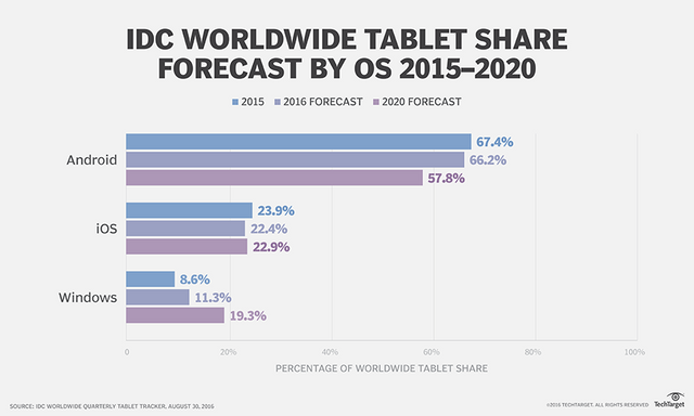
Below is a chart forecasting tablet sales by operating system.

Congratulations @fatmamk! You have received a personal award!
Click on the badge to view your Board of Honor.
Do not miss the last post from @steemitboard:
SteemitBoard and the Veterans on Steemit - The First Community Badge.
Congratulations @fatmamk! You received a personal award!
You can view your badges on your Steem Board and compare to others on the Steem Ranking
Vote for @Steemitboard as a witness to get one more award and increased upvotes!
Data visualization is how the data gets displayed after data analysis, including chart design, dynamic combination, two-dimensional charts, three-dimensional charts, linkage, drilling, large-screen display, etc.
The company Synergy Codefi creates applications that help you see all this, you can learn more on this page - https://synergycodes.com/what-we-do/. The functions of data visualization are mainly reflected in two aspects: one is data display, and the other is business analysis. The data display is well understood. It is to display the known data or data analysis results through visual charts. Business analytics is the effective translation of data and metrics to be analyzed into business-valued insights after seeing charts, dashboards, and large screens, enabling them to support decisions based on facts.