My LOGO Design Suggestion for Curie Logo
This is my participation for Curie logo design contest.
When I saw @curie's post about having a contest for creating a design for their Logo, I became so excited. Eventhough I am not a professional graphic designer, I want to participate in any kind of contest that I am able to use my little knowledge about graphic designs.
Few weeks ago, I saw some of Logo and Cover photo contest but sadly, I'm too busy back then I don't have much time to create my entry. Gladly, now I had some spare time that I am able to create a Logo for @curie's logo contest.
Here is the LOGO I made and my entry for Curie Logo design contest.

I created this logo using Photoshop CS5. I designed and made it in Circular form because Curie prefer it to be in Circular and full form.
How I came up with this Logo Design?
As you can see at the Logo, I only used colors similar with the 2 Steemit logo which consist of dark blue, light blue, green and a few touch of white. I wanted @curie's logo still connected to Steemit logo even only with their colors and also a simple yet meaningful.
I am going to show you on how I created this Logo STEP BY STEP and its MEANING.
The Making
First, I created the base circle and I chose the color dark blue which I got from the other steemit logo. I used grid line for me to checked if I made a perfect circle.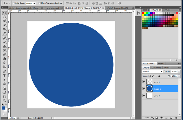
Then I deleted the center of the circle and left only the thin circle at the edge.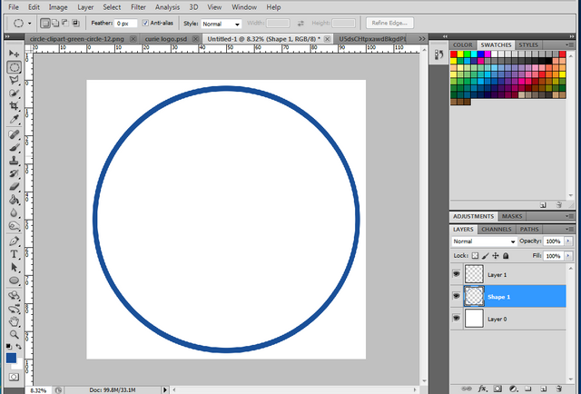
Again I created smaller light blue circle and put it at the center of the base circle. I also got the color from the other steemit logo.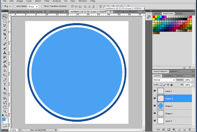
I repeated what I did on the base circle. I deleted the center then left only the thin circle at the edge.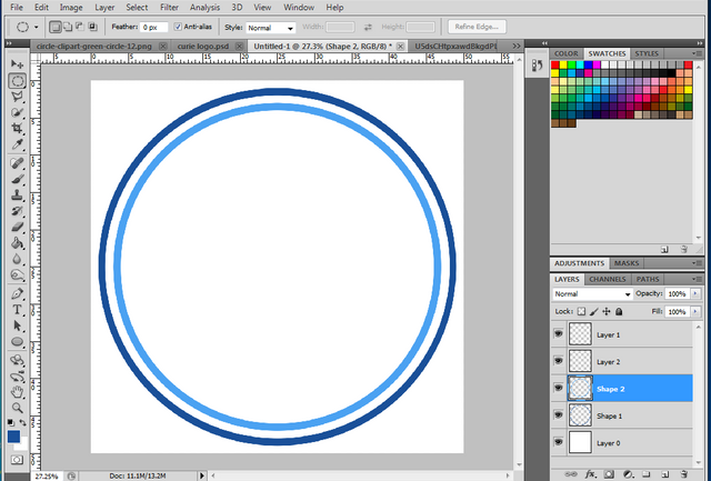
Again I created smaller dark blue circle and put it at the center. This will become the letter C from the word Curie.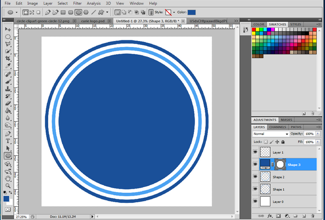
I used selection tool in the form of circle for this and deleted the other part of the circle. So this became looks like letter C.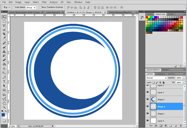
In this area, I selected little part of the base circle and turned it into color green. I think color green represents the minnows, I'm not sure about my observation. Anyway I made this to symbolize that minnows are part of the @curie project.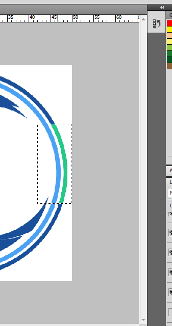
I also put some arrows upward in this area to symbolize the hard work of authors to make a quality content and their struggles to recognize their work.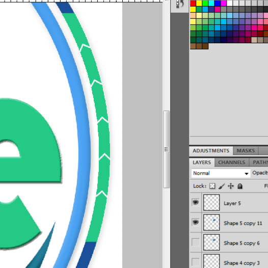
I wanted to add some accent at the letter C and make it looks like a whale. Then I started to select little part of the letter C using selection tool in the form of circle and made little twist on it. You can see on the screenshot that it gave little accent on the letter C and for me, it became looks like a whale.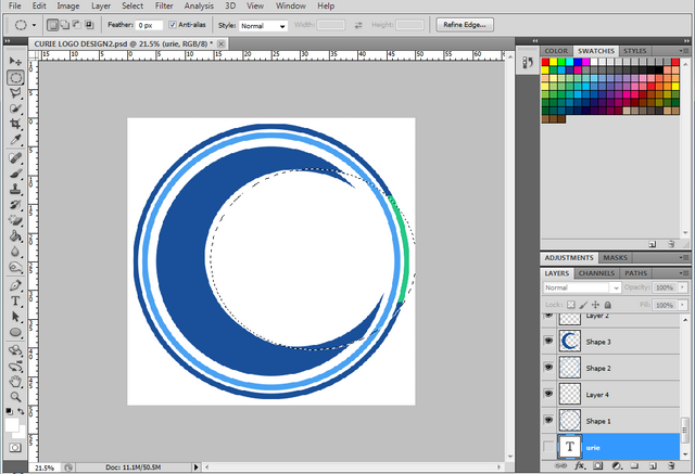
I begun to put the word "urie" next to letter C and chose color green for this. I also added emboss style to the 'urie' word.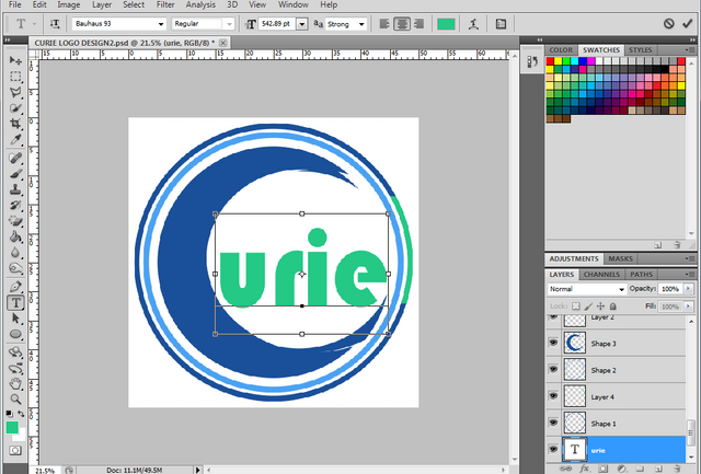
I created little dark blue circle and put it at the top of the letter "i". 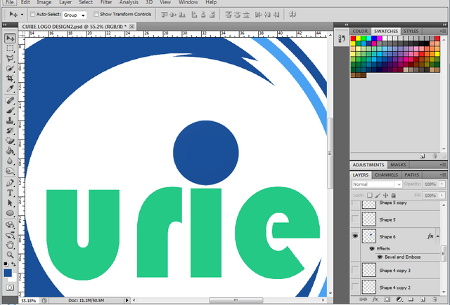
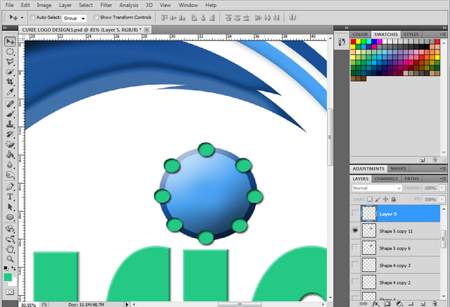
Then I put some accent, I turned the center into color light blue and added emboss style. I made this to became looks like a magnifying glass. This represents the Curator team who find posts with a hidden gems.
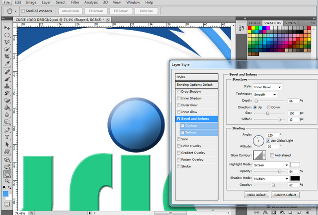
Back to the letter C, to make it more appealing, I added the bevel & emboss style and also made some adjustment on gradiant overlay. Here's the result.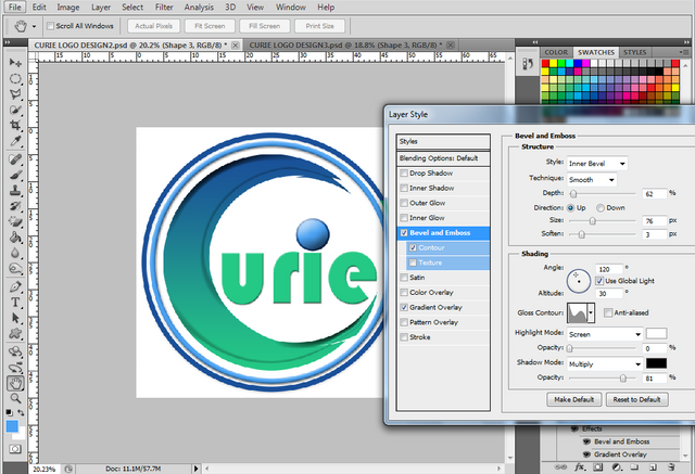
In this screenshot, you can see that I put little color green circle around the color blue circle(the blue circle that looks like magnifying glass represents the Curator team).
And I also put the Upvote icon at the center of the circle.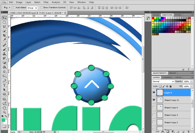
These tiny color green circle and the Upvote icon represent the Curie's Reviewer team who verify and upvote on the posts.
When you take a look at the tiny green circle and the dark blue at the edge of the light blue circle, you can see that the tiny green circle are connecting with each other because of the dark blue circle between them. This also represents the community that connects with each other.
Actually, the magnifying glass, the upvote icon and the tiny green circle connecting each other are the highlights of the logo I made which I think truly symbolizes the goal of the Curie Team.
Following are Curie’s main goals:
To discover and reward undiscovered but exceptional content by persistent creators with limited success.To empower quality curators.To develop a curation community on Steem.To build communities.To serve as a community witness.
Logo's final output. 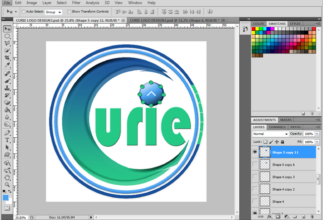
Each part of the logo I made had their own meaning that for me really represent the Curie team.
Hope you like my first time Logo creation :)
If you want also to participate in this @curie's logo design contest, you can check it here
PS. Top 10 finalist at curie logo contest will be chosen from the number of upvote received in the comment of each authors. If you like my creation or found it suitable for curie logo and want my entry to be on top 10 finalist in curie logo contest, you can nominate me by upvoting my comment Here.
THANK YOU!
Note: All photos/screenshots are mine.
@surpassinggoogle is a kind hearted person, please VOTE & SUPPORT him by typing @steemgigs as your witness at the first search box. Just click here ->https://steemit.com/~witnesses. Your vote is highly appreciated.
If you want him to be your proxy in voting for witness, you can visit https://steemit.com/~witnesses and type "surpassinggoogle" in the second box.

Galing sis, kung ako lang ang judge waging wagi na. hehehe.
This post has received a 0.13 % upvote from @drotto thanks to: @banjo.
Galing naman ate dette 😃
Nice design! 247% upvoted Thanks!