My Entry - Make a New Logo for Surfermarly
When I saw that @surfermarly was looking for a new logo for her blog I decided to dust off my design software, brew a pot of coffee and make her a logo.

For logo design I always work in vector so everything retains it's scalability and modifiability, and this is what the open source design program Inkscape is great for.
I started with this, I created a typographic title and added some design elements that surfermarly suggested be included or alluded to, like the sea, water, waves, sun and surfing. After making the base "design" I split it into two versions and designed both in tandem.

I was originally going to try use the Steemit logo as a wave but I thought Surfermarly might want to use the logo outside of Steemit so I nixed that idea.
I submitted the neon oval design for review and was rightly told to replace the neon colors, but that she liked the sun with the lines through it and the waves.
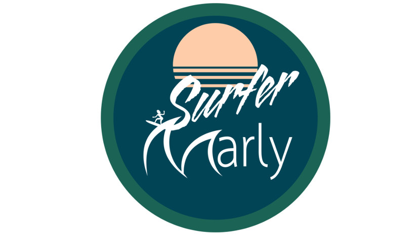
With the new feedback I scrapped the neon colors. I chose a more appropriate font for "Marly" and developed the typographic styling so the "S" is the surfers wake and the "M" from Marly resembles waves.

Finally I put all the elements that I felt worked best together into one simple round logo and gave Surfermarly a choice between that and the further developed version of the original I had already shown her. I was happy that she preferred the simplified round logo that didn't have any unneeded elements in it.
A logo should be able to work in monochrome and shouldn't rely on many colors or gradient tones to be visual interesting.

Update:
It was suggested to me by @writewords that the "M" might not mesh properly with the rest of the word "Marly". So here is an alternate option with the "M" in an equal line weight to the font, I also slightly opened up the spacing between the M and the A. I'm not sure that it's better this way but it's something to consider. We'll call this Alt #1.

If you'd like head on over to @Surfermarly 's post where she is asking for a logo design and upvote your favorite logos made by Steemians in the comments, there is 250 SBD in rewards up for grabs!
I like what you've done, and I really appreciate your work ethic.
While I see the "wave" theme on the "M" -- I'd offer the following constructive advice:
I believe the "M" contrasts too sharply with the style you have for the "arly" --- If you could address this, I believe you'd have a great shot at a win.
Thanks for your feedback, it's appreciated. I'm open to doing a final refinement. I could do another version of the wave with even line value that matches the font and/or a different font for "arly".
I'll see how @surfermarly feels about it and go from there.
Absolutely run it by her. I followed you as well. Your effort is worthy of respect.
Congratulations @ckurtish! You have completed some achievement on Steemit and have been rewarded with new badge(s) :
Click on any badge to view your own Board of Honor on SteemitBoard.
For more information about SteemitBoard, click here
If you no longer want to receive notifications, reply to this comment with the word
STOP