Pennsif's alternative lifestyle radio show - design-a-logo competition entry
Pennsif, in conjunction with launching his new Alternative Lifestyle radio show, announced he was running a design a logo contest for the show because, in his words, he was keen to re-brand away from his highly visible yet basic yellow & blue graphic.
I was eager to enter, as I didn't have to draw anything freehand.
So, always keeping in mind the essence of what was required:
Generally my view with logos is to keep them simple.
And think about different ways they might be used - on websites, on business cards, on fleeces, on mugs...
and although this statement was a tad daunting
I am though a difficult person to design for.
I was still curious to see what I could come up with (sometimes even I am amazed by what pops out of my head!). So, I have come up with a variety of options, and maybe one will appeal, or maybe parts of one and parts of another. You never know ...
Option 1
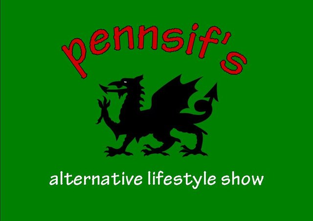
A simple rectangular shape, done in Publisher (which has long been a friend of mine), to the size of a postcard. I've utilised colours similar to the Welsh flag, and the silhouette of a classic Welsh dragon.
Option 2
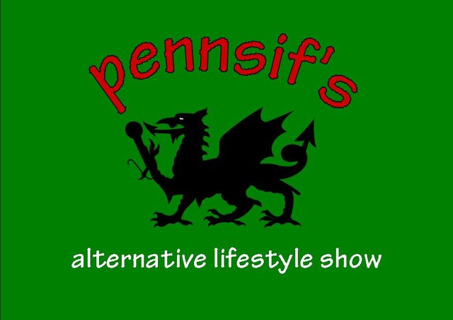
This option is the same as the first, with one difference - can you spot the addition? I think it's pretty nifty.
Option 3
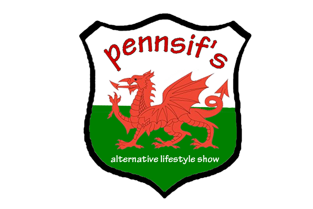
With this one, I asked for some help using Photoshop from my daughter and she came up with the shield design (and did all the work because I haven't mastered Photoshop yet in the slightest!). I am blatantly subversively subconsciously appealing to Pennsif's patriotism for his beloved Wales.
Option 4
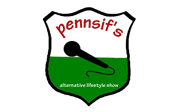
Keeping the design even simpler, and bearing in mind it is a radio show, I directed my daughter to create it for me came up with this.
Option 5
Last but never least, again my daughter simply played with the design a little. She is quick at producing something as she uses it a lot. Yes, if any one of the shield designs is chosen, I will ask that she receives the loot. ;)
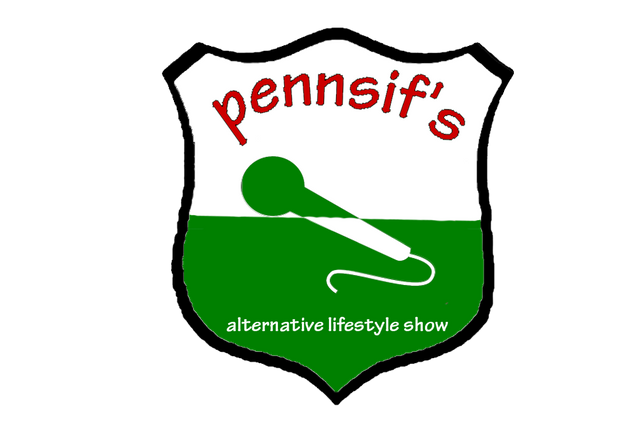
Keeping in mind that any of these designs can be tweaked if desired, they are my entries in this fun competition. Thank you for your consideration of the designs. :)
That was amusing to read :)
Why thank you, I do like to spread humour like sprinkles of glitter.
I should be asking, though, if you were laughing with me or at me, lololol. ;)

I did not notice the difference between the first and second drawing :)) I guess I'm not strong in logos :)))
Thank you for your entry to my logo competition.