RE: NEW! Curie Logo Design Contest - Calling All Designers!
Hello Curie team! I'm simply a steemit newbie, looking for contests around, when finally found Yours.
Beyond the contest, I find the cause very interesting, The meritocratic term, in my mind explains exactly that state, the thought of a value that has not reached the worthy attention. But that deserved it.
Concept on which we could, and we should debate more in our life :-)
However the concept of meritocracy, is based in my humble opinion, on a judgment of fact, and this implies as many people as possible.
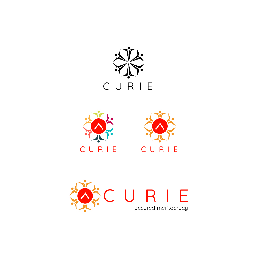
From this concept I preferred to put stylized people, in a circle to recall the concept of community. In the next eleaboration I have inserted the symbol of the upvote, as an element of common validation. Finally I opted for the red / orange color.
The reason is simple. Your proposal is clearly anti-political, as such, it makes sense to give a connotation of party color, just because you are not. The fact of declaring oneself anti-political, inevitably calls us to replace a polite superior concept, we are going to replace the political concept itself.
In short, it's a risky as a solution, but it could work =D
Hope you like it!


At least you gave an explanation for your entry, how nice... As said ib the post, you could blow this out too and make a post on your blog.
We'll love to share from how you came but the concept of the logo and maybe how you designed it too.
Cheers
Hello @dorth thanks for the kind comment! And thanks everyone for the upvotes.
nice sensation! =D
The design process, when is part of your days routine becomes pleasant and happy to explain, to make sense of it, to support your choice, in a natural way. It's the nice of contests!
Representing meritocracy, in a logo, is not something that is done every day :-) and the challenge is very interesting from this prospective.
In continuation of the previous concept I add another version, made with curved shapes, and typographically supported by the shaped font.
It is a simpler version, which expresses the same concept, but this time, the support comes from below, as a sustaining energy. The even more essential forms make it little playful, and funny/easy/quick to use in the graphic compositions, posters, banners, like below.
Below other two variations, based most on a concept of "protection":
Note: The gray color is used to get a good result in light/night steemit mode
Just continuing =D
Cheers!
If You like it here the full version with graphic blog elements:
https://steemit.com/contest/@overdye/curie-logo-design-contest-here-my-entry
Hi, apparently you didn't like the video I posted. I just wanted to help, so, if one of your designs is missing or you want me to delete your design, please let me know.
Helping who? 😆
Not me.. In next video please:
put my logos at the very end..
at a resolution of 25x25px
in black and white color
👍
People who want to see the logos without scrolling for hours. It may help them to find the logos they like. You can find your logo at 5:00. The order is more or less random. Why do you want your logo at the end? The video is 1920x1080 px. 25x25 px would be to small. Also: Why should it be black and white? I' dont understand why you flagged the video. Was it because of one of these:
?
So, you cannot tell me the reason you flagged me? Please stop abusing downvotes. You're hurting the steemit community.
Your video does not help to get any information.
Where did you put them?
Thanks for understanding
My real name is Alex.
Thanks for understanding!
Have a great day!
I downvoted 3 posts.
This one: https://steemit.com/design/@overdye/a-great-font-1
because I think its copy and paste
And two others, because i think you used a second account to upvote yourself.
Yeah this is true.
What the difference if I'll going to delegate steam power to an user?
Removing upvote..
€0.01 make no changes to me
:-)
Content references are added.
Please remove flags.
So, you edited this comment? Now my reply doesn't myke any sense. Do you understand why I flagged you? It's because of this:
I like the Mandala feel that this logo has, well done. Think the yellow and red one is my favourite. :)
hello @skippyza! Thanks for the feedback. You have mine.
Yes looks like a mandala, that's the power of adobe illustrator Ctrl+D "Mandala Maker" tool =D
It's the last, and my favourite from my series.
It return an evocative feelings, and energy that's spinning around the upvotes.. =D