Feeling the logo mania!!! One more EYE-CON logo for @truthproductions
This is my 18th personal design for the @truthproductions<
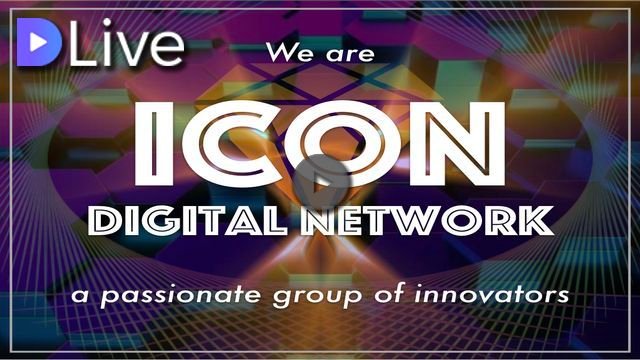
ICON DIGITAL NETWORK logo contest.
I also began an additional 4 designs and called out for collaboration.
See my latest creations and links here.
I've actually never made logos before.
I've always loved layers and depths of design,
just like I do in my life,
which is not really ideal for logos.
So in some ways this logo making goes against my grain,
and in other ways, it's the perfect opportunity to simplify,
and challenge myself to see things from a different perspective.
Here are two different colored versions of my personal entry #14!
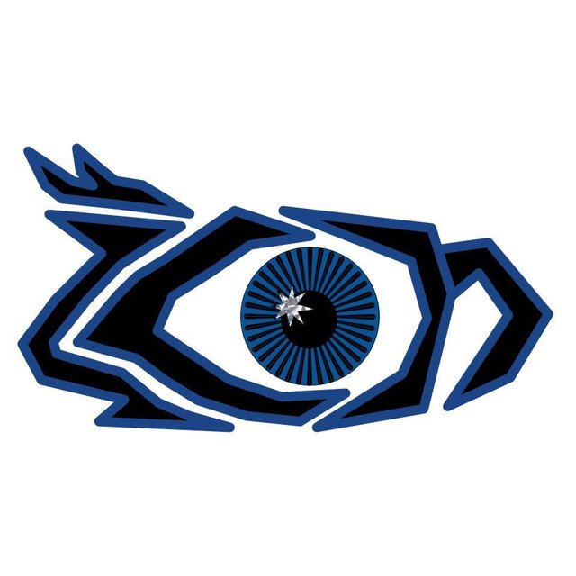

I think the blue outline helps the "I-C-O-N" letters stand out more.
And the grey outline makes the pupil more the focus.
I personally like the blue outline. What do you think?
There has been an incredible amount of active participation in this contest,
releasing some fun designs with great potential.
If you want to get in on the action, the deadline is September 18,
so you'll have all weekend to play.
See what ICON Digital Network is about:
Wow
Very interesting and cool.
Hard to say which I like more as the qualities are as u say and both have good reason.
Glad you like it @quinneaker. How about this combination?
I like it!!! Haha you're like me... once you get started on something interesting you just can't stop! lol love your creativity
Gotta love true focused, inspired immersion!! Glad to share that trait with you @nomadicsoul. I appreciate your appreciation. Thanks for being here.