Arsenic Lullaby - Cthulhu trading card or comedy vs art vs science vs madness
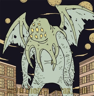
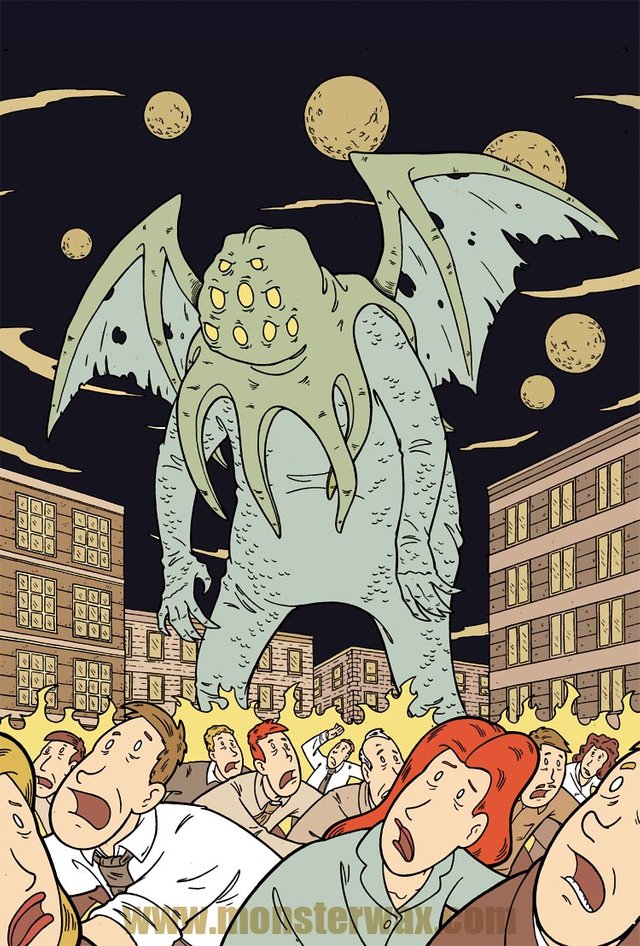
I'm showing this off today because I got word that FINALLY the trading card set the image was made for is getting produced. It's for a Monsterwax trading card set featuring the H.P. Lovecraft mythos. I'm told that my two cards will be foil embossed! (fancy stuff!) I've been waiting awhile to be able to raise a little hell about it. Now that I can I'm doing it right away ( hang in there just a little longer for the Krampus Exclusive...sorry @veryspider but it'll be worth the wait!)
Skilled though I may be at illustration, I consider myself a comedian/comedy writer first and illustrator second...and "artist" not at all. To me the difference between artist and illustrator is that an illustrator has a specific task of telling a story, series of events or showing specific details for a specific particular reason, where as an artist seeks to convey an mood, or an idea. One (artist) has function following form and the other (illustrator) form following function. That's all debatable, but that's how I view things.
So, while doing covers or posters is a nice change of pace, I'm not as comfortable with them as illustrating a story. I illustrate comedy. I've done plenty of stand up, written plenty of scripts, I have a solid internal compass for what is funny and how to tell a joke. Rhythm, timing, structure, are all things I have a good solid grasp on. You have the premise/joke...you make sure you have all the elements that lead to it, and have each of them arranged and given certain emphasis in the way that gives the premise/joke the most impact. It's not easy, but I understand how to do it.
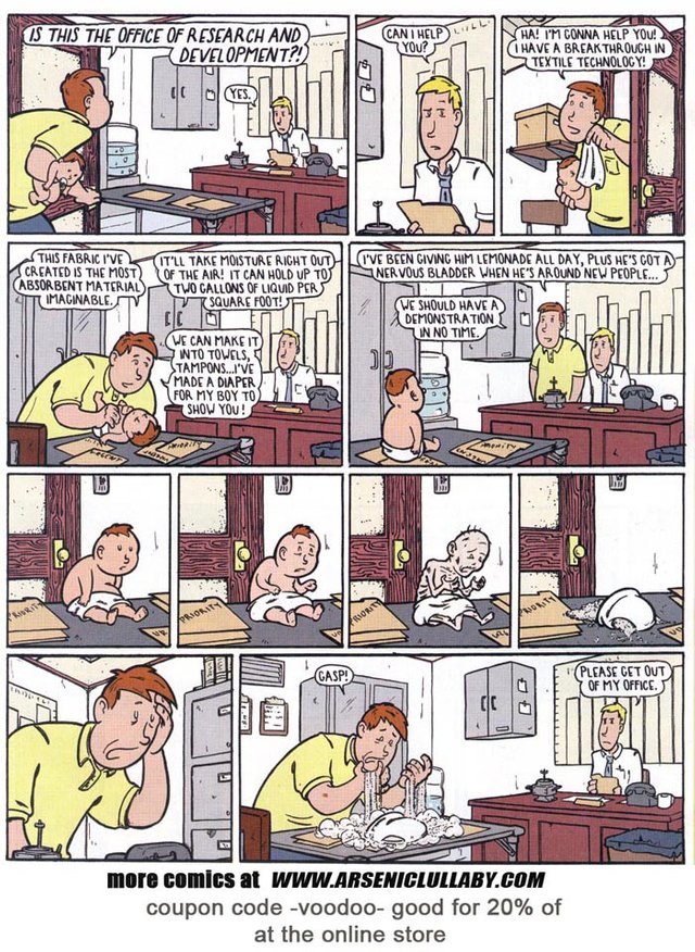
A cover or poster or in this case a trading card...that's one image...and the point of it is not delivering a joke, the point of it is...well the image itself.
You have to rely more on instinct. That always vexes me. I end up overthinking it to the ninth degree with no real grasp of what I'm even supposed to be thinking about.
…okay, this’ll help explain. I was about done with this illustration for a H.P. Lovecraft trading card set.
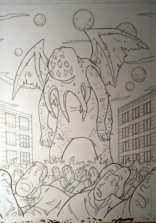
looks okay but the composition…is technically not good. Since this job is mostly in your head, beauty being in the eye of the beholder and all that, you want to guard against making things that only you see the charm in.
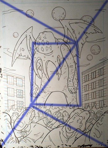
From what I can get my brain to remember, you determine the sweet spot of a image by drawing a line diagonal all the way across in one direction, then make diagonal lines from the other corners to make 90-30-60 triangle.
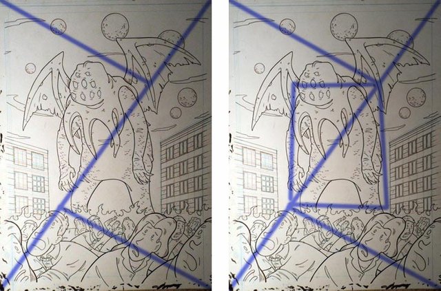
then you make a square and that’s the central focus of the eye…or something like that, really it’s just the center of the picture so whatever.
You don’t have to jam the important stuff into that spot, but you need to be aware of the eye starting there. and what’s there on this image? a whole lot of nothing.
Originally I was going to have a tidal wave behind him but as small as this will be when reproduced…it just wasn’t going to look good. BUT, I figure it could use something behind him to keep it from being basically two different scenes stacked together. I put some buildings in there, and it looks good. connects him and the city and people together nicely….but doesn’t really do jack squat about the sweet spot problem. I like it, but that technical problem is still there.
The visually interesting stuff, his head, wings, fleeing crowd, are all out of the sweet spot, and inside the sweet spot is his gut and a few tentacle ends.
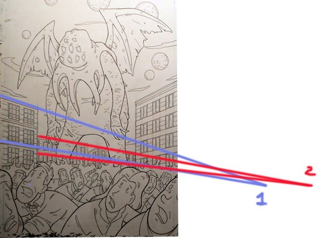
I gave the second set of buildings a different vanishing point to give it a little subliminal movement. But that’s neither here nor there in solving that composition problem.
Soooo…why does it look fine to me? maybe there’s some relationship between the ovals top and bottom that’s helping?
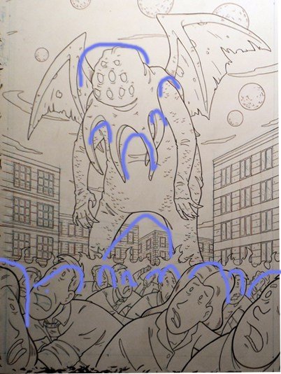
Whatever they are doing visually, it doesn’t change the fact that the sweet spot is underutilized and there is a big divide between the top and bottom. In fact from the top of the fire to an implied line that runs along his crotch and knuckles there is a complete dead zone.
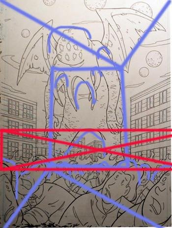
are the wings doing something? or the planets?
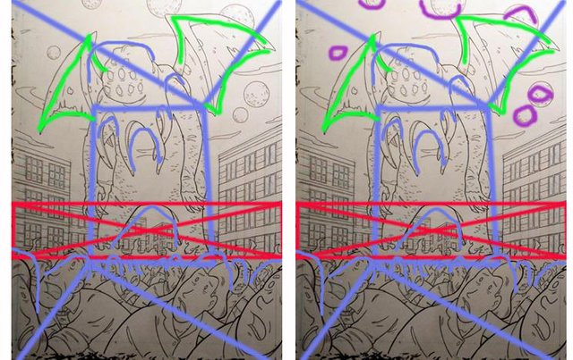
not really. Lemme see those vanishing points again.
Maybe it’s the vanishing points from both sides helping this somehow?
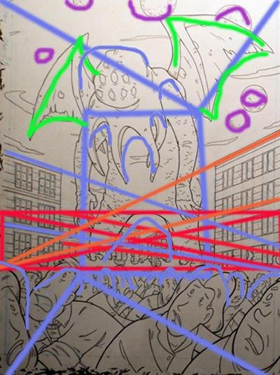
…
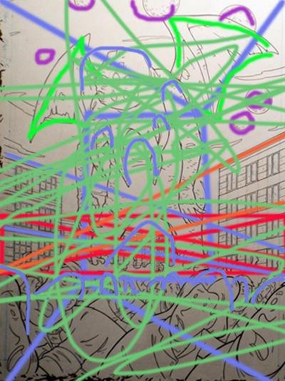
I decided to sleep on it. THEN, the next day, I get up and I look at it…
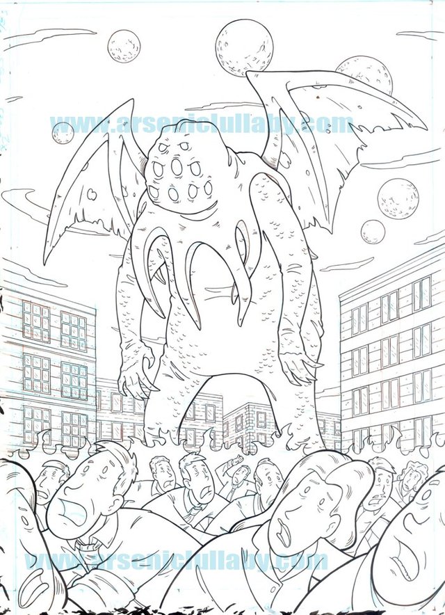
and says “it looks good, what’s the f8cking problem? Maybe it’s good because there are two different things visually separated…who the hell knows why something looks good? scan the fucker and let’s go, we got like three months of shit to do.”
A short time later, while looking for something else on my computer, I saw this guide for what’s known as the “golden ratio” as set in a rectangle.
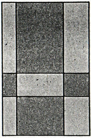
The golden ratio is a way of dividing things visually that is seen a lot in nature and used in architecture. It’s a ratio that the eye always finds compelling.
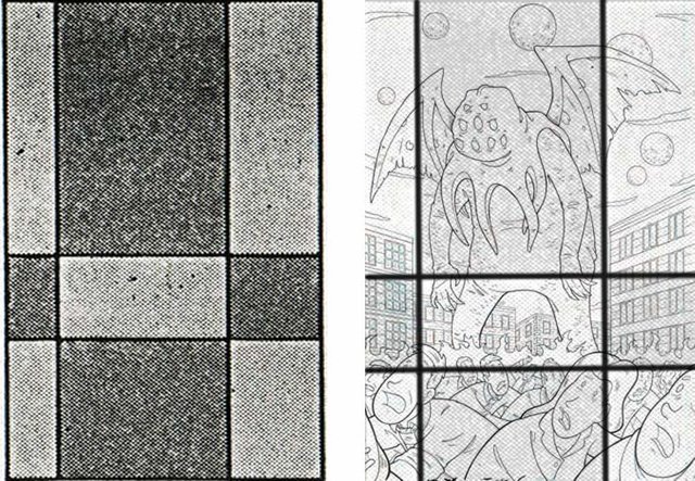
…Oh for F*CKS SAKE.
Not that I need reassurance anymore…but that’s pretty much SCIENTIFICALLY confirmed as good.
I'll give you more info about how to get the set as soon as I am given that info! and you can always find my work #comics at the Arsenic Lullaby website www.arseniclullaby.com and of course here on Steemit every few days!

Awesome artwork and love the writing! :)
Upvoted and resteemed!
Thanks a ton! BTW while you were out on vacation enjoying yourself...the rest of us have been pushing the boulder up a mountain. we have begun using the hashtag #comics in every post and comment until it is so popular that it's been used enough to show up on the main tags list. Feel free to join in! #comics and welcome back and happy birthday!
That's great although I don't create comics it maybe fits the genre a bit don't know.
Thanks man! :D
Excellent work! That comic you've posted is a bit morbid. Eheheh. 😃
Morbid?...or hysterical! ...(probably you're right, it's a bit morbid) In either case, thanks! #comics
That's a mighty nice Cthulhu you got there.
Thanks! I grew it myself. #comics
I like the 2 different vanishing points. It reminds me of how Lovecraft described the building's at R'lyeh having odd angles or something like that. #comics
Right! "the geometry was wrong" or something like that. That's exactly why I did that! (that was a lie....I hadn't thought of that until you just now reminded me...but let's just tell everyone that's why I did it) #comics
You've done this so well for so long that your subconscious just automatically lays out compositions in the golden ratio. I am jealous. I really love the Cthulu piece.
More like I got lucky hahaha. I think it turned out okay...kinda wonder how the other Cthulhu stories would have looked if I had use this version of him instead of the stretched head one. #comics
Congratulations! A fancy foil card is a pretty awesome thing. Wish I knew more about comedy. I keep getting nominated for the comedy contest. It is fun but I am like you and tend to overthink everything.
I'm anxious to see how it looks in foil. With the comedy contest you should give it a go! Maybe just tell a funny story that happened to you, that's a good way to start. #comics
Hope you will share a post with pics when it comes out. Would love to see.
Yeah I have done a couple rounds with the comedy challenge. I had fun just would really like to improve with that a bit.I am overthinking it.
I will. Improvement on comedy happens fastest by failing. I personally had to be onstage finding out the hard way what works and what doesn't. Feedback is gold as far as comedy goes. #comics
Thanks! That is pretty sound advice and makes a lot of sense. At any rate it is a fun little distraction at the moment. It is probably not the best idea to get to serious about being funny.
😊
Definetly overthinking....
This cthulhu isnt the scariest one, but damn, its a really good drawing.
Btw, is It me or he does look confused with why humans are running away from him? (Like, "wtf are they running from?)
He does seem befuddled doesn't he? #comics
Awesome post, you're cranking me up again :D
Excellent how you martyrise yourself for that composition!
Bravo ,)
also, im still waiting for that krampus exclusive ; __ ;
i am getting all dessicated like a baby in a super absorbent diaper ; __ ;
#comics
hang in there, stay hydrated!!! #comics
This is an excellent post, Doug. And it even taught me something new about the golden ratio, not that I will use it because I'm not at that stage yet where I can consider a lot of things in my drawing, but I will keep in mind for future time :D.
The poster itself looks awesome, and I think following ratio or not, in the end, if it looks good, then it looks good :).
#comics
-upvoted-
Thank you! The golden ratio is a nice crutch to use on the times you don't know where to start. yeah, I should have just said "eh, it look okay" and moved on...but I didn't :/
#comics