Creating content: Importance of your colour choices
There are many factors that go into writing good content (you know, the kind people want to read!).
While some of those things will be obvious to your reader (do you use proper grammar and have interesting things to say?) other elements are not so in-your-face. Good content will have people leave your story feeling something: intrigue, happiness, wonder...
In a post I wrote earlier this week, I talked about how establishing a voice in your writing helps readers to connect with you.
If voice is an obvious element in good writing, then other things--like formatting, image choice and even colour selections--are like the body-language of your text.
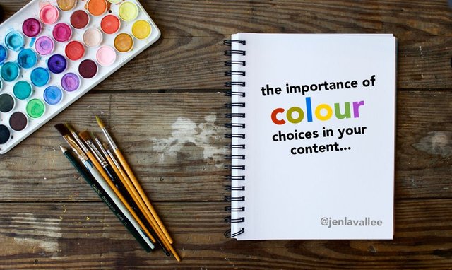
The colours you select in your content can have a subconscious effect on how readers react to your story--colour and images are, after all, one of the first thing people will notice about your story (and may even prompt someone to click on your link in the first place).
Certain colours will invoke certain feelings in people.
The Meaning of Colours
What, then, are the meanings of different colours? Looking at the ROYGBIV colour spectrum, here's what brand researchers know:
Red - Red is an attention grabber, it’s bold, passionate, and aggressive. Most popular in the following industries: restaurant, technology, automotive, and agriculture.
Orange - Orange is exciting, fun, and playful. Most popular in the following industries: technology and health care.
Yellow- Yellow is eye-catching. People find yellow to be creative, motivating, and invokes positivity. Most popular in the following industries: energy, restaurant, and household.
Green - There are many shades of green with the lighter versions signalling feelings of serenity and calm, and the darker versions those of prestige and affluence. Most popular in the following industries: energy, finance, technology, restaurant, and household.
Blue - Blue, the most popular of brand colours, puts people at ease, is trustworthy, secure, and signals dependability. Most popular in the following industries: energy, finance, airlines, technology, healthcare and agriculture.
Indigo - In indigo you will find calmness, wisdom and even a sense of spirituality. Most popular in the following industries: technology.
Violet - Violet (and it’s sister, purple) is a regal colour that invokes sentiments of sophistication, richness and mystery. Most popular industries: finance, technology and healthcare.
Of course, you can’t talk about branding colours and leave out black and white:
Black - Black is expensive. It’s timeless and sophisticated. Most popular in the following industries: clothing, technology, and automotive.
White - White is clean and makes people think of purity and softness. Most popular in the following industries: clothing and healthcare.
Colour is one small piece of the puzzle in content development. What other elements, would you say, act as the body language of a story?


Nice! Need some time to read it!
Thanks!!
I have heard that color can affect peoples' feelings. I have never thought to apply the concept when writing though. Neat! Thanks for sharing.
Thanks! Images can make a big difference: they encourage people to click a link or keep scrolling a lot of the time.
Agreed. Images definitely make a huge difference. Especially the thumbnail!