You are viewing a single comment's thread from:
RE: TASKMANAGER Asset Logo Design and NEW Details!
Great work @taskmanager - sending you a message on steemit.chat if that is ok - I have a bit of mileage with such things!
Great work @taskmanager - sending you a message on steemit.chat if that is ok - I have a bit of mileage with such things!
Oh sounds good :) and TY
Great job getting all the elements to work together without looking like a misfit. There are a few issues which might be worth looking into just on a pragmatic level.
Printing - the logo needs to look clean and strong when big and small and in B&W. Many printing scenarios are as such - fax, copy, financial reports (some); the base of the central upright is going to look messy and you may have print registration difficulties in certain situations. Personally I would drop the circle of seeds - I cannot get trivial pursuit out of my head when I see it! Sorry, could not help myself!
With the cross bar of the T - is it possible for it not to intersect with the uprights? It takes away a bit of the strength and fluidity of the three swaying steemit hula dancers! It may need tweaking to get the angle right. If I can assist let me know!
Thanks for your work!
It does need tweaking and cleaning, was going to get photoshop and try this tonight. However if you are skilled in such things I would gladly outsource the work.
I was staring at the angle and you are right it needs correction....
No, sadly, I am not the actual driver of the software but I have manually designed many logo concepts for the desk top publishers or digital artists to render up. If you like I could try to position the elements together - do you have the three swaying hula girls and the t bar in separate files? If so I can play with the angles and consequential impression - how does that sound?
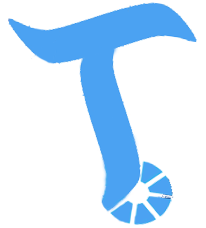
That would be awesome sauce. This is what I have seperate, rotated the T slightly.


Looks amazing @ebryans.
@rigaronib, I may have to take you up on that when things are all done. TYVM
If you guys come up with a design I would be more than happy to render it for you. I have Adobe Illustrator and can create a nice, clean vector logo for you. :)
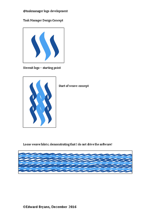
Hi @taskmanager, apologies for delay - am back!I toyed around with the 't' concept as you began it. The balance of it just dod not work as I had described I saw that it could.

Anyway, I started to look at the different renditions of the principal three legged Steem logo. I eventually came up with a kind of fabric look. I magine the logo on its own - fairly aesthetically cool but fragile in the face of any external force. If woven together in a self-supportive structure, it has strength and durability.Let me know what you thinkl. This fabric look can be made into any motif or shape you like. Would be cool if it started loose and came together in a tighter weave to form your 'T'.
Let me know what you think. Again apologies for any delay, hope you like.
Good deal, buddy. Just let me know what you need and I'll see what I can do! I'm on steemit.chat under the same handle.