Bitcoin Chart Analysis 25 June 2017
Hello Fellow Steemers.
Introduction
Once in a while, I look at the Bitcoin charts and think of what they are telling me. I leave Bitcoin day trading to others and tend to look at the long(er) view. Below, I share my thoughts on the price developments and the directions that the charts may give. I note that charts and technical indicators do not predict the future; they only show the past. However, they may signal the probability of the next move.
Please note that all charts are logarithmic, meaning that any doubling - for example from $1,000 to $2,000 or from $3,000 to $6,000 - would be shown on a similar scale (i.e. a straight line). This filters away extreme price spikes as appearing from normal charts.
Let's start with the first chart.
1. Daily Chart

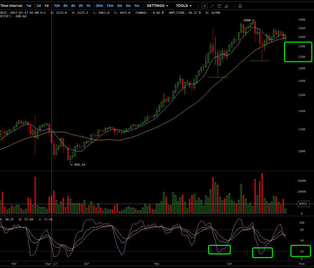
Daily chart (Bitcoinwisdom) - direct link
The Bitcoin daily chart shows that we are in an intermediate correction pattern. The oscillator below the chart (KDJ) reflects some weakness in price to follow short term. From this, I suspect that price can fall a little within the marked green zone to place a second bottom after the sub $,2200 bottom two weeks ago. KDJ going under 20 could be an opportunity to buy.
2. Three Day Chart

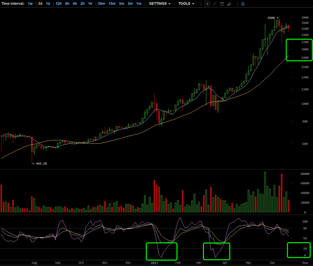
3 day chart (Bitcoinwisdom) - direct link
The 3 day chart shows the KDJ indicator slowly starting to bend downwards. While not immediately worrying, this enforces the thought that the movement towards $2,200 described above, could shift into something bigger, with a movement to the $1,800-2,200 range. This would fit a narrative of increased uncertainty in the Bitcoin scene now that the 1 August 2017 deadline is rapidly approaching.
If KDJ spikes downwards below 20 close towards 0 in such a larger move downwards, a buy in the zone marked green could prove to be an excellent choice.
4. Weekly Chart

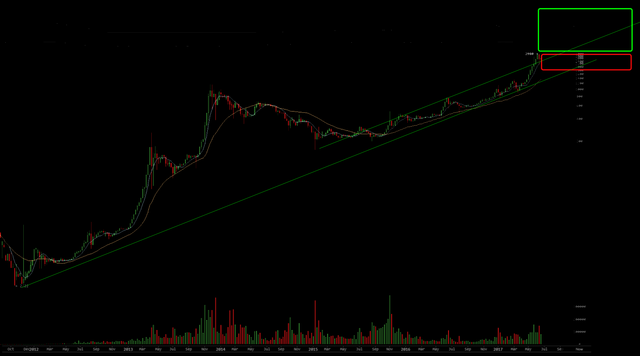
Weekly chart ((Long View) (Bitcoinwisdom) - direct link
The weekly chart shows the main trend line as from 2012. Open the chart with the link provided if not clearly visible.
If this line will be broken, I will get very cautious. However, we are still a long way from breaking this trend line. In fact, we are still in an accelerated move away from the bullish channel that has been loosely indicated on the chart.
This chart provides a clear view of the impact of the two 2013 bubbles and how far we are still away from a real 2017 bubble. The green zone marks a potential area for a real spike upwards. The y axis does not show prices but think of $10-15k before it gets really 2013-like bubbly.
And that brings me to the last chart.
4. Bullish Long View - Chart

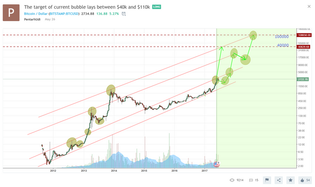
Bullish as Hell (Masterluc's) (Tradingview) - direct link
This chart shows the most bullish projections for a 2017-2019 price spike up to $110k. It is my understanding that the person who made this chart (and maintains it over at Tradingview is the same as masterluc in the infamous 'Analysis never ends' thread over at Bitcointalk. He has been right numerous times in 2013 and he may be right this time.. But this will take a strong HODL attitude.
This is it for now. Happy trading (and HODL-ing).
DISCLAIMER: just sharing ideas, no trading advice. I am long Bitcoin.
Very good hits
Let's hope the long view becomes reality.
I agree, thanks for the comment
Saving for later study thanks for the hard work
Nice post!