Cover art updates for my current KS
A few tweaks to the monster design that will be on the cover of this Volume 2 Creature Feature Quarterly for The Black Hack. I think I might go for the regular negative look on the black cover, but still this was kinda neat.
I like the original monster art for this guy (the Bog Horror). But there was a little bit of shadow under him that looked funky once I made it a negative. So I started adjusting this and adjusting that... and a few hours later it's quite different.
What do you guys think?
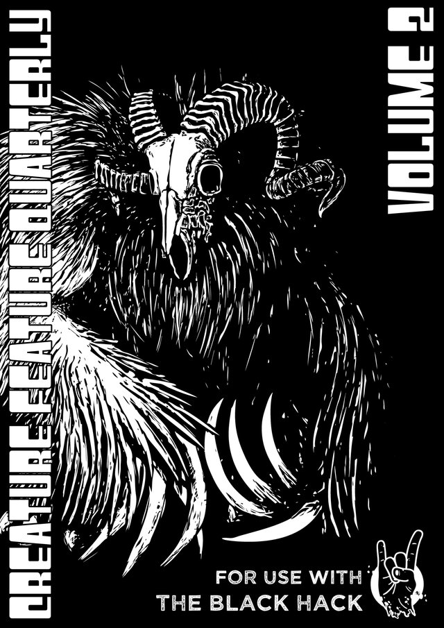
Updated art. Front cover. Black background. No negative filter applied to character (unusual for a Black Hack compatible product.)
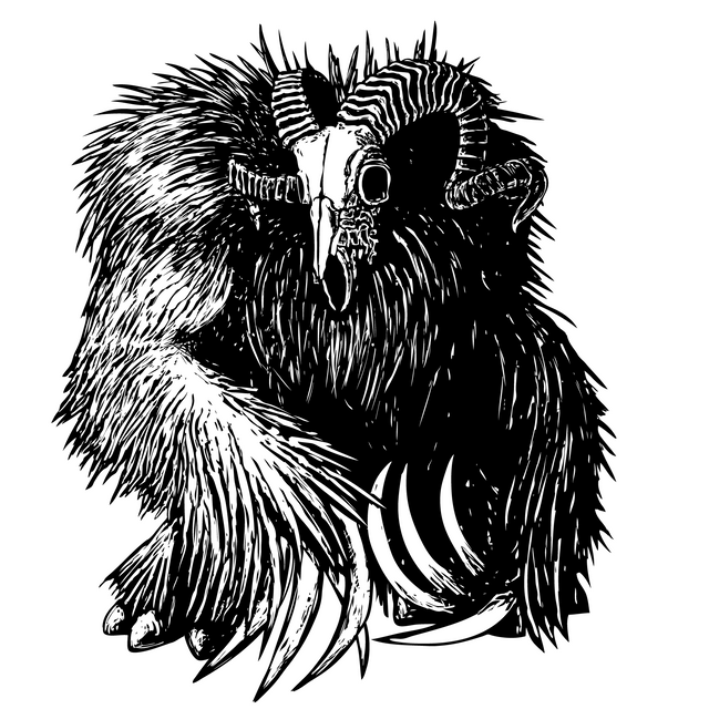
Updated art. I think it looks more bear-like and a bit like a monster out of folklore... maybe like the things in The Village.
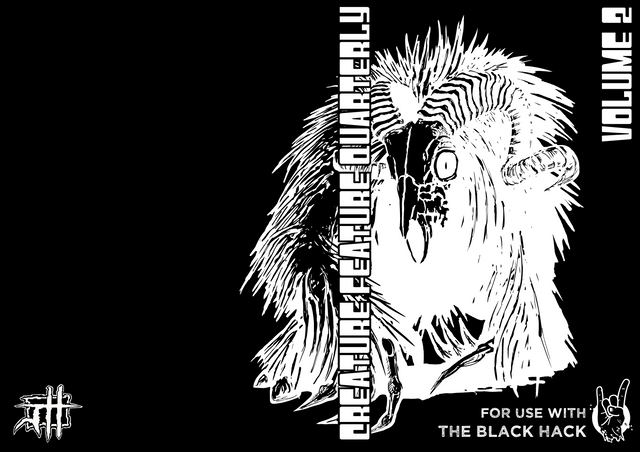
Original art. Wrap cover. Black cover. Negative filter on character art.
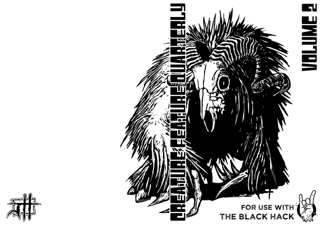
Original art. Wrap cover. White cover. No filter.

Original art.
If you are interested in this project, please check out the Kickstarter link above.
I'm also on Patreon. That's where I generate the stuff I compile into my monster books. Backers on Patreon also get access to all my art to use in their own projects as well as discounts on my stuff on DriveThruRPG. You can find my page here:
https://www.patreon.com/jeremyhartillos
This post was shared in the Curation Collective Discord community for curators, and upvoted and resteemed by the @c-squared community account after manual review.
@c-squared runs a community witness. Please consider using one of your witness votes on us here
I like it a lot:) I think with the black lines and black background it looks the best:)
Love the detailing in his fur and that skeletal face really pops up super nicely with the black background <3
The horns are super cool <3 <3 <3