#37 Design | @steemit-outdoors Official Logo, An Initiative by @bambam808
.png)
First Things First
I am forever grateful to have met someone like @bambam808 on Steemit. Who knew that Steemit could've brought such an amazing friend into my life. This platform is truly amazing in so many ways.
I just want to thank @bambam808 once again for letting me in on his endeavors. Everytime he comes up with a brilliant idea for an initiative, he would always give me the opportunity to help him in the design works and I am truly grateful for that. It is always a pleasure to work alongside with you especially on this upcoming initiative which is very exciting!
@steemit-outdoors will provide a whole new experience for Steemians on the outdoors but before I spoil the whole climax for you like how some kid on Facebook shares the ending to The Avengers : Infinity Wars... I would let @bambam808 do the official announcement of the initiative. Which would be VERY SOON. So head on over and give him a follow because you do not want to miss out on the announcement when it comes out.
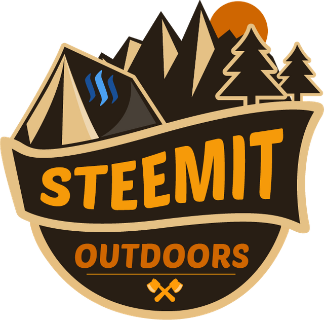
@steemit-outdoors Official Logo
.png)
The Idea
I'm being reminded that references are very important when starting a design project. I would always look for the feel and aesthetics that would properly help deliver the message and vision of the initiative through the design. I've written a few guides on this specific topic because even animators need to stash a dozen shelf load of references in their video library to be able to whip them out anytime when needed.
Moving forward, I shortlisted a few references of designs found on the net like the Survivor series logo which we all loved and used to watch on TV. I wonder do people actually watch the television nowadays. But yea, I've taken their logo reference, picked a few good ones and began crafting the logo for @steemit-outdoors.
I wanted the @steemit-outdoors logo to have the 'wild, forest, and hiking' factors. At one glance, you know this has got something to do with these extreme adventures. At the same time, shouting out the Steemit logo and text. I ended up creating one like a scout's badge. Those scout badges made of cloth that you sew them on your sleeves? Yeaps, those sort of badge logo which was perfect to bring out the adventure element.
Creating the Layout
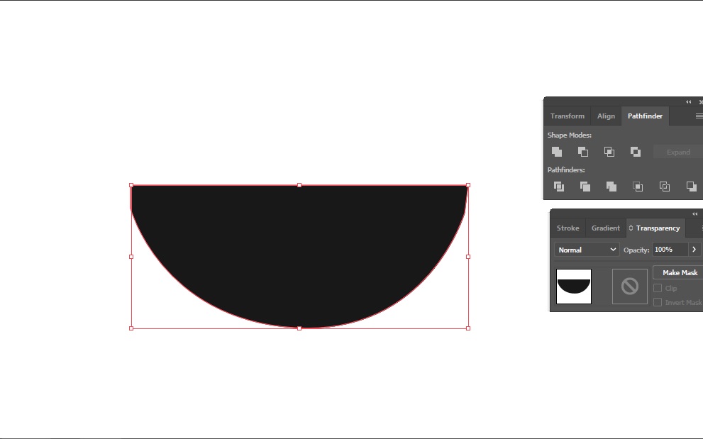
I started to create the base of the Logo first. I just wanted a semi-circle base. I chose a rounded base instead of a rigid square or rectangle base for one very simple reason. I wanted it to represent our Earth.
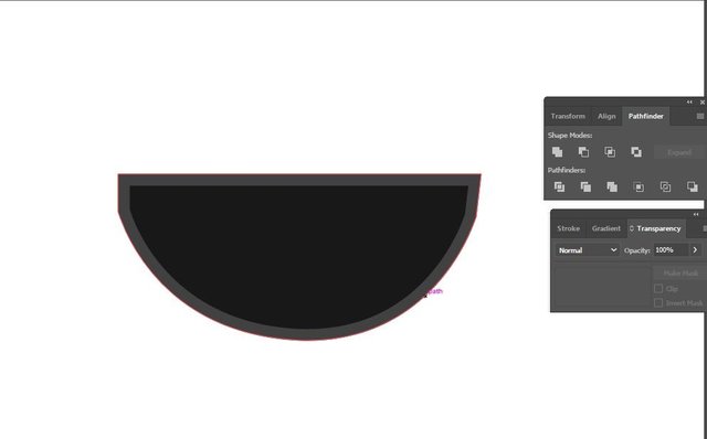
Some technical stuff going on here. Did an offset path to recreate another similar shape but equally larger on all sides.
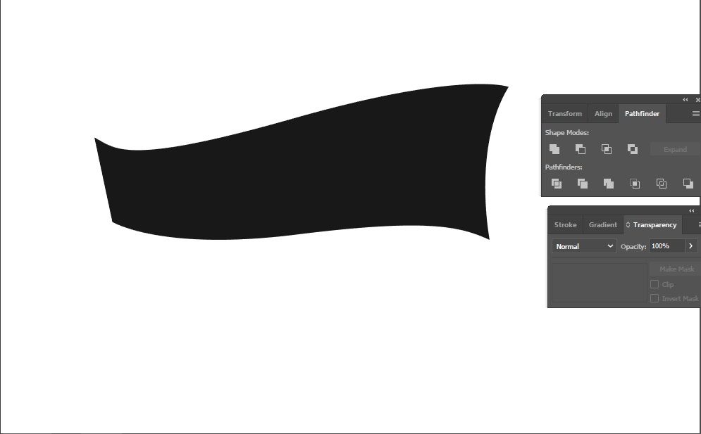
I moved on create the base for the main text. Created it wavy to represent a river flowing through the forest.
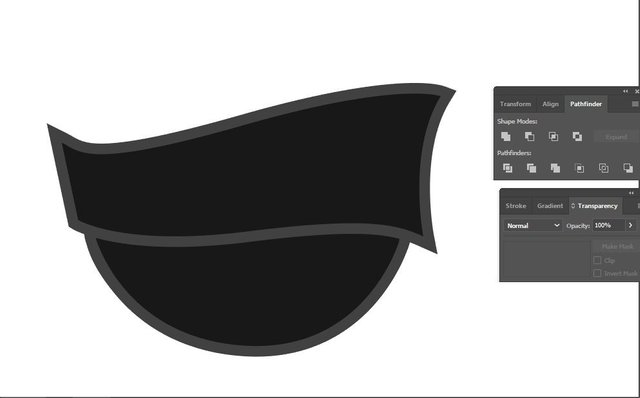
Offset the paths similarly to what I did to the rounded base and aligned the two shapes together. This is the base layout for the logo which I'm going to continue build on.
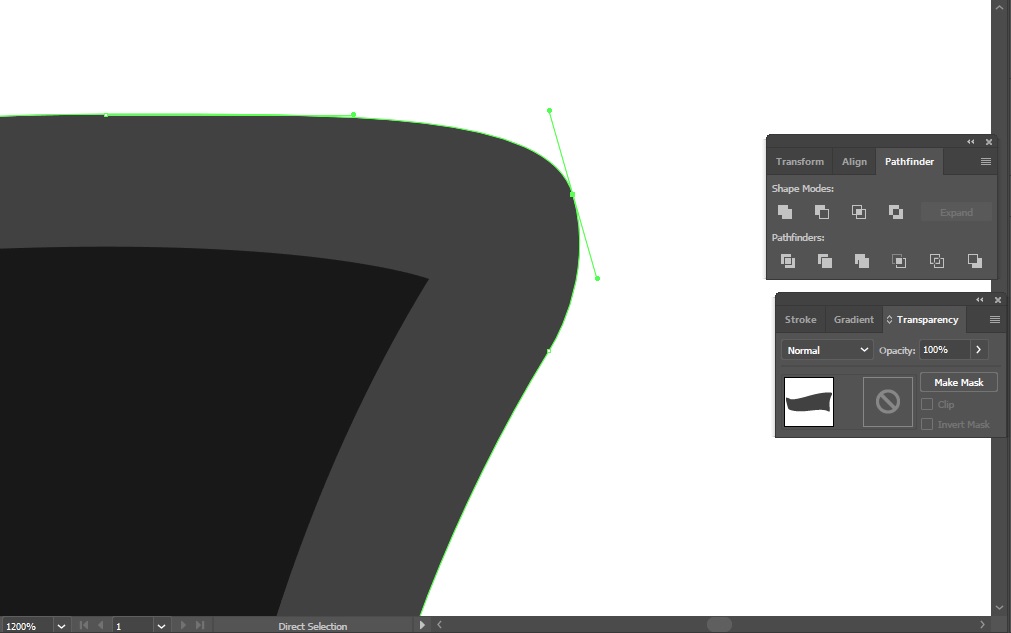
The edges were a little sharp to my liking and rivers are supposed to be smooth. So I rounded the edges.
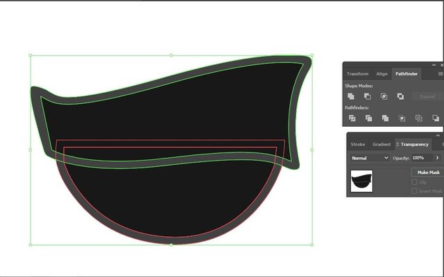
And this is the outcome and I was pleased with it. I would usually make sure I've nailed down the basic shapes first before moving on.
Creating Elements
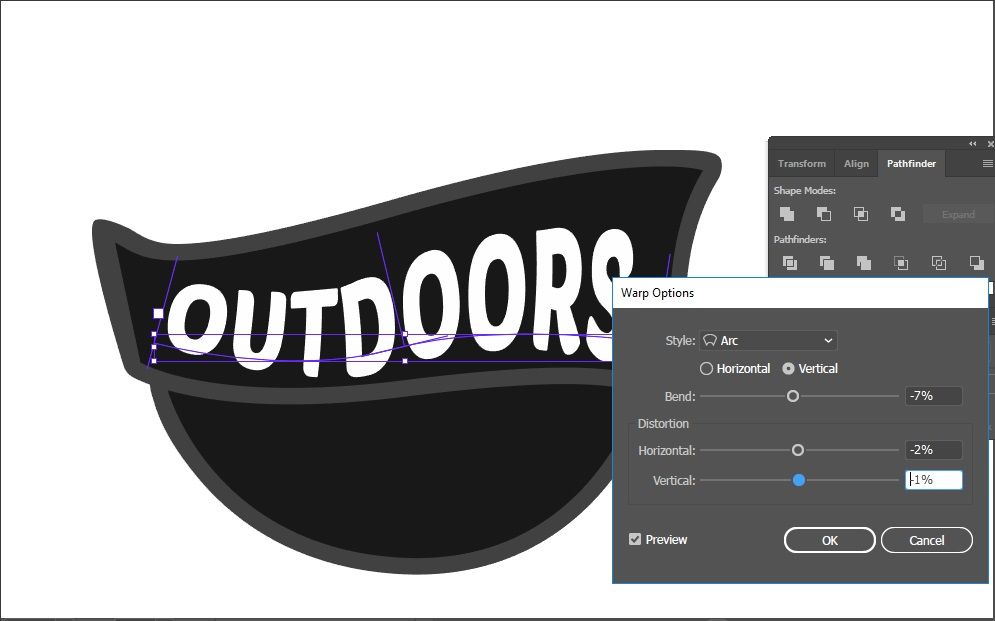
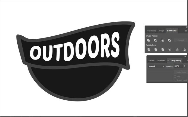
Added the Main title for the logo which I would later swap with the word Steemit just cause it looks better. Used the warp options to curve the text. If you've noticed, I've been using black and white all this time, that is because I want to focus on the shapes first before I start on polishing it up. But it is not long after this, I started to add the colours onto the logo. Kinda wanted to bring it to life.
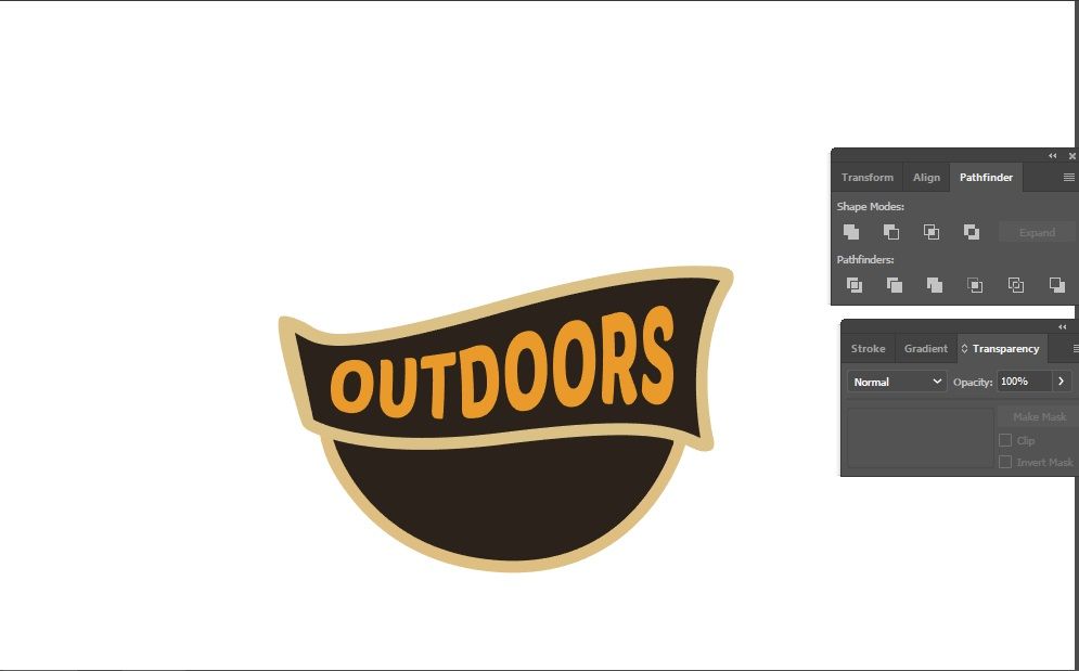
Here you go, added the colours and I'm using some rough and tough dirt colours for the logo with warm colours like orange to highlight the sunrise/sunset.
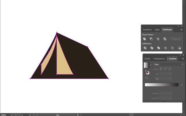
I went on to creating the land elements like the tent! Who goes hiking and adventures without a tent to sleep in ey?
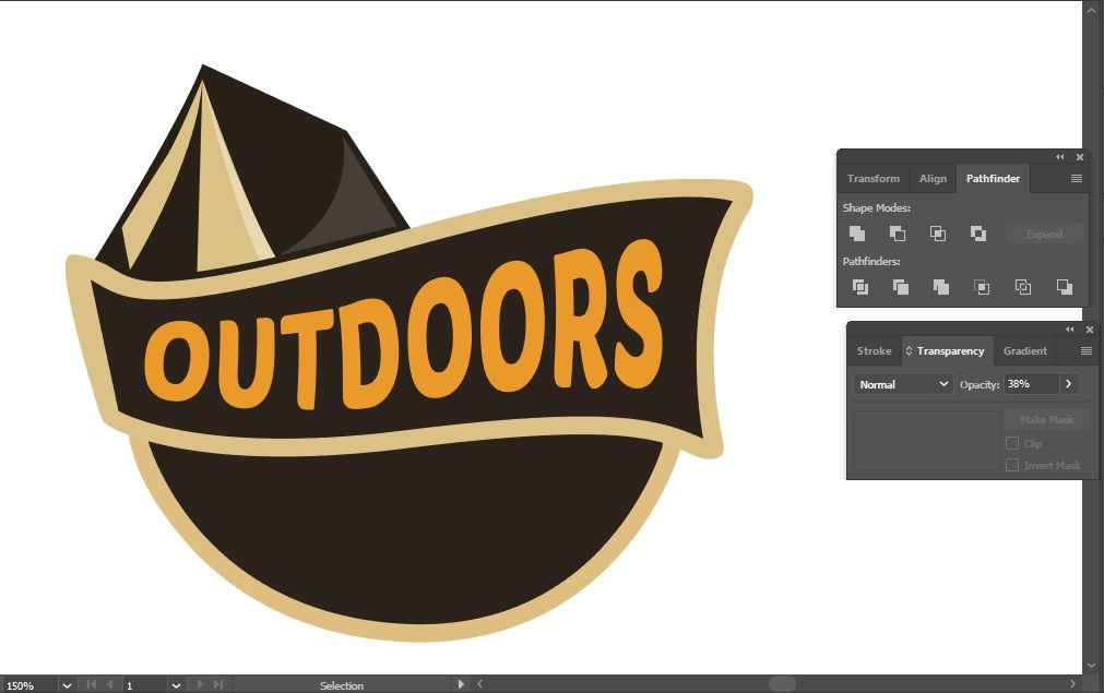
Added the tent on the logo. I decided to also add some finer details like the highlights to the tent so it looks more solid.
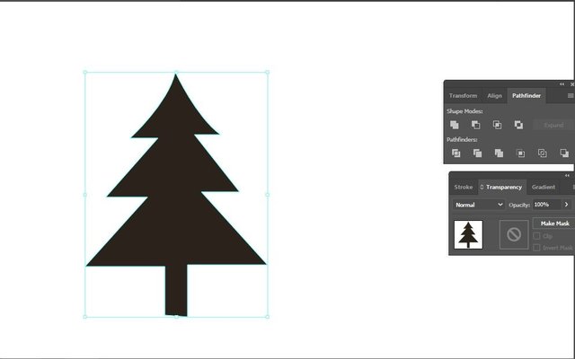
Kinda reminded me of christmas, I opt to create this type of tree because it was easier than the trees with a lot of branches. As long you guys know it symbolizes a tree then it's fine... :D
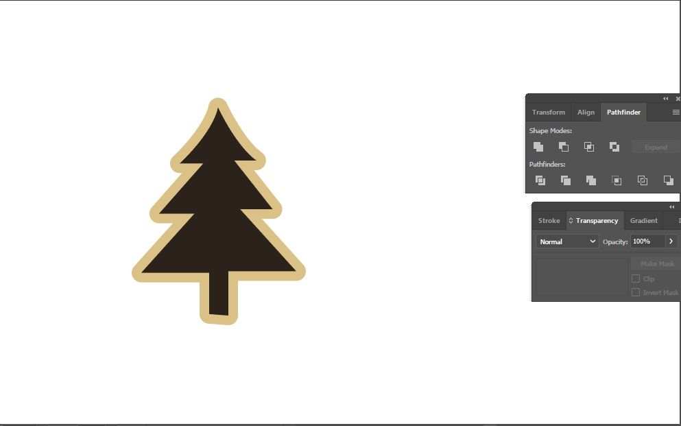
Looks like a cookie ey? I offset the tree as well to create an outline or else it will blend into the other elements surrounding it.
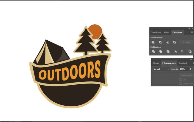
Added trees onto the logo and the orange egg yolk, i mean.... sun. The sun rising on the right side and thus the highlights tone are on the right side as well.
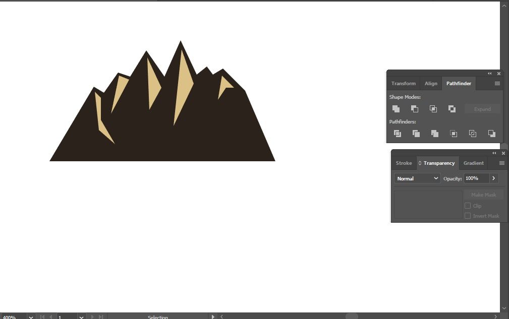
Adding the last and final element to the logo, the rocky mountains.
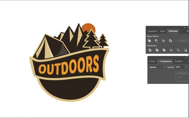
Adjusted the sun placement and combining all the elements. The logo is looking better and better and I'm actually quite satisfied at how it has turned out so far.
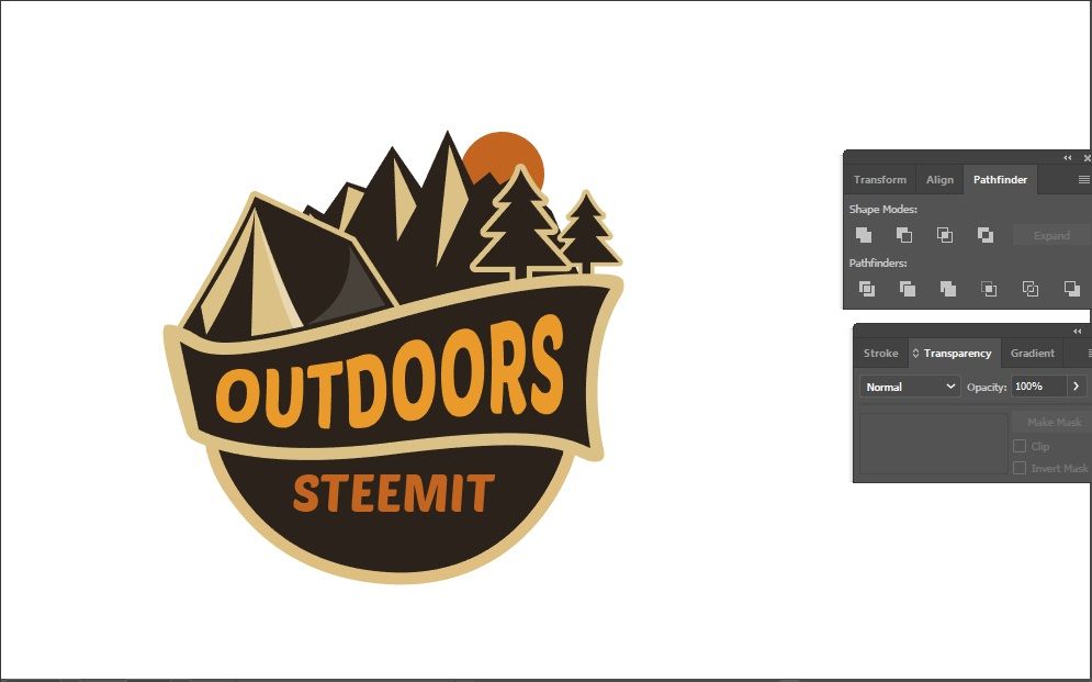
Completing the @steemit-outdoors texts which I would later swap with each other.
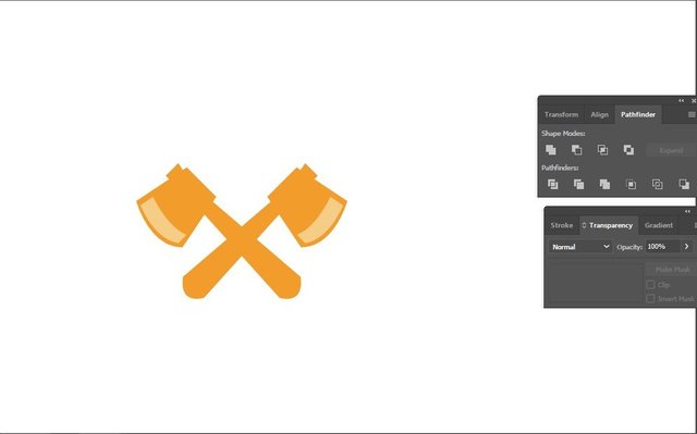
Created two wood-cutter axes just for cuteness and fun to be onto the logo base. Actually to also fill up the empty space below the logo.
Final
.png)
Wuaaaalahhhh! I swapped the words with each other and added the Steemit logo on the tent. With it's striking blue colour among the warm and darker colour palette, it is definitely more prominent.
The logo is now at its perfection! I'm actually surprised and pretty satisfied with it overall. As you all know, I'm not well-versed with using Adobe Illustrator and Photoshop, well, it isn't my strength but I'm just glad I managed to pull this off for @bambam808. Always loving a good challenge.
I hope you all enjoyed the thought process behind this logo design as I spent quite an amount of time designing this and a lot of thought into it at the initial stages.
Thank You
If you like what I do, check out my other posts on meetups, animation, and designs.
Get your Personalized Steemit Profile Banner,Logos & GIFs

You are so talented. It's always such a pleasure to see your work-in-progress ... become a final result.
Thank you :)
You have collected your daily Power Up! This post received an upvote worth of 0.53$.
Learn how to Power Up Smart here!
You've done it again @zord189 !! Well done, I LUUURRRRV it! Following @bambam808 now and waiting in anticipation to find out about steemit-outdoors.
Thanks @sweetpea. :D
That is a nice looking logo you have created, was "quite amount of time" like several hours or a couple days? Did you also experiment with other designs for this project? Just curios.
Um... took me a few hours to do, but a few days of planning in my head. What do u mean experiment with other designs? I kinda took a few references of good designs that I like to follow.
What I meant was using different colors or shapes, maybe a stream scene, things like that while in the thought process.
Hey, @Zord189! Very sharp final product. That's a great logo.
Followed @bambam808 ! Hehe
Nice!
It's....it's...just...
via GIPHY
Hahaha Thanks @traciyork
I like the logo design, and it was nice seeing how you put it together. I look forward to hearing from @steemit-outdoors too :)
Thanks man. I'm excited too
Wow, getting good with Adobe Illustrator ya!
Haha hopefully! Thanks
Practise make perfect, soon...
Great logo! I look forward to see what Steemit outdoors is all about😊
Thanks! Can give it a follow and the first post would be up soon!
the logo looks really good! aesthetically very pleasing haha... but was slightly put off by the steem logo placement ... maybe cuz the tent is at an angle.. but the steem logo's perspective is different haha...
OCD triggered
Haha Thanks! I actually thought of warping the logo to the tent's perspective, didn't look that good. So I just went to flat it out. :D hahahah
haha ic, another idea i had while looking at this ... was to put a campfire outside of the tent, and use the steem logo (without the ori color) as the smokes haha...
i think it'll look pretty nice :))