Colour Wheel and Colour Theory Explanation using Watercolours
Hello dear Steemians! I got a set of new water colours at a very cheap price recently and tested them. I also thought of making a colour wheel and share how the colour theory works.
The water colour
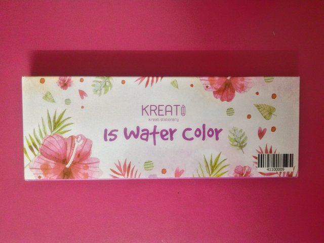
It is from a brand called Kreati. It costed me only RM 2.00 (0.48 USD)! I have never seen a set of water colour this cheap, so I got it to try. I bought it in Kedai 2 Ringgit (RM 2.00 Store) in Bukit Beruntung, Selangor.
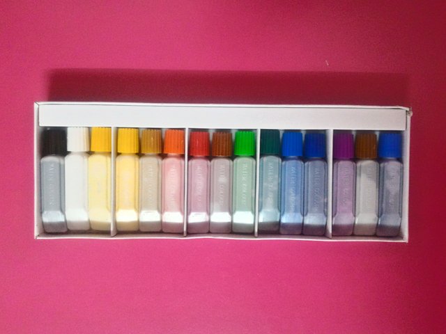
It consists of 15 colours.
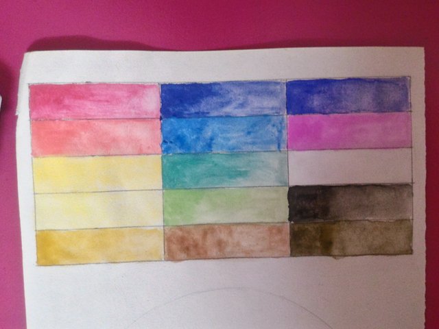
There was a red which looked cool. The orange looked like a warm red and not orange. There were two types of yellow, one being a cool yellow while the other was a warm yellow. There was also a golden brown which could pass for dark orange.
These are two of the blues, as there were three altogether and two shades of greens along with a brown.
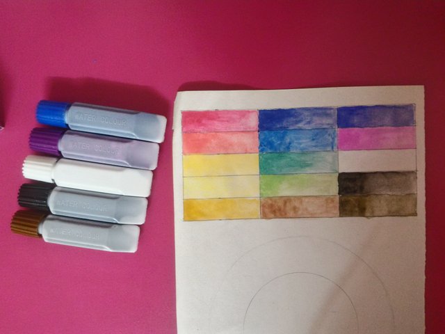
I tested the rest of the colours. The third shade of blue was more of an indigo. The purple was unexpectedly too warm for a purple. It was closer to pink. The black and white were neutral as usual while the dark brown looked like a sepia version of black.
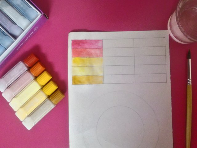
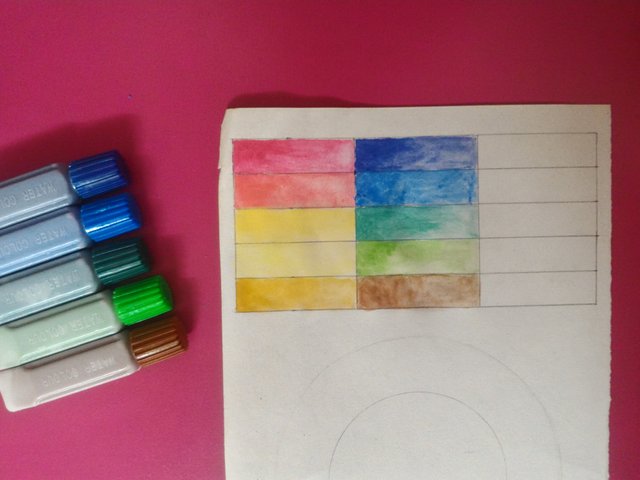
This is the entire colour palette tested. On the left area of each colour, I tested them with only a drop of water while on the right area, I added more water to see how they perform with water.
I tested them more by checking how they mix with each other while making a colour wheel. They didn't seem like they have a lot of binders for a cheap set of colour which is good.
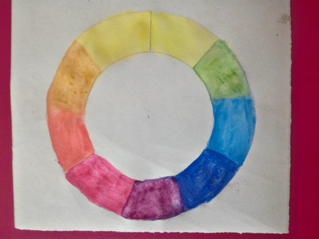
The Colour Wheel and Colour Theory
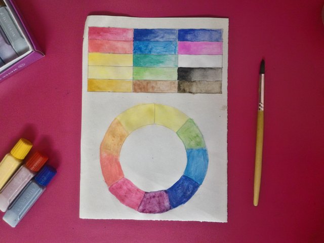
This is the colour wheel that I created. I used two versions of the primary colours for each one (red, blue and yellow). One is the cool shade while the other is a warm shade. The reason is because when secondary colours are mixed using the primary colours, the outcome depends on the shade of the primary colour. For instance, a warm red and a warm yellow will mix well to create a vibrant looking orange. However, if I attempt to use a cool red and a cool yellow, I will end up creating a dull shade of orange.
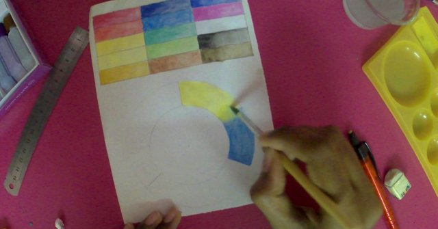
A cool yellow is more suitable to create a green by mixing it with a cool blue. if I use a warm blue or warm yellow, I will still be able to create a green but it will look a lot duller compared to using a cool yellow and cool green. On the other hand, a cool red is more suitable to mix with a warm blue and create purple. If I try other variations, the outcome will look muddy, too dull or dark. Such colours might be useful if they are required for an artwork, but that is often not the case. I have shared my colour wheel for you to understand it better.
I hope that my colour wheel and the explanation on how to pick colour shades to mix a new colour are helpful to you. Thank you for checking my post out and have a great day ahead!
Hello @yashny, thank you for sharing this creative work! We just stopped by to say that you've been upvoted by the @creativecrypto magazine. The Creative Crypto is all about art on the blockchain and learning from creatives like you. Looking forward to crossing paths again soon. Steem on!
Thank you for the support! I really appreciate it =)
Posted using Partiko Android
Congratulations @yashny! You have completed the following achievement on the Steem blockchain and have been rewarded with new badge(s) :
You can view your badges on your Steem Board and compare to others on the Steem Ranking
If you no longer want to receive notifications, reply to this comment with the word
STOPTo support your work, I also upvoted your post!
Vote for @Steemitboard as a witness to get one more award and increased upvotes!
Reminds me of when I wanted to start painting class. My mentor said I should first create a color wheel so I could understand how they relate.
Posted using Partiko Android
High 5! My teacher taught me this too in one of the first lessons. I guess it does hold an importance when it comes to learning to paint.
Posted using Partiko Android
Yeah, the truth is that you wont realize the benefits that moment until later on in life.
Posted using Partiko Android
This post was shared in the Curation Collective Discord community for curators, and upvoted and resteemed by the @c-squared community account after manual review.
@c-squared runs a community witness. Please consider using one of your witness votes on us here
Thank you @c-squared! =)
Posted using Partiko Android
Oh ! That is an interesting exercise, @yashny! I see how doing this might be a good way to get to know how the colour would actually look like, when they are on paper, and how they would look like when they are interacting with each other :D
Really cool~ I might do one with the watercolour set that I got from Shibasaki later :D :D :D
Thank you @veryspider! That will be great! I'm sure the colours will also come looking very vibrant as he uses high quality colours. Sakura if I'm not mistaken.
Posted using Partiko Android