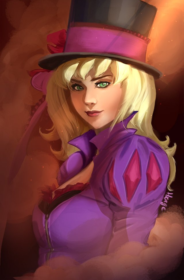
Really cool artwork, I have some suggestions to improve this piece that you might wanna follow. I'm a professional concept artist working for video game and this is just to help you. In no way this is a negative critique of your work. Take a look at some modifications

HD here: http://imgur.com/IvM6ij8
As you can see I changed multiple things:
- Anatomy
- Lighting
- Volume
- Texture
Anatomy
There is multiple little flaws to her face. You have to think a bit more about the volume of her head, and how her eyes fit on it. The nose had a weird perspective and was a bit to big. The breast looked a bit too unrealistic even if you like big boobs it was astronomical. The neck is quite long but it fit with the overall "anime" style
Lighting
You didn't really chose a light source for this picture and the overall image looks a bit flat because of it. The shadows need a clear direction to do that a clear light source. I used an easy spotlight trick to emphasize her face and play with the mystical effect of the theme.
Volume
Every shape is in 3D and you have to think about that everytime. you are trying to draw something. You did an overall good job but the face is really to flat take a closer look at how light influences the human face to try to understand it more
Texture
Some brush effects you chose are lacking in Spontaneity. It might be a bit weird to say but try to be more relaxed and confident with your brush strokes, use a wider brush for large surfaces. Hair is tough subject and you need to had more fluidity to it.
TIPS : Use multiply layer to add strong shadows to your characters: be Bold with it. Finish with a color dodge effet to add a nice and smooth flare effect on the light.
Keep it going great work overall !
Thank you very much for all the tips! Yes, you really pointed all the things that I wasn't happy with, I tried to fix them, but now I understand a bit more why it didn't happen. With more practice and hfollowing your tips in mind, surely will improve rapidly! I need to remember that sometimes less is more, I think I overdid on some aspects and as you mentioned I was a bit scared to play with the huge contrast in colors, because it was kinda turning out awkward.
You did a fabolous rework! It looks amazing. Thank you very much for the very helpful and constructive comment!! :)
Great overpaint! Definetely pushed the mood and values!