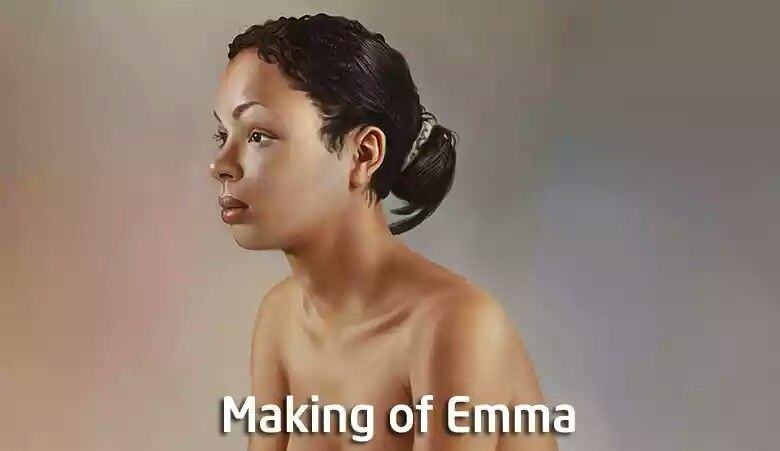
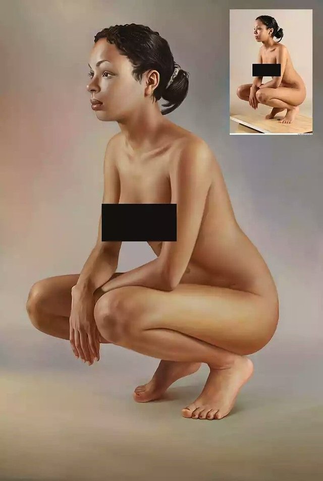
DIGITAL PAINTING #2 - PAINTING OF EMMA.
31-03-2018 : My second post on DIGITAL PAINTING FOR STEEMIANS TO LEARN FROM - PAINTING OF ELLA
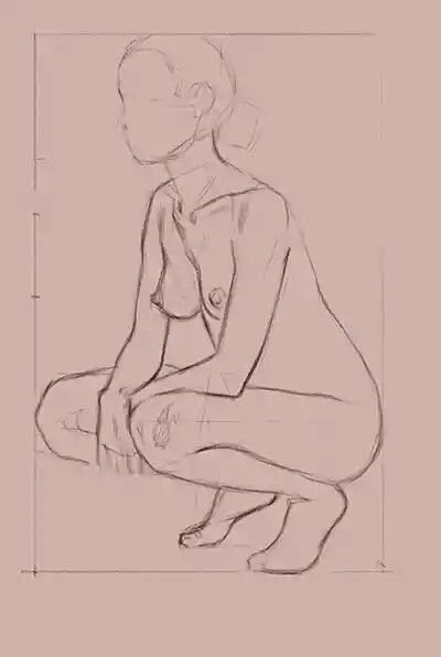
SKETCHES
First I did is making box for composition and proportion building. It is a bounding box of object I draw. It helps me to build more detailed subdivision for my character in future.
Then I use anything like a grip pen for understand proportions and locations of body. And box serves me like invisible grid. I can make some marks on it and use it for control of proportions. Next I make basic sketch of body with contours of big parts like head, spine, hands, legs and so on.
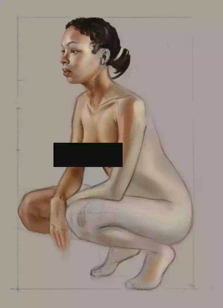
Then I create the new layer and attempt to choose a technique or brush options for paint. It is usually standard brush with 40% follow and 70 - 100% opacity. Then I make some tests for skin colour and lighting. I try to avoid the use only red or orange colours (as suggested by my friends). Then I paint the face first to stretch my hands for painting all pictures.
This part I begin to paint with more final quality for the part of the body. It has more experiments and trying. For soft blend between dark edges of hands and specular spots. I fill hands with darkest colour of edges and then paint specular. For better blend I use intermediate colours, red, yellow or orange. But it is depend on light. Red for hot - blue and mix with grey for cold. Often I use colours nearly grey area to paint cold tones.
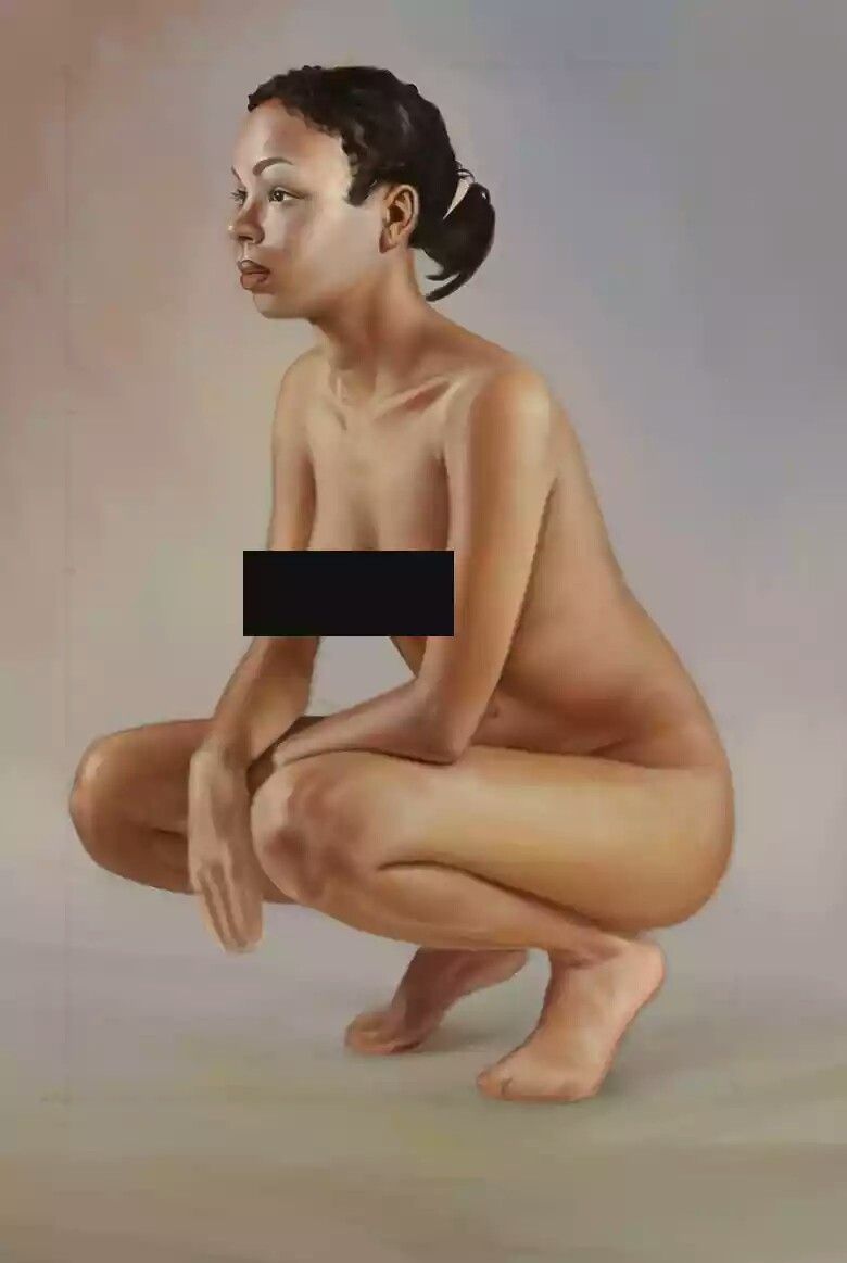
WRISTS
This is horrible place for all artists. Be careful. At first you need to build all wrist with pencil or other thin brush.
Don't afraid to spend time for this. Compare few times. Then go slowly from nails and fingers up.
One dark tone and then specular. Brush option follow 20% and opacity 50 - 60%.
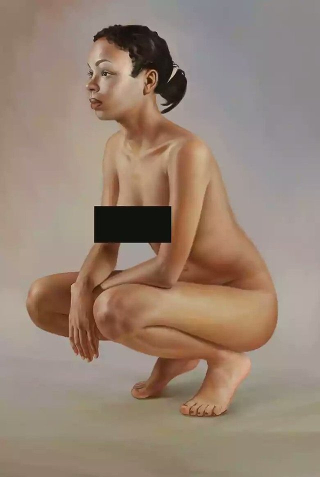
FOOTS
More green and gray. Some yellow and white with light pink. Less details on shadowed places.
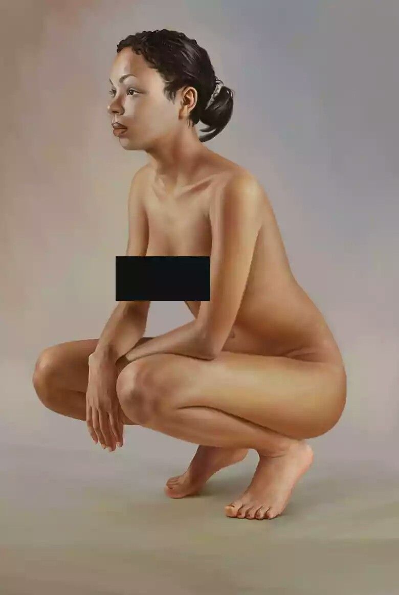
HAIRS
It is easy. Black color. Then you paint some diffuse spots with dark gray or tone of your light. Then make more thin specular spot, wide and solid. After this you can add more thin hair with brighter tone. Just watch for topology of hairs as on reference.
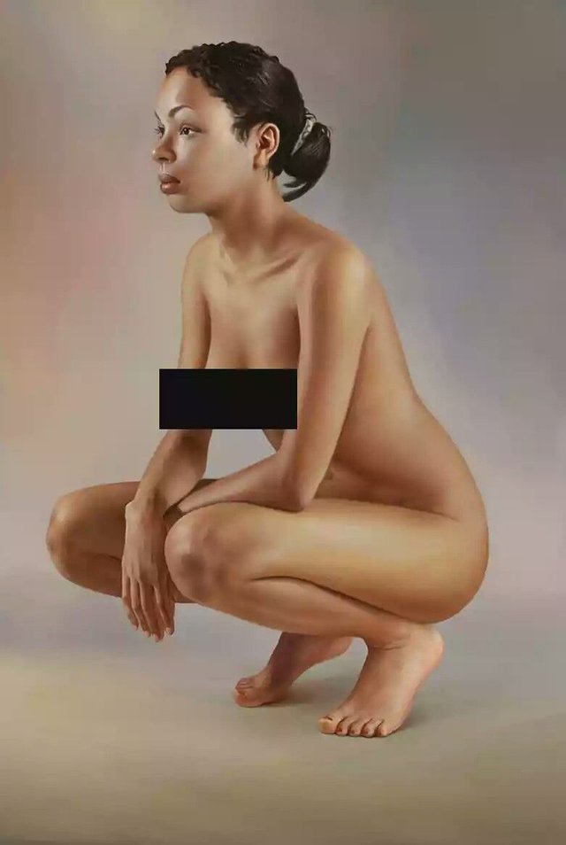
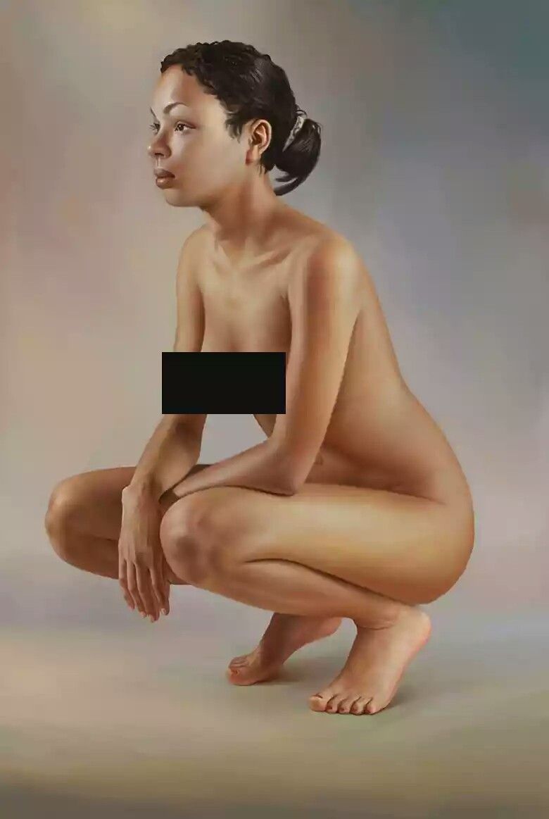
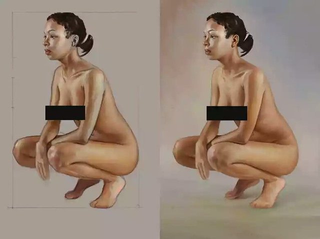
BACKGROUND
It is up to you. I just wanted to make focus on the character. That is why I used neutral background for this work. PhotoStudio classic of your wish. Just one spot for key light, cold background for spine to divide colors of body and environment.
And many different colors for your eye. people love colors. Here you can see the live reference I used for painting this image.
Digital Painting #1 PAINTING ON BED. Click here>>
As this post helped you, You can leave your comment.
I have already warned you once! You are being reported to steemcleaners.
Stealing others work and profiting from it will not be tolerated.
http://www.cgarena.com/freestuff/tutorials/photoshop/emma/emma3.php
It's not that hard to work on a post yourself, or give credits for the hard work of another.
How long did you imagine you were going to keep it up?
Same behaviour that has eaten deep into our blogosphere is the same you're exuding into Steemit's .
You don't have to be among the train of reputation spoilers of our country.
How hard can it be to write about your life or participate in contests. Even if you think you aren't creative enough, you can spend your time commenting on other stuffs - that way you learn and still earn.
You were cautioned more than once but you didn't adhere.
Steemit isn't a get rich scheme, that it isn't working for you doesn't mean you should soil it for others.