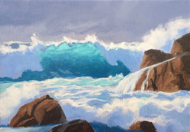
NEW PAINTING - 'Atlantic Storm' Seascape - Art and Painting Process
Hello Steemers
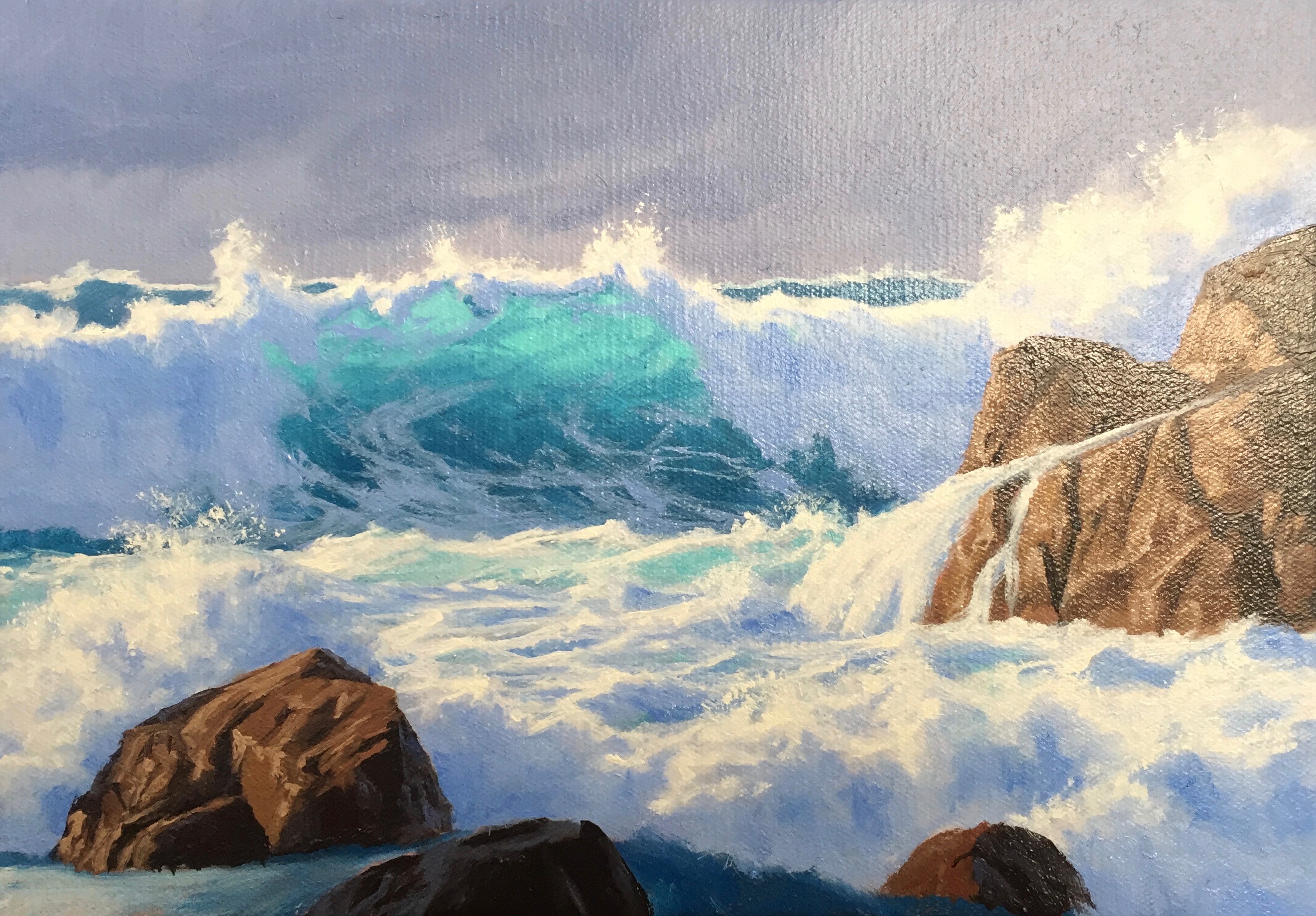
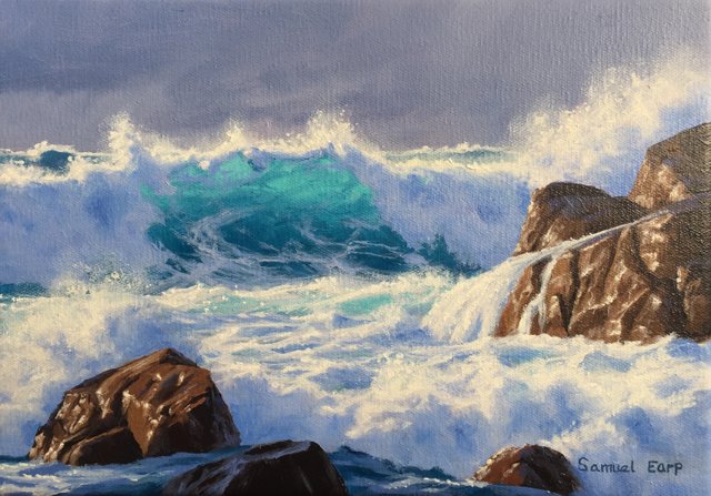
I have just finished this seascape painting which I started a few weeks ago. This art work is painted in oils and is inspired by the wild coast of Guernsey, in the English Channel. There a frequent storms that better the coastline but it makes for great paintings of the wild sea.
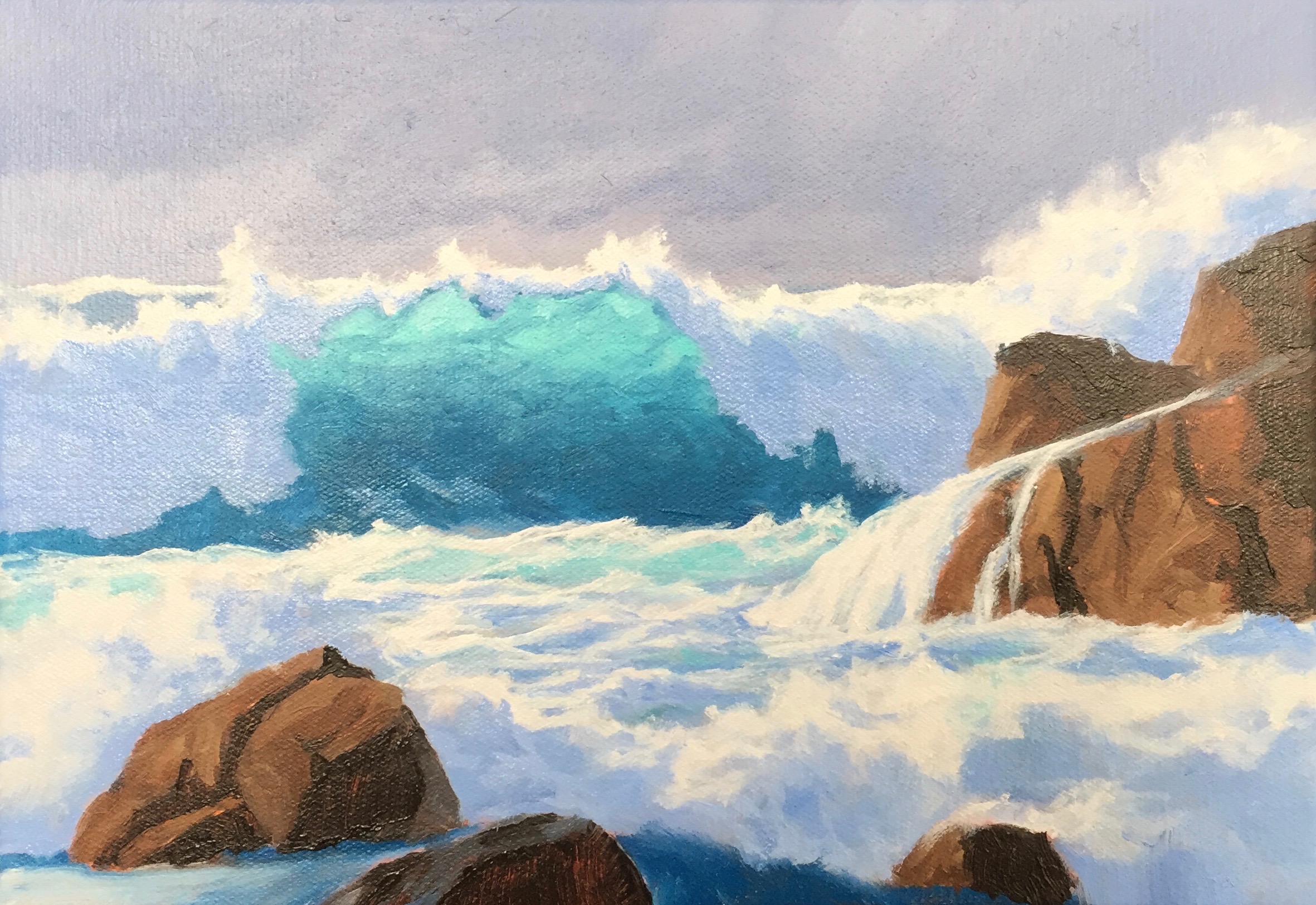
This is my finished painting and in this blog I will show you my painting process of how I created this art work.
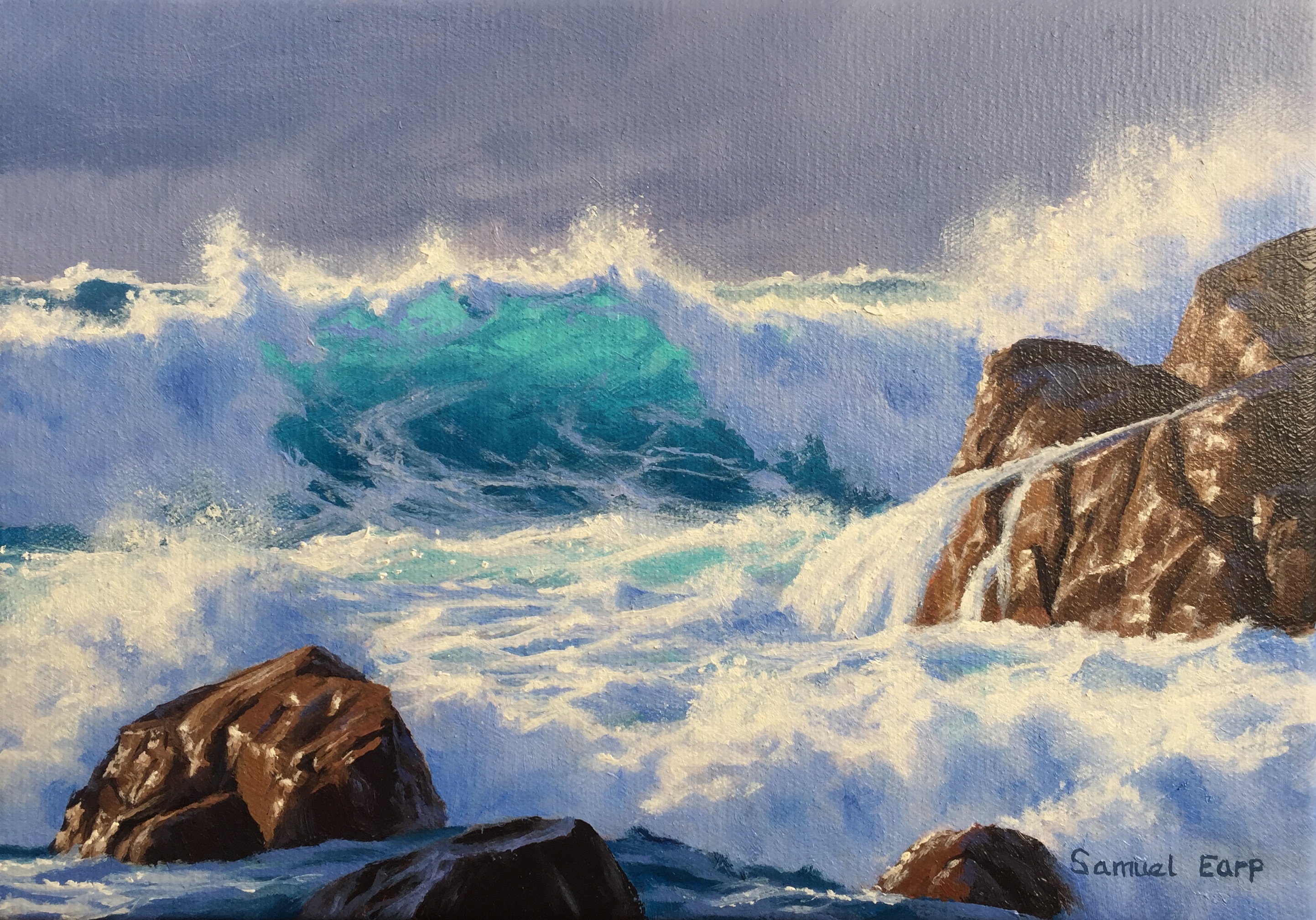
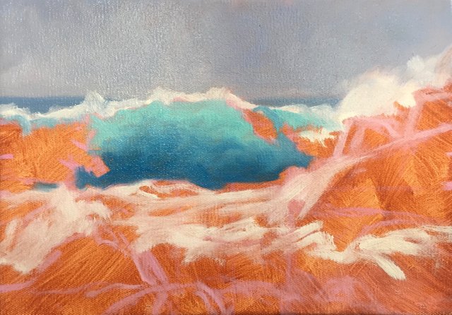
Atlantic Storm, 20cm x 30cm, oil on canvas.
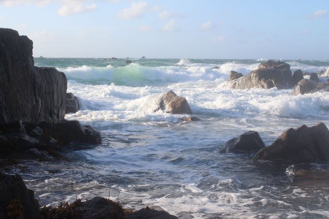
This was one of the reference photos I used for the painting, I used a few. I love the rocks in this photos and the white water in the foreground. I used different photos for the waves.
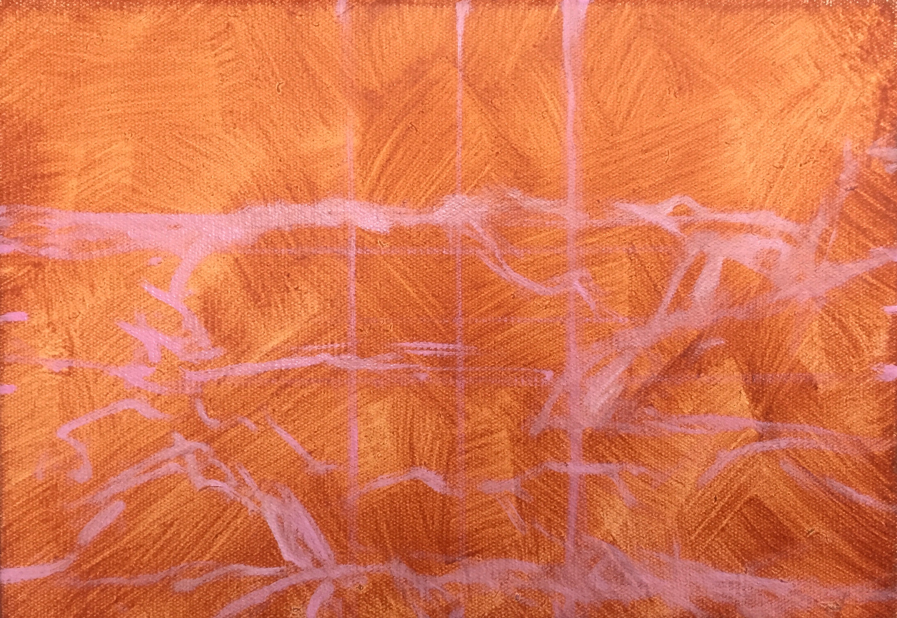
I started this painting by applying a layer of burnt sienna and letting it dry as this warms up the canvas as it comes through the paint layers.
I sketched the scene using quinacridone magenta mixed with titanium white and I mixed it with liquin which thins the paint and speeds up the drying.
I start this painting by blocking in the sky. I have deliberately opted for a dark, moody sky to indicate stormy weather conditions, but the dark sky will also contrast nicely against the wave highlights which will emphasise it and add more drama to the painting.
I mix the sky colours with a combination of ultramarine blue, burnt umber, quinacridone magenta and titanium white.
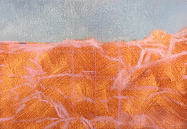
Next, I paint the horizon line of the sea using ultramarine blue, a little phthalo green, titanium white and burnt umber to desaturate the mix. I have opted for a high horizon so I can emphasise the drama of the foreground and when painting landscapes or seascapes you should never have your horizon in the middle of the canvas as this forms a distraction in the composition.
I outline the highlights of the waves and foreground white water with pure titanium white from the tube and liquin, I'm not concerned that I'm using white at this stage as it will soon mix with the painting outline and the colours I am about to add to the painting.
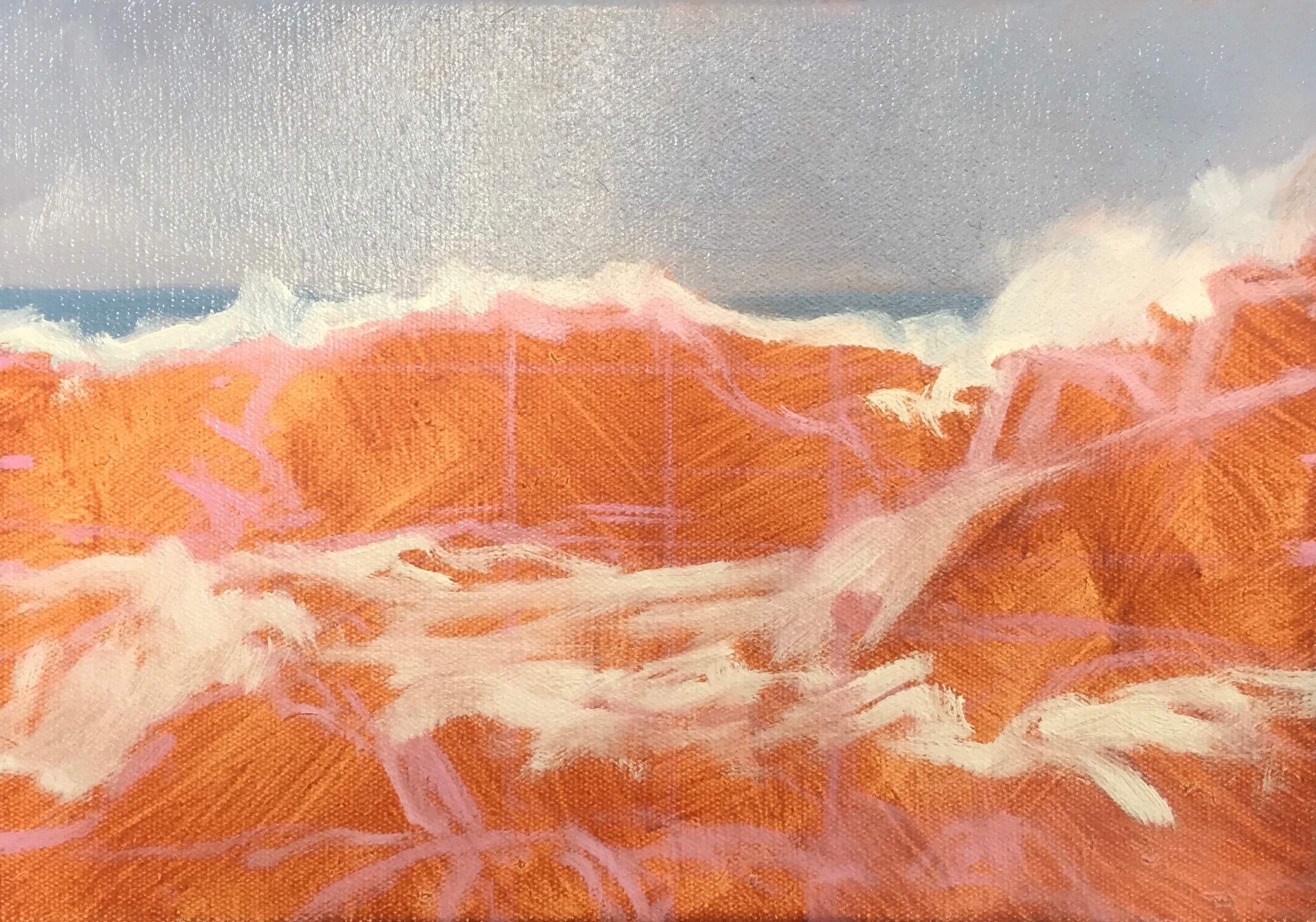
Next I focus on the main focal point of the painting, the wave itself. I paint the translucent area of the wave by mixing titanium white with cobalt teal and phthalo green and then as I move towards the trough of the wave I start introducing ultramarine blue and cobalt blue into the mix and using less titanium white.
I manipulate the paint to give the appearance of turbulent water and at this stage of the painting I am not at all concerned about detail, I just want a base to work from.
I start blocking in the shadows of the waves and white water using a combinations of ultramarine blue, cobalt blue, quinacridone magenta and titanium white. I vary the colour combinations to achieve a variety of tones in the water to give the illusion that it is turbulent and stormy.
I also apply some of my wave colour mix to the white water to add interest to the foreground.
To complete the blocking in stage I add in the rocks in which I have mixed the colours using a varying combination of burnt umber, burnt sienna, yellow oxide, cadmium yellow and titanium white. I keep the tone darker at this stage so I can add highlights later on in the painting.
I mix the rock shadows using a combination of of burnt umber and ultramarine blue which creates a very dark tone.
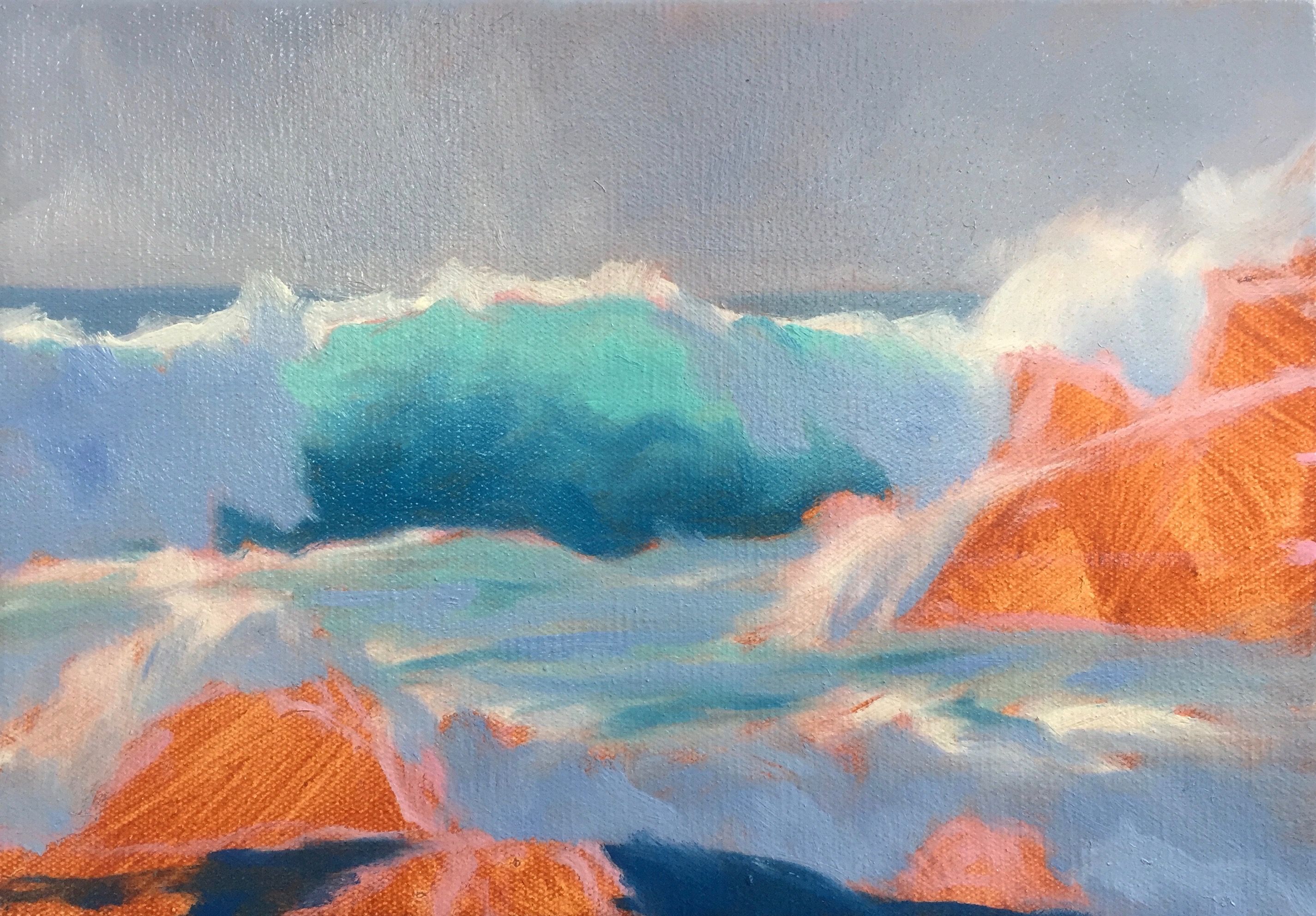
Now that the blocking in stage is complete and I've allowed the painting to dry I start working on the detail of the painting. I focus my attention on the wave highlights and the white water in the foreground but I don't want to dive in there with pure titanium white from the tube.
If you look at the photo for the most part the white water and wave highlights are not quite white, only a few parts of it are, so I need to reduce the tone of the white by adding in a little ultramarine blue, burnt umber and quinacridone magenta, basically the same colours I used in the sky. By using the same colours that I used in the sky it's actually creating more colour harmony in the painting.
By decreasing the tone of the water I can achieve a more 3D effect in the water later on in the painting by adding lighter tone at the end.
Next I paint the foam patterns of the breaking wave, little tendrils of trapped air in the water that form interesting patterns that add to the drama of the breaking wave. I use the same colours for the foam patterns as I did with the shadow areas of the white water.
Now that the water has gotten to the stage where I just need to add final highlights to it, I focus mu attention on the rocks on the right. I mix burnt umber, burnt sienna, titanium white and a little ultramarine blue to create the illusion of wet rocks. I increase the tone by adding titanium white.
Next I paint the rocks in the foreground on the left using a combination of burnt umber, burnt sienna, yellow oxide and then in places a little cadmium yellow and cadmium red light to increase the saturation of the colour. I vary the tone by adding titanium white to the mix.
I am trying to give the illusion of wet rocks so I add highlights to some of the rock edges and faces to give the illusion of the sun reflecting off a wet surface.
Next using a fan brush I start adding more highlights to the water to give the illusion of droplets of water as hits the rocky shore. Using lighter tone that the previous layer allows for a more 3D effect in the water.
To finish the painting I had my final highlights to the rocks by mixing titanium white with a little cadmium yellow and burnt umber. I also add some reflected light to the upper surfaces of the rocks by mixing cobalt teal, quinacridone magenta, cobalt blue and titanium white.
I add pure titanium white in small quantities to the crest of the wave and to the white water in the foreground. This is where I apply my lightest tones to truly bring the water to life and with that the painting is complete.
I hope you enjoyed this blog post and if you found this blog post interesting and helpful.
Check out my website for more painting demos and my art: samuelearp.com
Subscribe to my mailing list for news, new paintings and art tips and receive a FREE DIGITAL ART PRINT DOWNLOAD of one of my seascape paintings suitable for printing an image of any size: https://www.samuelearp.com/subscribe/
Amazing! Loooks sooo real... :)
Thanks @acidmaster :)
@samuel-earp-art you are really talented mate! Congrats! the movement and colorful waves look simply amazing!
If you like art, check out my latest post about Eduardo Kobra, probably the best urban artist on earth... your support will be super welcome
https://steemit.com/art/@albertoyago/eng-who-is-eduardo-kobra-esp-quien-es-eduardo-cobra-my-favourite-urban-artist-on-earth
Thanks @albertoyago, great blog post, his murals are impressive. Sorry I've been late catching up with all the comments!
this is very beautiful painting of a sea-scape. Waves are really fun to play with while painting... I still have yet to incorperate waves in a tattoo yet! I hope I do soon!
Thanks @mindcombustion, a wave / seascape tattoo would be pretty impressive, I'd like to see that.
I am totally in love with your paintings, they are so fresh & alive.
Thanks @bella-volen-art, I really like your art work too, your pencil drawings a brilliant :)
The painting is so good and the tips are helpful as well. Thanks for the post . It will surely help me to art like your paintings one day .
Hey @sulav, thanks for that. I have more painting demos on my website:
https://www.samuelearp.com/new-blog/
Thank you so much.
A great work. A useful post
Thanks @ideosprocess :)
the light through the dive is amazing! OMG :D
Hats down to you sir. Exquisite work and an excellent step by step demonstration. Thanks for sharing. Looking forward to your future posts. Cheers.
Thanks @dosbosnivianos :)
thnx for sharing. i am not a painter but amateur phoographer. but really really nice work!!
Thanks @mbroek1983 :)
Loved the wave work
Thanks @bensignal :)