DLive Logo Contest With Unnecessary Night Mode, art process (finding balance to myself)
Hello streemer strams.. Or strammer steemer.
Today, I joined a contest, this contest is like.. Very very big like, super duper big, and you know go big or go home kinda big. I am excited to join this because it's such a fun thing to design a logo or something.
So I brainstormed the designs in my mind, but none never clicked with the "slick" or "clean" designs of things, since most modern places have more clean designs. The more I preasured myself to do it the more I'm intimidated with the slick design and stuff because I am NOT a guy who does simple stuff. I over complicate things ALOT, in drawing, and in real life LEL. I guess it just flows from my personalitty.
And with that said I have became even more like "o h no- what to do" and then after that I have read a comment from @coinsandchains
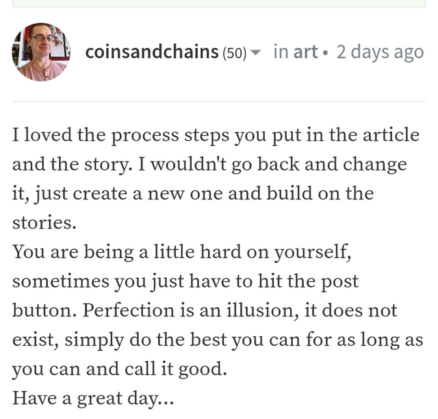
And for that I'll just try to.. Chillax a bit, like don't pressure myself and just be myself and yknow what? There's no rules to have overcomplicated stuff, why am I overthinking this?! Coins is right maybe, I shouldn't try to pressure myself, but pressuring myself sometimes got me more into drawing and forcing myself to it. So it's all in a grey area! :0
I think we all should just try to find a balance of it, we can't completely burn ourself out we'll hate drawing completely! But at the same time I hate being lazy. So the right balance is probably what I need to find.
By the way coins, and everyone especially u spooder thilah and scrawly u know who u are 👀👀 thanks for the comments! Without yall I don't think I'd able to actually pull through this LEL
Now .. I gotta figure out the ninja part, but that gives me an idea of japanese stuff logo, and sure it's centered around the color yellow, well I'll give it to them MWAHAHAHAH HERES YELLOW FOR YOU FOLKS.
I like the restrictions, I find it weird why they chose ninjas for "talented individuals" I thought it's because of that fortnite streamer LOL, but I'm not gonna complain to be honest hehe.
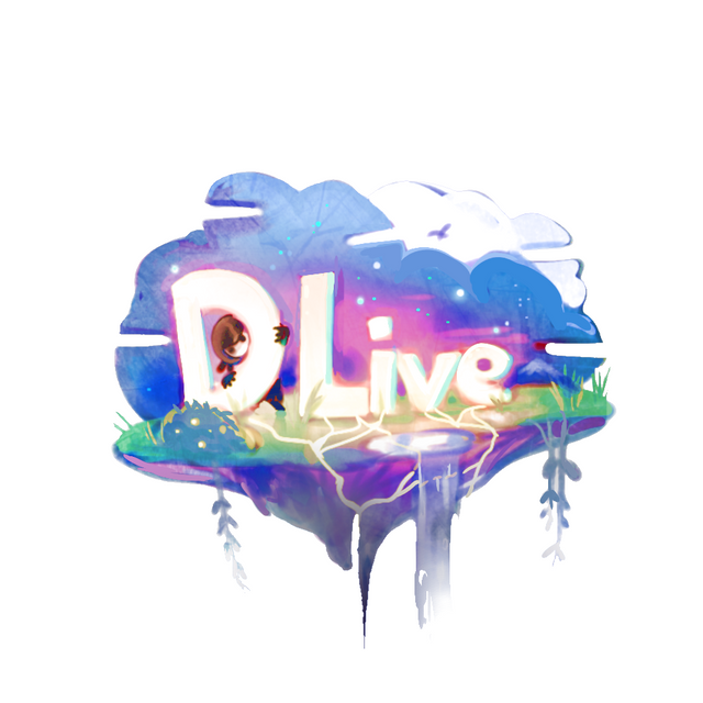
P-Progress?!?!
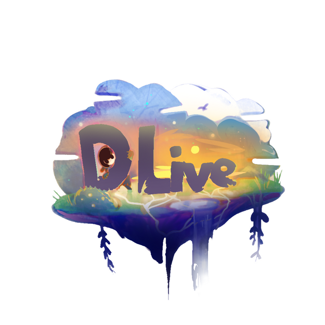
So anywayss I've made 2 versions, normal version, and night mode just for shits and giggles! Let's start off with the normal mode.
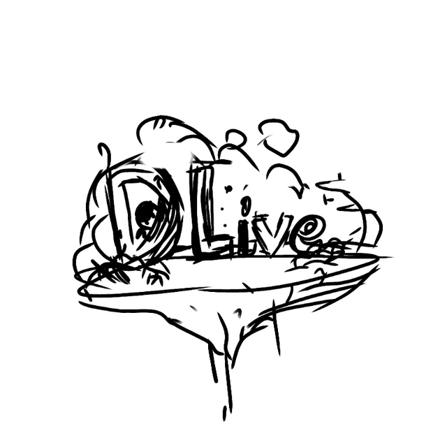
First off, we need to do the.. You guessed it. The sketch, how predictable I am.
I guess I was just going for my gut ya know what im sayin, I hid the lil ninja behind the D because that's what ninjas do right? Being ninjas as a hired assasin and stuff.
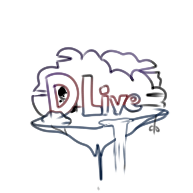
Then I do the lineart nothing to say but just making the lineart look soft
Then I colored it with flat shadin
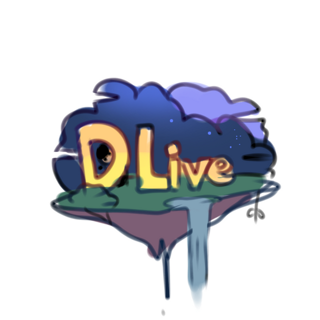
Then finally the magic happens..
Blending layer multiply and blending layer Add.
Adding details such as:
- refining the sky that looks like a drama stage
- refining the out lines of "DLive"
- adding vines
- detail to waterfall
- light at the bottom of the floating island
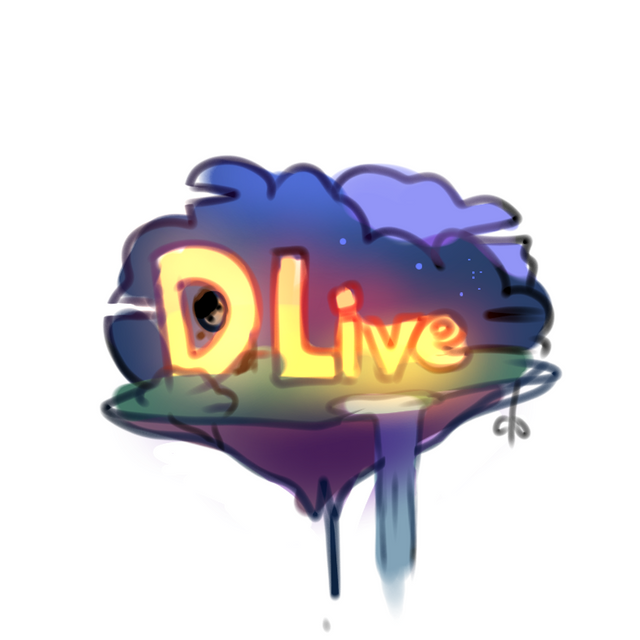
I started to
- get rid of that one vine on that L
- Dlive getting their roots to the ground, saying that their talent is rooting and growing on the small island
- adding grasses and refinning the bushes
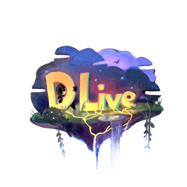
I started to try to make the water look atleast decent, and makin sone finishing touches aaandd
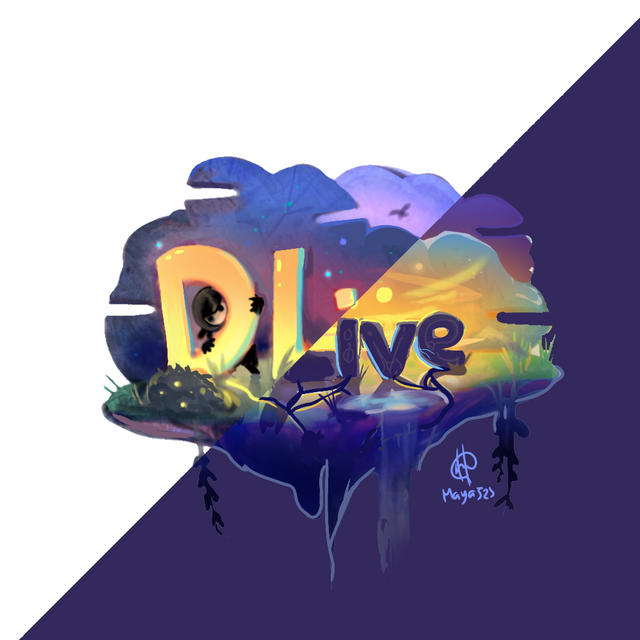
FINISHED!!
And there we go UwU we have ourselves our shiny new bright Logo
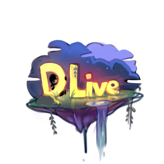
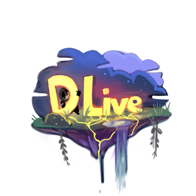
And now for the night mode!
P-p rogress number 2?!?!
Alright so it might be weird buuuut I started off with the normal picture and then I have color corrected it to make it bright as hell to make it seem like its day time.
Then adding
- stone like structures to the DLIVE
- making it shadow-ish
- and adding the YELLOW sky
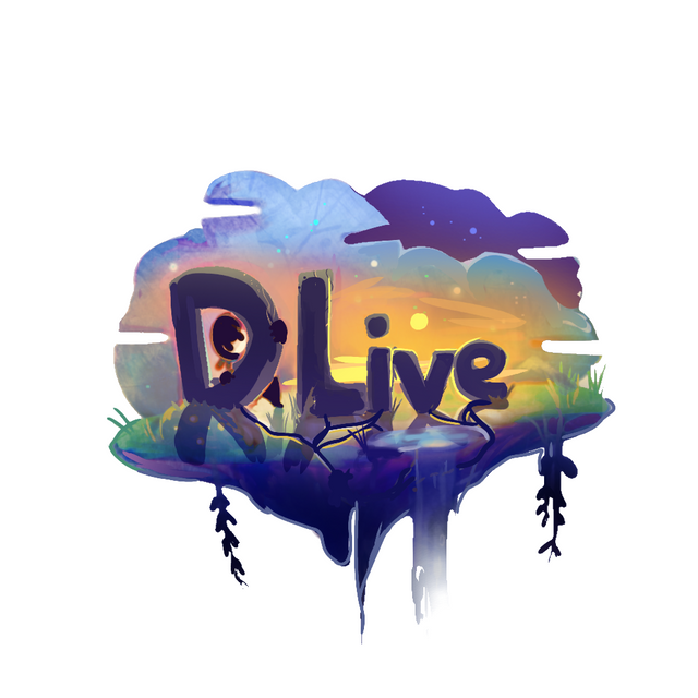
Then adding shadows using the multiply layer and trying to fix that weird waterfall, and add and night sky on the white thing. And instead of the roots, it all turned to cracks on the ground.
Andddd
FINISHED!!
We finish it off to a night version, yeah you may find it ironic that the day time is night mode but hey, I find it balancing, like yin and yang. We all gotta find balance into our world.
But ya know I'm not even sure if I'll win so why bother LOL im just doing this cuz why not and its fun too..
And money ofcourse duh, I want a PC XD I'm still drawing with a phone so yeeep
I had fun drawing this and I hope you had fun reading it! :D
Anywayss see ya next time folks and sweet nightmares!
It looks great to me.
Are you telling me that you did that on a phone?.... Now that is amazing to me. I couldn't even begin to do something like that.
Thank you for the kind words. It takes a very mature and self-aware person to ponder someone's words and then apply them to their life. I can definitely relate, I'm a perfectionist at heart, it took me a long time to learn that and I still struggle with finding that balance. It took me a couple months to get the nerve to make a post on here because I know that I'm not great at it, but I'm getting better.
Will your entry win, I have no idea. Did you enjoy doing it and maybe learn something or hone one of your skills in the process? Probably, which is still a win as far as I'm concerned.
One other thing, whether you get advise from me or someone else, Always evaluate it based on you and your values, never just blindly follow.
Thankyou coins for your comment! It's okay if I don't win or not atleast I wasn't preassuring myself to make it.
I'll always try to hear advice, from people, but if their advice is bad ofcourse I won't listen XD thankyou again for the comment
It's my pleasure, Thank you for sharing your art with the world.
Aaaaa no problem ^^
This post was shared in the Curation Collective Discord community for curators, and upvoted and resteemed by the @c-squared community account after manual review.
I like the organic feel of it and definitely stands on it's own...
Thankyou roguedenied :00.
What a way to describe the drawing haha! :D
What a great and attractive logo. I really like how fun it looks like, not just the usual professional looking style.
And of course the fact that you did this in your phone, it's still crazy to me XD.
-upvoted-
Thaanks I don't know how to pro hahahah I don't really get design and such so hey it's good practice right? :D
Very nicely done, maya-chan ! Love the colours and the finished version is super adorable and has that magical vibes about it <3 Good luck in the competition <3
Thankyou Spidy! :D thats really sayin something! Thankyouuuu
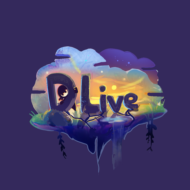
Very nice, Maya! I prefer the first one, with the white background.
Good luck for the contest!
Thanks trin! :D I'll make sure the first one is cool!
Has this one been in PIFC?
The artist? Yes... I've featured Maya a couple of weeks ago.
This particular post? No. It hasn't been picked, so far.
I'd say... Go for it! 😃
lol, I will if I can get caught up, it's been a long day already.
"You know who you are" ...I don't *SCREAMS AND FADES OUT TO EXISTENTIAL NOTHINGNESS"////NO And my god this is probably one of the most adorable and pretty logos I've ever seen~ All the best for the contest Maya!
DONT RUN AWAY FROM ME U FRICC FRACC!
I'm MORE WORSER THAN THE THANOS SNAP
AND ThaNKYOUUUU aAAAA I'll do my best!!
It was nice knowing you Maya RIP me
I'M FUCKING DY ING HAHAHAHA DONT DISSAPEAR ON MEEEEEEEE NOO
this looks amazing! I love the floating island sort of look you have, and the waterfall. im a big fan of your painting style as well, you manage to make the digital emulate a more traditional look, and you get a very nice 3D effect. i agree that I also prefer the first one, but the night time one also looks really good. Good luck!
Woaaa thankyou so much corinnei!! You really describe the art on point! I could never even describe it myself XD
Thankss correnei! I'll do my best
Anjirr ini keren minta ampun. 😻😻
Great job!!
Waaah makasih ya gibic thankyouuu!!
Oh, that's wonderful design, Maya-chan! Unique, relaxing and very colorful! Love both version and the night mode is definitely not unnecessary, my dear! It's actually the opposite - when making a logo design, both versions are required - on white/light and black/dark background and also in different sizes (to see if small details become too small and unreadable). So you've done your job beautifully, don't worry! <3 <3 <3
Oh, hope you buy a pc soon. I just got a new one. ;)))
Ah I guess you are right, why do my inner doubts always get to me XD I felt I was doing some overkill stuff but you're right ahahahha and thankyou so much btw it means a lot coming from you <3 good luck in the contest too kat!
Oohh in different sizes, I'm pretty sure if it's gonna be small, the ninja can't be seen but that's kinda the point of ninjas right? Cuz I intentionally did that haha
Hehe, thank you, Maya-chan! Good luck to you, hope to see you in the second round. ;)))
Yeah, making the logo in different sizes and on different backgrounds is a must, because they said are going to use it not only for the site but also print it on t-shirts and other products.