You are viewing a single comment's thread from:
RE: Original Art Photography Series by @velimir #165 'Thin White Line'
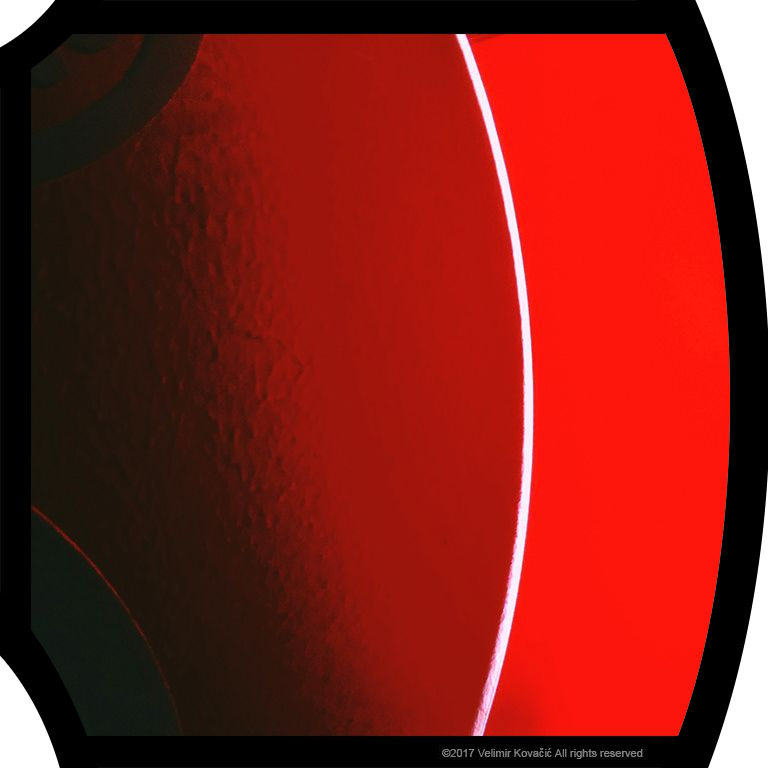
Hope you don't mind that I modified your work, but the first thing I thought when I saw this photograph and read about the line work was:

I rounded the corners to fit the lines and it somehow feels right to me like this, I'd love your input. As it is a jpg to conserve space, the corners are simply white to fit the steemit white background.
Edit: Now it's a png with transparency.
hahaha looks funny :) you totally removed the seriousness. quite cool! I like the right side better. sometimes less is more. if only the right side is bent and following the line, I'd like that a lot! :)
Thanks very much for the input! I thought the bends on the left made the frame look sort of like a coca-cola can, but I agree that maybe they don't fit too well overall so here's a version with just the right side, hope you like: