Seascape. Drawing with dry pastel. My detailed creative process
Hello, Steemit!
Last evening I decided to paint with dry pastel. Again I chose the theme of the sea, probably, it will never bother me.)
Usually I do not have time to watch master classes, but I decided to learn something new for myself.
For this work I used a dry pastel in the brushes "Sonnet" in a set of 48 colors and blue pastel paper "Palazzo".

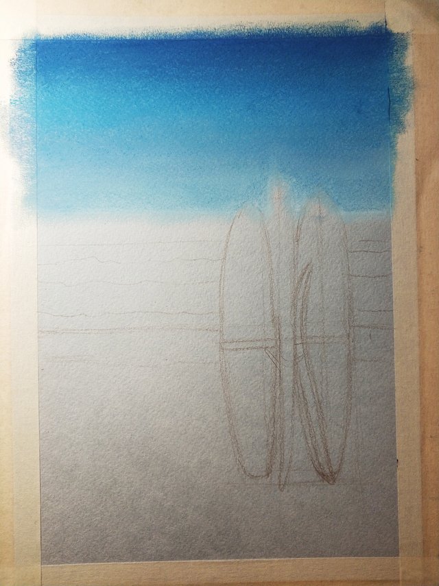
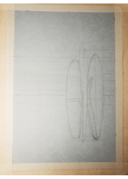
First I drew the contours of the future drawing with a pencil.

Then I painted the sky. For the sky I used a pastel of three celestial shades - navy blue, blue and pale blue. Softened by fingers the color transitions.
Then I moved to the sea. The border between the sky and the sea I painted with dark blue. The distant waves were painted with a light turquoise color, the near waves – with blue pastel. At the same time, I drew the clouds in the sky, using a white color.
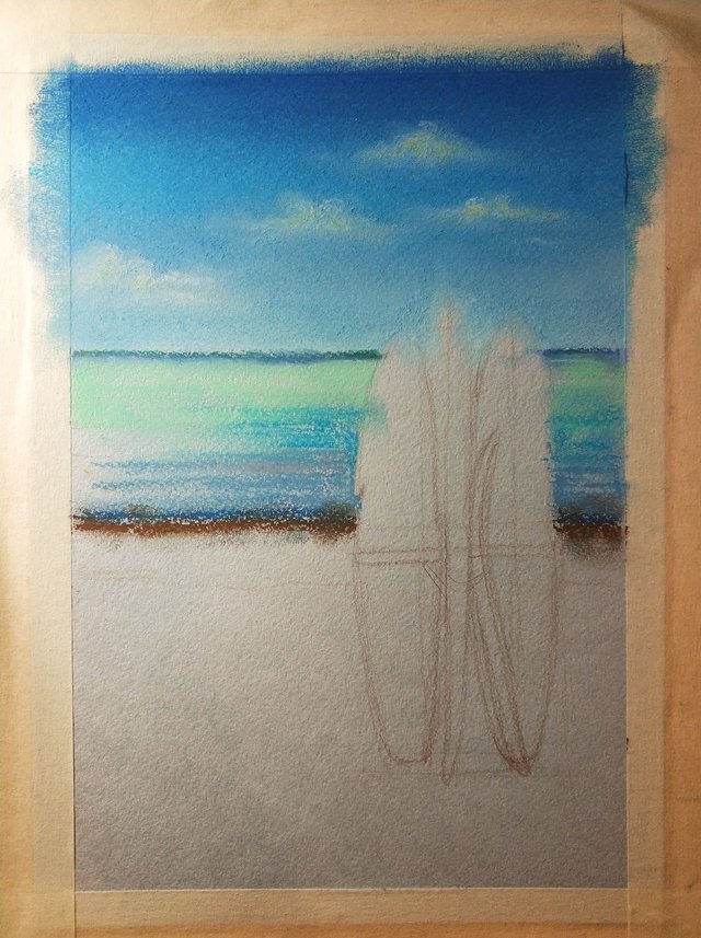
With white pastel I painted foam on the far wave, emphasizing its contours with thin lines of umber color. With white lines drew iridescent glare on the water. On the clouds I added a light yellow color, showing solar reflections.

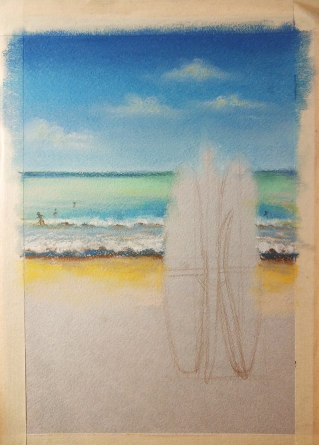
I drew white foam on the near wave. With pastel color of light ocher I painted the sand. I tried to leave textual traces of pastels on paper on the sand, shading transitions only on some places. Drew with pencil the figures of surfers.
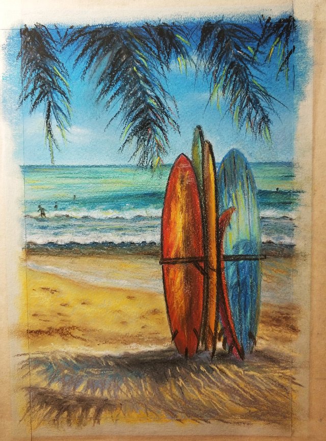
I finished the drawing of sand in the picture. Drew the drooping branches of a palm tree first with a dark blue pastel, then I emphasized it with black color. In the required colors I painted the surfboards. Drew with blue pastel the shadow of a palm tree on the sand, shading transitions.
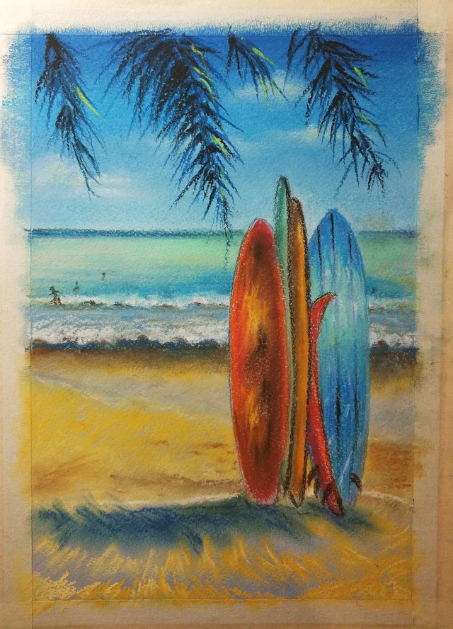
At the final stage, I strengthened the detailing of the picture, the shadows and intensified the light flare. With black pencil emphasized the contours of the boards. On the palm leaves I added a salad shade, red color as reflexes from boards, yellow color as a reflex from the sun and sand, a little umbra for intermediate shadows. With umbra drew footprints on the sand. In the shadow of a palm tree on the sand I added the umber and gray color. With yellow and light yellow colors emphasized the sun's rays on the boards. The drawing is ready.
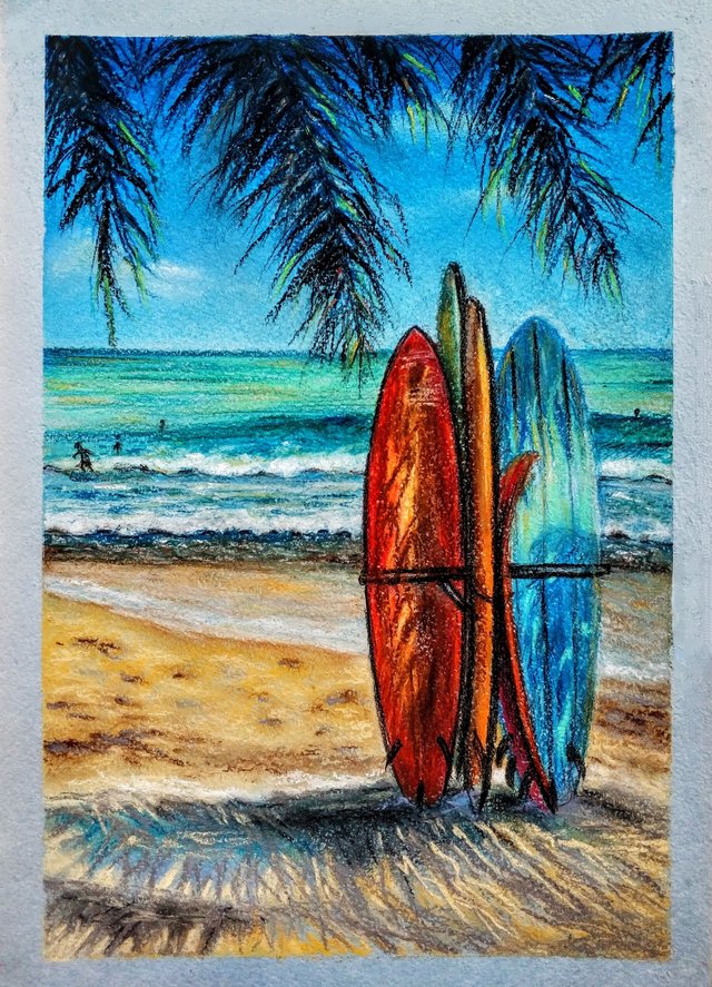
Earlier I never pasted the edges of paper with scotch tape for the frame, so for me it was a novelty. Unfortunately, scotch took some pieces of pastel paper in some places(.
Gif with all stages of my creative process.
Thank you for your attention! If you like my post – please, subscribe).
I apologize if you find mistakes in my text. Unfortunately, my English is not perfect.
Absolutely wonderful! Looks really realistic.
Splendid work!
thank you very much!)
Wonderful work AGAIN, Kleonella. Always a pleasure to see your work!
thank you very much!)
Dear Artzonian, thanks for using the #ArtzOne hashtag. Your work is valuable to the @ArtzOne community. Quote of the week: Art, freedom and creativity will change society faster than politics. -Victor Pinchuk
This post was shared in the Curation Collective Discord community for curators, and upvoted and resteemed by the @c-squared community account after manual review.
So beautiful ! I love how tropical the colours are, you really are amazing with the pastel skills <3 the waves and the froth of the waves are so nicely done <3 and the sky ! the sky is so lovely <3
and the hanging leaves are so sweet, shaded and beautifully detailed <3
thank you!)
yo´re so amazing Kleonella! stuning pic! i love this!
thank you very much)
You've received an upvote from @slothicorn! Click Here to Read our New Curation Policy And Updated Rules. (@ghulammujtaba)
Fantastic work! I like vibrant colors!