Comic Book Art - Traffic Review
Here we review original, pro, comic book art that has recently traded hands among art dealers. These images are high resolution photos of the original artwork, not prints.
Click on the header link to learn more about each piece.
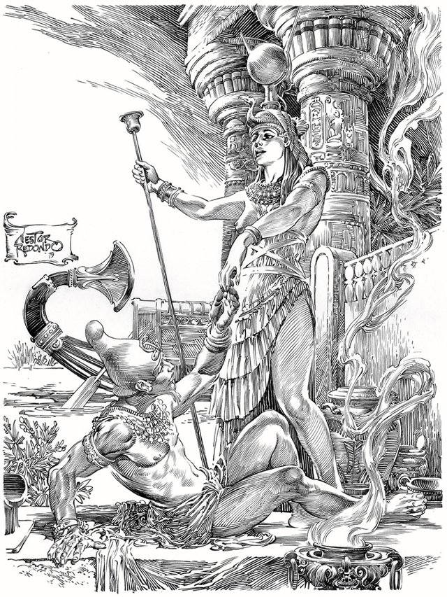
Osiris and Isis by Nestor Redondo
Nestor Redondo is an older comic book artist who died in 1995 with most of his work coming from the 1970's. This piece appears to be the original artwork used to create the plates for printing. Back in the 70's most publications were produced using traditional offset printing which required that the artwork be transformed into a carved plate. This sort of artwork required exceptional line quality, which is exactly what we see here. Each and every line in this piece is perfected with exquisite details only possible through many years of practice. If you look at the image directly and zoom in, it really exposes the talent going on here.
The Winner of the 2016 Comic Book Art Traffic Review Award for Most Incredible Artwork Changing Hands!
This is going to be the most incredible and my favorite piece of artwork covered all year long. It is very rare, rather old (1979), it is NOT FOR SALE, and the new owner is looking for more just like it... If they exist. We'll see about that in the months and years ahead.
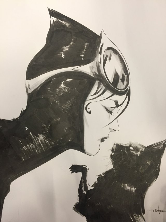
Catwoman by Jae Lee
Jae Lee's Catwoman really captures the essence of a feline in this character, which is why I think Lee's rendition of Catwoman has to be my favorite of all. So it is easy to understand why someone would pay him for an original drawing of her. This piece was a paid commission and is clearly labeled as, Not For Sale. I imagine it set the new owner back at least 3000 USD but it is original, totally unique artwork from one of the masters.
Most of Lee's art these days seems to be done with a brush and ink, rather than with a pen. Look at the image directly and zoom in so you can look very closely. I really get lost in those brush strokes and how easy he makes it all seem. You can see where his ink overlapped and how he mixes the use of different sized brushes to create the various effects.
The Leader by Arthur Adams
Way back in 1995, it appears that Arthur Adams was using his talents to design action figures. This is a great piece to show how his artistic process works, so all you young artists out there should pay close attention. This is a very hi-res image, so if you view it alone, you can zoom substantially.
Notice the marks on the left and right edges of the paper... Adams is "counting heads" there, which is where his amazing sense of proportion begins. Each mark is the size of one head from the base of the chin to the top of the head. This character is about 5 and 3/4 heads tall. The top of the knee is at about 2 and the groin at 3, the shoulders at 4 1/2. Many varying configurations of these numbers can create many different effects in the character end-design for different reasons. This is a rather un-standard configuration for humans or super humans, so Adam's is highly exploiting the proportions here to create something very unique.
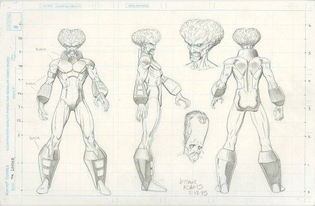
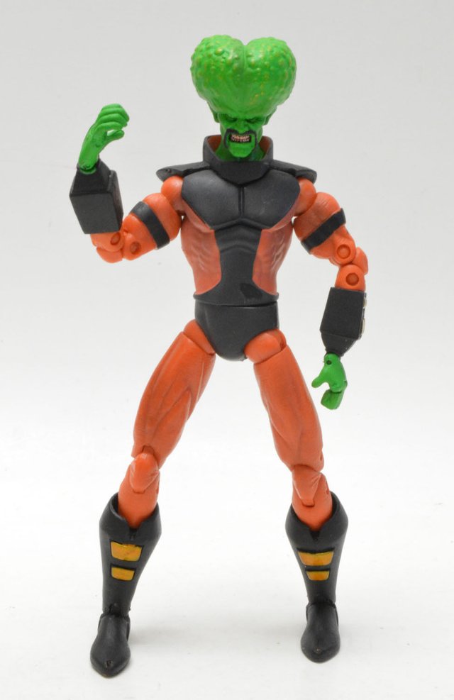
The original art is labeled as Not For Sale and probably set the owner back many thousands of dollars while the action figure is on sale at eBay for $25.00.
Below is how the action figure looks today.
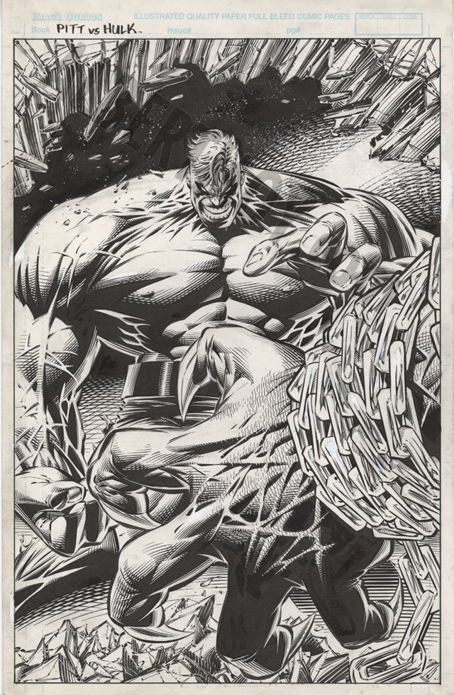
Pitt vs. Hulk by Dale Keown
Albert Moy, the art dealer, is currently selling this classic Dale Keown piece for 4000 USD. Keown drew my absolute favorite Hulk rendition of all time while working for Marvel. After the big break up of Marvel artists in the 90's, Keown put his talents to use on Pitt for Image Comics. A while after that, when relationships had mended, the Hulk/Pitt crossover finally became real. That is my favorite rendition of Hulk there in the background, while Pitt's fist takes up the entire foreground in a rather amazing composition.
Great column! Glad to see it again!
With any luck we'll be the Steem early adopters who make a fortune and can finally afford to buy some of these pieces.
I started reading Hulk just a few issues before Keown first debuted on it and his work was amazing to me as well. I have fond memories of those years, including the runs by Gary Frank and Liam Sharp that followed.
I love the doodle on Adam's design piece of the "old style" Leader crying. The little extras artists do to keep themselves entertained are usually gems.
That IS funny about Adam's doodle of the old leader. I did not realize what was really going on there until you said something. So I am glad you chimed in. The old leader was an older design from a more classic age. I think Adams did a fine job modernizing the character design with his own unique style. Adams' updated rendition is more appealing in nearly every way, while still respecting the early designs. Pretty amazing work.
I'm not 100% sure who originated the new design, although I think it may have been McFarlane. I'd guess Adams was referencing it for this toy model sheet.
I tried my best to look it up and I could not come up with anything on who is responsible for the updated design. Just when you think Google knows everything...
Jae Lee is so amazing, I love that Catwoman sketch.
I love this kind of art, love this history of artist even more <3
Great posts!
Thanks for the kind words folks! It has been a fun year, and I look forward to many more. This is just my regular reading every week and when I come across something cool, I just have to share. This time of year gets busy, so not sure I will be able to do another before 2017 begins. Unless I see something really spectacular, then I probably won't be able to resist sharing it on Steemit. lol