AUTODESK SKETCHBOOK REVIEW(PART 2)
Hello guys, how are you all doing today? Hope you all are having a wonderful day?
Yesterday i made some few reviews on autodesk sketchbook interface for andriod. click the link next https://steemit.com/art/@kenn24/autodesk-sketchbook-interface-review-for-andriod-devices to check it out if you missed the post. I promised i'll be coming out with the concluding part later, i guess that later is now. You may want to get your app handy for follow up if you are now interested in the app and if you are still doubting the genuity of the app or may be you are thinking may i'm giving the software much credits or some kind of hype, it's okay to think like that..YEAH, you can also get yourself chair,sit back and read along because i forsee you going to change your perspectives towards the app eventually. Okay
REVIEW
On the 4th icon is the one I called color lab.

THE COLOR LAB: under the color lab, we have two color racks namedcolor and copic.

On the color part, we can see some other color options. The first is the color wheel, the wheel let's you to blend or mix two different colors. Following the wheel is the HSL which I guess the abbreviation to be hue,saturation, lightrespectively.
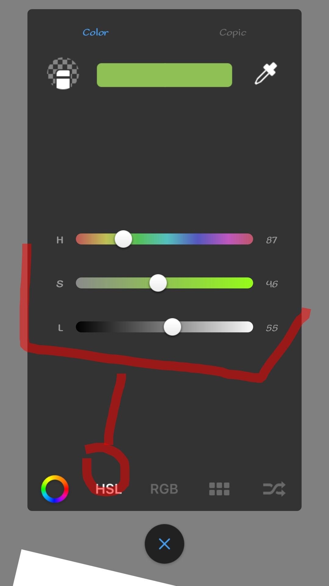
This features enables you to adjust to a particular color of your wish by toggling on each of The white circles. On the top part(left and right of the preset color are transparency which looks like an eraser and color picker which looks lick eye dropper) . Transparency works like an eraser,tapping it turns your brush loaded to transparent which while whipping on your art tends to clean out portion just like eraser,so there won't be need to go to the brush sets to pick a eraser, while color picker also let's you to target a particular unique color you might not have in the lab or to act as shortcut to picking color you initially used.

Next in these segments is the "RGB" I assumed these to stand for Red,Green,Blue respectively. Toggling the circles next to the tends to blend the colors together in RGB.

The icon that follows is the color rack which I'd already talk briefly on and the last under color lab is color shuffle, this let you shuffles between color and at the same time adjust its HSL. The different between this color and the color wheel is the provision of HSL.

The HSL can be activated by tapping on the arrow below the color shuffle. That concluded the review on color lab, next is copic ,the copic lab comprises of 13 vertical colors which each of them has their shades from white to its respective color. While by selecting further provides for you the details about your selected color such as name.


These sets of colors are found under copic illustration and close to it is copic design which also contains 13 vertical colors but about 11 shades. Selecting the colors also reveal the nomenclature of the selected color.
The next icon is the layer Icon.

THE LAYER ICON Layer is known to help differenciate or seperate each process of your art work. Right on the top is a (+) sign which when tap on it provides you with another layer and from below the layer tray is the background which when tap on takes you to color lab where you can choose from sets of different colors to change the default background color of the work or drawing screen.

You can see from the shot the change in the background color soon as the red color was tapped on while tapping on the background layer and selecting white color will change the canvas from red to white.

The eye on each layer symbolises layer transparency, tapping on it turns the particular layer invisible and hides whatever drawing done on that layer.
Below the eye is the padlock, the padlock functions as lock, once tapped on,drawing on such layer would be nullified,so you have to tap on it again then make some scribe and now you have stroke. Tapping on the plain part of the layer tray pops out loads of layer settings,which each of there functions shall be briefly analysed.

Copy: This option becomes active when a artwork is done on a particular layer. The option enables you to produce multiple replica of a particular art.
Cut: There is no copy without cut and likewise paste. Once a copy is done or a design as been highlighted for copy, tapping on the cut option completely removes such art totally from the layer and cannot be recovered from the trash can.
Paste: With paste, making multiple copies of art becomes possible instead of having to draw a particular art repeated,you just have to select the art, goto layer setting , locate paste and thats all. You dont have to keep on trying to make two circles look alike.
•Duplicate: this option enables you to double a particular layer you are working on, probably to carry out different operations.
•Merge: merge let's you make two layers one.
•Merge all: it is used after completion of work, it allows you to make all layers opened and worked on to be joined together as one.
•Delete:it enables you to remove entirely a layer you are working on. Also, the delete option can be reached by holding on the layer to be deleted on layer tray. Also from the the layer tray, holding on any layer tends to activate the delete bin up in the position of the add layer(+sign) and dragging the layer over the delete bin tends to delete such layer.
•Lock layer: explained.
•HSL adjustment: this allow you to adjust the HSL of the art progress on each layer (check for how HSL works).
•Opacity: This opacity has a scale of 0-100, toggling up or down increases or decreases the transparency of the art on a particular layer.
•Blending: Here, you can choose from different varieties of blend mode either for painting or drawing. On the list includes

Normal,darken, multiply, color burn, linear burn, lighten,screen, color dodge, linear dodge, glow, soft color, overlay, soft light, hard light, Hue, saturation, color, luminosity. each of these options are mostly adopted for finishing of your painting and shading and shall all be looked In my subsequent posts.
•Color label: this option let you choose from each of the out listed colors to tag your progress for easier recognition of steps.
The next on the **Draw screen"" icon is the full screen icon, tapping on it tends to hide all other icons except this icon. these, I hope has explained and reviewed briefly on the sketchbook worktools.
Now, looking down to the base part of the drawing screen is a tiny white dot( these dot may seem not visible if white background is selected).
These dot is the shortcut to all the parts of the app's work interface reviewed.

We can see the pencil or brush currently in use and by tapping on it takes us back to brush sets lab and if either swipe up or down increases or decreases the clarity or opacity of the pencil, while below is a circle holding the color currently in use. Also tapping on it would take us to the color lab and swiping up or down increases and decreases its luminance respectively while swiping front and back increases and decreases its saturation. Below are some icons like the color picker, transparency, last brush, last color, canvas flip, undo and redo and at the top corners are other shortcut for clear layer and frame canvas respectively. Holding on either of these shortcut produces a pop out list for choosing or changing the shortcut . Tap the "X" button below the screen hides the on screen options. This has brought me to the end of the sketchbook app review. Don't forget to stay on for the ext review(using and setting the brushes) and many more arts and reviews to come. I hope you enjoyed and found this post educative. Kindly comment, upvote and resteem for someone else in need of the review to benefit from it. Thank you all. GOD BLESS
@steemiansarena @steemgigs @artcity @surpassinggoogle #ocd-resteem @ocd-resteem #artzone @nogano